In this Quick Introduction to the Flash Professional Components, we're going to look at the UILoader and UIScrollbar.
Brief Overview
Take a look at the preview. In the SWF, on the left side there is a UILoader component which is invisible upon first glance (because there is nothing in it); we will be loading an image into this.
Under the UILoader there is a label with the text "Image Not Loaded"; upon successfully loading the image we'll change this label's text to read "Image Loaded".
The button below the label is used to start the loading of the image. On the right-hand side there is a text field and UIScrollbar which are initially invisible (the text field is invisible because there is nothing in it); upon pressing the button with the label "Load Text" we load the text from a sample text file and set the UIScrollbar to be visible.
Step 1: Setting Up the Document
Open a new Flash Document and set the following properties:
- Document Size: 550x260px
- Background Color: #FFFFFF
Step 2: Add Components to the Stage
Open the components window by going to Menu > Window > Components or pressing CTRL+F7.
Drag a UILoader, a Label, two Buttons, and a UIScrollbar to the stage.

In the Properties panel give the UILoader the instance name "imageLoader". If the Properties panel is not showing go to Menu > Window > Properties or press CTRL+F3.

Set the UILoader's X position to 37 and its Y to 20

Give the label the instance name "loadedLabel". Set the label's X to 37 and its Y to 182.
Give the first button the instance name "loadImageButton" and set the label's X to 37, its Y to 213.
In the Tools panel select the Text tool and drag out a TextField on the stage. If the Tools panel is not showing go to Menu > Window > Tools or press CTRL+F2.

Give the TextField the instance name "loremText". Set the TextField's X to 272 and its Y to 15, then set its width to 243, its height to 101.
Give the UIScrollbar the instance name "textScroller". Set the UIScrollbar's X to 525.00 and its Y to 15
Give the second Button the instance name "loadTextButton" and set its X to 272, its Y to 213.
Explaining the Components
The UILoader component is a container which can display SWF, JPEG, progressive JPEG, PNG, and GIF files.You can load in these assets at runtime and optionally monitor the loading progress. To see how this can be done, check out my tutorial on the ProgressBar component (the concepts are the same) and apply to the UILoader as I did with the Loader in that tutorial.
The UIScrollbar allows you to add a scrollbar to a textField. When you have a long block of text the UIScrollbar component allows you to scroll through without having a very large TextField to accommodate all your text. This component is very easy to use in that you can just drop it onto a TextField and it automatically "wires up" to that TextField. Here, I'll show you how to do it in ActionScript.
Step 3: Preparing the AS File
Create a new ActionScript file and give it the name Main.as.
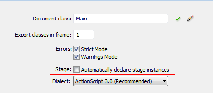
We will be declaring our components in Main.as so we need to turn off "auto declare stage instances"; the benefit of doing this is that you get code hinting for the instance when using Flash's code editor. To do this go to Menu > File > Publish Settings and click on Settings, next to Script [Actionscript 3.0].

Uncheck "Automatically declare stage instances".
In Main.as, open the package declaration and import the classes we will be using. Add the following to Main.as:
package  {

    //We will extend the class of MovieClip
    import flash.display.MovieClip;

    //Import the components we will be using
    import fl.containers.UILoader;
    import fl.controls.Button;
    import fl.controls.Label;
    import fl.controls.UIScrollbar;

    //Needed for our Event Handlers
    import flash.events.MouseEvent;
    import flash.events.Event;

    //Needed to Loaded images and Text
    import flash.net.URLLoader;
    import flash.net.URLRequest;
    import flash.text.TextField;
Step 4: Set Up the Main Class
Add the class, make it extend Movie Clip, and set up our Constructor Function.
Here we declare our variables and call our functions in the Main() constructor. Add the following to Main.as:
public class Main extends MovieClip {

    //Our on-stage components
    public var loadImageButton:Button;
    public var loadTextButton:Button;
    public var loadedLabel:Label;
    public var loremText:TextField;
    public var imageLoader:UILoader;
    public var textScroller:UIScrollbar;

    //Used to load the Text into the TextField
    public var textLoader:URLLoader;


    public function Main() {
        setupButtonsAndLabels();
        setupTextField();
        setupScrollBar();

    }
Step 5: Main Constructor Functions
Here we'll define the functions that are used in our constructor. In the setupButtonAndLabels() function we set our button's label property and add event listeners to be triggered when the user clicks the button.
In the setupTextField() function we set the text field's wordWrap property to true so the text will wrap to the next line when it reaches the right edge of the TextField.
In setupScrollBar() we set the UIScrollbar's direction to "vertical" (this can be "vertical" or "horizontal") and, since we don't want it visible when the movie first starts, we set its visible property to false.
Add the following to Main.as:
private function setupButtonsAndLabels():void {
    //Sets the buttons Label(Text shown on Button)
    loadImageButton.label="Load Image";
    loadImageButton.addEventListener(MouseEvent.CLICK,loadImage);
    //Sets the buttons Label(Text shown on Button)
    loadTextButton.label ="Load Text";
    loadTextButton.addEventListener(MouseEvent.CLICK,loadText);
    //Sets the labels text
    loadedLabel.text="Image Not Loaded";
}
    private function setupTextField():void {
    //Lines will wrap when they reach end(right side) of textfield
    loremText.wordWrap = true;
}

private function setupScrollBar():void {
    //Sets our scrollBars direction; can be "vertical" or "horizontal"
    textScroller.direction="vertical";
    textScroller.visible = false;
}
Step 6: Event Listeners
Here we'll code the event listeners we added to the buttons and then close out the class and package.
In the loadImage() function we set the scaleContent of the imageLoader to false (if it were true the image would scale down to the size of the UILoader), as we want the image to be its normal size. We then load the image and add an event listener to be triggered when the image has completed loading.
In the loadText() function we set up our URLLoader and load the text file. Here we also set up a listener to be triggered when the text has finished loading.
In the imageLoaded() function we set the label's text to "Image Loaded" -- a simple example, but you could do something less trivial in a "real" application.
In the textLoaded() function we set the text field's text to the Event's (e.target.data), which will be the text from the text file. We then set the UIScrollbar to be visible and set its scrollTarget (the text field we wish it to control).
		private function loadImage(e:MouseEvent):void{
			//If were set to true the image would scale down to the size of the UILoader
			//Here we set to false so the UILoader respects the actual image size
			imageLoader.scaleContent = false;
			//Loads the image and fires a function when loading is complete
			imageLoader.load(new URLRequest("theimage.jpg"));
			imageLoader.addEventListener(Event.COMPLETE,imageLoaded);
		}
		private function loadText(e:MouseEvent):void{
			//Loads our text file and fires a function when loading is complete
			textLoader = new URLLoader();
			textLoader.load(new URLRequest("lorem.txt"));
			textLoader.addEventListener(Event.COMPLETE,textLoaded);

		}
		private function imageLoaded(e:Event):void{
			//Sets the text on the label
			loadedLabel.text="Image Loaded";
		}
		private function textLoaded(e:Event):void{
			//Sets the TextField to the loaders data(the text in the textfile)
			loremText.text=e.target.data;
			textScroller.visible = true;
			textScroller.scrollTarget = loremText;

		}
    }//close out the class

}close out the package
Note that at the end we close out the class and package.
Conclusion
You'll notice in the Components Parameters panel of the components that you can check and select certain properties.

The above image is for the UILoader component.
The properties for the UILoader component are as follows:
- autoLoad: a Boolean value that indicates to automatically load the specified content
- enabled: a Boolean value that indicates the whether the component can accept user input
-
maintainAspectRatio: a Boolean value a value that indicates whether to maintain the aspect ratio that was used in the original image or to
resize the image to the current width and height of the UILoader component - scaleContent: a Boolean value that indicates whether to automatically scale the image to the size of the UILoader instance
- source: an absolute or relative URL that identifies the location of the content to load
- visible: a Boolean value that indicates whether or not the component is visible on the stage
The properties for the UIScrollbar are
- direction: sets the direction of the scrollBar (can be "vertical" or "horizontal")
- scrollTargetName: the target TextField to which the UIScrollbar is registered
- visible: a Boolean value that indicates whether or not the component is visible on the stage
The help files are a great place to learn more about these properties.
To learn more about the properties for Labels and Button be sure to check out the Quick Introduction to the Button and Label components.
Thanks for reading!

Comments