In this Quick Introduction to Flash Professional components we are going to look at the ScrollPane and ColorPicker. Let's dive in..
Brief Overview
Check out the demo. In it, on the left hand side, you see two Color Picker components, two Labels labeled "Custom Color Picker" and "Normal Color Picker" and a blue rectangle.
The Custom Color Picker uses colors taken exclusively from a selection of our choosing. The Normal Color Picker has all the colors of a regular color picker and when a user chooses a color we change the rectangle to the color they've chosen.
On the right hand side of the SWF there is a ScrollPane, into which we load an image, and a button that we use to initiate the loading of the image.
Step 1: Setting Up the Document
Open a new Flash Document and set the following properties:
- Document Size: 550x400px
- Background Color: #FFFFFF
Step 2: Add Components to the Stage
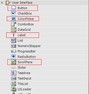
Open the components window by going to Menu > Window > Components or press CTRL+F7
Drag two ColorPickers, two Labels, a ScrollPane and a button to the stage.

In the Properties panel give the first Label the instance name customLabel.
If the Properties panel is not showing go to Menu > Window > Properties or press CTRL+F3.

Set the Label's X to 16 and its Y to 12.

Give the second Label the instance name "normalLabel"; set its X to 16 and its Y to 176.
Give the first ColorPicker the instance name "customColorPicker"; set its X to 16 and its Y to 41.
Give the second ColorPicker the instance name "normalColorPicker"; set its X to 16 and its Y to 206.
Give the second ScrollPane the instance name "imageScrollPane"; set its X to 277 and its Y to 29.
Give the Button the instance name "loadImageButton"; set its X to 354 and its Y to 332.
Using the rectangle tool draw a rectangle on the stage. I drew mine with a blue color. Select the rectangle and go to Menu > Modify > Convert to Symbol (or press F8); set its name to "square" and make sure "Type" is set to MovieClip.
Next, give it an instance name of square as we did with the components above. Set its size to 143x97px, set its X to 90, and its Y to 47.
Explaining the Components
The ColorPicker is a great little component which allows users to select a color. You can also define which colors you want available in the ColorPicker.
The ScrollPane component displays DisplayObjects, JPEG, GIF, and PNG files, as well as SWF files, in a scrollable area. When the content you are loading is too large for the movie this is an ideal component to use.
Step 3: Preparing the AS File
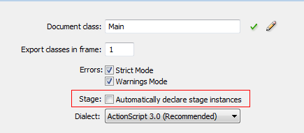
Create a new ActionScript file and give it the name Main.as. We will be declaring our components in Main.as so we need to turn off "auto declare stage instances"; the benefit of doing this is that you get code hinting for the instance.
Go to Menu > File > Publish Settings and click on Settings next to Script [Actionscript 3.0]

Uncheck "Automatically declare stage instances".

Next, in Main.as, we'll open the package declaration and import the classes we will be using.
Add the following to Main.as:
package  {
    //We extend MovieClip
    import flash.display.MovieClip;
    //Need to import the components we are using
    import fl.controls.ColorPicker;
    import fl.controls.Label;
    import fl.containers.ScrollPane;
    import fl.controls.Button;
    //The events we need
    import flash.events.MouseEvent;
    import flash.events.Event;
    //Needed to change color of movieClip
    import flash.geom.ColorTransform;
    //Needed to load image
    import flash.net.URLRequest;
Step 4: Set up the Main Class
Add the Class declaration, make it extend Movie Clip, and set up our constructor function. Here we declare our variables and call our functions in the Main Constructor.
Add the following to Main.as
public class Main extends MovieClip {

    //Our onstage Components
    public var customLabel:Label;
    public var normalLabel:Label;
    public var customColorPicker:ColorPicker;
    public var normalColorPicker:ColorPicker;
    public var square:DisplayObject;
    public var imageScrollPane:ScrollPane;
    public var loadImageButton:Button;
    public function Main() {
		setupLabels();
		setupColorPickers();
		setupButton();
    }
Step 5: Main Constructor Functions
Here we define the functions that are used in our constructor.
In the setupLabels function we set the text on the Labels. In setupColorPickers we set the colors for our customColorpicker; these colors are an array of colors using Flash's syntax for hexadecimal colors. We also add an event listener to our color pickers so that when a user chooses a color we fire off the relevant function.
In the setupButton function we set the Button's Label property and add an Event Listener for when the user clicks on the Button.
Add the following to Main.as:
private function setupLabels():void{
    //Sets the Labels' text
    customLabel.text ="Custom Color Picker";
    normalLabel.text ="Normal Color Picker"
    }
private  function setupColorPickers():void{
    //Here we set the colors for the color picker
    customColorPicker.colors =[0x000FF,0xFF0000,0x00FF00,
                               0xFFFF00,0xFF33FF];
    //When the user picks a color we call the changeColor function
    customColorPicker.addEventListener(Event.CHANGE,changeColor);
    normalColorPicker.addEventListener(Event.CHANGE,changeColor);
}

private function setupButton():void{
    //Sets the Buttons Label(The Text on the Button)
    loadImageButton.label ="Load Image";
    //When user clicks on button we call loadImage function
    loadImageButton.addEventListener(MouseEvent.CLICK,loadImage);
}
Step 6: Code our Event Listeners
Here we code the functions for the event listeners we added above.
The changeColor function uses a ColorTransform object so that we can change the color of the rectangle on the stage. We set the ColorTransform's color to the color the user selected by using e.target.selectedColor. The target is the ColorPicker whose color was just changed. Then, we use the transform property of the square movieClip and set the colorTransform to the color selected.
		private function changeColor(e:Event):void {
			//Need to set up a ColorTransform Object to change the MovieClip's Color
			var color:ColorTransform = new ColorTransform();
			//set the colorTransform color to the color user picked in colorPicker
			color.color = e.target.selectedColor;
			//Change the movieClip's color using the ColorTransform
			square.transform.colorTransform = color;
		}

		private function loadImage(e:Event):void {
			//Loads the image into the scrollPane
			imageScrollPane.load(new URLRequest("image.jpg"));
		}
	}//close out the class

}//close out the package
Conclusion
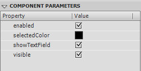
You'll notice in the Component Parameters panel (which can be opened from the Window menu) that you can check and select certain properties.

The above image is for the ColorPicker component.
The properties are as follows for the ColorPicker component:
- enabled: a Boolean value that indicates the whether the component can accept user input.
- selectedColor: A hexadecimal value that sets the selected color of the ColorPicker.
- showTextField: a Boolean value that indicates whether the internal text field of the ColorPicker component is displayed.
- visible: a Boolean value that indicates whether or not the component is visible on the stage.
The properties for the ScrollPane are
- enabled: a Boolean value that indicates the whether the component can accept user input.
- horizontalLineScrollSize: a value that describes the amount of content to be scrolled, horizontally, when a scroll arrow is clicked.
- horizontalPageScrollSize: he count of pixels by which to move the scroll thumb on the horizontal scroll bar when the scroll bar track is pressed.
-
horizontalScrollPolicy: a value that indicates the state of the horizontal scroll bar. Can be:
ScrollPolicy.ON,ScrollPolicy.OFF,ScrollPolicy.AUTO. - scrollDrag: a Boolean value that indicates whether scrolling occurs when a user drags on content within the scroll pane.
- verticalLineScrollSize: a value that describes how many pixels to scroll vertically when a scroll arrow is clicked.
- verticalPageScrollSize: the count of pixels by which to move the scroll thumb on the vertical scroll bar when the scroll bar track is pressed.
-
verticalScrollPolicy: a value that indicates the state of the vertical scroll bar. Can be:
ScrollPolicy.ON, ScrollPolicy.OFF,ScrollPolicy.AUTO. - visible: a Boolean value that indicates whether or not the component is visible on the stage.
The help files are a great place to learn more about these properties.
To learn more about the properties for Labels and Button be sure to check out the Quick Tip on the Button and Label components


Comments