In this week's Quick Tip on Flash Professional tools we will be taking a look at the Tile and TileList components.
Step 1: Setting up the Document
Open a new Flash Document and set the following properties:
- Document Size: 550x400px
- Background Color: #FFFFFF
Step 2: Add Components to the Stage
Open the components window by going to Menu > Window > Components or pressing CTRL+F7.
Drag two Labels, one List and one TileList component to the stage.

In the Properties panel give the first Label an instance name of "populationLabel".

(If the Properties panel is not showing, go to Window > Properties or press CTRL+F3.)
Set the Label's X to 31.00 and its Y to 26.00.
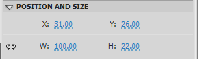
In the Properties panel give the second Label the instance name "flagsLabel". Set the Label's X to 31.00 and its Y to 238.
Then give the List the instance name "statesList" and set the List's X to 31.00 and its Y to 62.00.
Finally, give the TileList the instance name "statesTileList" and set the TileList's X to 31.00 and its Y to 269.00.
Step 3: Importing the Classes
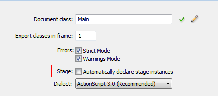
Create a new ActionScript file and name it Main.as. We will be declaring our components in Main.as, so we need to turn off "auto declare stage instances"; the benefit of doing this is that you get code hinting for the instance.
Go to Menu > File > Publish Settings. Click on Settings next to Script[Actionscript 3].

Uncheck "Automatically declare stage instances".
In Main.as, open the package declaration and import the classes we will be using by adding the following code:
package  {


    import flash.display.MovieClip;
    import flash.display.Loader;
    import fl.data.DataProvider;
    import fl.controls.List;
    import fl.controls.TileList;
    import fl.controls.Label;
    import flash.events.Event;
    import flash.text.TextFieldAutoSize;
    import fl.controls.ScrollBarDirection;
    import flash.net.URLRequest;
Step 4: Setup the Main Class
We'll add the class definition, making it extend MovieClip, and we'll set up our constructor function.
Add the following to Main.as:
public class Main extends MovieClip {
    //our List Component
    public var statesList:List;
    //our TileList Component
    public var statesTileList:TileList;
    //our Labels
    public var populationLabel:Label;
    public var flagsLabel:Label;
    //Data Providers for the list components
    var listDp:DataProvider;
    var tileListDp:DataProvider;
    //Needed to load a larger picture of the selected flag
    var picLoader:Loader;

    public function Main() {
    setupListDataProvider();
    setupTileListDataProvider();
    setupLabels();
    setupList();
    setupTileList();
    setupLoader();
}
Step 5: Functions
Here we'll define the setupListDataProvider(), setupTileListDataProvider(), setupLabels(), setupTileList(), and setupLoader() functions, as mentioned previously in the constructor.
In the library you will find movie clips named by "state" MC; these are used as an icon for the List component. You must setup the linkage for the movie clips for them to be added to the list. Do this by right-clicking on the movie clip and selecting "Properties". Here we use the name of the movie clip as the Class name:

The DataProvider class gives us an easy way to set up data to be used by components.
Add the following functions to Main.as:
private function setupListDataProvider():void{
    //This dataprovider will supply our List component
    listDp = new DataProvider();
    //Here the iconsSource is a movieClip linked in the library
    //population acts like a dynamic variable on our list
    listDp.addItem({ iconSource:alabamaMC, label:"Alabama",population:"4661900" });
    listDp.addItem({ iconSource:alaskaMC, label:"Alaska" ,population:"686293" });
    listDp.addItem({ iconSource:arizonaMC, label:"Arizona",population:"6500180" });
    listDp.addItem({ iconSource:arkansasMC, label:"Arkansas",population:"2855390" });
    listDp.addItem({ iconSource:californiaMC, label:"California",population:"36756666" });
    listDp.addItem({ iconSource:coloradoMC, label:"Colorado",population:"4939456" });
    listDp.addItem({ iconSource:conneticutMC, label:"Conneticut",population:"3501252" });
    listDp.addItem({ iconSource:delawareMC, label:"Delaware",population:"873092" });
    listDp.addItem({ iconSource:floridaMC, label:"Florida",population:"18328340" });
    listDp.addItem({ iconSource:georgiaMC, label:"Georgia",population:"9685744" });
    listDp.addItem({ iconSource:hawaiiMC, label:"Hawaii",population:"1288198" });
    listDp.addItem({ iconSource:idahoMC, label:"Idaho",population:"1523816" });
    listDp.addItem({ iconSource:illinoisMC, label:"Illinois",population:"12901563" });
    listDp.addItem({ iconSource:indianaMC, label:"Indiana",population:"6376792" });
    listDp.addItem({ iconSource:iowaMC, label:"Iowa",population:"3002555" });
}

private function setupTileListDataProvider():void{
    //This dataProvider will supply our tilelist
    //The source is them image you want to show
    //fullSize acts like a dynamic variable to our tileList
    tileListDp = new DataProvider();
    tileListDp.addItem({source:"flags/alabama.gif",fullSize:"flagsLarge/alabama.jpg"});
    tileListDp.addItem({source:"flags/alaska.gif",fullSize:"flagsLarge/alaska.jpg"});
    tileListDp.addItem({source:"flags/arizona.gif",fullSize:"flagsLarge/arizona.jpg"});
    tileListDp.addItem({source:"flags/california.gif",fullSize:"flagsLarge/california.jpg"});
    tileListDp.addItem({source:"flags/colorado.gif",fullSize:"flagsLarge/colorado.jpg"});
    tileListDp.addItem({source:"flags/connecticut.gif",fullSize:"flagsLarge/connecticut.jpg"});
    tileListDp.addItem({source:"flags/delaware.gif",fullSize:"flagsLarge/delaware.jpg"});
    tileListDp.addItem({source:"flags/florida.gif",fullSize:"flagsLarge/florida.jpg"});
    tileListDp.addItem({source:"flags/georgia.gif",fullSize:"flagsLarge/georgia.jpg"});
    tileListDp.addItem({source:"flags/hawaii.gif",fullSize:"flagsLarge/hawaii.jpg"});
    tileListDp.addItem({source:"flags/idaho.gif",fullSize:"flagsLarge/idaho.jpg"});
    tileListDp.addItem({source:"flags/illinois.gif",fullSize:"flagsLarge/illinois.jpg"});
    tileListDp.addItem({source:"flags/indiana.gif",fullSize:"flagsLarge/indiana.jpg"});
    tileListDp.addItem({source:"flags/iowa.gif",fullSize:"flagsLarge/iowa.jpg"});
}

private function setupLabels():void{
    populationLabel.text ="Choose A State";
    flagsLabel.text ="Click on flag for larger Image";
    //Needed so our labels autosize to hold all the text
    populationLabel.autoSize = populationLabel.autoSize = TextFieldAutoSize.LEFT;
    flagsLabel.autoSize = flagsLabel.autoSize = TextFieldAutoSize.LEFT;
}

private function setupList():void{
    //The iconField sets what the icon will be
	//Here it uses iconSource which we defined in our dataprovider
    statesList.iconField = "iconSource";
    statesList.width = 150;
    //set the hieght of the rows
    statesList.rowHeight = 30;
    //sets how many rows show in the List
    statesList.rowCount = 5;
    //Here we set the List's dataProvider to the one we created earlier
    statesList.dataProvider = listDp;
    statesList.addEventListener(Event.CHANGE,getPopulation);
}

private function setupTileList():void{
    //set the direction of the scrollBar for the tileList
    statesTileList.direction = ScrollBarDirection.HORIZONTAL;
    statesTileList.rowHeight = 60;
    //How many columns the TileList will have
    statesTileList.columnCount =1;
    //How many rows to show in the TileList
    statesTileList.rowCount=1;
    statesTileList.width = 400;
    //Here we set the TileList's dataProvider to the one we created
    statesTileList.dataProvider = tileListDp;
    statesTileList.addEventListener(Event.CHANGE,loadPic);
}

private function setupLoader():void{
    //This is the Loader we use to load the larger pics of the flags
    picLoader = new Loader();
    picLoader.x = 228;
    picLoader.y =117;
    addChild(picLoader);
}
Step 6: Event Listeners
Here we'll code our Event Listeners for when an item in either of the lists is clicked.
Add the following to Main.as
		private function getPopulation(e:Event):void{
			//Here we get the population by grabbing the label(state) and the population
			//The selectedItem.label returns the currently selected Item in the list
			populationLabel.text = "The population for " + e.target.selectedItem.label + " is " + e.target.selectedItem.population;
		}

		private function loadPic(e:Event):void{
			//Here we load the fullSize pic by getting the currently selected Items fullSize var
			picLoader.load(new URLRequest(e.target.selectedItem.fullSize));
		}

	}//Close out the class

}//Close out the package
Conclusion
Using the List and TileList components is a great way to display lists of data and images.
You'll notice in the Component Parameters panel of the components that you can check and select certain properties.

The above image is for the List Component, the properties for which are as follows:
-
"allowMultipleSelection: a Boolean value that indicates whether more than one list item can be selected at a time -
"dataProvider: the data model of the list of items to be viewed -
"enabled: a Boolean value that indicates whether the component can accept user input -
"horizontalLineScrollSize: a value that describes the amount of content to be scrolled, horizontally, when a scroll arrow is clicked -
"horizontalPageScrollSize: the count of pixels by which to move the scroll thumb on the horizontal scroll bar when the scroll bar track is pressed. -
"horizontalScrollPolicy: value that indicates the state of the horizontal scroll bar -
"horizontalLineScrollSize: a value that describes the amount of content to be scrolled, horizontally, when a scroll arrow is clicked -
"horizontalPageScrollSize: he count of pixels by which to move the scroll thumb on the horizontal scroll bar when the scroll bar track is pressed -
"verticalScrollPolicy: a value that indicates the state of the vertical scroll bar -
"visible: a Boolean value that indicates whether the component instance is visible
The properties for the TileList are as follows:
-
allowMultipleSelection: a Boolean value that indicates whether more than one list item can be selected at a time -
columnCount: the number of columns that are at least partially visible in the list -
columnWidth: "the width that is applied to a column in the list, in pixels. -
dataProvider: the data model of the list of items to be viewed -
direction: a value that indicates whether the TileList component scrolls horizontally or vertically. -
enabled: a Boolean value that indicates whether the component can accept user input -
horizontalLineScrollSize: a value that describes the amount of content to be scrolled, horizontally, when a scroll arrow is clicked -
horizontalPageScrollSize: the count of pixels by which to move the scroll thumb on the horizontal scroll bar when the scroll bar track is pressed. -
rowCount: the number of rows that are at least partially visible in the list. -
rowHeight: the height that is applied to each row in the list, in pixels. -
scrollPolicy: " the scroll policy for the TileList component. -
verticalLineScrollSize: a value that describes how many pixels to scroll vertically when a scroll arrow is clicked. -
verticalPageScrollSize: the count of pixels by which to move the scroll thumb on the vertical scroll bar when the scroll bar track is pressed.. -
visible: a Boolean value that indicates whether the component instance is visible
The help files are a great place to learn more about these properties.
To see the properties for Labels be sure to check out the Quick Tip on the Button and Label components.
Thanks to http://www.state-flags-usa.com for allowing me to use their flag images.
Thanks for reading and keep watching for upcoming component tutorials!

Comments