In this Quick Tip on the Flash Professional Components, we will be taking a look at the CheckBox and RadioButton Components.
Brief Overview
In the preview you see a single checkbox at the top. When this checkbox is selected the checkbox's label will change to say "Checked" or "Not Checked".
With the bottom six checkboxes you can select what sports you are interested in and the text area below will update to show the changes. With the radio buttons on the right you are only able to select one option; the label will change each time you make a selection and update to say which option you have chosen.
Step 1: Setting up the Document
Open a new Flash Document and set the following properties:
- Document Size: 550x400px
- Background Color: #FFFFFF
Step 2: Add Components to the Stage
Open the Components panel (Menu > Window > Components or CTRL+F7).
Drag four labels, seven checkboxes, three radio buttons and one text area to the stage.

In the Properties panel give the first checkbox the instance name "toggleCheckBox".
If the Properties panel is not showing go to Menu > Window > Components or press CTRL+F3.

Set the checkbox's X to 5.00 and its Y to 21.00.

Note: Now follows a fairly repetitive process until we have all our components set up - hang in there :)
In the Properties panel give the second checkbox the instance name "swimmingCheckBox". Set the checkbox's X to 5.00 and its Y to 91.00.
In the Properties panel give the third checkbox the instance name "footBallCheckBox". Set the checkbox's X to 116.00 and its Y to 191.00.
In the Properties panel give the fourth checkbox the instance name "hikingCheckBox". Set the checkbox's X to 5.00 and its Y to 127.00.
In the Properties panel give the fifth checkbox the instance name "soccerBox". Set the checkbox's X to 116.00 and its Y to 127.00.
In the Properties panel give the sixth checkbox the instance name "boxingCheckBox". Set the checkbox's X to 5.00 and its Y to 161.00.
In the Properties panel give the seventh checkbox the instance name "baseballCheckBox". Set the checkbox's X to 116.00 and its Y to 161.00.
In the Properties panel give the first label the instance name "sportsLabel". Set the label's X to 5.00 and its Y to 57.00.
In the Properties panel give the second label the instance name "interestLabel". Set the label's X to 5.00 and its Y to 191.00.
In the Properties panel give the third label the instance name "attendingLabel". Set the label's X to 278.00 and its Y to 21.00.
In the Properties panel give the fourth label the instance name "willAttendLabel". Set the label's X to 278.00 and its Y to 143.00.
In the Properties panel give the first radio button the instance name "yesRadio". Set the radio button's X to 278.00 and its Y to 51.00.
In the Properties panel give the second radio button the instance name "noRadio". Set the radio button's X to 367.00 and its Y to 51.00.
In the Properties panel give the third radio button the instance name "notSureRadio". Set the radio button's X to 278.00 and its Y to 88.00.
In the Properties panel give the text area the instance name "sportsTA". Set the text area's X to 5.00 and its Y to 223.00.
Step 3: Preparing the .as File and Importing the Classes
Create a new ActionScript file and give it the name "Main.as".
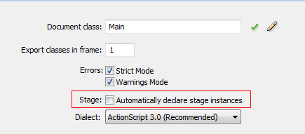
We will be declaring our components in this Main.as file so we need to turn off "auto declare stage instances". The benefit of
doing this is that you get code hinting for the instance.
Go to Menu > File > Publish Settings. Click on Settings next to "Script[Actionscript 3]"

Uncheck "automatically declare stage instances".
In Main.as, open the package declaration and Import the classes we will be using by adding the following code:
package
{

    //Import our controls
    import fl.controls.Label;
    import fl.controls.CheckBox;
    import fl.controls.TextArea;
    import fl.controls.RadioButton;


    //Needed to AutoSize the Text in our Labels
    import flash.text.TextFieldAutoSize;

    //Need to put our radio Buttons into a Group
    import fl.controls.RadioButtonGroup;

    //Need to extend Movie Clip
    import flash.display.MovieClip;

    //Need for our checkboxes
    import flash.events.Event;
Step 4: Set up the Main Class
Add the Class, extend Movie Clip and set up our Constructor Function.
Add the following to Main.as:
public class Main extends MovieClip
{
    //The components
    public var interestLabel:Label;
    public var sportsLabel:Label;
    public var attendingLabel:Label;
    public var willAttendLabel:Label;
    public var toggleCheckBox:CheckBox;
    public var labelCheckBox:CheckBox;
    public var swimmingCheckBox:CheckBox;
    public var hikingCheckBox:CheckBox;
    public var boxingCheckBox:CheckBox;
    public var footballCheckBox:CheckBox;
    public var soccerCheckBox:CheckBox;
    public var baseballCheckBox:CheckBox;
    public var sportsTA:TextArea;
    public var yesRadio:RadioButton;
    public var noRadio:RadioButton;
    public var notSureRadio:RadioButton;

    //Need an array for the sports CheckBoxes
    private var sportsCheckBoxes:Array;

    public function Main()
    {
            setupLabels();
            setupCheckBoxes();
            setupRadioButtons();
    }
Step 5: Functions in the Main Constructor
Here we define the setupLabels(), setUpCheckBoxes(), and setupRadioButtons() functions.
In the setupCheckBoxes() function we put all the sports checkboxes into an array; this way we can loop through them and add a single event listener to each one of them, saving us from having to manually type addEventListener() each time.
For the setupRadioButtons() we have used a radioButtonGroup. Radio buttons are intended for only one of a group to be selected at a time. When we add a radio button to a group we are stating which radio buttons it belongs with.
Add the following to the Main.as:
private function setupLabels():void
{
    //Sets the text on the label
    sportsLabel.text = "What sports interest you?";
    interestLabel.text = "Your Interests Are:";
    attendingLabel.text="Will you be attending the event?";
    willAttendLabel.text="Will be attending = Yes";

    //Use autosize so our labels can hold all the text
    sportsLabel.autoSize = sportsLabel.autoSize = TextFieldAutoSize.LEFT;
    interestLabel.autoSize = interestLabel.autoSize = TextFieldAutoSize.LEFT;
    attendingLabel.autoSize = attendingLabel.autoSize = TextFieldAutoSize.LEFT;
    willAttendLabel.autoSize = willAttendLabel.autoSize = TextFieldAutoSize.LEFT;


}

private function setupCheckBoxes():void
{
    //sets the text on the labels
    toggleCheckBox.label = "Checked";
    swimmingCheckBox.label = "Swimming";
    hikingCheckBox.label = "Hiking";
    boxingCheckBox.label = "Boxing";
    footballCheckBox.label = "Football";
    soccerCheckBox.label = "Soccer";
    baseballCheckBox.label = "BaseBall";


    toggleCheckBox.width = 250;


    toggleCheckBox.selected = true;

    toggleCheckBox.addEventListener(Event.CHANGE,toggleChange);
    //here we put the checkboxes into an array so we can loop through them
    //and easily add the same eventListener to each of them
    sportsCheckBoxes = new Array(swimmingCheckBox,hikingCheckBox,boxingCheckBox,footballCheckBox,soccerCheckBox,baseballCheckBox);

        for (var i:int=0; i<sportsCheckBoxes.length; i++)
        {

                sportsCheckBoxes[i].addEventListener(Event.CHANGE,sportsSelected);
        }


}


private function setupRadioButtons():void
{

        yesRadio.label="Yes";
        noRadio.label="No";
        notSureRadio.label="Not Sure";

        yesRadio.selected = true;

        //Radio Buttons are intended have only one selected at a time
        //by putting them into a group we say which belong with eachother
        var attending:RadioButtonGroup = new RadioButtonGroup("attending");

        //here we assign the radio buttons to the group
        yesRadio.group = attending;
        noRadio.group = attending;
        notSureRadio.group = attending;

        yesRadio.addEventListener(Event.CHANGE,willBeAttending);
        noRadio.addEventListener(Event.CHANGE,willBeAttending);
        notSureRadio.addEventListener(Event.CHANGE,willBeAttending);

}
Step 6: Event Listeners
Here we'll code our Event Listeners. Add the following to Main.as
		private function toggleChange(e:Event):void
		{
			if (e.target.selected == true)
			{
					e.target.label = "Checked";
			}
			else
			{
					e.target.label = "Not Checked";
			}
		}

		private function sportsSelected(e:Event):void
		{
			//we clear the textarea and add the new options below
			sportsTA.text = "";

			for (var i:int=0; i<sportsCheckBoxes.length; i++)
			{
		        //if the current checkbox is selected we add it to the textArea
				if (sportsCheckBoxes[i].selected == true)
				{
						sportsTA.text +=  sportsCheckBoxes[i].label + "\n";
				}
			}

		}

		private function willBeAttending(e:Event):void
		{

			//we use the currently selected radios button label to set Will be attending
			//to "Yes","No",or "Not Sure"
			willAttendLabel.text ="Will be attending = "+e.target.label;
		}

	}//close out the class

}//close out the package
Conclusion
Using radio buttons and checkboxes is a great way to allow your users to make a selection.
You'll notice in the "Component Parameters" panel of the components that you can check and select certain properties:

This image is for the checkbox component.
The properties are as follows for the checkbox component:
- enabled: a Boolean value that indicates whether the component can accept user input.
- label: the text label for the component.
- labelPlacement: Position of the label in relation to the checkBox.
- selected: a Boolean value that indicates whether a checkbox is toggled in the on or off position.
- visible: a Boolean value that indicates whether the component instance is visible.
The properties for the radioButton are as follows:
- enabled: a Boolean value that indicates whether the component can accept user input.
- groupName: The group name for a radio button instance or group.
- label: the text label for the component.
- labelPlacement: Position of the label in relation to the radioButton..
- selected: a Boolean value that indicates whether a radioButton is toggled in the on or off position.
- value: A user-defined value that is associated with a radio button..
- visible: a Boolean value that indicates whether the component instance is visible.
Thanks for reading and keep your eyes open for upcoming component tutorials!

Comments