If you followed my previous tutorial, you'll now have a theme on your site (or a child theme) which includes links to your top-level pages in the site header.
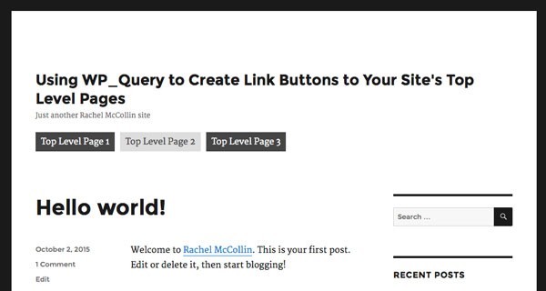
I created a child theme of twenty sixteen, and this is how my links are looking right now:
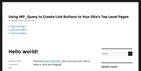
In this tutorial I'll show you how to add some CSS to your theme to make those links a bit nicer. Let's start by getting rid of the bullets and adding floats.
Removing Bullets and Adding Floats
Open your theme's stylesheet. If you created a child theme it will be empty, but if you're working with your own theme I suggest you add this styling in the part of your stylesheet where you keep styling for the header.
A recap on the code that outputs the page links (if there are pages to link to):
<ul class="top-level-page-links">

<?php // using a foreach loop, output the title and permalink for each page
foreach ( $pages as $page ) { ?>

    <li class="page-link">

		<a href="<?php echo get_page_link( $page->ID ); ?>">
			<?php echo $page->post_title; ?>
		</a>

	</li>

<? } ?>

</ul>
This means we're targeting a ul element with the top-level-page-links class and within that, li elements with the page-link class followed by a elements (i.e. links).
First, let's remove the bullets. Add this:
ul.top-level-page-links  {
    list-style: none;
}
Next, let's get rid of the padding on each list item and add a margin-left declaration:
ul.top-level-page-links  {
    list-style-type: none;
	margin-left: 0;
}
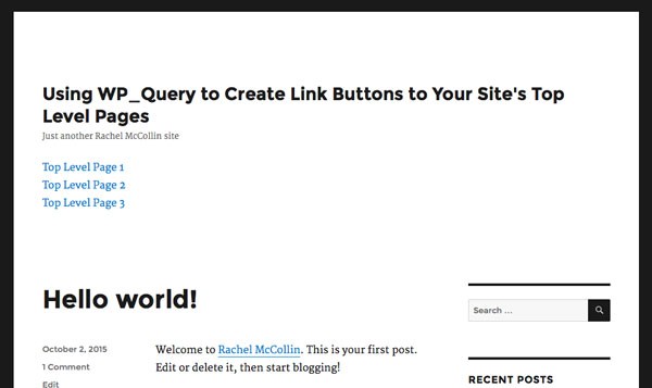
Now refresh your screen and you'll see that the list styling is gone:
Next let's get those links floating next to each other. Add this to your stylesheet:
.page-link {
    float: left;
}
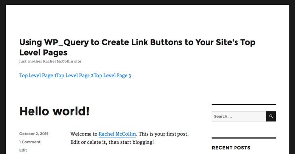
Now your links will be all next to each other:
Next, let's move on to making the links look a bit more like buttons.
Adding Margins, Padding and Backgrounds
To make our links look like buttons, we'll add a margin, padding and a background to the links.
Add this to your stylesheet:
.page-link a {
    margin-right: 10px;
	padding: 0.5em 10px;
	background-color: #454545;
}
Note that I've only used a margin on the right as I want the left-hand button to align to the left of the page.
When you refresh your screen, your buttons will look more button-like:
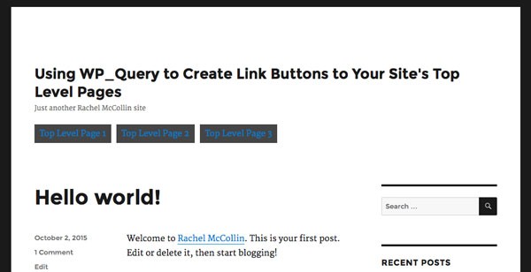
They're looking much better but need a bit of finesse. Let's edit the color of the text and background so that when someone hovers over the button, it changes color.
Adding Hover Effects
Now let's make those buttons a bit more attractive.
Add two more declaration blocks to your stylesheet, making sure you add these after the declaration block for links you just added:
.page-link a:link,
.page-link a:visited {
    color: #fff;
	text-decoration: none;
}
.page-link a:hover,
.page-link a:active {
	background-color: #dddddd;
	color: #454545;
	text-decoration: none;
}
This changes the color of the links, removes the underline, and changes the color when someone hovers over a link or it's active.
Let's see how this looks on the page:
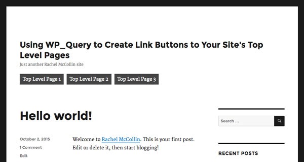
And when I hover over a link:

Much better!
Summary
In this two-part tutorial, you've learned how to create links to your site's top-level pages which are automatically generated, and then to style those links using CSS so they look like buttons.
This gives you a nice, prominent way to let your visitors go straight to those pages, and will be useful if you have top-level pages you want to ensure plenty of visitors can access.


Comments