This is the second in a two-part tutorial series on designing an iPhone banking application. In this part of the series, we will be designing the main layout/content of each of these pages: the menu/home page, the statement page, and the add account screens. Missed part one? Get up to speed by reading it here.
Step 1
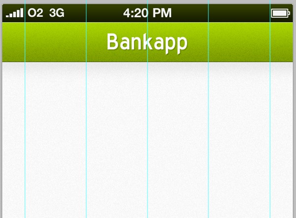
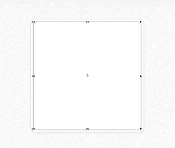
Following on from where we left off, select the Rectangular Marquee Tool. From the toolbar overhead, select fixed size from the style drop-down menu and use settings 50 x 50 pixels. Click somewhere on your canvas to create a 50 x 50 pixel selection. Drag your selection up to the edge of your canvas, and drag a guide from your ruler (View > Ruler) and snap it up against your selection. Repeat the process until you have two guides on either side of your canvas.
Place a guide in the center of your canvas - you should be able to automatically snap it.
Now drag out guides and make them central between the two we've already made, like below:
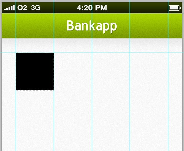
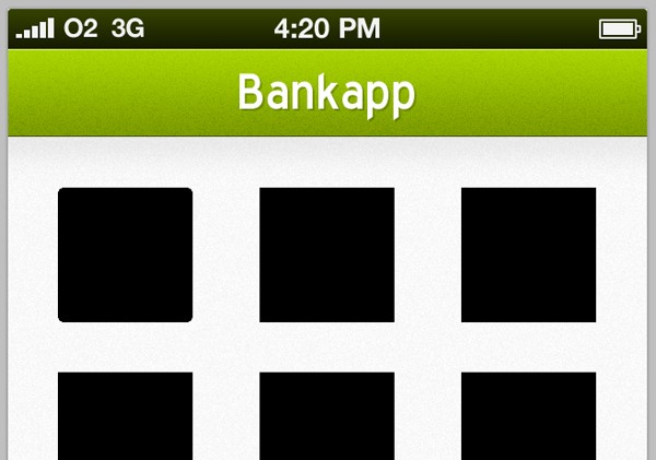
We now have a very simple grid ready to place our icon/buttons once we have designed them. Select the Rectangular Marquee Tool and the style menu, select normal rather than fixed size. Drag out a square (hold the Shift-Key to keep it squared) in between our left guides. Fill it with black.
Repeat the process twice more, making sure to fill in each shape on a new layer.
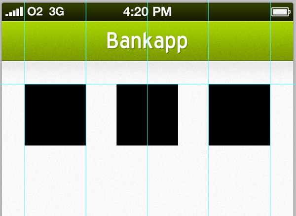
Duplicate all three layers and position them 50 pixels beneath your previous shapes.
Using the Rectangular Marquee Tool, create a solid black block at the bottom of the menu screen and rename the layer to "ad."
Step 2
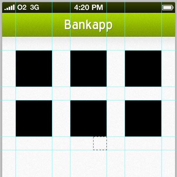
With the main structure of our home screen done, it's time to start adding all of those little details that make the design come to life. Cmd+Click (Ctrl+Click on Windows) on your first icons layer thumbnail to reselect it. Go to Select > Modify > Smooth and enter 4 pixels, then click OK. Right-Click and select Select Inverse from the menu.
Hit the Delete-Key on your keyboard to remove the corners of your selection. Go to View > Clear Guides to remove all of your guides.
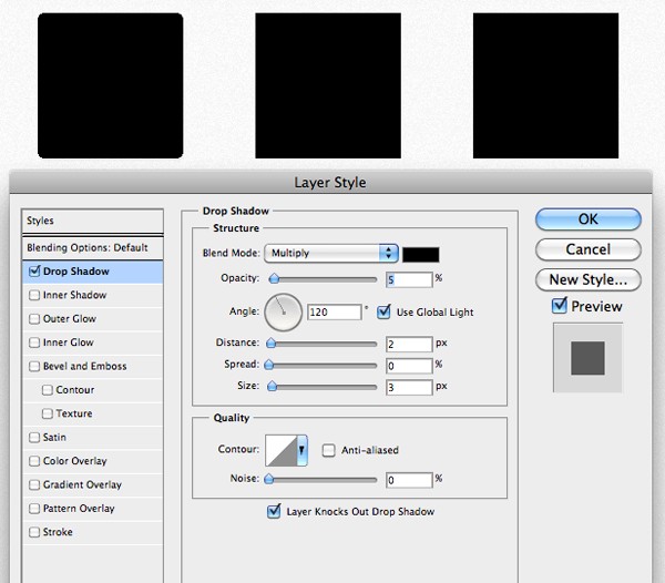
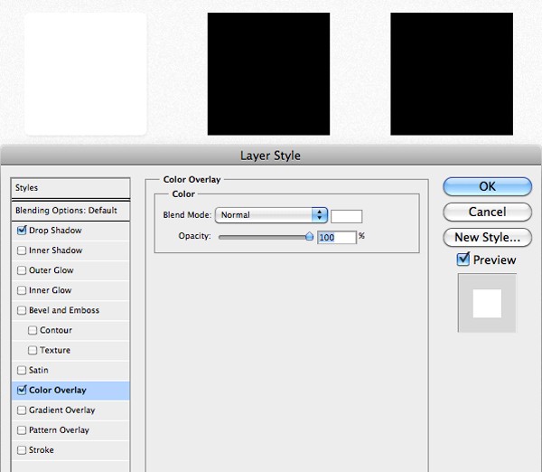
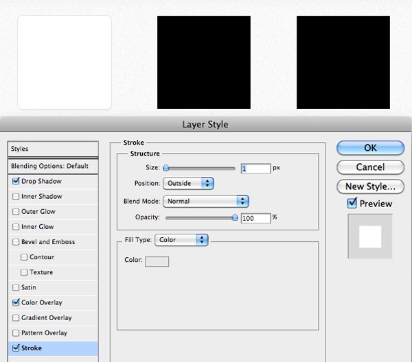
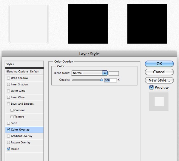
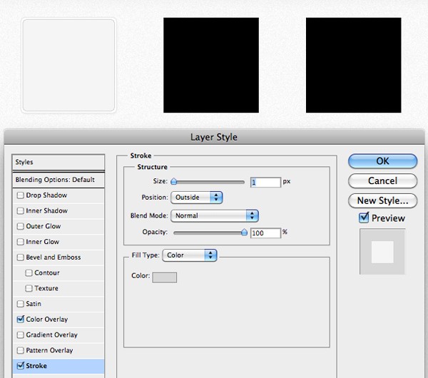
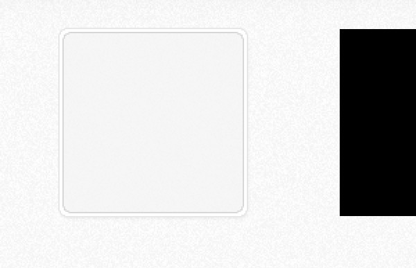
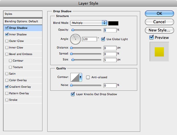
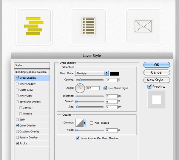
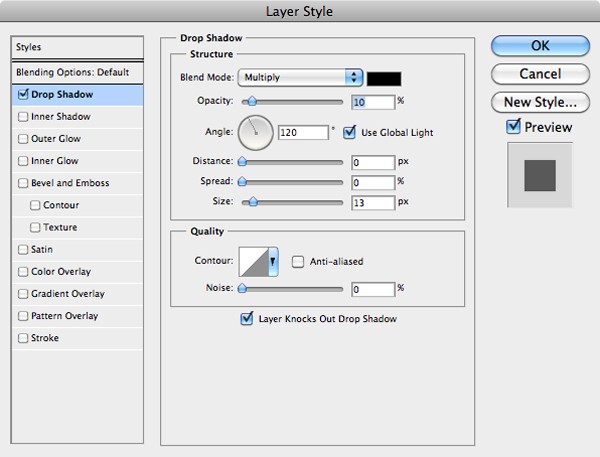
Open up the layer styles window for your first icon. Apply a drop shadow, a color overlay, and a stroke. All of the settings can be seen in the screenshots below:
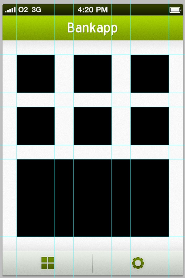
Duplicate your layer and go to Edit > Transform > Scale. Whilst holding both the Shift-Key and Alt-Key, scale your shape down a little bit.
Open up the layer styles window for your new layer, and apply the following settings to our existing effects, and completely remove the drop shadow...
Duplicate the layer once more, and completely remove the layer styles by Right-Clicking on the layer and selecting clear layer style from the menu. Go to Filter > Noise > Add Noise. I added 10% noise and then lowered the layers opacity to 5%.
Repeat the whole process to all of your icons.
Step 3
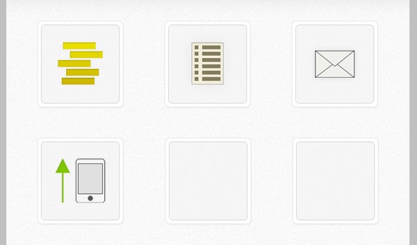
It's time to start creating the icons that we will then place on top of our buttons. Create a new layer and select the Rectangular Marquee Tool. The first icon we're going to design is a stack of coins that will represent "balance." Create a small rectangle with the marquee tool and then fill it with black.
Nudge your selection up a few notches and then to the right - fill this selection with black on the same layer. Keep repeating the step until you have something that looks like below.
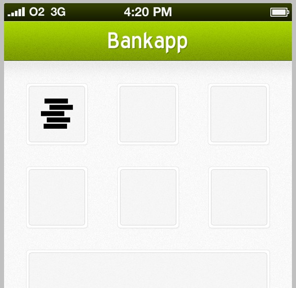
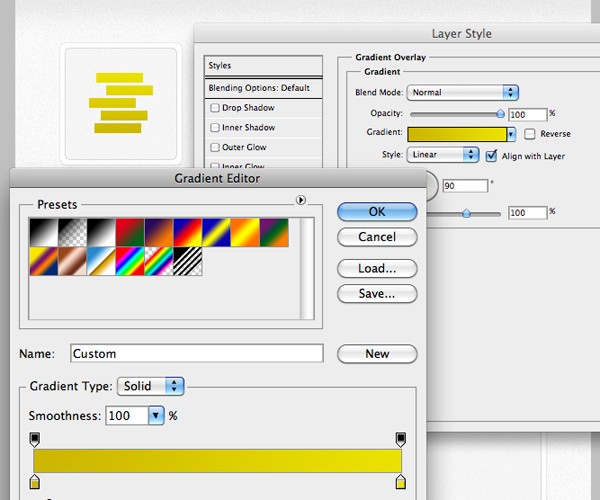
Open up the layer styles window for your new coins layer. Add a fairly subtle golden gradient overlay to your coins.
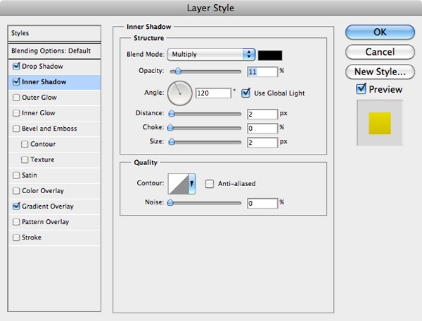
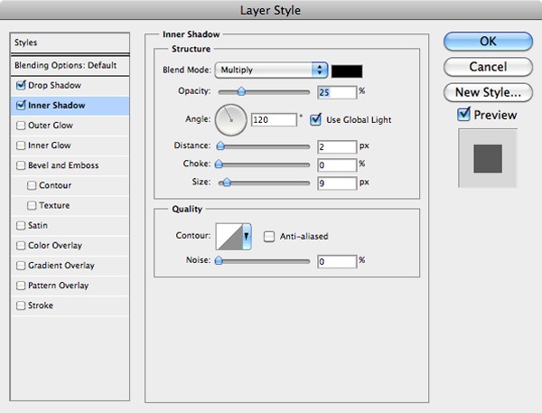
Now add a drop shadow and inner shadow to your shape, you can see the settings I used in the screenshots below.
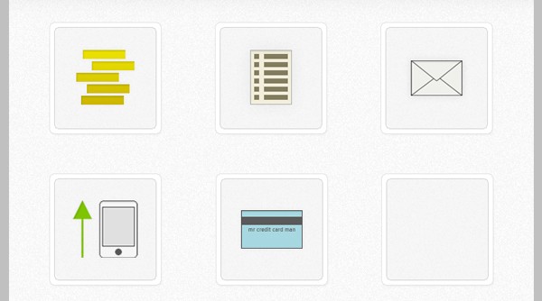
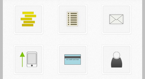
Using techniques we have been using throughout both parts of this tutorial, complete all of the other icons. I'm going to create the following icons: Paper Statement (for statements), Envelope (for notifications), Mobile Phone (for phone top-ups), Credit Card (for credit card statements) and a Silhouette (for add account).
Step 4
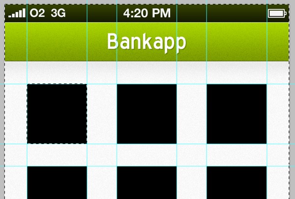
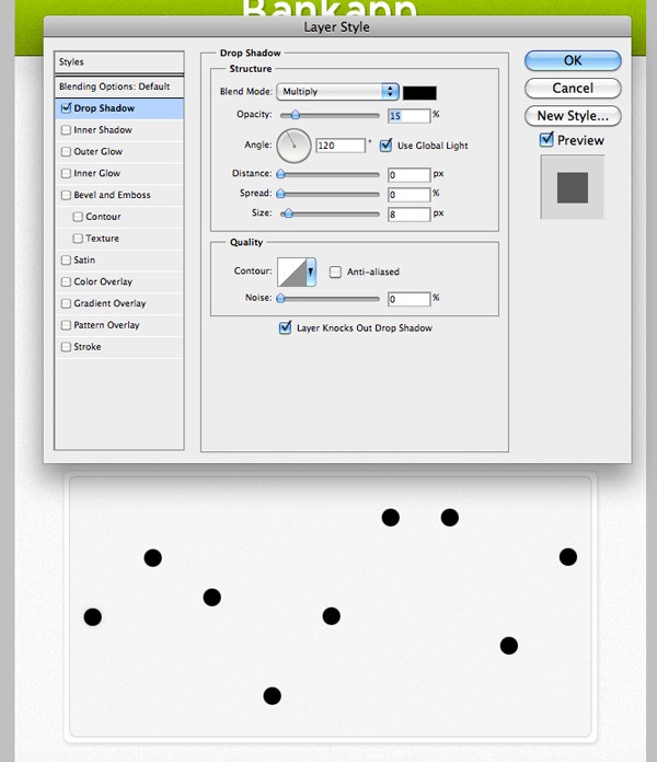
After completing my icons, I've decided that the drop shadow beneath our main white shapes need darkening up a little. Open up the layer style window and up the opacity of the shadow to 15%. I also increased the size of the shadow from 2px to 5px.
Do the same for all of your other button shapes.
Step 5
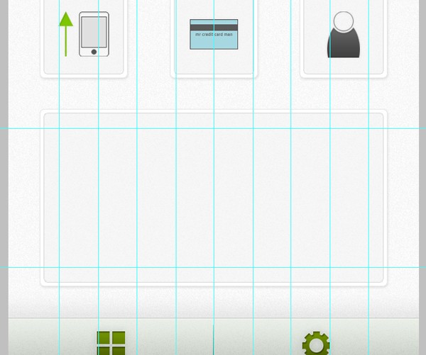
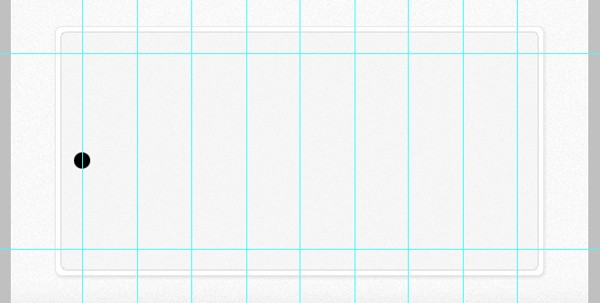
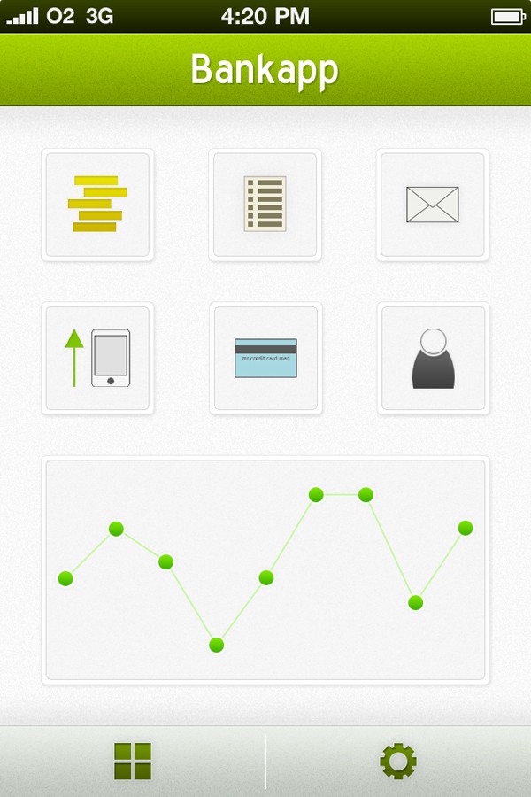
Instead of using the bottom rectangle for an advertisement, I think it would be a great little addition to have a simple graph in its place, giving users a quick overview of whether their account balance is on the up (or down). Using the same technique we used earlier, drag out some guides from the ruler.
Grab the Elliptical Marquee Tool and drag out a small circle whilst holding the Shift-Key to keep i16t round. Fill it with black on a new layer.
Duplicate the layer and place one dot on the next vertical guide. Repeat the step until you have something that looks like this:
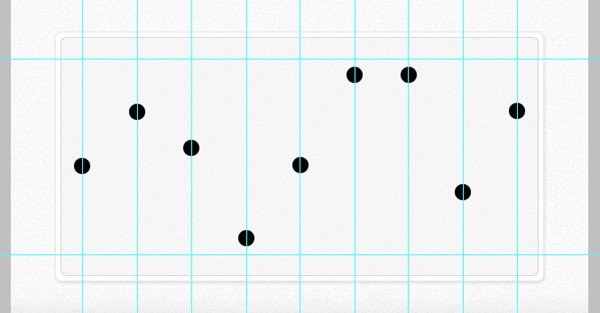
Go to View > Clear Guides to remove the guides on our canvas. Open up the layer styles option for your first blob, and apply the following styles:
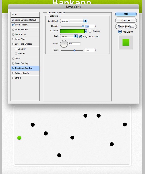
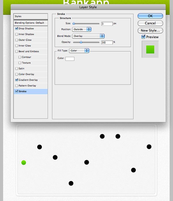
Copy the layer styles by Right-Clicking on your layer and selecting Copy Layer Style. Select all of your other circle layers, Right-Click and select Paste Layer Style. This should automatically add the styles you just created to all of your other layers.
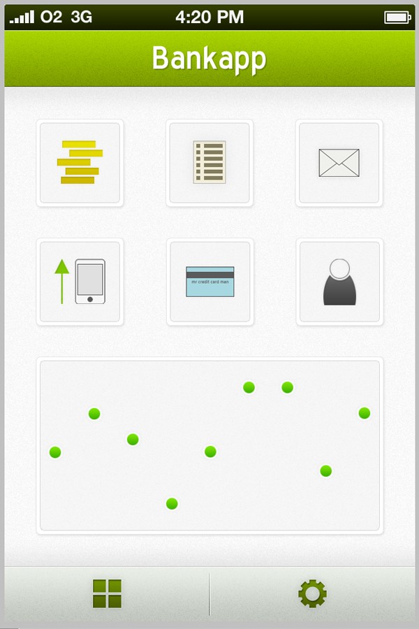
Grab the Line Tool and drag a line from one dot to the other. Do this beneath your dot layers.
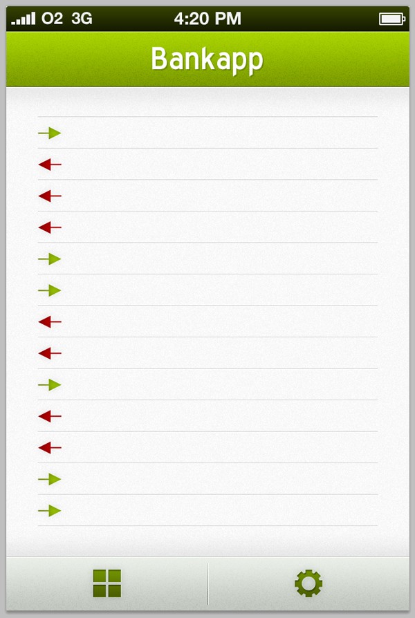
With that done, so is our navigation screen! Put all of your recent layers into a folder called "Navigation Screen" to keep things nice and tidy!
Step 6
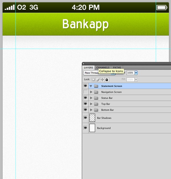
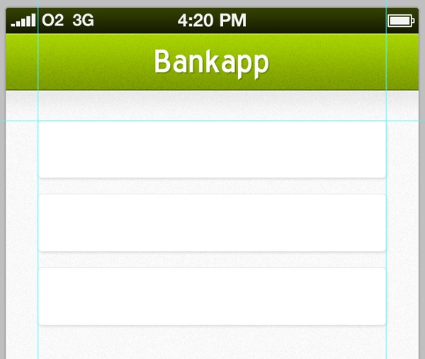
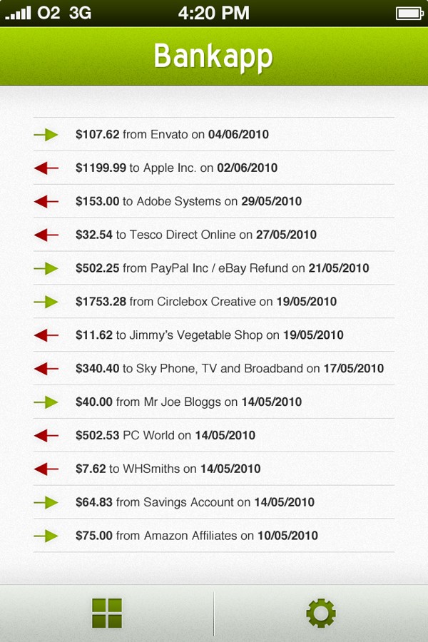
Drag out layers to the edge of your icons on your navigation screen, and then hide the whole folder. Create a new folder and call it "Statement Screen."
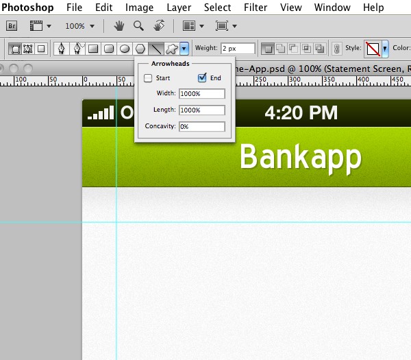
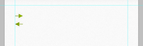
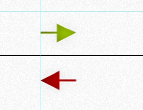
Select the Line Tool, and from the toolbar click on the drop-down menu and make sure arrowheads (end) is selected.
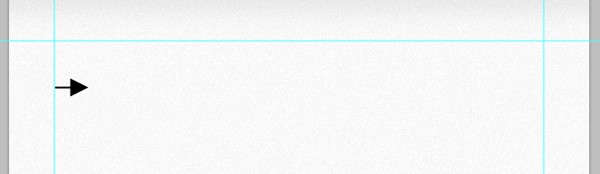
Drag out a very small arrow, like below:
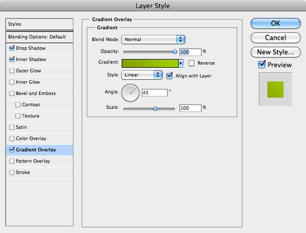
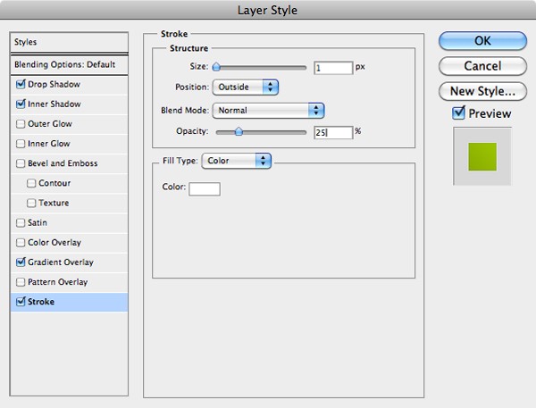
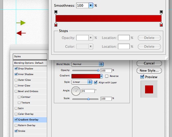
Right-click on the arrows layer, select rasterise, and then rename the layer to "green arrow." Open up the layer options window for your arrow then apply a drop shadow, inner shadow, gradient overlay and stroke. All of the settings can be seen below:
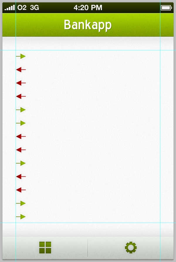
As you've probably guessed, this arrow will be the icon we use for incoming transactions (money paid into the users account). Duplicate the layer and nudge it down a few spaces using the Shift-Key and Cursor-Keys. Go to Edit > Transform > Rotate and whilst holding the Shift-Key, rotate the arrow so that it is pointing to the left.
Change the layers name to red arrow, and then open up the layers style window and apply a red gradient to it.
Keep duplicating the two arrows and place them below each other in a random order.
Select the Single Row Marquee Tool and make a selection below your first arrow, fill it with black on a new layer called "separator."
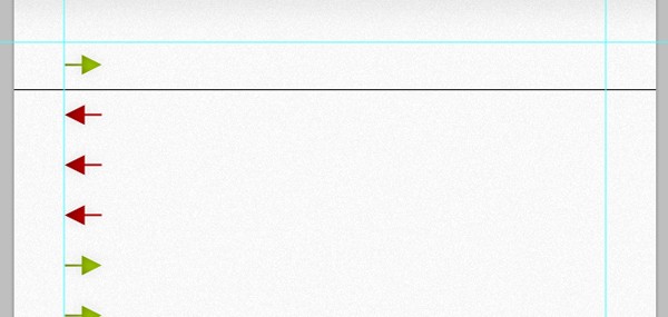
Duplicate the layer, then move it down one pixel by pressing the down button on your Cursor-Keys. Recolor the line to white.
Merge the two layers together by selecting them both, Right-Clicking and selecting Merge Layers from the menu. Change the layer opacity to 15%, and then cut off the end of the lines up to the guidelines using the Rectangular Marquee Tool and Delete-Key.
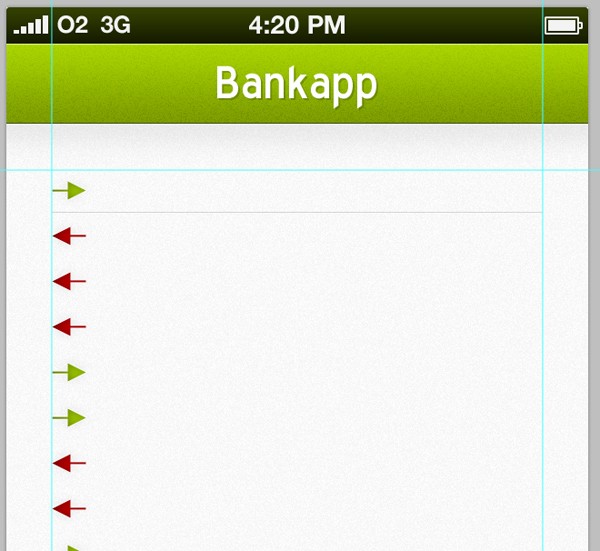
Duplicate the layer and place it between your next two arrows. Keep repeating the step until you have a line inbetween all of the arrows. Go to View > Clear Guides.
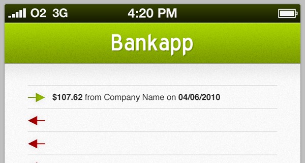
Grab the Text Tool and drag out a text box inbetween your top two separating lines making sure it is central. Type something in. I have used the text "$107.62 from Company Name on 04/06/2010." I used Helvetica for this, set at 4pt.
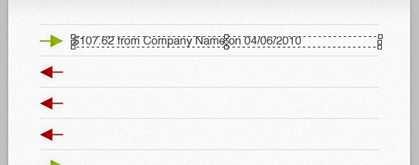
Make certain bits of your text stand out more by using different sub-typefaces, such as bold and italic.
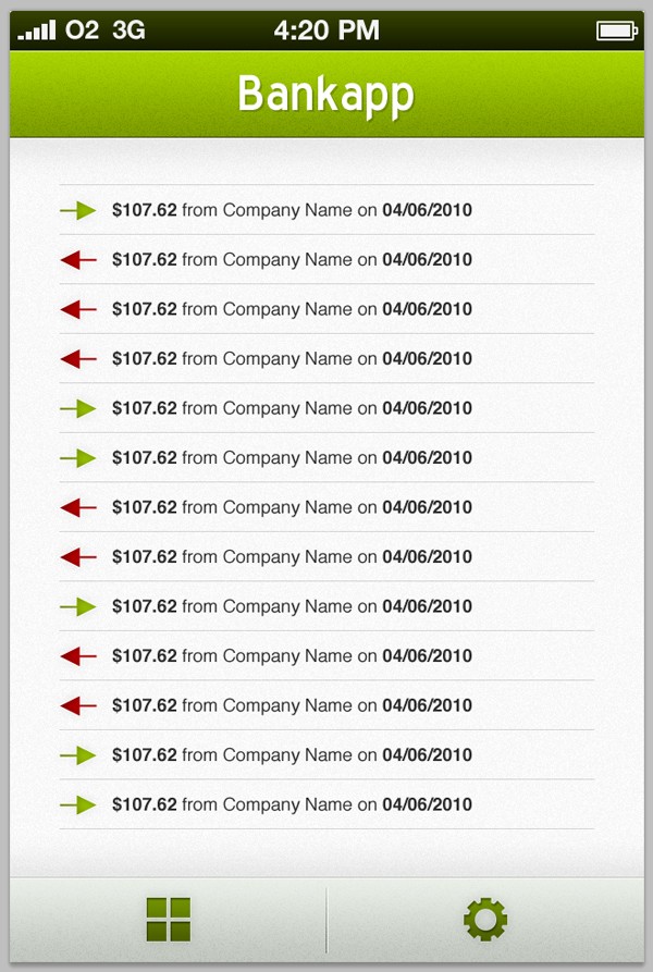
Duplicate the text layer and move it down to the next transaction - keep repeating this step until you have filled all of the gaps.
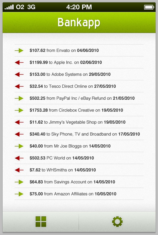
To make your design mock-up look more realistic, go through your text layers and change the amount, company name, and dates.
Step 7
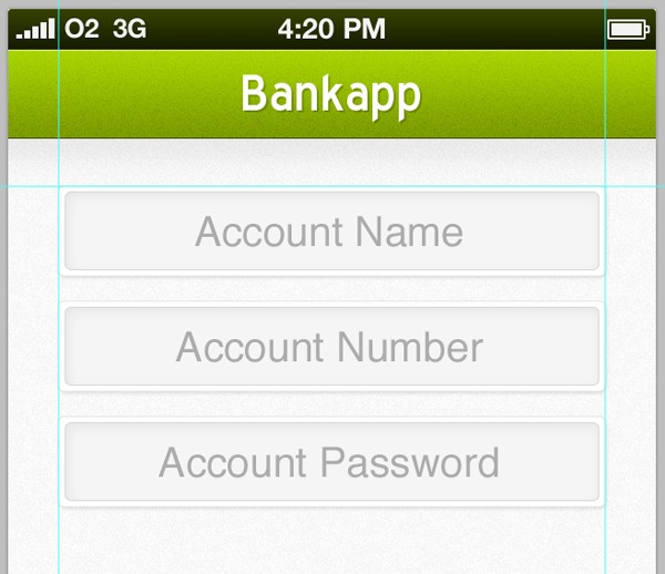
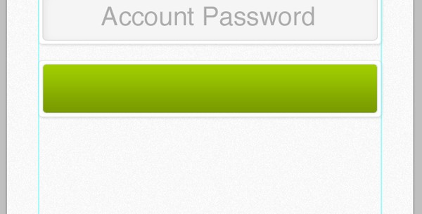
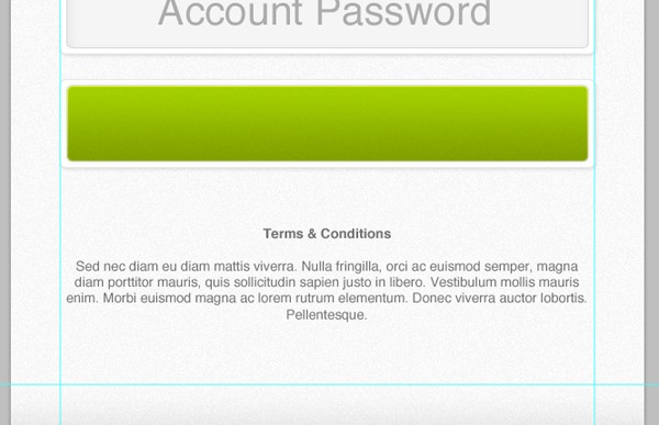
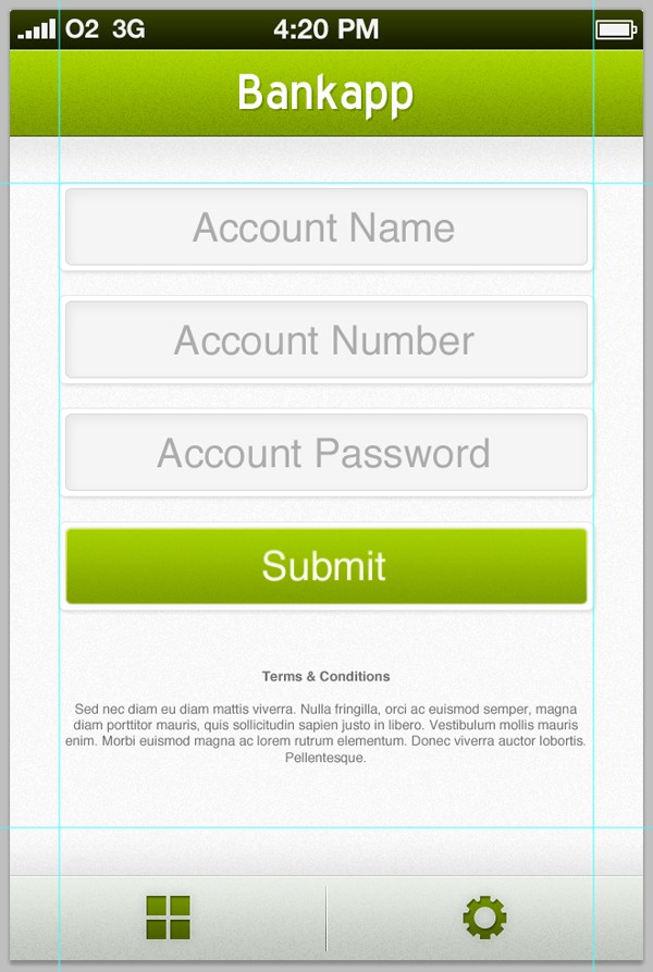
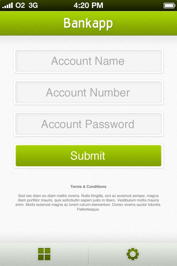
Using techniques you've already used throughout both parts of the tutorial, start and complete the add account screen. Below are several screenshots taken throughout designing the final screen of the tutorial.
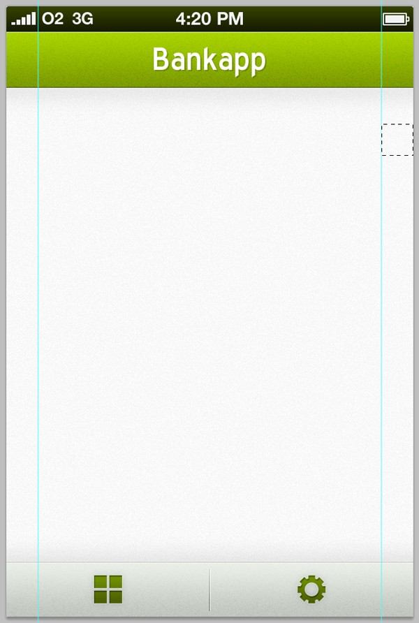
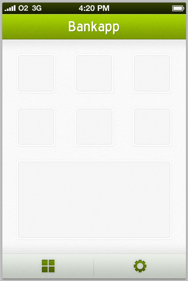
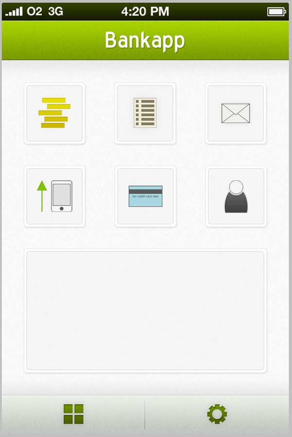
Final Results
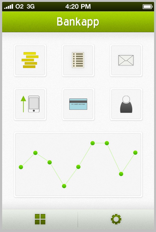
Home/Navigation Screen:
Statement Screen:
Add Account Screen:

Comments