As a developer, you may have bought into the myth that Photoshop is a tool only comprehensible to the artsy folk. The goal of this series is to shatter that lie by showing just how easy it can be to begin to add aesthetically appealing touches to your mobile web sites and applications. You may not become Raphael overnight, but hopefully you will find the tips and tricks presented here as a fitting complement to your programming prowess. Ready to start learning the tool that can make apps "pop"? Let's get started.
Overview
Among professional graphic and web designers, Photoshop is internationally the most popular and comprehensive tool available for creating and editing graphics. Personally, I haven’t run across a graphical problem that Photoshop couldn’t handle in over 10+ years of professional design work. In this tutorial series, I will be introducing you to the fundamentals of Photoshop with the goal of empowering you to increase the aesthetic quality of your programs and applications. Before we get started, know that Photoshop is an extremely powerful piece of software, and that we will only be able to scratch the surface of its capabilities in this series. There are a thousand different ways to take on any challenge, so the techniques within this tutorial are just one of the many ways available to complete a task.
Workspace
Take a quick look at the following picture to get a sense for the various components within the standard Photoshop UI. I'll expand on each section below.
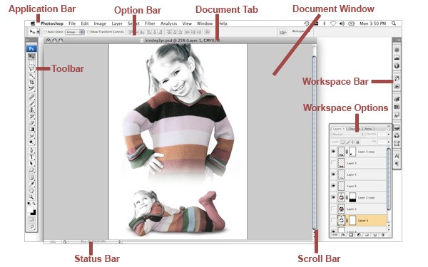
Application Bar – The Application Bar is like most other standard software bars. The bar contains all major menus within the software. Anything from opening and closing to changing image size and applying filters are spread throughout ‘File, Edit, Image, Layer, Select, Filter, Analysis, 3D, Window, and Help.’ We won’t get into details of each menu but take comfort in knowing what you need is in there somewhere (helpful, I know).
Option Bar – Each tool from the Toolbar has a different Option Bar associated with it. The Option Bar gives you customization options for each tool. For example, when the text tool is selected, from the Option Bar, you can change the font family, font size and font color, among other options.
Document Tab – This is the name of the document you currently have opened. So, I know what you are thinking: what's the point of even mentioning this? Consider the following features: tabs and state display. Tabs allow you to easily switch back and forth between multiple open files, and the state of each file is indicated by the presence or absence of a '*'. When the '*' is present in the document tab bar, it indicates that the file currently has unsaved changes.
Document Window – The Document Window is the window in which the open documents appear. Holding your mouse over the bottom right hand corner of the window can scale the window size. When the cursor changes to arrows, drag the corner of the window either inward or outward to modify the size.
Toolbar – The Toolbar houses the beef (or tofu, for you veggies). All of the main tools are located within the panel either at the top level or as a sub-menu. All tools with a little black triangle in the bottom right hand corner can be expanded to reveal more options (see the ‘Toolbar’ section below for more details).
Workspace Bar – The Workspace bar can be customized based on preference. There are presets built in but some designers would rather have options they use more often, more readily available. To see the full list of what is available to add to the Workspace bar, you can also go to the WINDOW Menu in the Application Bar.
Workspace Options– Working in conjunction with the Workspace Bar, the Workspace Options Panel gives you yet more options. In some cases, Workspace Options offer the same content as the Option Bar.
Scroll Bar– Everyone should know what a Scroll Bar does, right? If not, shoot me an email and I will recommend a good book.
Toolbar
All tools with a little black triangle in the bottom right hand corner can be expanded. To expand the options, click and hold your mouse over the tool of your choice to reveal more options, as seen below:
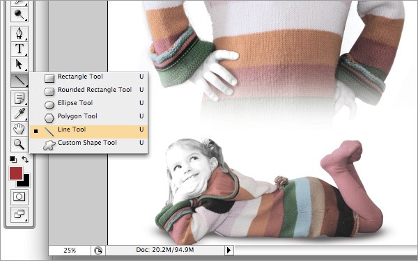
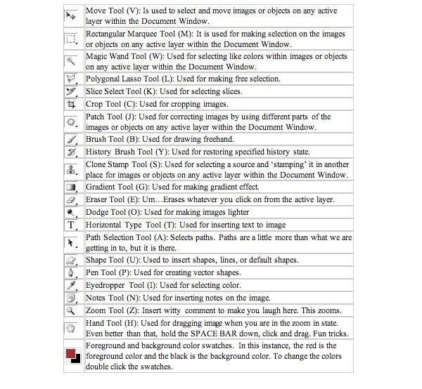
As you can see, there are quite a few options to go through here. I will try to make this as painless as possible. Photoshop will tell you, in a tool tip, the name of each tool by hovering your cursor over it. The letters inside the brackets are the shortcuts for each particular tool. If you plan on using Photoshop regularly, I strongly recommend getting to know the shortcuts, as they will save you endless amounts of time.
Layer Basics
LAYER STACKS - Within the Workspace Bar on the right, Find the Layer icon ![]() . Photoshop uses Layers for differentiating objects within the same file. Layers are really what make everything possible in Photoshop. To open your Layers Panel go to Window > Layers. There are a lot of different analogies for understanding layers, but layers are really just that: individual layers of the image or graphic.
. Photoshop uses Layers for differentiating objects within the same file. Layers are really what make everything possible in Photoshop. To open your Layers Panel go to Window > Layers. There are a lot of different analogies for understanding layers, but layers are really just that: individual layers of the image or graphic.
Whatever is at the top of the stack is the most visible. In contrast, whatever is at the bottom of the stack is the least visible, because of all the layers above it in the stack. Talk is just talk, I am a more visual person so let’s see some screens.
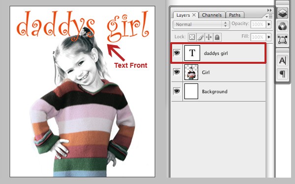
As you can see, the text in front of the girl in the Document Window and the text is on the top of the stack in the Layers Palette. To move the text behind the girl, we have to click and drag the text layer to just below the layer named ‘Girl.’ Another little shortcut would be to use Ctrl+] to move the layer up and Ctrl+[ to move the layer down.
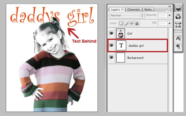
This puts the girl in front of the text and at the top of the Layer Palette.
The layer that you currently have selected and are working on is known as the Active Layer. Active layers are differentiated from all other layers by the highlighted layer name. All additions, modifications or filters will take affect to the active layer only.
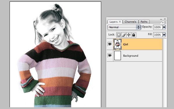
Layer visibility can be toggled by the little eye icon ![]() on the left hand side of the Layers palette. A visible eye means the layer is visible, while clicking the eye will hide the chosen layer as well as the icon itself.
on the left hand side of the Layers palette. A visible eye means the layer is visible, while clicking the eye will hide the chosen layer as well as the icon itself.
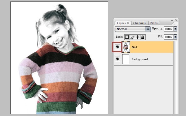
NOTE: You can hide and unhide any layer at any time, active or not.
Saving for the Web
Saving from Photoshop can sometimes be a task if you are unfamiliar with the relationship between resolution, file sizes, and file formats. For this tutorial, I am going to assume your image is at web friendly resolution and you want to save for the web or a mobile device.
To save your image, go to File > Save for Web & Devices or press Alt+Shift+Ctrl+S and you will see a window like the one below:
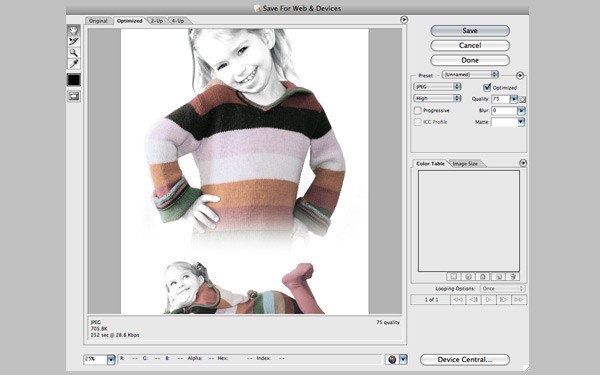
From here you have the option to
- Change the image type to JPG, GIF, PNG and WBMP.
- Change the quality of the image.
- Change transparency if necessary.
- Click Save > (Choose your location) > Save, and you’re done.
Wondering what format to choose for mobile devices? Check out Jen Gordon's article Exporting Graphics for Mobile Apps.
Photoshop has massive amounts of power and there is the potential for so much creativity. In order to create a successful mobile web site or application that people will continually want to use is often more than just producing functional code. The interface has to be clean, professional, easy-to-use, and appealing. Photoshop can help with all of the above. Like anything else, you just have to get your feet wet and start learning!
There you go, the 20,000-foot overview of Photoshop. Stay tuned as we delve further into the the world of Photoshop and how it can help you and your mobile web sites and applications.
About the Author:
Kyle Herges and his mad design skills have been making things look good for nearly a decade now. While often being referred to as ‘one of the best kept secret in the design industry,’ the word is getting out. Based in Middle America, his skills have been remotely molded by professionals all across the nation. A master of ‘Web Design and New Media,’ Kyle specializes in user interface design, web design, graphic design, and pretty much anything else ending in "design". See more, learn more and collaborate (more) at KHDesignGraphics.com


Comments