We’ve gone through a lot already in this series. I would like to think that from what we've covered so far you could start to design some pretty cool stuff! For this tutorial on buttons, I'm going to show you how to make an icon using just four circles. Yep, that’s it, just four! While four circles will get you something pretty cool, I'll give you even more bang for the buck by showing you how to enhance the graphic by adding two more circles. Let’s get drawing!
Creating Buttons

This is what we are going to end up with. This same technique will work for pretty much any shape, so when we are done, you can create a square or a rectangle with rounded corners as well. Experiment. Changing colors should be pretty simple so if you aren’t down with the green, change it up. Learn a little color theory in one of my previous posts to optimize your desired effect.
- Open Photoshop and create a new document.
- Select the Ellipse shape tool (u) from the toolbar.
- Hold the SHIFT key down and create a circle
- Click on the name ‘Shape-1’ in the layer palette to rename it.
- Press Enter to save the changes.
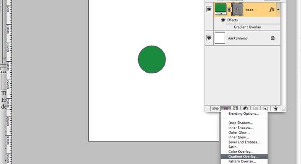
- Double click the color swatch on the ‘base’ layer color swatch to change the color.
- Choose the color you want to make your button. I used #529655.
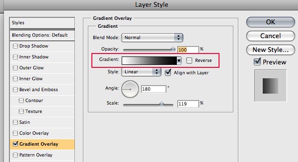
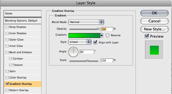
- Double click the layer or click the ‘Add a layer style’ button from the layer palette.
- Choose Gradient Overlay
- Double click the gradient color swatch.
- Click OK to accept the gradient settings.
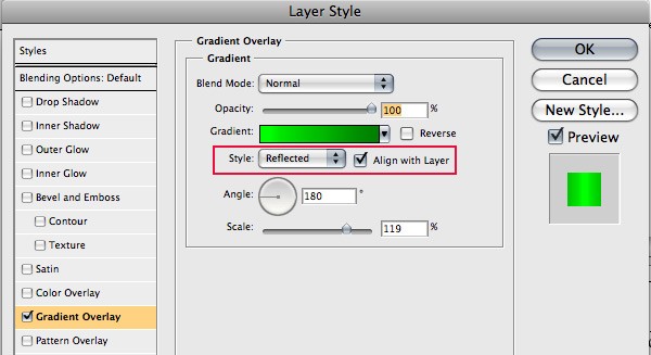
- Choose ‘Reflected’ from the gradient style drop down box.
- Click OK to close the layer style window.
- Select the Ellipse shape tool (u) again from the toolbar.
- Now without holding SHIFT down like we did before, try drawing the same circle just not quite as tall.
- Click on the name ‘Shape-1’ in the layer palette to rename it.
- Press Enter to save the changes.
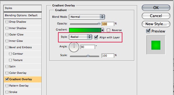
- Double click the layer or click the ‘Add a layer style’ button at the bottom of the layer palette.
- Choose Gradient Overlay.
- Double click the gradient color swatch.
- Click OK to accept the gradient settings.
- Choose Radial from the style drop down box
- Click OK to close the layer style window.
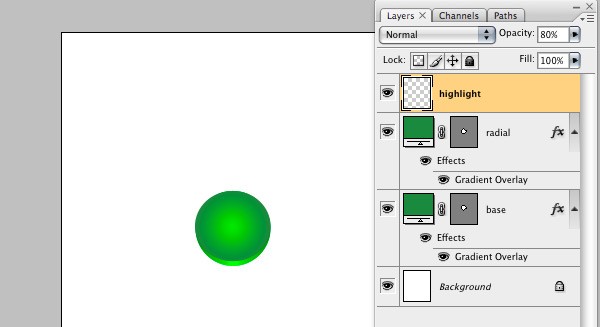
- Create a new layer and name it highlight.
- Choose the Ellipse marquee tool (M) from the toolbar.
- With the highlight layer selected, create a circle about the same height as you did for the radial layer except a little more narrow.
- Choose White as your foreground color in the toolbar.
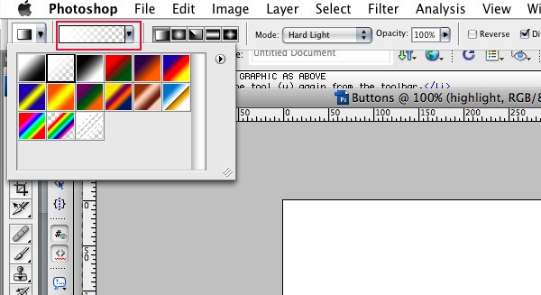
- With our selection created, choose the Gradient Tool (G) from the toolbar.
- Choose Foreground to Transparent from the gradient option bar.
- Click and drag from the top of the selection to the bottom of the selection.
- Adjust the transparency from the layer palette. I changed it to 80%.
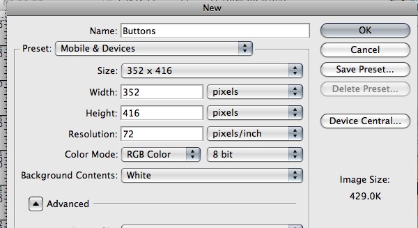
I used the presets above for simplicities sake and since I want these icons in my mobile app. The presets might have to be changed based on how you want to use your buttons.
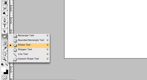
You can also choose the Ellipse tool from the option bar at the top.
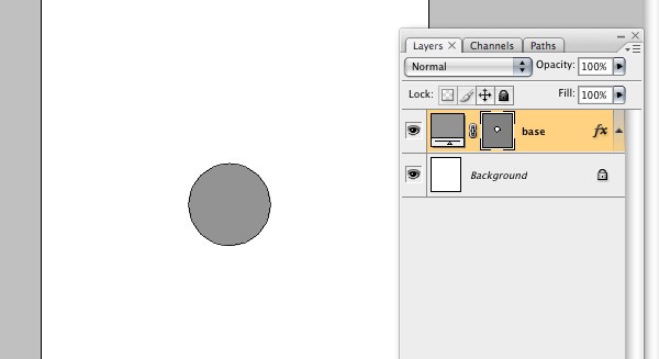
This is going to be the size of your button so judge size accordingly. A new layer with the name Shape-1 should have been created in your layer palette.
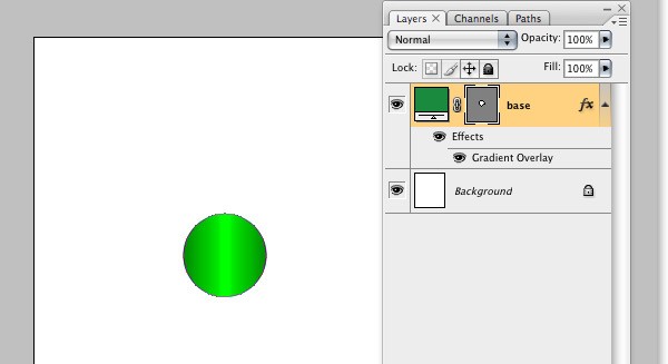
Name your layer something descriptive or easy to remember. I named mine base because this is the starting layer and everything will be built from here.
We are going to create the nice little highlights and shadows that you are seeing in the finished piece. Gradients are perfect for that effect and can be used in lots of different creative ways.
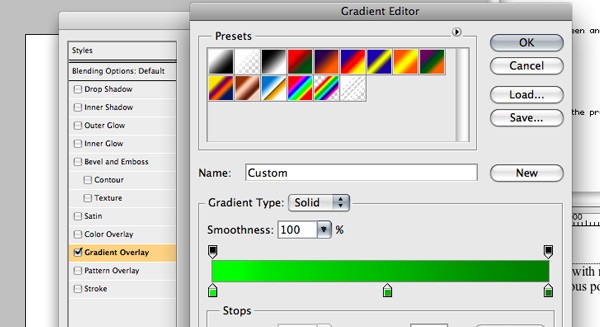
Here we are going to add three colors to our gradient, a highlight, a shade and something in between. Highlight meaning lets add some more green and white and less red and blue. Shade meaning take out some green and blue. I used highlight - #00ff24, something in between- #00bb23 and shade- #00891a.
Looks kind of goofy now, huh? Let’s get another circle on there quick.
NOTE: Start at the top and use the space bar while drawing or check ‘from center’ from shape options and line it up with the middle of the previous circle.
A new layer with the name Shape-1 should have been created in your layer palette.
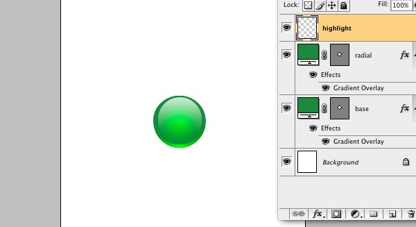
Name your layer something descriptive or easy to remember. I named mine radial and that will make a little more sense here in a second.
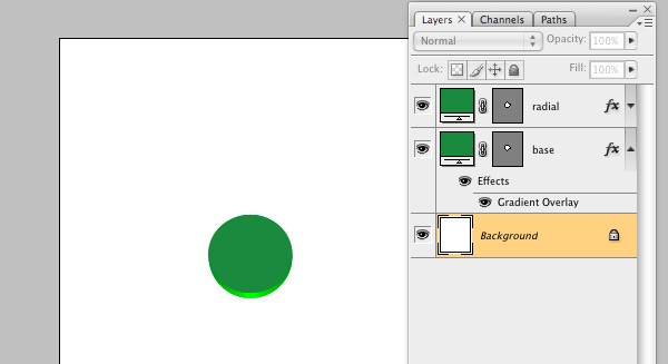
So you should now have two layers, base and radial in your layer palette.
Now we are just going to use two colors. #1be220 for the highlight and #529655 for the darker color.
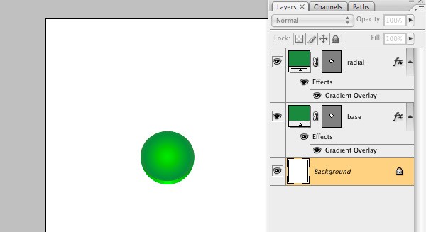
Now its starting to look pretty good. Two circles down, one to go. We are going to add one more circle that will be our highlight.
We are doing this one a little differently just to show you how to carry out similar effects with different tools. For glares though, I find the marquee tool is a little easier to use than the shape tool.
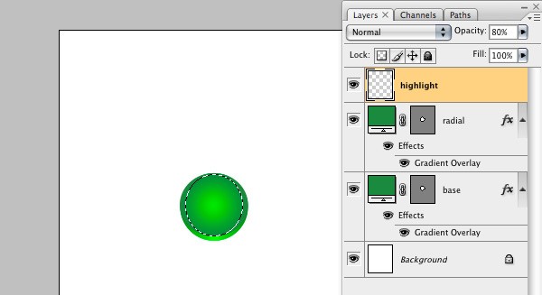
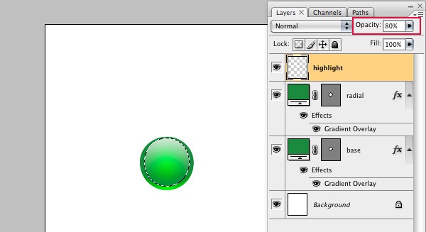
Nice huh? We might want to make it a little more subtle, so lets adjust the opacity a little bit. With the highlight layer still selected:
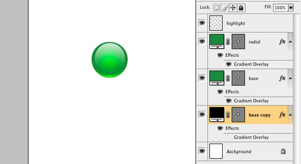
There you have it. Three little circles with some different styles and we have a sweet little icon. About the simplest button you can make, that actually looks good anyways.
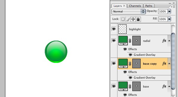
If you want to give your icons that little bit extra, lets add a little more depth. A little drop shadow should do the trick. Two more circles anyone?
- Select the base layer.
- Right click and choose Duplicate Layer.
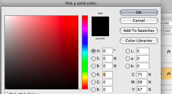
- Double click the color swatch on the duplicate layer.
- Change the color to black or #000000
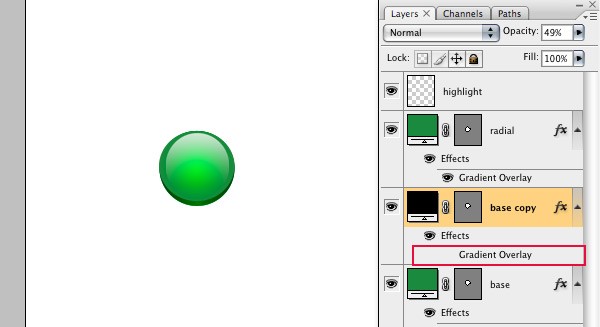
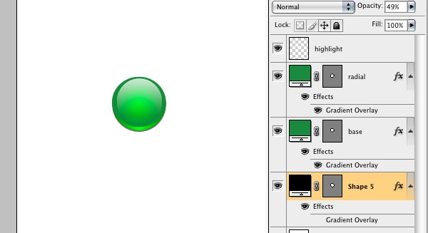
- Turn off the Gradient Overlay on the duplicated layer by clicking the eye icon in the layer palette.
- With the black layer selected, drag the duplicated layer below the 'base' layer.
- Choose the move tool (V) from the tool bar.
- Now use your down key on the keyboard and press it three times.
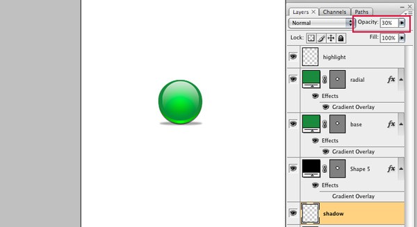
- Change the opacity of the black layer to 50% from the layer palette.
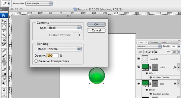
- Create another new layer and name it shadow.
- Choose the Ellipse marquee tool (M) from the tool bar.
- Drag an Ellipse at the bottom of the button and make it the same width as the 'base' circle, but not very high.
- Click SHIFT f5 or go to Edit>Fill. Fill the selection with black.
- Change the opacity of the shadow layer to 30% and step away from the computer.
Instead of renaming the layer, we will just use the default name and use the color to differentiate them.
Note: You're not going to see any change to the image quite yet.
We just moved the layer down a little bit (3 pixels) so we have little shadow peaking out behind the base layer.
One more shadow to go and we’re done-done. That's an industry term.
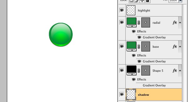
Note: Drag the layer to the bottom of the layer palette, under the black circle we just created if it's not already.
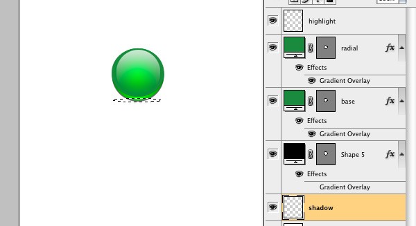
This is going to make it look like the button is sitting on a surface.
How did yours turn out? As you can see you can overlay any type of icon or photoshop shape on this button and you can have a nice little icon set to use for you app.
See what I mean?

One reason I like to use the opacity for the shadows instead of just choosing a gray color is because when we save this, we want to use a format that supports transparencies. The opacity will be preserved and no matter what the background color, the shadows will look good.
I hope you found this tutorial useful.
Next we will look into Image Optimization for mobile devices as well as a little known tool within Photoshop that makes prototyping a breeze.

Comments