In this tutorial, we're going to be designing the user interface of a financial based iPhone application in Photoshop. We will be using a truck-load of modern techniques to really make this design pop! The tutorial will be split into two parts, so be sure to subscribe via RSS or E-mail to check out the rest of the tutorial!
Step 1
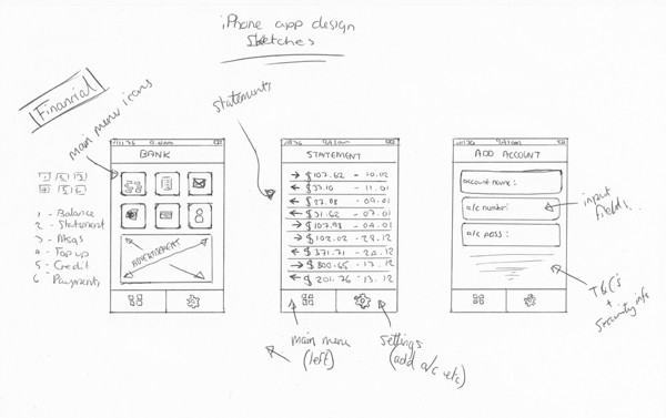
With any design, you should start with a sketch, even if it is really rough. We're going be designing an interface suitable for a financial application, such as a bank, where you can check your balance, statements, etc. We're just going to be creating a few screens of the application throughout the two parts of this tutorial series: the homepage, the statement page, and the add account page. These three pages will consist of icons/navigation, a list, and some text fields. If you wish to create more pages after the tutorial, they will basically be made up of the same elements we will be learning how to create.
Below is a scanned in UI sketch I created to base our application design on:
Step 2
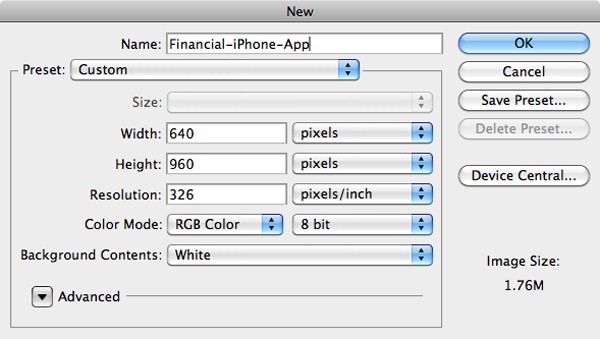
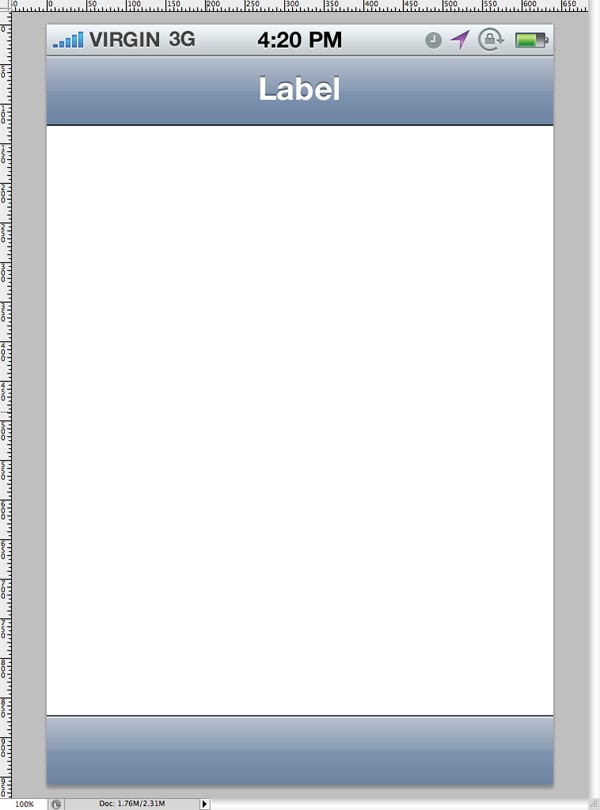
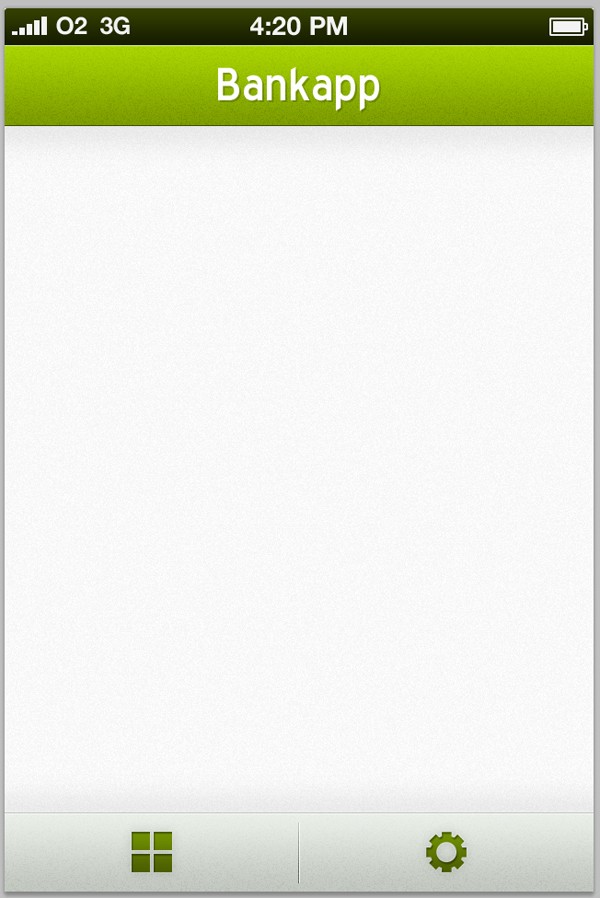
We're going to be designing the application to the latest iPhone 4 dimensions, which measure 640x960 pixels at a 326ppi resolution. Open up Photoshop and go to File > New. Create the new document using these settings:
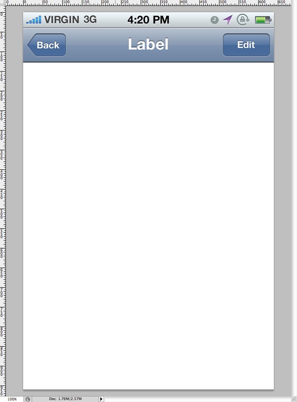
Head over to Teehan+Lax to download the iPhone 4 GUI PSD (Retina Display) pack. This pack will allow us to grab elements for our application, although we won't be using very many of them as most of our design is highly customized.
Open up the file you just downloaded in Photoshop. In the layers panel, find the folder named "top bar (application)." Select this folder and drag it across into your application design PSD.
Go back into our GUI elements PSD file, and drag over a the layer "Bar (Grey - Blue)":
Finally, drag over the folder "bar bottom". We're going to highly modify these. If you're reading this tutorial, you probably already know how to play with simple shapes, so you should be able to create something similar to these by scratch anyway. The first thing is to remove the two buttons "back" and "edit" from our top bar, as we won't be needing these. Remove the folders "back button" and "blue button" from the "Bar (Grey - Blue)" folder.
Step 3
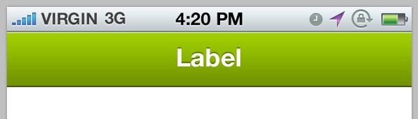
We're going to start fiddling with our colors now, and base the rest of the application on the colors we decide to use in the bars we already have. Open up the layer styles window for the layer titled "background" in the "Bar (Blue - Grey)" folder.
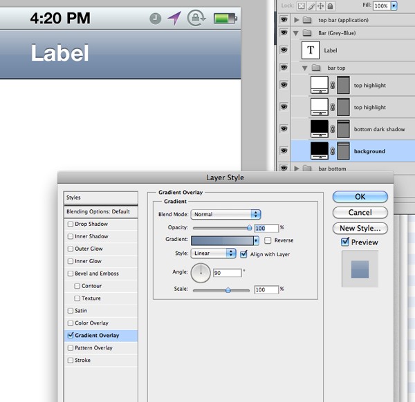
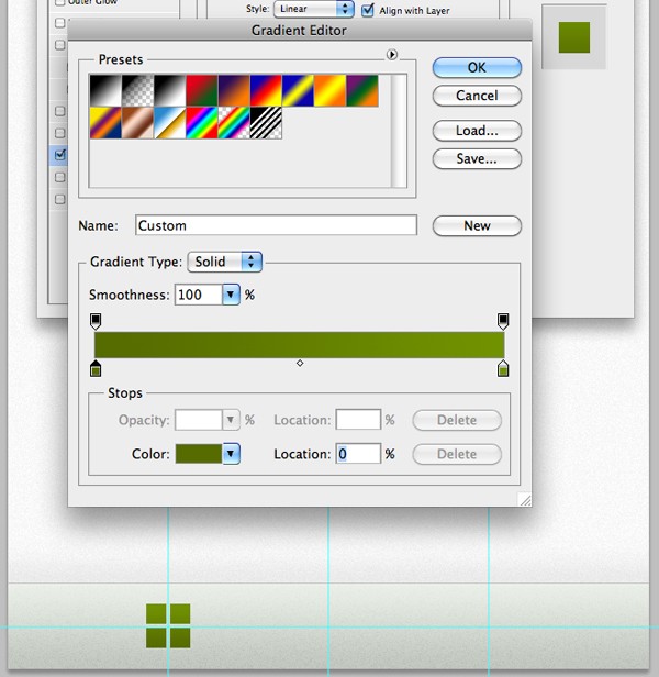
I'm going to use a green and silver color scheme for my application design. From the layer styles window, open up the gradient overlay section, and then open up the gradient editor window, as seen below:
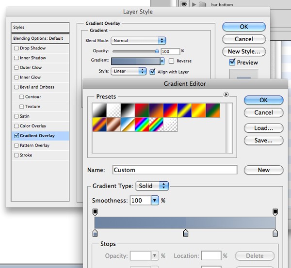
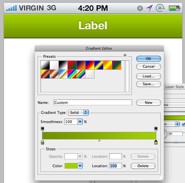
Change the colors to a color of your choice. I'm using two colors in my gradient, going from dark (#719100) to light (#A1CF00).
The next layer, titled "bottom dark shadow" is far too noticeable for the subtle look I am going to go for in my design, so lower the opacity to around 50%. Do the same for the next layer titled "top highlight."
Step 4
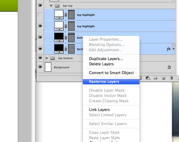
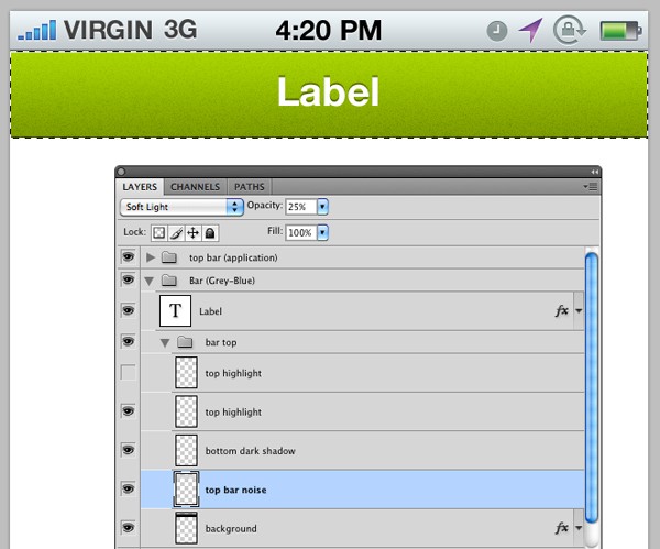
We're now going to add some noise to our top bar. Select all 4 of the layers in our "bar top" folder, then right click and select "Rasterize Layers."
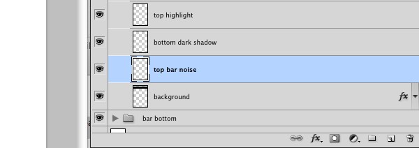
Create a new layer and call it "top bar noise," place it above your "background" layer, as seen below:
Hold down the Cmd-Key (or Ctrl-Key on Windows) and click on the thumbnail in your layers panel next to your "background" layer. This should make a selection of your shape. Click on your "top bar noise" layer, then fill the shape with white.
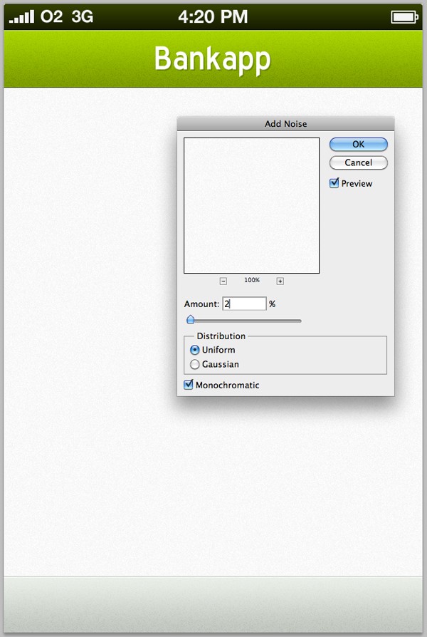
Go to Filter > Noise > Add Noise, and use the following settings:
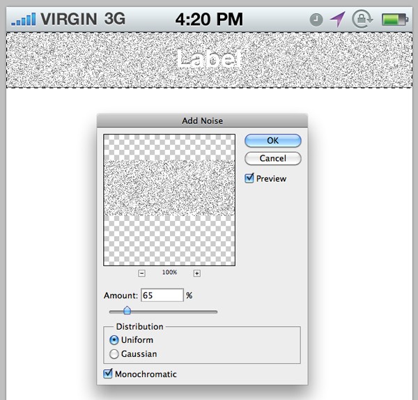
After hitting the OK button, change the layers blending mode to "Overlay" and lower the opacity to 25%. This helps to add a little bit of detail to our application design. We will be using subtle noise as texture throughout the tutorial, so be sure to remember how we did that!
Step 5
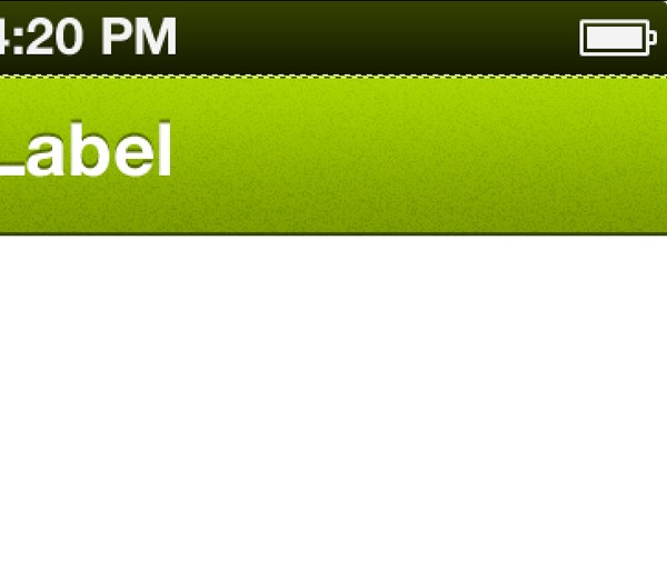
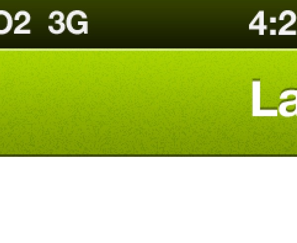
We're now going to change the color of our status bar (the very top bar that displays the phones signal etc). Using the same technique we used earlier to change the color of the top bar, change your status bar to a dark green gradient.
Go through your different layers and change all the status bar objects to white (such as the battery, time etc). This is very easy to do, you simply need to remove all gradients and replace them with a color overlay in the layer style window.
Step 6
Zoom into your top bar, and select the Rectangular Marquee Tool. Make a small, width-long selection across the top of your top bar, making sure it is just 2px high.
Make a new layer in your "top bar" folder, making sure it is placed above all other layers. Call it "top stroke" and, finally, fill your selection with white, lowering the opacity of the new layer to 45%.
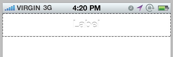
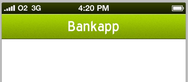
It's time to change the text that currently reads "Label". Select the Text Tool and click on the text, enabling us to edit it. Type something suitable to match your application idea, in my case that is "Bankapp".
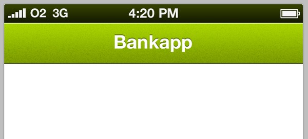
Play around with fonts and sizes - I'm going to use a typeface called "Blue Highway" set at 10pt.
Open up the layer styles window for your text, and remove the Drop Shadow settings entirely. Click OK.
Duplicate your text layer, and change the color of your original text to a dark green. Nudge the old text down 2 pixels, and then to the right 2 pixels. Lower the opacity to 25%.
Step 7
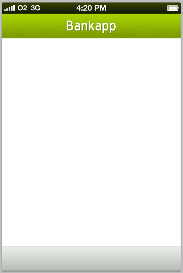
We're now going to work on the bottom bar. I'm going to make mine silver. Looking back over the sketch, the bar will be separated into two buttons. Using the same process we used earlier, change your bottom blue bar into a silver bar. I used a very very small hint of green in my colors to give it that little extra oomph. The colors I have used are #B9BFB7 and #E8EDE6.
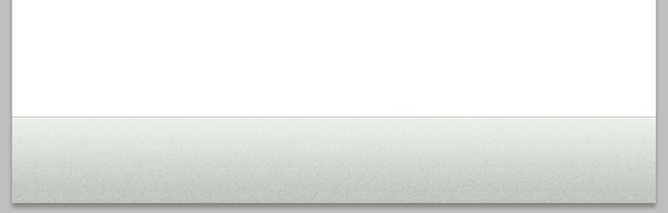
Using the same technique we used earlier, add some noise to your bottom bar.
Step 8
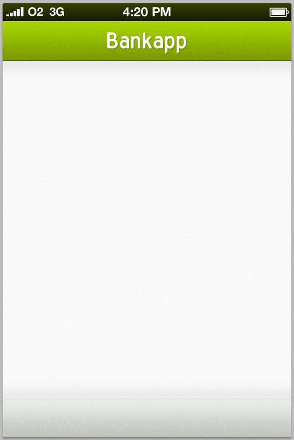
Fill your main background with a light grey (I used #F9F9F9). Go to Filter > Noise > Add Noise and add some noise to your background.
Select the rectangular marquee tool and make two small selections above your bottom bar and below your top bar. Fill them with black on a new layer directly above your main background layer.
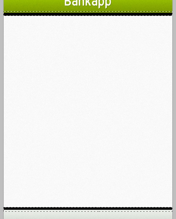
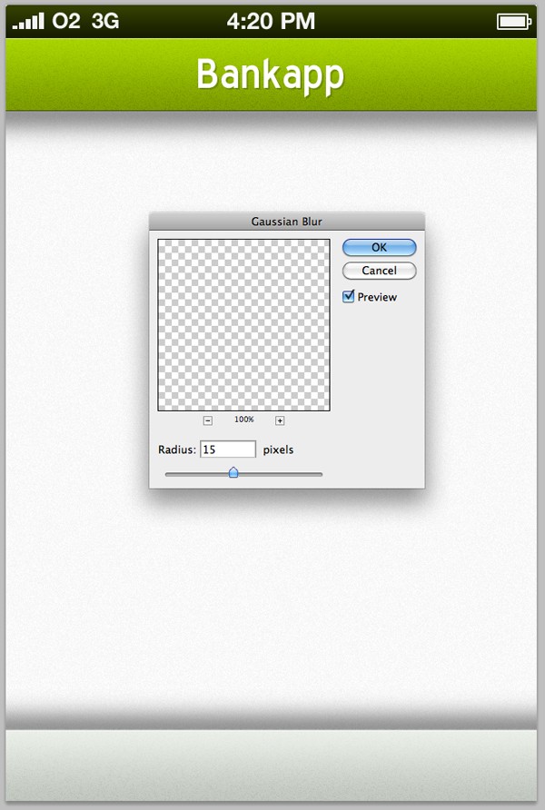
Go to Filter > Blur > Gaussian Blur and blur your new shapes by around 15 pixels.
Change the layers opacity to 15%. These new blurred shapes will act as shadows beneath our bars, as seen below:
Step 9
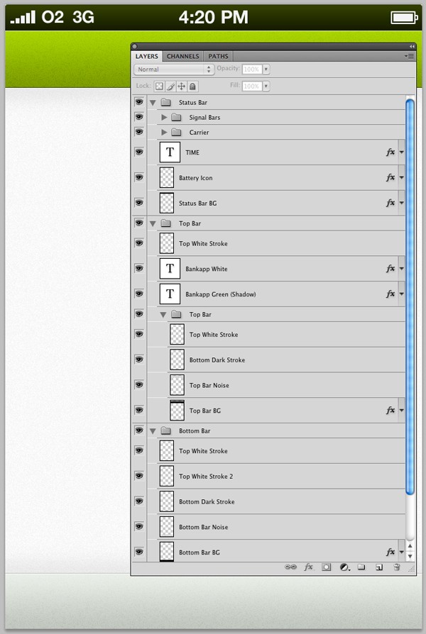
It's time to tidy up our layers - this is an essential part of not just mobile UI design, but any design. A messy layer panel leads to a messy brain, and you'll be kicking yourself when you can't find the layer you need! Organize your layers in a structured way that works for you; mine can be seen below:
Step 10
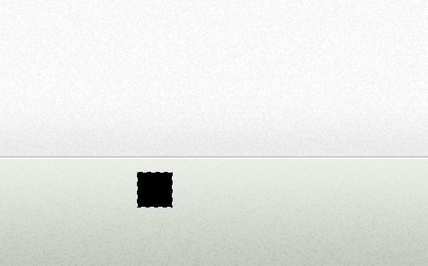
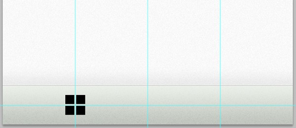
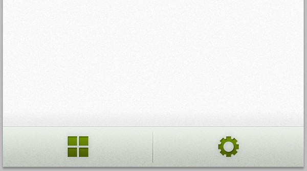
Before finishing up on this tutorial, we're going to create the icons for our bottom bar. Create a new layer, and select the Rectangular Marquee Tool. Drag out a small selection whilst holding the Shift-Key to keep it square. Fill it with black.
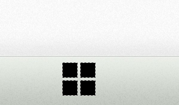
Move your selection to the right by using the Cursor-Keys, and then refill with black. Repeat the process until you have something that looks like this...
Zoom back out. If you're rulers aren't already showing, enable them by going to View > Rulers. From the rulers, drag out guides throughout your document so that you know where the center (width-ways) is of the main screen, as well as the bottom bar.
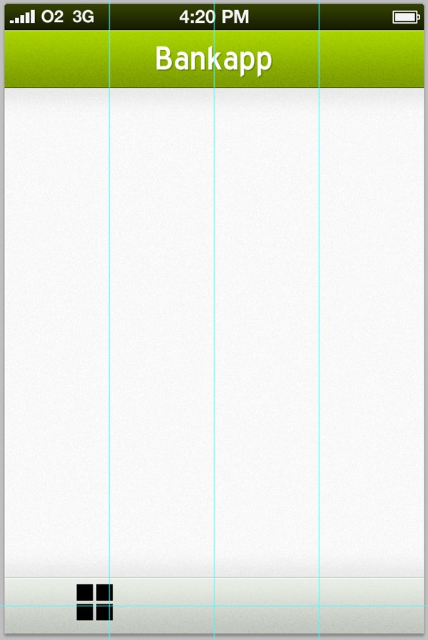
Use the guides to align your menu/home icon - you may need to resize your icon to make it fit nicely in the bottom bar, you can do this by going to Edit > Transform > Scale.
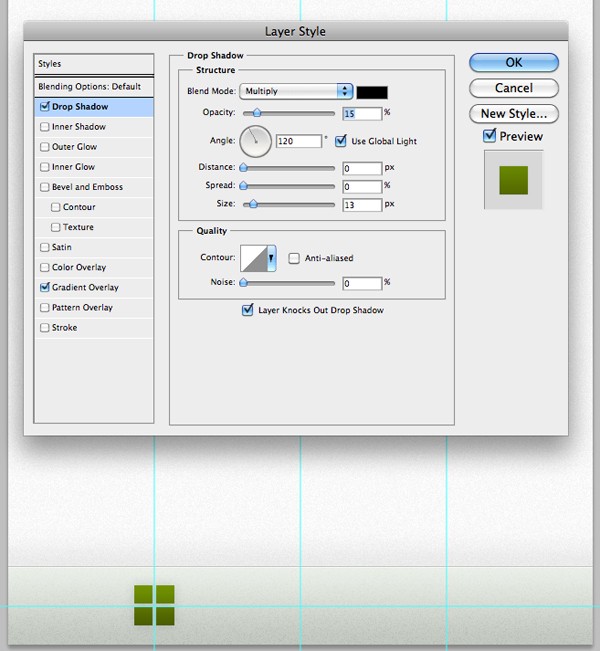
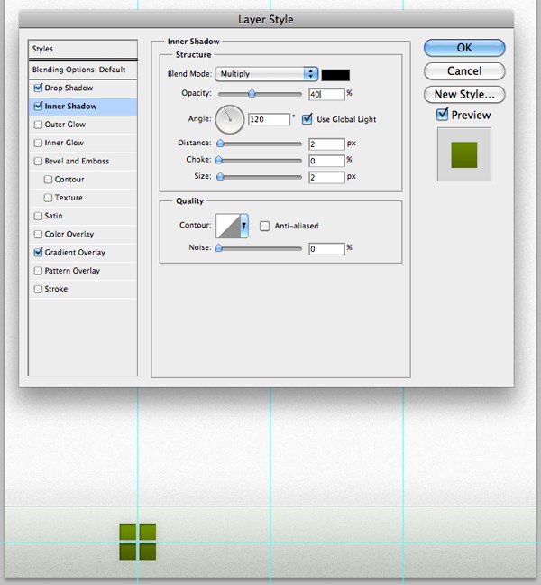
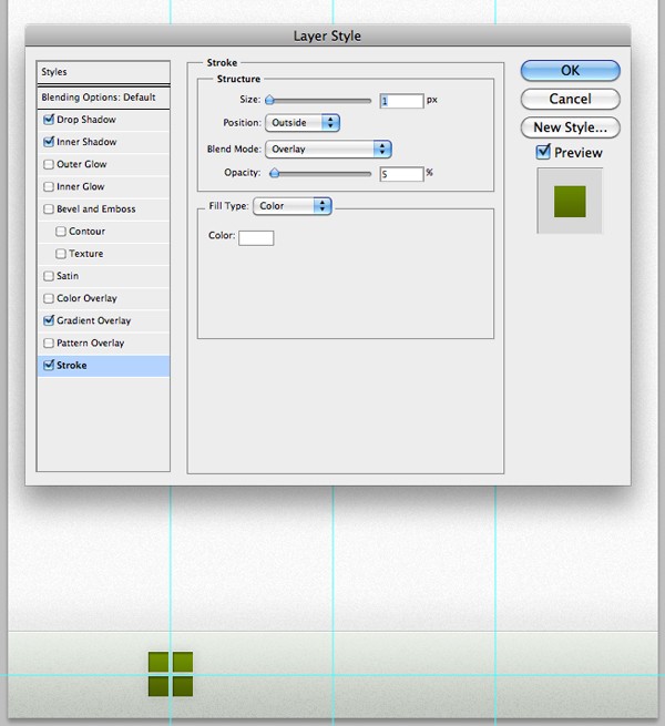
Open up the layer styles window for the icon. Apply a gradient overlay, a drop shadow, an inner shadow, and a stroke. All of which can be seen below:
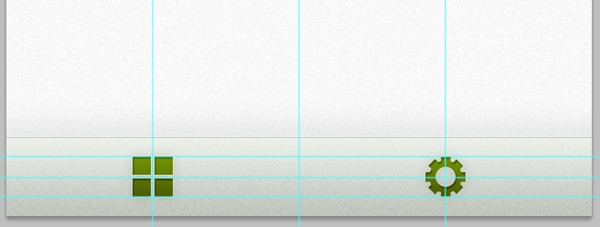
Create an icon to represent the settings screen, and reapply the same effects.
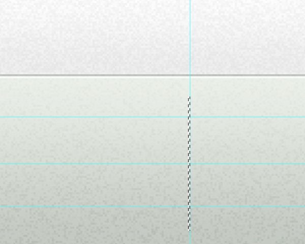
Grab the rectangular marquee tool and make a vertical selection just 1px wide, as seen below.
Create a new layer, and fill the selection with black. Duplicate the layer and move it one pixel to the right using your Cursor-Keys. Fill this line with white.
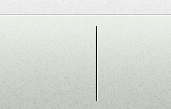
Change the blending mode of the two layers to Overlay, and align your lines to the center of your navigation bar.
Moving on...
That's it for part number one of this tutorial! We have created the main structure and color scheme of our application design. In the next tutorial, we will be creating the content for the home, statement and add account screens, and will be getting stuck into all the little design elements that will make the design come together nicely.

Comments