Let's recap: My claim is that the reason of the magnitude of WordPress's market share is because it's so darn easy to create corporate websites with WordPress, and this is also the exact reason why the top-selling WordPress themes are corporate (or multi-purpose) themes.
Theme makers might have clogged the market a bit by putting the same designs into practice, but that doesn't mean we can't create something new. In the previous part, I talked about the market a little and started off with making the unicorn of a WordPress corporate theme by talking about the homepage and About page. It's time to continue with other pages now.
Creating a Unique Corporate Theme for WordPress—Part Two
We've already covered the homepage and the About page, so let's move on to the remaining page types that we make for corporate websites.
Portfolios, Products and Services

The problem: "Products", "Services" or "Portfolio". These pages are about what the company does to make money. These pages tell the customer: "This is what you will pay us for." These pages are the pages that should sell themselves... and we're stuck with grids.
Dull grids with two to six columns, masonry grids with animated items, or any kind of grid that can be filtered by categories (and with animations, again). It works, and it doesn't look bad at all, but it doesn't have any difference from the next (or previous) corporate theme. Can we think of a better design for these pages?
I believe we can.
How to achieve originality: For your next theme, consider placing a slider in the "Products" page of your demo. Yes, the one that we shouldn't place in the homepage. Why? Well, because it could serve the purpose of "teasing" the products.
(I know, I know: We should all hate sliders because they're impractical and whatnot—but could they work in a "Products", "Services" or "Portfolio" page? What do you think? That's something we can discuss in the Comments section below.)
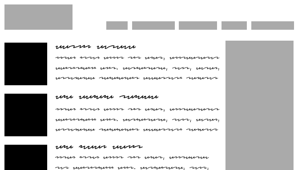
Or, try to lay on a variation of those full-width "product teasers" that we came up with for the homepage. Corporate folks would enjoy a page with large pictures and quality copy that either tell the whole story about the product, or link to the products' own sub-pages to talk more about it.
Oh, and web designers could (and should) use testimonials here as well. Social proof is key in selling things, so testimonials would be valuable page elements for both the main "Products" page and sub-pages.
The Blog—I Mean "News and Announcements"

The problem: Hey, does anybody remember that WordPress was at first made for blogging?
Kidding. We all know that WordPress is the first brand that springs to mind when it comes to blogging. Having said that, company blogs aren't really essential, even though it's been proven that they can raise customer engagement and even generate more sales.
Still, running a company blog is hard work for corporate folks, mostly because they don't employ copywriters (or even outsource the work). Creating content is a hard thing to do, and even harder if you need to create constantly. Because of this, corporate folks like to call their blogs "News" sections, because each post would require fewer words and less originality. Hmpfh.
So, how do we design a better "News" section?
How to achieve originality: To be fair, those "News" sections can't have creative design features as, for example, Medium.com has. After all, they're just short news stories about companies. They probably won't even bother to set featured images for their posts, or they would lazily upload some generic stock photos of people in safety helmets. So, you should work your magic with titles and short post contents only. You can be bold, of course, but not too bold—or else the corporate folks won't like it, and web designers won't buy your theme.
Food for thought: Why not create both a "News" section and a blog page? Providing that you create new custom post types as a separate plugin (with the TGM Plugin Activation library), you can let your customers decide what to use: a shiny company blog, or a simple "News" section.
The Contact Page

Let's finish up with one of the harder page types: Contact pages.
The problem: Contact pages, in general, have only a few elements in corporate websites: the main contact information (like telephone numbers, addresses and such), a contact form, a map (or several maps, if the company has more than one address), and maybe some links to social media accounts.
Let's see what we can do with these data.
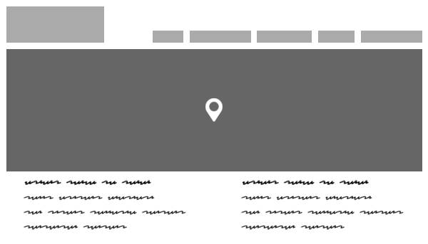
How to achieve originality: The map is usually considered to be the largest element, and for a good reason: It indicates the company's address, the most basic form of contacting them. So, why not show it off by making it go full-screen? (One of the best contact pages I've seen had a full-screen map behind the header and the footer.) And if the company has more than one address, you can simply mark more than one spot on the map. As for the contact information, the contact form and social media links, they can float over the map (without breaking the consistency of the design).
Or, if you want to go with a slightly more classical approach, splitting the page in half between the map and the rest is still a good idea. Again, your call.
In Conclusion
Final recap: Whether we like it or not, the high market share of WordPress is—most likely—the result of the ease of creating corporate websites with WordPress. Because of this, the top-selling themes are from the "corporate" or "multi-purpose" categories. Therefore, the market has become very saturated in these categories. Hence, the competition is extremely high. Ergo, you must show ultimate attention if you want to make a WordPress corporate theme that will stand out among its rivals.
We have a wide variety of WordPress themes available in the marketplace, as well. If they suit no other need, perhaps they'll provide you with some inspiration as you move forward with building your own custom theme.
Now, it's time to hear from you! Feel free to share your thoughts and opinions on this topic in the Comments section below. And if you liked this article, don't forget to share it with your friends!


Comments