The Material Design language was created to address issues with flat design on smaller screens by providing visual cues to interactive elements. In this article you will learn about some of the fundamental concepts of animation and how they can be used to provide a natural, life-like feel to elements. You'll see how to use these ideas to delight your users while helping them understand your app's UI.
Core Ideas of Material Motion
Google suggests that all animations should be responsive, natural, aware, and intentional. Objects on the screen should act as if they are made of specific materials, with their own weight and volume that dictate how they move and act on the screen.
Animations that occur should be directly correlated to an action and should feel purposeful and alive. They should be meaningful and help guide the user through your application by having a purpose and serving that purpose. Animations should create context for your users and help guide their eyes on the screen so that they are aware of what's possible with your app.
Motion should be more concerned with the amount of time it takes to get from point A to point B, rather than the distance that needs to be covered. Distances will change depending on the size of the screen, but the speed of an object will add emphasis and help the user understand what's happening.
When an object needs to be removed and another added to the screen (such as a button changing from play to pause), then you should morph the first object into the second. Likewise, you can signal significant change in an object by changing color and alpha for the screen item. This way, users are aware of what has changed, and you can emphasize what's available in your apps for users to interact with.
The Illusion of Life
One of the greatest references for understanding natural animations is the book The Illusion of Life by Frank Thomas and Ollie Johnston, which has a chapter detailing the principles of animation used by Disney in their animated films. Thomas and Johnston outline 12 fundamental principles in their book. In this section we will discuss a few of these principles and how they can be related to Material Design.
Squash and Stretch
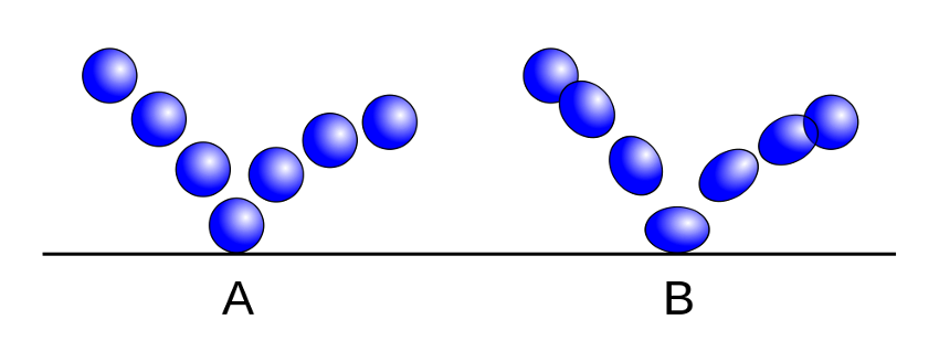
When an object progresses through an action, it'll show changes in its shape based on the material that it is made of.
This concept is represented by the Squash and Stretch principle, which can be illustrated best by thinking of a bouncing ball. As external forces act on the ball, such as gravity or upward acceleration, the ball will stretch. When the object hits the ground, it will bunch up and squash towards the surface. Objects that move and interact with surfaces in your app should use this idea in order to give the illusion of weight and volume to your object as it moves.

Anticipation
No major actions should happen out of the blue. When performing an animation in your apps, you should have another, smaller, action that leads up to the main animation. This principle is called anticipation, and it helps prevent the situation where your user asks, "Why did this happen?" Natural movement generally starts with a warm-up rather than simply starting. In Android, you can use the AnticipateInterpolator class to create an animation that first backs up a small distance before moving forward.
Staging
The purpose of staging is to make your content clear and understandable for your users. Your UI and animations should feel natural and anchored to a core task or concept, rather than leaving your user unsure why something happened in a particular way. You should only perform one major action at a time to keep things simple and deliberate.
Follow-Through and Overlapping Action
When a moving object comes to a stop, it doesn't all stop at once (short of hitting another solid object, but that's where Stretch and Squash comes into play). Appendages of an object will continue to move for a short time after the core of the object has stopped.
When creating Material animations, you should attempt to use two different positions: the desired stopping point, and one that is a little further along, which your animation can fully stop at and then bounce back to your final position. This prevents your animation from seeming flat and mechanical. This sort of animation can be accomplished using the BounceInterpolator or OvershootInterpolator classes.
Slow In and Slow Out
Natural movement doesn't happen at a consistent speed, and neither should your animations.
When an object is moving from outside of the field of view and entering the screen, it should do so quickly and then slow down as it comes to its final position. The quick movement will catch your user's attention and provide enough time for them to notice where it ends up.
Inversely, an object leaving the screen should start slowly and speed up as it leaves the screen. This will give your user enough time to notice that the object is moving, and as it speeds up to leave they will understand that they should stop caring about that item on the screen.
When an object is moving from one position on the screen to another, without leaving the screen at any point, you should combine these two ideas so that the user sees what's happening while your animation maintains a natural feel. This principle is also applied to lists, as they will quickly scroll when a user flings them, and then will slow down until they stop. When a list jumps between sections, it becomes less immersive and feels mechanical. You can use the LinearOutSlowInInterpolator, FastOutLinearInInterpolator, or FastOutSlowInInterpolator to add these animation effects.
Arcs
With very few exceptions, natural movement occurs in arcs rather than precise straight lines. When moving objects across the screen, in addition to the slow in and out principle, you should attempt to move the object in an arced path to avoid a mechanical, unnatural feel in your animation. You can use the Android ArcMotion object to move your objects along a curved path.
Secondary Action
Secondary actions are smaller, simpler actions that support the idea of the main occurring action. Secondary actions should not overshadow or appear more interesting than the main action, as they exist simply for emphasis.
An example of a secondary action would be when you open the navigation drawer in an Android application. While the drawer sliding open is the main action, the hamburger icon to arrow animation is a simple effect that emphasizes what's occurring without overshadowing the main change on the screen.
Timing
When working with animations, timing is everything. If an animation moves too slowly or quickly, the user will notice that something feels "off".
It's important to remember that Material Design calls for objects to appear as if they are made of some sort of material. If an object is meant to feel like paper sliding on a surface, then it shouldn't be moved quickly across the screen. Understandably, there's no sure formula for animation speeds in apps, but with some time and practice, you should be able to build well-timed animations that fit with the theme and purpose of your app.
Conclusion
Now that you're aware of the major concepts of Material Motion and some of the fundamental principles of animation, you can start playing around with the various available tools to animate your app and add the little extra pop to delight your users.
If you want to learn more about creating animation in Android, check out the in-depth course Animate Your Android App from Ashraff Hathibelagal, here on Envato Tuts+.
Or check out some of our other tutorials on animation in Android!


Comments