This tutorial is part of the Building Your Startup With PHP series on Envato Tuts+. In this series, I'm guiding you through launching a startup from concept to reality using my Meeting Planner app as a real-life example. Every step along the way, I'll release the Meeting Planner code as open-source examples you can learn from. I'll also address startup-related business issues as they arise.
Improving the Home Page
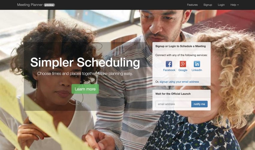
A web service's home page has many roles. Functionally, it must make it easy for people to sign up and get started with the application. But it must also aesthetically touch visitors and give them a professional impression that your service delivers what the home page tells them it does.
Since I've been so focused to this point building the scheduling functionality for Meeting Planner, I haven't had time to focus on polishing the home page—and frankly it was falling short, leaving first-time visitors unimpressed.
While I am a program and product manager, a bit of a UX designer and a web developer, I'm not a skilled graphic designer or HTML/CSS guru. Neither am I yet investing external resources in the project, so I needed to improve this myself.
In today's episode, I'll walk you through how I strengthened the home page and what aspects of Bootstrap and CSS I exploited to provide a more professional appearance. There's a lot you can do with Bootstrap on your own if you dive a bit deeper.
If you haven't tried out Meeting Planner or Simple Planner yet, go ahead and schedule your first meeting. I do participate in the comment threads below, so tell me what you think! You can also reach me on Twitter @reifman. I'm especially interested if you want to suggest new features or topics for future tutorials.
As a reminder, all of the code for Meeting Planner is written in the Yii2 Framework for PHP. If you'd like to learn more about Yii2, check out our parallel series Programming With Yii2.
The Current Home Pages
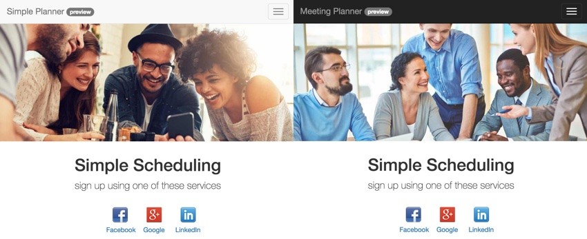
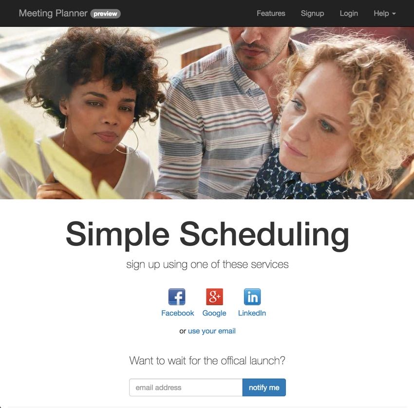
In the last episode, I mentioned launching Simple Planner alongside Meeting Planner with different color schemes and images. They didn't look bad, but the product lead and signup buttons were below the fold. First-time visitors would arrive and primarily see the photograph.
Here's a closer look:
Planning the Improvements
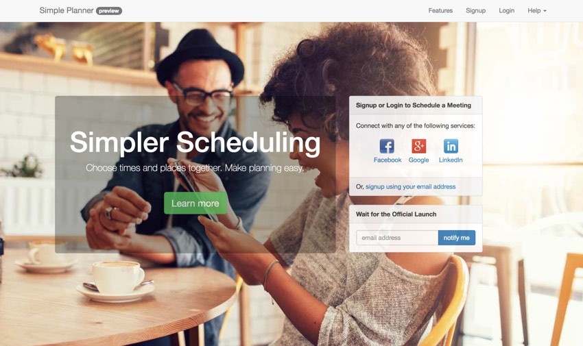
Above, you can see the final version I created. Essentially, I wanted to migrate the lead and the login and signup options above the fold, while not completely obstructing the home page background image.
Essentially, I needed to do four things:
- Ensure that the background image was responsive and had the capacity to apply opacity (transparency).
- Create a left column with a transparent panel to display the lead.
- Create a right-hand column to display panels with signup, login and launch notification form with some transparency.
- Ensure that the video carousel positioned itself below the background image.
Let's look at each challenge.
Restructuring the Background Image
To make the background more reliably responsive, I rewrote the code to place it as a background image on the body element of the page.
First, I created a new home.css stylesheet which would be configured in the HomeAsset.php file:
<?php
/**
 * @link http://www.yiiframework.com/
 * @copyright Copyright (c) 2008 Yii Software LLC
 * @license http://www.yiiframework.com/license/
 */

namespace frontend\assets;

use yii\web\AssetBundle;

/**
 * @author Qiang Xue <[email protected]>
 * @since 2.0
 */
class HomeAsset extends AssetBundle
{
    public $basePath = '@webroot';
    public $baseUrl = '@web';
    public $css = [
        'css/site.css',
        'css/home.css',
        'css/home-video.css',
    ];
    public $js = [
      'js/home.js',
      'js/froogaloop2.min.js',
    ];
    public $depends = [
        'yii\web\YiiAsset',
        'yii\bootstrap\BootstrapAsset',
    ];
}
The asset file determines which CSS, JavaScript and dependent libraries are loaded for each layout.
Here's the top of home.css defining the body element:
/* CSS used here will be applied after bootstrap.css */
body {
 -webkit-background-size: cover;
 -moz-background-size: cover;
 -o-background-size: cover;
 background-size: cover;
}
In order to rotate the background image dynamically, I added a style tag to the layout file, Home.php (CSS can't do that):
<?php
use yii\helpers\Html;
use yii\helpers\Url;
use yii\bootstrap\Nav;
use yii\bootstrap\NavBar;
use yii\widgets\Breadcrumbs;
use frontend\assets\HomeAsset;
use frontend\widgets\Alert;

/* @var $this \yii\web\View */
/* @var $content string */

HomeAsset::register($this);
$urlPrefix = (isset(Yii::$app->params['urlPrefix'])? $urlPrefix = Yii::$app->params['urlPrefix'] : '');
?>
<?php $this->beginPage() ?>
<!DOCTYPE html>
<html lang="<?= Yii::$app->language ?>" >
<head>
    <meta charset="<?= Yii::$app->charset ?>"/>
    <meta name="viewport" content="width=device-width, initial-scale=1, maximum-scale=1" />
    <?= Html::csrfMetaTags() ?>
    <title><?= Html::encode($this->title) ?></title>
    <style type="text/css">
    body {
     background: url('./img/home/home-<?= Yii::$app->params['site']['img'] ?>.jpg') no-repeat center 30px;
    }
    </style>
    <?php $this->head() ?>
</head>
<body>
This applied the chosen background image defined in the last episode by SiteHelper.php:
body {
     background: url('./img/home/home-<?= Yii::$app->params['site']['img'] ?>.jpg') no-repeat center 30px;
    }
The Left-Hand Side of the Grid
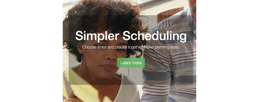
Next, I created a Bootstrap grid layout to display the left-hand content panel:
<div class="site-index ">
  <div class="row home-top">
      <div class="col-md-6 col-md-offset-1">
        <div class="jumbotron">
            <h1><?php echo Yii::t('frontend','Simpler Scheduling'); ?></h1>
                <p class="lead">Choose times and places together. Make planning easy.</p>
                <div class="centered">
                  <p><a class="btn btn-lg btn-success" href="features"><?= Yii::t('frontend','Learn more') ?></a></p>
                </div>
          </div> <!-- end jumbo -->
      </div>
I used a one-unit offset, col-md-offset-1, and a six-unit column, col-md-6. And there are a few other aspects integrated here.
The home-top class in the row allowed me to integrate a vertical margin for these panels. I found that 16% worked well for me, from home.css:
.home-top {
  margin-top:16%;
}
By giving the panels on the home page some opacity, opacity: 0.9;, the background image still showed through a bit, which was aesthetically pleasing:
.panel-default {
 opacity: 0.9;
}

.jumbotron {
    text-align: center;
    background-color: rgba(0,0,0,0.3);
    color:#fff;
    border-radius:5px;
}
.jumbotron .lead {
  color:#fff;
}

.jumbotron .btn {
    font-size: 21px;
    opacity:.8;
    margin:25px;
}
Also I was able to give the left-hand panel a black background color but with opacity using rgba, background-color: rgba(0,0,0,0.3);.
RGBA color values are an extension of RGB color values with an alpha channel - which specifies the opacity of the object. An RGBA color value is specified with: rgba(red, green, blue, alpha). The alpha parameter is a number between 0.0 (fully transparent) and 1.0 (fully opaque). (W3 Schools)
And I created round borders using border-radius:5px;.
The result allows the background image to show through while promoting the white lead text.
The Right-Hand Panels and Forms
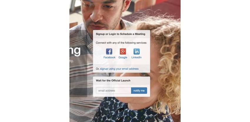
To create the right-hand side, I created a three-unit column, col-md-3. Then, I created two Bootstrap panels inheriting the same 0.9 opacity:
<div class="col-md-3 ">
  <div class="panel panel-default">
      <div class="panel-heading">
        <strong><?php echo Yii::t('frontend','Signup or Login to Schedule a Meeting'); ?></strong>
      </div>
      <div class="panel-body panel-auth-clients">
          <?php $authAuthChoice = AuthChoice::begin([
            'baseAuthUrl' => ['site/auth','mode'=>'signup'],
            'popupMode' => false,
        ]); ?>
        <?= Yii::t('frontend','Connect with any of the following services:'); ?><br /><br />
        <ul class="auth-clients" >
        <?php foreach ($authAuthChoice->getClients() as $client): ?>
            <li class="auth-client"><?php $authAuthChoice->clientLink($client) ?></li>
        <?php endforeach; ?>
        </ul>
        <?php AuthChoice::end(); ?>
      </div>
      <div class="panel-footer">
          Or, <?= HTML::a(Yii::t('frontend','signup using your email address'),['site/signup']); ?>
        </div>
  </div>
  <div class="panel panel-default">
    <div class="panel-heading">
      <strong><?php echo Yii::t('frontend','Wait for the Official Launch'); ?></strong>
    </div>
    <div class="panel-body">
      <?= $this->render('launch');?>
    </div>
  </div>
</div>
The AuthClient widget in the top panel displays the Facebook, Google and LinkedIn icons which I covered in this earlier tutorial.
Vertical Margin for the Video Carousel
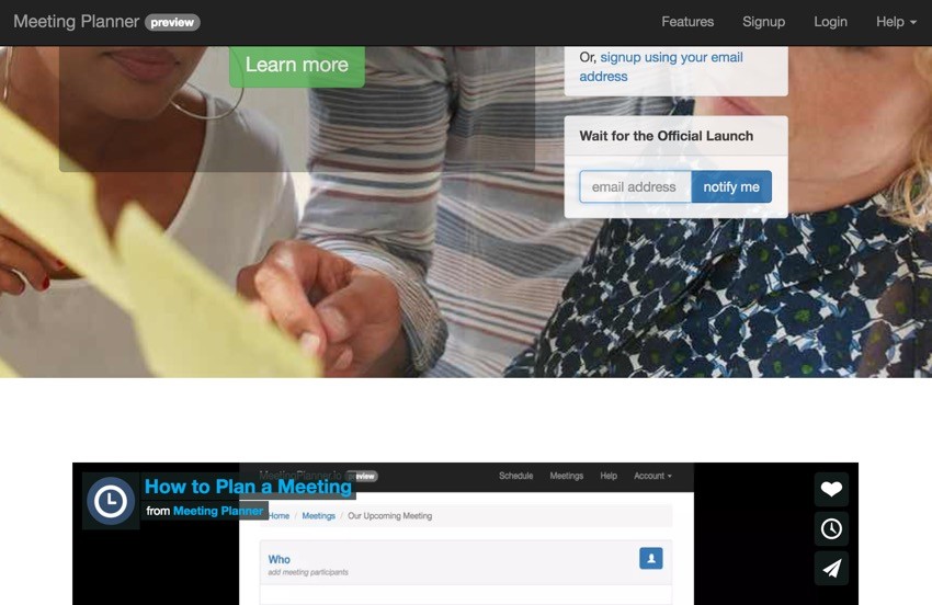
Finally, I just needed to make sure the video carousel below the fold had enough vertical margin so as not to overlay the background image. I used the video-top class for this:
.video-top {
  margin-top:23%;
}
The 23% margin worked well for desktop and mobile. And here's the HTML:
<div class="row video-top">
      <div class="col-md-12">
        <?= $this->render('_video_carousel.php',['urlPrefix'=>$urlPrefix]);?>
      </div>
  </div>
The Improved Mobile Home Pages
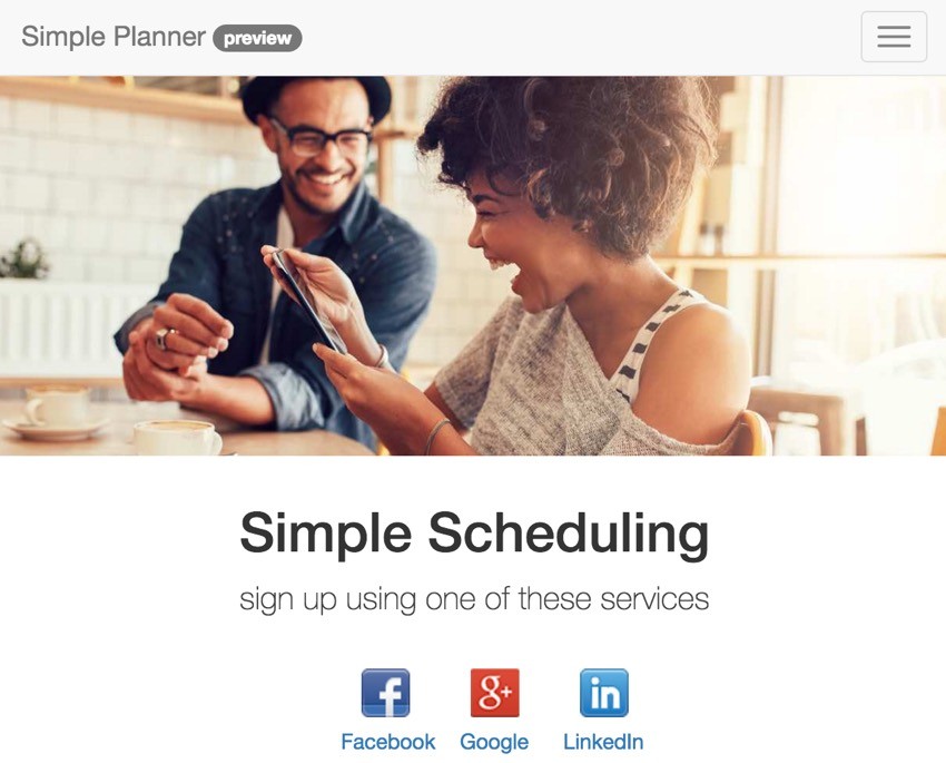
Here's what the improved bootstrap pages look like on mobile:

They are much more effective. Now, when users arrive on mobile, they see content right away and not just the lead image.
What's Next?
Certainly, there are a lot of ways to polish and improve the home page experience. But I hope you've seen today that you can quickly leverage common elements in Bootstrap to provide an aesthetically professional experience for your visitors. I was able to do all of this without resorting to hiring an outside designer and CSS coder, so far. I hope to do that at some point when the project is funded.
Over the next couple of weeks, I'll monitor the ratio of visitors to signups and see if improvements are realized.
Looking ahead, I'll be building features to improve Meeting Planner such as activity planning, more SMS, and enabling the development of a mobile app. There's still lots to do. I hope you stay with us.
In the meantime, please check out Meeting Planner and share it with your business associates, family, and friends.
I'm also getting closer to launching the experiment with WeFunder based on the implementation of the SEC's new crowdfunding rules. You can follow our profile there if you'd like. I will also write more about this in a future tutorial.
Have your own thoughts? Ideas? Feedback? You can always reach me on Twitter @reifman directly. Watch for upcoming tutorials here in the Building Your Startup With PHP series.


Comments