This tutorial will introduce you to Pure, a CSS library made of small modules, that can help you in writing completely responsive layouts, in a very fast and easy way. Along the way, I'll guide you through the creation of a simple page in order to highlight how you can use some of the library's components.
Why Create Responsive Layouts?
Over the past few years in web development, three words that are bouncing around, over and over again are: Responsive Web Design (RWD). At this point you should already know what it is, but, just in case you missed it, here are some resources to fill in the gaps:
But the question is: Why go responsive? The answer is that we don't have any control over which resolution the next device will be using when they visit our website. No longer can we just display sentences like, "Best viewed at 1024x768 resolution" (although you can still find them on the web). One of the main reasons for this phenomenon was from the growth in the width of PC monitors and also from the spread of mobile devices which are connected to the Internet. Additionally, based on StatCounter, currently ~ 16% of users are connected through a mobile device. Now I'm not saying that RWD is just a matter of optimizing a website for a given screen size, what I mean is that we're creating a great experience for users visiting our website regardless of the devices they are using.
With that said, it's also clear that not all of us work for a company where every person has a single role (designer, developer, tester, and so on). So, let's say that you're a solo developer, working as a freelancer and you don't know much about web design. There are a lot of libraries available that can speed up your work-flow. The most complete ones are surely Boostrap and Foundation but sometimes they can be overkill and you may need something smaller. In these instances, a new interesting project has been launched by Yahoo which we can use, called Pure.
What Is Pure?
Citing the Pure website, it is a set of small, responsive CSS modules that you can use in every web project.
As said before, the complete library is really light, being only 4.2KB minified and gzipped, but to keep your website even lighter, you can include just some of the available modules. Basically, it's composed of the following modules:
- Base
- Grid
- Forms
- Buttons
- Tables
- Menus
One of the things I really appreciate about Pure is that it's based on Normalize.css, a well known library that renders elements more consistently and in line with modern standards and also works in older browsers. Since it's really small, it doesn't offer a complete solution to all of your problems, but it has several prebuilt common UI elements that you can find in a lot of websites on the web. Another interesting feature of Pure is that it's highly extensible and customizable. The authors used SMACSS to build it and all of its classes start with pure-, so you can easily recognize them.
Although Pure is an interesting project to look at, keep in mind that it is really new and might not be a good fit for large projects. In fact, the current version (0.2.0 at the time of this writing) has several issues that you probably wouldn't find in more mature frameworks and its documentation could also be improved upon. Nonetheless, I liked it and being a precursor, you have the advantage to study and learn Pure, from the very start, which could end up being the next well known project on the web.
Let's See Pure in Action
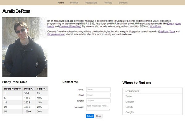
They say that an image is worth a thousand words. For us, as developers and designers, a demo that we can play around with is even better. So, to see what Pure can do for us, let's create a basic demo app. Our demo will consist of a simple Homepage containing some information about myself (sometimes my imagination scares me). The image below shows you what the final result should look like on a large screen:
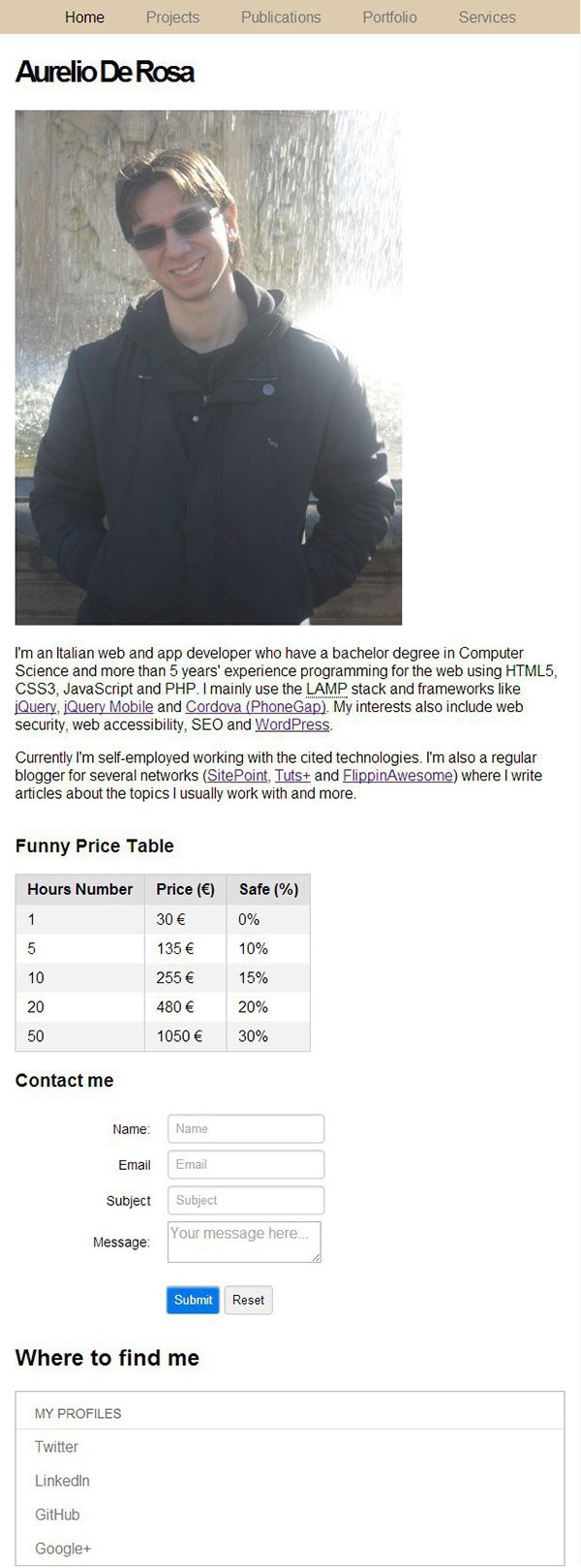
And the following image, instead, shows you how it will look on a smartphone:
Step 1: Create the Horizontal Menu
As I said, Pure has several prebuilt common elements that you can find in a lot of websites on the web. A horizontal menu is surely one of them and will give us the chance to take a look at some of the classes of the menus module.
To create this using HTML5, we usually have a <nav> element wrapping an unordered list that contains the main links of our website. Once the list is created, we have to display it horizontally. To achieve this, we have to apply three classes to the list wrapper (<nav>): .pure-menu, .pure-menu-open, and .pure-menu-horizontal. The first class applies rules that are common to all menus in Pure. The .pure-menu-open class is used to show (instead of hide) the list items, while the .pure-menu-horizontal class is the one responsible for showing the list items on the same line. Please note that by default, the menu isn't centered.
Now, to enhance the user interface, we should highlight the list item that links to the current page. This is done by applying the .pure-menu-selected class to the <li> element you want to highlight. By doing so, the color of the text will turn from grey to black.
The complete code of our menu is displayed below:
<nav id="main-menu" class="pure-menu pure-menu-open pure-menu-horizontal">
   <ul>
      <li class="pure-menu-selected"><a href="#">Home</a></li>
      <li><a href="#">Projects</a></li>
      <li><a href="#">Publications</a></li>
      <li><a href="#">Portfolio</a></li>
      <li><a href="#">Services</a></li>
   </ul>
</nav>
Step 2: The Author Description
After the menu, you can see we have an ideal "row" containing on the left side, a photo and on the right side, a small description of me. This "row", is actually a responsive grid made of two grid units, where the first wraps the photo and occupies 25% of its space, while the second wraps the description and occupies the remaining 75%, as long as the width of the screen is larger than 767px. On the contrary, if the screen's width is equal to or smaller, the grid units are stacked and occupy 100% of the width available. Please note that the units have a 100% width, so if the elements inside them are smaller in width, they will occupy only part of the unit. To see how this works, try resizing the window and notice how the photo does not consume 100% of the width, while at the same time, the grid units are stacked.
As noted before, Pure has a specific module for managing grids. To declare a responsive grid, you have to apply to the container a class called .pure-g-r. The grid units though, instead, share a similar name, .pure-u-*-*, where the final part of the class specifies how much space the given unit will take up. For example, if you apply to an element the .pure-u-1-4 class, it'll reserve 25% of the available width, as I did for the photo. Another example could be .pure-u-2-3 which will allow the unit to take up 66.6% of the grid space.
This grid system is really interesting because it can save you a lot of time if you don't know how to manage float, clear, and other rules to create layouts. In addition, they will save you from all the pain of managing the responsive side of the layout.
With that said, the code that implements the first grid should look like this:
<article id="about-me" class="pure-g-r">
   <h1>Aurelio De Rosa</h1>
   <div class="pure-u-1-4">
      <img src="http://aurelio.audero.it/images/aurelio-de-rosa-2.jpg" alt="Aurelio De Rosa" />
   </div>
   <section class="pure-u-3-4">
      <p>
         I'm an Italian web and app developer who have a bachelor degree in Computer Science and more
         than 5 years' experience programming for the web using HTML5, CSS3, JavaScript and PHP.
         I mainly use the <abbr title="Linux Apache MySql PHP">LAMP</abbr> stack and frameworks like
         <a href="http://jquery.com/" target="_blank">jQuery</a>, <a href="http://jquerymobile.com/" target="_blank">jQuery Mobile</a> and
         <a href="http://phonegap.com/" target="_blank">Cordova (PhoneGap)</a>. My interests also include web security,
         web accessibility, SEO and <a href="http://wordpress.org/" target="_blank">WordPress</a>.
      </p>
      <p>
         Currently I'm self-employed working with the cited technologies. I'm also a regular blogger for
         several networks (<a href="http://www.sitepoint.com/author/aderosa/" target="_blank">SitePoint</a>,
         <a href="http://mobile.tutsplus.com/author/aurelio-de-rosa/">Tuts+</a> and
         <a href="http://flippinawesome.org/authors/aurelio-de-rosa/" target="_blank">FlippinAwesome</a>)
         where I write articles about the topics I usually work with and more.
      </p>
   </section>
</article>
Step 3: The Information Grid
The second and last grid is split into three equal parts. I created them to show you other components of the library, so you can have a good overview of them. In fact, the first unit has a table, the second has a form, and the third has a vertical menu.
The code below shows you how to split the grid into three parts:
<article class="pure-g-r">
   <div class="pure-u-1-3">
   </div>
   <div class="pure-u-1-3">
   </div>
   <div class="pure-u-1-3">
   </div>
</article>
Now, let's explore each unit of this responsive grid.
Step 4: A Responsive Table
Another one of the available modules in Pure, is Tables. Like the name says, it contains rules to style a <table> element and its children. By default, tables will have a vertical border applied to visually separate columns. However, you can also add a horizontal border, applying the .pure-table-bordered class or show only the latter using the .pure-table-horizontal class to the <table> element. Additionally, you can also create striped tables to aid the user in reading the data. To achieve this, you have two possibilities. The first will work on browsers that support nth-child and consists of applying the .pure-table-striped class name to the <table> element. The second, instead, works in all the browsers, including Internet Explorer 8 and lower, but it's more verbose. It consists of adding the .pure-table-odd class name to every other <tr> element. For compatibility reasons, I'll go for the second approach.
Currently, tables have a problem when viewed on small screens, but it'll be fixed in the next release. Please note that you won't see it in the demo because I fixed it. High five for me.
The code that creates the striped table is shown below:
<h3>Funny Price Table</h3>
<table class="pure-table">
<thead>
<tr>
<th>Hours Number</th>
<th>Price (€)</th>
<th>Safe (%)</th>
</tr>
</thead>
<tbody>
<tr class="pure-table-odd">
<td>1</td>
<td>30 €</td>
<td>0%</td>
</tr>
<tr>
<td>5</td>
<td>135 €</td>
<td>10%</td>
</tr>
<tr class="pure-table-odd">
<td>10</td>
<td>255 €</td>
<td>15%</td>
</tr>
<tr>
<td>20</td>
<td>480 €</td>
<td>20%</td>
</tr>
<tr class="pure-table-odd">
<td>50</td>
<td>1050 €</td>
<td>30%</td>
</tr>
</tbody>
</table>
Step 5: A Stacked Contact Form
Forms are yet another module of the Pure library. It allows you to display your forms in several different types of styles. In this demo, we'll create a stacked form, where the input elements are below the labels. To do this, we have to add the .pure-form and the .pure-form-stacked classes to the <form> element. Then we have to place both the label and the input tags within a wrapper, where we'll apply the .pure-control-group class and then put all of these wrappers into a <fieldset> element. The submit and the reset button will have a wrapper as well, but their wrapper will have the class .pure-controls. Please note that for the submit button, we used the class .pure-button-primary to highlight it. The cited class belongs to the Buttons module and is used to change the style of the button, applying a blue color.
Here's what your form code should look like:
<h3>Contact me</h3>
<form id="contact" name="contact" action="#" method="post" class="pure-form pure-form-aligned">
   <fieldset>
      <div class="pure-control-group">
         <label>Name:</label>
         <input type="text" name="name" placeholder="Name" />
      </div>
      <div class="pure-control-group">
         <label>Email</label>
         <input type="email" name="email" placeholder="Email" />
      </div>
      <div class="pure-control-group">
         <label>Subject</label>
         <input type="text" name="subject" placeholder="Subject" />
      </div>
      <div class="pure-control-group">
         <label>Message:</label>
         <textarea name="message" placeholder="Your message here..."></textarea>
      </div>
      <div class="pure-controls">
         <input type="submit" class="pure-button pure-button-primary" value="Submit" />
         <input type="reset" class="pure-button" value="Reset" />
      </div>
   </fieldset>
</form>
Step 6: A Vertical Menu With a Header
The final element that you'll learn how to create, using Pure, will be a vertical menu with a header. A menu of this type is styled with a black border, all around. To use it, we'll apply to the list wrapper, two of the three classes we've already used in the first step, that is .pure-menu and .pure-menu-open. In addition, to create the header, we must add another element and apply to it the .pure-menu-heading class.
The code for this menu is listed below:
<h2>Where to find me</h2>
<div class="pure-menu pure-menu-open">
   <a href="#" class="pure-menu-heading">My profiles</a>
   <ul>
      <li><a href="http://www.twitter.com/AurelioDeRosa">Twitter</a></li>
      <li><a href="http://www.linkedin.com/in/aurelioderosa">LinkedIn</a></li>
      <li><a href="https://github.com/AurelioDeRosa">GitHub</a></li>
      <li><a href="https://plus.google.com/111199469497044249730">Google+</a></li>
   </ul>
</div>
Conclusion
So that completes this introduction to Pure. I hope you enjoyed it. If you'd like to follow the development of Pure, you can visit its repository on GitHub. Feel free to submit issues, issue pull requests, and contribute.

Comments