In this tutorial, you'll learn how to lay out React Native apps and how to implement layouts commonly used in apps. This includes the Stack Layout, Grid Layout, and Absolute Layout. I'll be assuming that you already know the basics of styling a React Native app and how to use CSS in general, so I won't dwell too much on StyleSheet.create and how to add styling to different elements.
You can find the full source code for this tutorial on GitHub.
Project Setup
To make things easy, we'll use React Native for Web. With the React Native for Web Starter, we can easily spin up a new React Native project that can run in the browser. This code is 100% compatible with the React Native project. We'll create a separate component for each layout that we'll implement so you can easily import them into a normal React Native project if you want. We're just using React Native for Web because it's easier to get it up and running.
You can execute the following commands to set up the project:
git clone https://github.com/grabcode/react-native-web-starter.git RNLayouts
cd RNLayouts
rm -rf .git
npm install
Once it's done installing, navigate inside the app/components directory. This is where the files are that we'll primarily work on.
Open the App.js file and replace the default code with the following:
import React, { Component } from 'react';

//import the components that we'll be creating here

export class App extends Component {
  render() {
    return (
        //use the components here
    );
  }
}
Later on, you can import the components that we'll be creating and then render them from this file. Just remember that any component that we save inside the layouts directory shouldn't be rendered with anything else. For example, if we have layouts/StackLayout.js, do the following in App.js:
import React, { Component } from 'react';

//import the components that we'll be creating here
import StackLayout from './layouts/StackLayout';

export class App extends Component {
  render() {
    return (
        <StackLayout />
    );
  }
}
You can serve the project by executing the following command:
npm run dev
This allows you to access it in the browser by visiting http://localhost:3000. A full page reload will be triggered if you make a change to any of the files that are currently imported from the App.js file.
How to Create Different Layouts
Layouts in React Native use a subset of Flexbox. (I say "subset" because not all features that are in the Flexbox specification are included.) So if you already know Flexbox, then you can readily apply those skills in React Native. It's also worth noting that there are no floats or percentage-based units in React Native. This means that we can only do layouts using Flexbox and CSS positioning.
Stack Layout
The first kind of layout that we will implement is the Stack Layout. For vertical orientation, it stacks elements on top of each other, while for horizontal orientation, the elements are placed side by side. Let's take a look at vertical orientation first:

Here's the code to accomplish the layout above:
import React, { Component } from 'react';
import {
  StyleSheet,
  View,
  Dimensions
} from 'react-native';

var { height } = Dimensions.get('window');

var box_count = 3;
var box_height = height / box_count;

export default class VerticalStackLayout extends Component {
  render() {
    return (
        <View style={styles.container}>
            <View style={[styles.box, styles.box1]}></View>
            <View style={[styles.box, styles.box2]}></View>
            <View style={[styles.box, styles.box3]}></View>
        </View>
    );
  }
}

const styles = StyleSheet.create({
  container: {
    flex: 1,
    flexDirection: 'column'
  },
  box: {
    height: box_height
  },
  box1: {
    backgroundColor: '#2196F3'
  },
  box2: {
    backgroundColor: '#8BC34A'
  },
  box3: {
    backgroundColor: '#e3aa1a'
  }
});
Breaking down the code above, we first get the height of the available space for the app to consume. Then we calculate what the height of each box will be. Since we have three boxes, we divide it by three.
var { height } = Dimensions.get('window');

var box_count = 3;
var box_height = height / box_count;
For the markup, the boxes should be wrapped inside a container. Common styles are declared in the box object, and unique background colors are applied to uniquely named objects (box1, box2, box3):
<View style={styles.container}>
    <View style={[styles.box, styles.box1]}></View>
    <View style={[styles.box, styles.box2]}></View>
    <View style={[styles.box, styles.box3]}></View>
</View>
To use Flexbox, you must use the flex property on the container. The value is the amount of space it will consume. If it's 1, it means that it will consume all the available space, provided that the element has no siblings. We'll take a look at an example of using flex with siblings later on.
flexDirection allows you to specify the primary axis of the layout. By default, this is set to column. Setting flexDirection to column means that the children of the container will be laid out vertically (stacked on top of each other) while setting it to row means that the children will be laid out horizontally (side by side). To achieve equal height, set the height of the box to that of the value that we calculated earlier.
const styles = StyleSheet.create({
  container: {
    flex: 1,
    flexDirection: 'column'
  },
  box: {
    height: box_height //set this one
  },
  box1: {
    backgroundColor: '#2196F3'
  },
  box2: {
    backgroundColor: '#8BC34A'
  },
  box3: {
    backgroundColor: '#e3aa1a'
  }
});
Here's an image to help you visualize how the content will flow based on the flexDirection that you specified.

The method I just showed you is the manual way of doing things. Using the Dimensions to compute the width or height of the elements will fail if your app supports both portrait and landscape device orientation. That's because as soon as the user flips their device, the width or height that you computed earlier will be wrong. React Native won't automatically recompute it for you, so the app ends up looking weird.
Flexbox can actually do the computation for you if you just supply the correct values. To achieve the same layout as above without using the Dimensions, all you have to do is specify flex: 1 for all the boxes instead of specifying the height:
box: {
    flex: 1
},
This is now an example of using flex with siblings. Now we have three siblings with the same flex value. This means that all three of them will equally share the available space since the flex value is the same. (You can actually use any flex value as long as the child elements all have the same value.)
Using this knowledge, you can now achieve layouts with a header, content, and a footer:
//header
box1: {
    flex: 1,
    backgroundColor: '#2196F3'
},
//content
box2: {
    flex: 10,
    backgroundColor: '#8BC34A'
},
//footer
box3: {
    flex: .5,
    backgroundColor: '#e3aa1a'
}
Here's what it will look like:
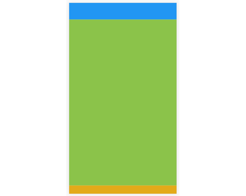
Note that this will be static. So if your main content becomes higher than the maximum available height, then the rest of your content will be hidden. If you expect your content to go over that limit, you can use the built-in ScrollView component to automatically generate a vertical scrollbar just like in web pages.
Horizontal Stack Layouts
To implement horizontal stack layouts, all you have to do is change the flexDirection to row.
  container: {
    flex: 1,
    flexDirection: 'row'
  },
If we change the box flex value back to 1, this results in the following output:

The only thing we changed is the flexDirection, which is now set to row. Since the boxes are all set to flex: 1, they will have the same width and height. All the ideas from the vertical stack layout are equally applicable to this one.
Justify Content
If you want to control the distribution of children within a container, you use the justifyContent property on the container.
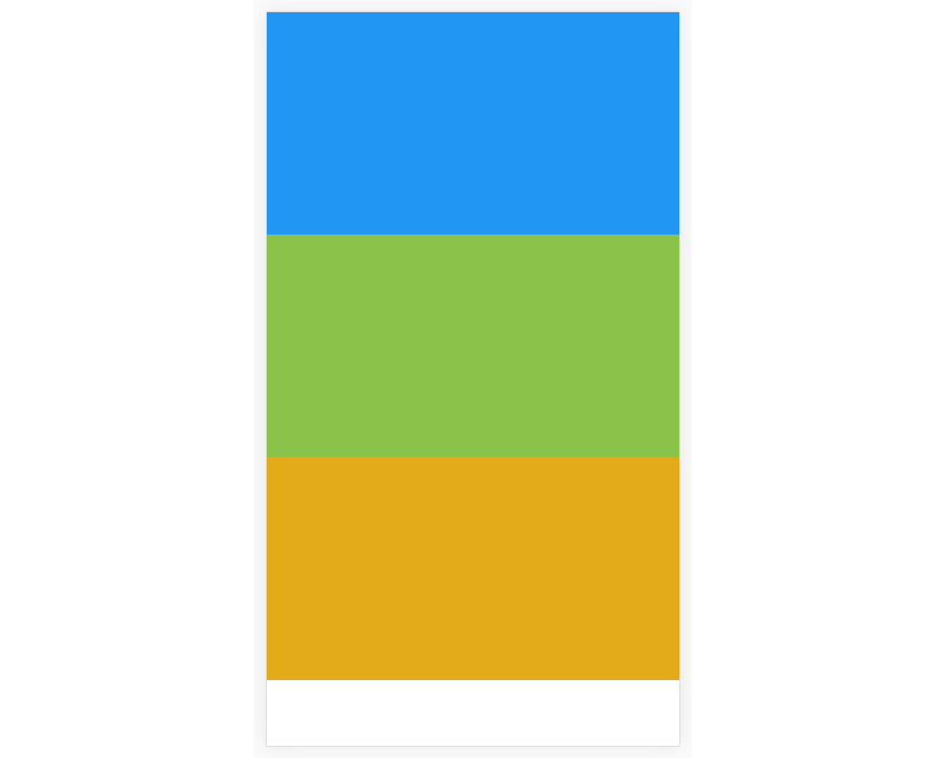
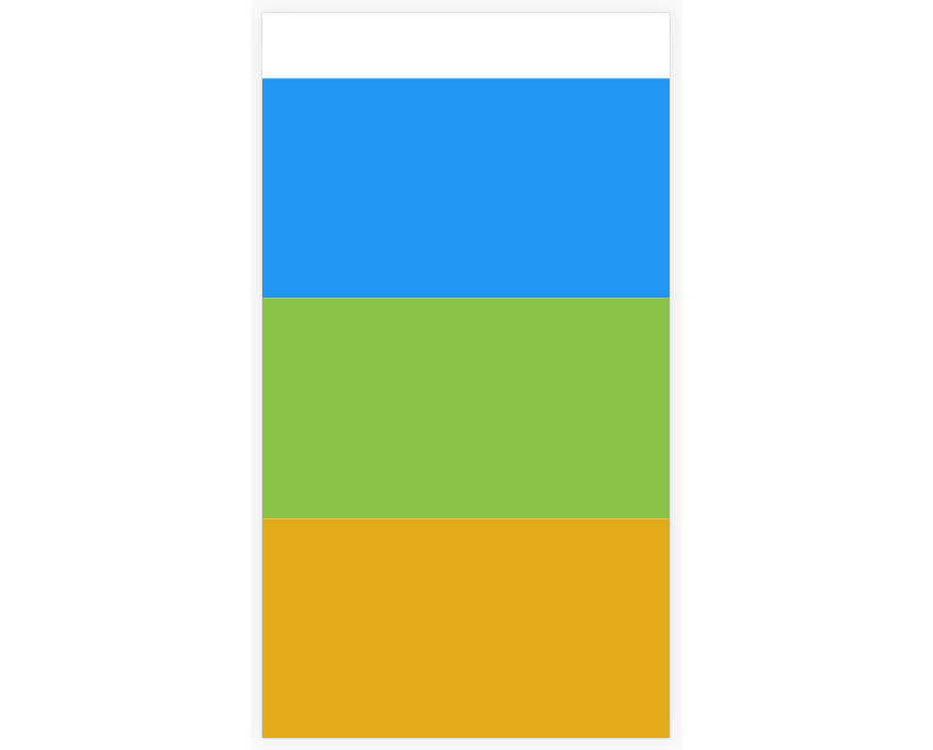
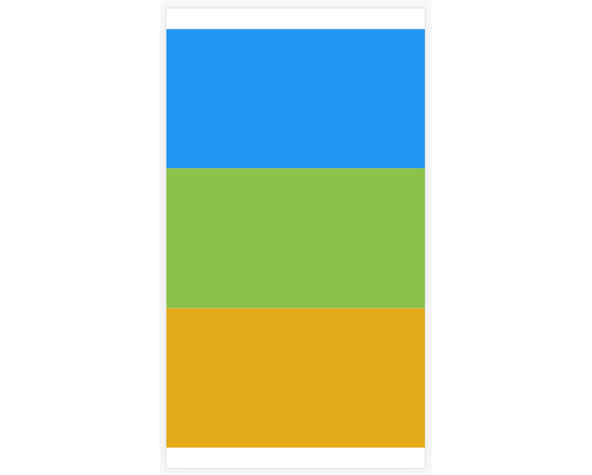
Below are the five possible values that can be used with this property. In the following examples, the height of each of the children is diminished to demonstrate how each would look. You wouldn't be able to see any difference if the flex value was 1 for each of the children, because they would end up consuming all the available space.
-
flex-start: child elements are aligned toward the starting point. Notice the white background right below the last child. That is how you know that this is usingflex-startbecause all the children are aligned towards the starting point. This leaves an empty space towards the end.
-
flex-end: child elements are aligned toward the end line. Notice that this time the empty space is at the starting point.
-
center: child elements are placed towards the center. This time the empty space is equally divided between the starting and ending point.
-
space-around: child elements are distributed such that there would be equal space around each of them. This means that the elements in the outer part would have less space on their outer side and the space between the two children is doubled.

-
space-between: child elements are distributed such that there would be an equal amount of space between each of them.

As you may have noticed, each of these style properties is dependent on the height or width of the child elements. It's dependent on the width if the flexDirection is row, and on the height if the flexDirection is column.
For example, space-between won't really have any effect on a vertical stack layout if each of the child elements is using flex to control the height. This is because there will be no more space left for the gap between each child element to consume.
Align Items
At first glance, justifyContent and alignItems might look as if they're doing the same thing. They also share three possible values: flex-start, flex-end, and center, with the addition of a stretch value.
The main difference between justifyContent and alignItems is the axis on which the children are distributed. As you have seen earlier, justifyContent always uses the primary axis when distributing child elements. But alignItems uses the axis opposite to the primary one.
We already know that the axis is determined by the flexDirection that has been set. So if the flexDirection is row, the primary axis flows from left to right. This means that the cross axis will flow from top to bottom. On the other hand, if flexDirection is column then the cross axis will flow from left to right.
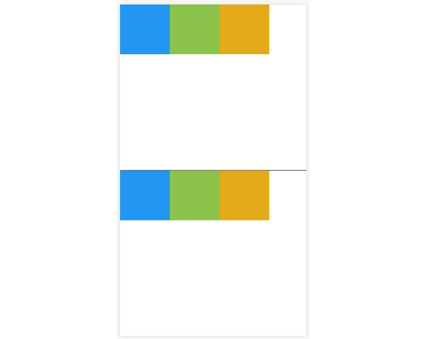
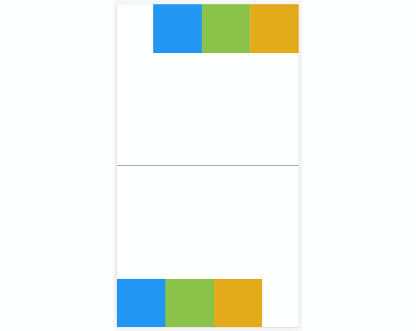
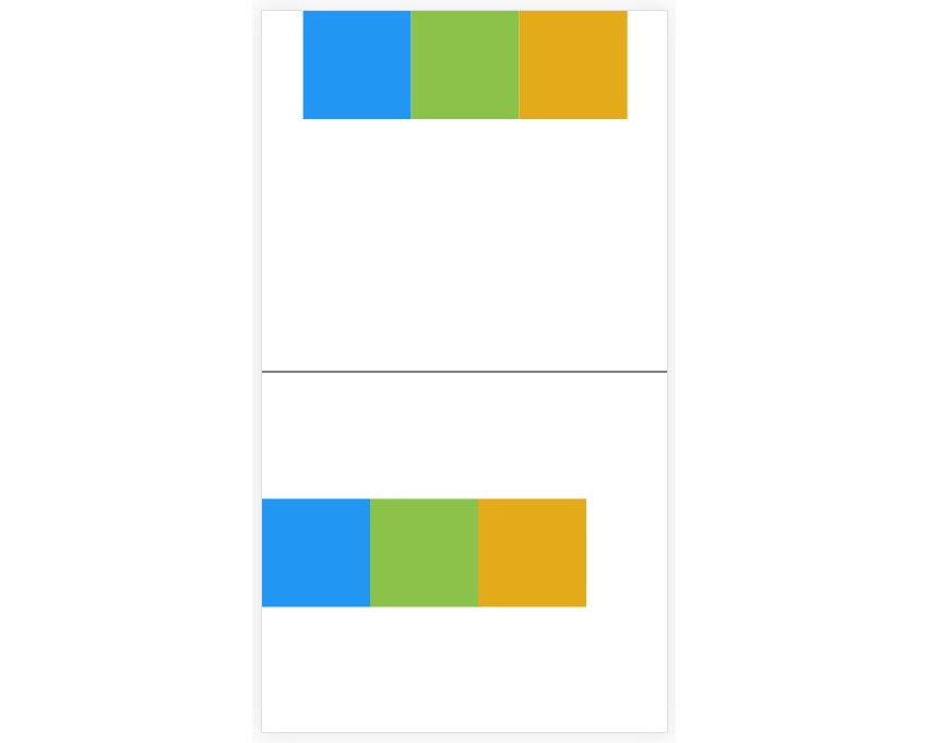
Below are some examples of justifyContent and alignItems implemented side by side with the flexDirection of row. The first one uses justifyContent while the second uses alignItems.
-
flex-start: the positioning of the elements is the same, which is why thealignItemsimplementation looks exactly likejustifyContent.
-
flex-end: now we start to see a difference. In the first instance, it's at the end of the line of the first row, while the second instance appears to be at the starting line of the last row.
-
center:centerhas the same idea as the rest of the values that we've used so far. In the first instance, the items are centered on the x-axis while in the second, the items are centered on the y-axis.
-
stretch: use this to have the child elements stretch to fill the container. This is the default value foralignItems, so specifying this value is optional. You've already seen how this works when we implemented vertical and horizontal stack layouts.
Here's the code used in the examples above. Just play with the values for the flexDirection, justifyContent and alignItems if you want to see how they look:
import React, { Component } from 'react';
import {
  StyleSheet,
  View
} from 'react-native';

export default class AlignItems extends Component {
  render() {
    return (
      <View style={styles.wrapper}>
        <View style={styles.container}>
            <View style={[styles.box, styles.box1]}></View>
            <View style={[styles.box, styles.box2]}></View>
            <View style={[styles.box, styles.box3]}></View>
        </View>
        <View style={styles.container2}>
            <View style={[styles.box, styles.box1]}></View>
            <View style={[styles.box, styles.box2]}></View>
            <View style={[styles.box, styles.box3]}></View>
        </View>
      </View>
    );
  }
}

const styles = StyleSheet.create({
  wrapper: {
    flex: 1
  },
  container: {
    flex: .5,
    flexDirection: 'row',
    justifyContent: 'flex-start', //replace with flex-end or center
    borderBottomWidth: 1,
    borderBottomColor: '#000'
  },
  container2: {
    flex: .5,
    flexDirection: 'row',
    alignItems: 'flex-start' //replace with flex-end or center
  },
  box: {
    width: 100,
    height: 100
  },
  box1: {
    backgroundColor: '#2196F3'
  },
  box2: {
    backgroundColor: '#8BC34A'
  },
  box3: {
    backgroundColor: '#e3aa1a'
  }
});
If you want to specify the alignment of individual elements within a container, you can use the alignSelf property. All the possible values for align-items are applicable to this property as well. So, for example, you can align a single element to the right of its container, while all the rest are aligned to the left.
Grid Layout
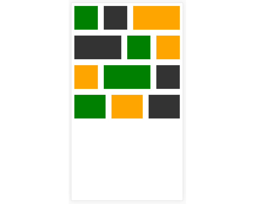
React Native doesn't really come with a grid layout system, but Flexbox is flexible enough to create one. By using the things we learned so far, we can recreate Grid layouts using Flexbox. Here's an example:
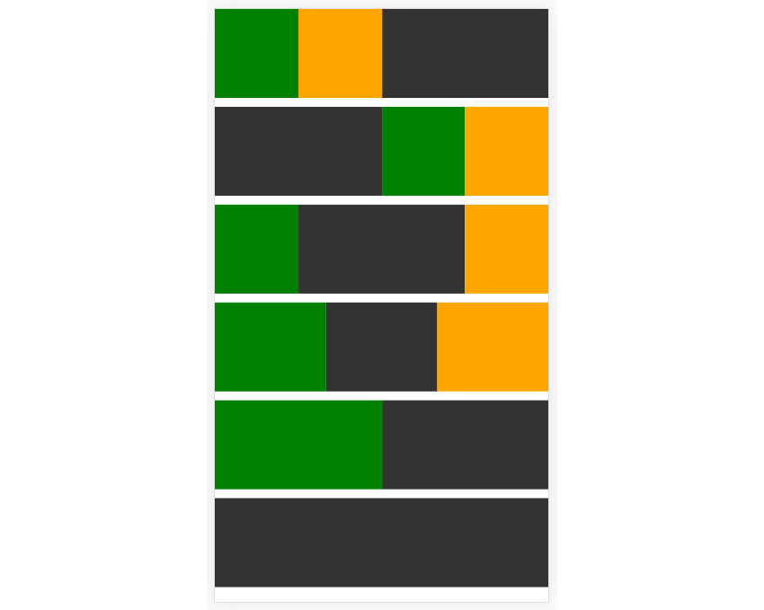
And here's the code that creates that layout:
import React, { Component } from 'react';
import {
  StyleSheet,
  View
} from 'react-native';

export default class GridLayout extends Component {
  render() {
    return (
      <View style={styles.container}>
          <View style={styles.row}>
            <View style={[styles.box, styles.box2]}></View>
            <View style={[styles.box, styles.box3]}></View>
            <View style={[styles.box, styles.two]}></View>
          </View>

          <View style={styles.row}>
            <View style={[styles.box, styles.two]}></View>
            <View style={[styles.box, styles.box2]}></View>
            <View style={[styles.box, styles.box3]}></View>
          </View>

          <View style={styles.row}>
            <View style={[styles.box, styles.box2]}></View>
            <View style={[styles.box, styles.two]}></View>
            <View style={[styles.box, styles.box3]}></View>
          </View>

          <View style={styles.row}>
            <View style={[styles.box, styles.box2]}></View>
            <View style={[styles.box]}></View>
            <View style={[styles.box, styles.box3]}></View>
          </View>

          <View style={styles.row}>
            <View style={[styles.box, styles.box2]}></View>
            <View style={[styles.box]}></View>
          </View>

          <View style={styles.row}>
            <View style={[styles.box]}></View>
          </View>
      </View>
    );
  }
}


const styles = StyleSheet.create({
  row: {
    flex: 1,
    flexDirection: 'row',
    justifyContent: 'space-between',
    marginBottom: 10
  },
  box: {
    flex: 1,
    height: 100,
    backgroundColor: '#333',
  },
  box2: {
    backgroundColor: 'green'
  },
  box3: {
    backgroundColor: 'orange'
  },
  two: {
    flex: 2
  }
});
From the code above, you can see that we're emulating what they usually do in CSS grid frameworks. Each row is wrapped in a separate view, and the grid items are inside it. A default flex value of 1 is applied to each item so that they will equally share the space available on each row. But for items that need to consume larger space, a higher flex value is applied. This automatically adjusts the width of the other items so it accommodates all the items.
If you want to add spaces between each item in a row, you can add a padding to each of them and then create a box inside each one.
This results in the following output:
Absolute Layout
React Native only supports absolute and relative positioning. This shouldn't limit you, though, because you can always combine these with Flexbox to position the different elements anywhere you want.
Let's look at how we would accomplish the following:
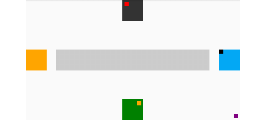
We can achieve this easily if we have full command over the positioning values that are available in the browser. But since we're in React Native, we need to think of this the Flexbox way first and then use CSS positioning for the small boxes.
Using Flexbox, this can be achieved in two ways. You can either use row or column for the flexDirection for the main container. How you arrange the different elements will depend on which method you choose. Here we're going to use row for the flexDirection so the screen will be divided into three columns. The first column will contain the orange box, the second column will contain the black, gray and green boxes, and the third will contain the blue and small purple boxes.
import React, { Component } from 'react';
import {
  StyleSheet,
  View
} from 'react-native';

export default class Positioning extends Component {
  render() {
      return (
      <View style={styles.container}>

        <View style={styles.left}>
          <View style={[styles.box, styles.big_orange_box]}>
          </View>
        </View>

        <View style={styles.middle}>
          <View style={[styles.box, styles.big_black_box]}>
            <View style={[styles.inner_box, styles.red_box]}></View>
          </View>
          <View style={[styles.big_gray_box]}></View>
          <View style={[styles.box, styles.big_green_box]}>
            <View style={[styles.inner_box, styles.orange_box]}></View>
          </View>
        </View>

        <View style={styles.right}>
          <View style={[styles.box, styles.big_lightblue_box]}>
            <View style={[styles.inner_box, styles.black_box]}></View>
          </View>
          <View style={[styles.inner_box, styles.purple_box]}></View>
        </View>

      </View>
  	);
  }
}
If you already know how each of the elements will be laid out, it's only a matter of applying the things we learned so far. After all, we don't really need to apply CSS positioning on the big boxes, only the small ones.
The first column only has the orange box, so applying justifyContent: 'center' to its container should do the trick. In case you've already forgotten, flexDirection defaults to column. This means that if you set justifyContent to center, the children will be aligned on the center of the Y-axis.
The second column has basically the same idea as the first one, only this time we don't want to align all the boxes to the center. What we want is for them to have equal spaces in between each other, and justifyContent: 'space-between' gets that job done. But at the same time we also want to center all the children on the X-axis so we use alignItems: 'center'.
The only tricky part here is that you shouldn't apply any width property to the gray box because we want it to stretch all the way to consume the full width of its parent. Since we didn't apply any width, we should apply alignSelf: 'stretch' to the gray box so that it will consume the full width of its parent.
Next, to position the small red box slightly away from its relative position, we use position: relative and then apply top and left values because its relative position is around the upper-left corner of its parent.
As for the small orange box, we use position: 'absolute' because we need to align it to the upper right corner of its parent. This works because absolutely positioned elements in React Native are bound to their parent.
The third column basically applies the same idea so I'm no longer going to explain it.
const styles = StyleSheet.create({
  container: {
    flex: 1,
    flexDirection: 'row'
  },
  left: {
    flex: 1,
    justifyContent: 'center'
  },
  middle: {
    flex: 5,
    justifyContent: 'space-between',
    alignItems: 'center'
  },
  right: {
    flex: 1,
    justifyContent: 'center',
    alignItems: 'flex-end'
  },
  box: {
    width: 100,
    height: 100,
    backgroundColor: '#333'
  },
  big_green_box: {
    backgroundColor: 'green'
  },
  big_orange_box: {
    backgroundColor: 'orange'
  },
  big_lightblue_box: {
    backgroundColor: '#03A9F4'
  },
  big_gray_box: {
    height: 100,
    alignSelf: 'stretch',
    backgroundColor: '#ccc'
  },
  inner_box: {
    width: 20,
    height: 20,
  },
  red_box: {
    position: 'relative',
    backgroundColor: 'red',
    top: 10,
    left: 10
  },
  orange_box: {
    position: 'absolute',
    backgroundColor: 'orange',
    top: 10,
    right: 10
  },
  purple_box: {
    position: 'absolute',
    backgroundColor: 'purple',
    bottom: 10,
    right: 10
  },
  black_box: {
    position: 'relative',
    backgroundColor: 'black'
  }
});
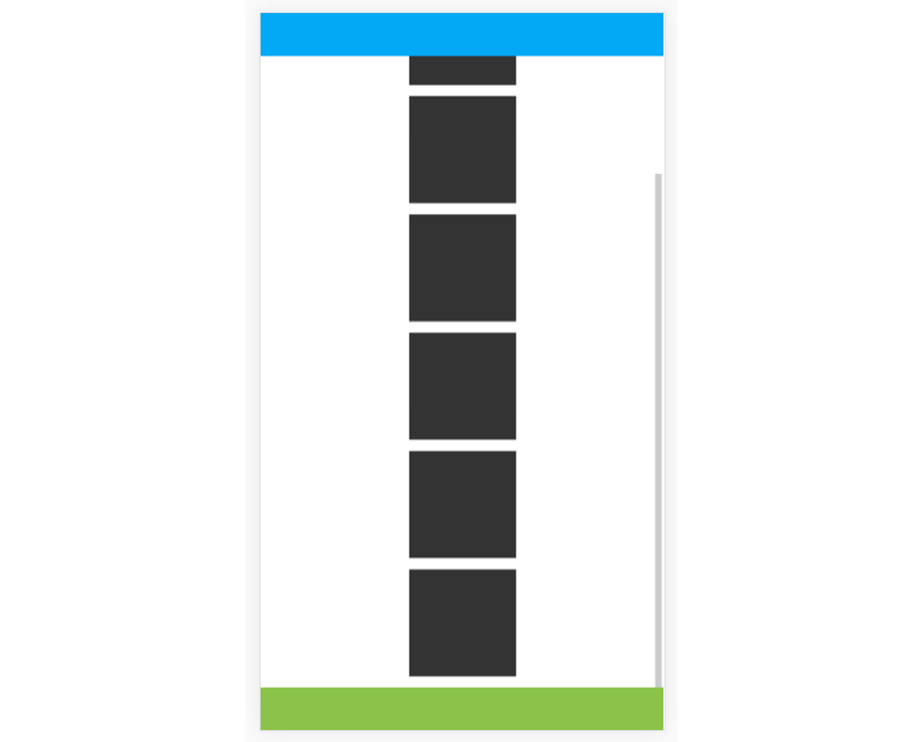
Next, let's try to implement a fixed header and footer layout. This is commonly found in apps that have a tab navigation; the tabs are fixed at the bottom of the screen while the main content can be scrolled.
For us to accomplish this, we need to use the ScrollView component so that if the main content goes over the height of the container, React Native will automatically generate a vertical scrollbar. This allows us to add marginTop and marginBottom to the main content container so that the fixed header and footer won't obstruct the main content. Also, note that the left and right values of the header and footer are set to 0 so that they will consume the full device width.
import React, { Component } from 'react';
import {
  StyleSheet,
  View,
  ScrollView
} from 'react-native';

export default class FixedHeaderFooter extends Component {
  render() {
      return (
      <View style={styles.container}>
        <View style={[styles.header]}></View>
        <ScrollView>
          <View style={[styles.content]}>
            <View style={[styles.box]}></View>
            <View style={[styles.box]}></View>
            <View style={[styles.box]}></View>
            <View style={[styles.box]}></View>
            <View style={[styles.box]}></View>
            <View style={[styles.box]}></View>
            <View style={[styles.box]}></View>
          </View>
        </ScrollView>
        <View style={[styles.footer]}></View>
      </View>
  	);
  }
}


const styles = StyleSheet.create({
  container: {
    flex: 1,
    flexDirection: 'column',
    justifyContent: 'center'
  },
  header: {
    height: 40,
    position: 'absolute',
    left: 0,
    right: 0,
    top: 0,
    backgroundColor: '#03A9F4',
    zIndex: 10
  },
  content: {
    alignItems: 'center',
    marginTop: 50,
    marginBottom: 40
  },
  footer: {
    height: 40,
    position: 'absolute',
    left: 0,
    right: 0,
    bottom: 0,
    backgroundColor: '#8BC34A'
  },
  box: {
    width: 100,
    height: 100,
    backgroundColor: '#333',
    marginBottom: 10
  }
});
Here's how it will look:
Third-Party Libraries
React Native has a big community behind it, so there's no wonder that a few libraries have already been created to ease the implementation of layouts. In this section, I'll introduce you to a library called React Native Easy Grid. You can use it to describe how you want to lay out your app by making use of the Grid, Row, and Col components.
You can install it with the following command:
npm install react-native-easy-grid --save
Import the library and extract the different components in your file.
import React, { Component } from 'react';
import {
  StyleSheet,
  View
} from 'react-native';

import { Col, Row, Grid } from "react-native-easy-grid";
The Grid component is used for wrapping everything. Col is used to create a column, and Row is used to create rows. You can specify a size property for both Row and Col, though we only used it on the Row below. If the size isn't specified, it will equally divide the available space between the Col instances.
In this case, there are only two, so the whole screen is divided into two columns. The first column is then divided into two rows. Here we specified a size, but you can actually skip it if you just need equally sized rows, as we did below.
export default class FlexboxGridLibrary extends Component {

  render() {
    return (
        <Grid>
            <Col>
                <Row size={50} style={styles.orange_box}></Row>
                <Row size={50} style={styles.green_box}></Row>
            </Col>
            <Col style={styles.gray_box}></Col>
        </Grid>
    );
  }

}
Once that's done, all you have to do is add the styling for the rows and columns:
const styles = StyleSheet.create({
  orange_box: {
    backgroundColor: 'orange'
  },
  green_box: {
    backgroundColor: 'green'
  },
  gray_box: {
    backgroundColor: 'gray'
  }
});
As you have noticed, React Native Easy Grid has a very intuitive API.
Conclusion
In this tutorial, you learned how to lay out React Native apps. Specifically, you learned how to use React Native's Flexbox to position things around. You also learned how to use React Native Easy Grid, which makes Flexbox implementation easier.
In an upcoming tutorial, we'll put everything you learned into practice by recreating UI elements that are commonly found in apps: things like the calendar, lists, and tab navigation.


Comments