In this tutorial I will teach you how to use iScroll 4 to create a simple mobile web site. The site we create will have a fixed header and a fixed footer with content that can be easily scrolled in-between. As we'll see, achieving this effect on both Android and iOS isn't as easy as you might think!
Web based apps are a great place for front end developers to begin their journey into the world of building mobile applications. Using your existing knowledge of HTML, CSS, and Javascript, you can build apps that look-and-feel very close to those made with a native platform SDK. Even better, your applications will be cross-platform compatible and will work on any mobile device with a modern browser.
Of course, there are some caveats to developing for mobile browsers. Some may be obvious, such as inability to tap into the device camera (at least for now). Others might not be as obvious, like the sheer number of mobile browsers that are already in use (the variety is mind boggling).
While there are plenty of frameworks (e.g. jQuery Mobile, SenchaTouch, etc.) that can help get you started with mobile web apps, for now I'm not going to use any of them. Instead, I'm going to focus on pure JavaScript with one handy library: iScroll 4.
iScroll solves a problem in the mobile WebKit based browsers found on both Android and iOS. Both of these browsers offer no support for absolutely positioned header and footer content with scrolling content placed in-between by default. The entire HTML document is scrolled regardless of any CSS you might have in place to achieve otherwise. Because many native mobile applications are designed with a fixed navigation bar at the top of the screen and a fixed toolbar or tab bar at the bottom of the screen, this lack of fixed content support in the WebKit browsers is really quite a problem. Not to worry: in this tutorial, I'm going to show you how to achieve this layout with iScroll.
Step 1: Basic HTML Layout
Let's go ahead and setup a basic web app layout. This will be a pretty basic page and in no way production-quality markup, but for this demo it'll work nicely.
I generally start most mobile web apps (I'll refer to these as Webile Apps), with the same basic template (assuming I am not using HTML5 boilerplate or another framework). The only meta tags I use initially are to set the scale options in the viewport. I also add a little 'reset' to the elements I know need them. I very rarely use a CSS reset for Webile Apps as it's generally overkill for a mobile device and once you get into optimising, less is usually more.
<!DOCTYPE html>
<html>
<head>
	<meta http-equiv="content-type" content="text/html; charset=utf-8">
	<meta name="viewport" content="width=device-width, initial-scale=1.0, user-scalable=0, minimum-scale=1.0, maximum-scale=1.0">
	<title>Web App Template</title>

	<style type="text/css" media="all">
	body,ul,li {
		padding:0;
		margin:0;
		border:0;
	}
	</style>
</head>

<body>

<header>
	Web App Template
</header>

<div id="wrapper">
	<!--content goes here -->
</div>

<footer>
	Some Footer Content
</footer>

</body>
</html>
Step 2: Basic CSS
Now we can add some basic CSS to get a nice layout for the header and footer.
body {
	font-family:helvetica;
}

header{
	position:absolute;
	z-index:2;
	top:0; left:0;
	width:100%;
	height:45px;
	background-color:#deb500;
	padding:0;
}

footer {
	position:absolute;
	z-index:2;
	bottom:0; left:0;
	width:100%;
	height:48px;
	background-color:#c27b00;
	padding:0;
	border-top:1px solid #444;
}

header, footer{
	font-size:20px;
	text-align:center;
	color:#f3f3f3;
	font-weight:bold;
	text-shadow:0 -1px 0 rgba(0,0,0,0.5);
	line-height:45px;
}
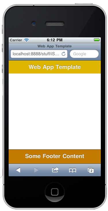
You should now have something that looks like this. Note that we gave the header and footer a z-index, this will come into play in a bit.
Step 3: Scrollable Content
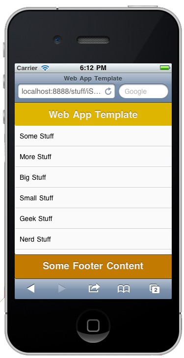
Now it's time to add the content that we'd like to be scrollable. I've used a simple list, but the content can be anything you want. We need to ensure that whatever we want to scroll is wrapped inside a container with an ID, which we will use to hook into iScroll. This will be inside the DIV with the ID of wrapper we set up in Step 1.
<div id="wrapper">
	<div id="scroll-content">
		<ul>
			<li>Some Stuff</li>
			<li>More Stuff</li>
			<li>Big Stuff</li>
			<li>Small Stuff</li>
			<li>Geek Stuff</li>
			<li>Nerd Stuff</li>
			<li>Fast Stuff</li>
			<li>Slow Stuff</li>
			<li>Good Stuff</li>
			<li>Bad Stuff</li>
			<li>Your Stuff</li>
			<li>My Stuff</li>
			<li>Their Stuff</li>
			<li>Our Stuff</li>
			<li>Super Stuff</li>
			<li>Uber Stuff</li>
			<li>Stuff Stuff</li>
			<li>French Stuff</li>
			<li>German Stuff</li>
			<li>English Stuff</li>
			<li>American Stuff</li>
			<li>Stuff</li>
		</ul>
	</div>
</div>
And then let's give the list some nice CSS to make it look a bit less boring. Also, we are going to position the wrapper absolutly with a lower z-index than the header and the footer.
#wrapper {
    position:absolute;
    z-index:1;
    top:45px; bottom:48px; left:0;
    width:100%;
    background:#aaa;
    overflow:auto;
}

#scroll-content {
	position:absolute;
	z-index:1;
	width:100%;
	padding:0;
}

ul {
	list-style:none;
	padding:0;
	margin:0;
	width:100%;
	text-align:left;
}

li {
	padding:0 10px;
	height:40px;
	line-height:40px;
	border-bottom:1px solid #ccc;
	border-top:1px solid #fff;
	background-color:#fafafa;
	font-size:14px;
}
As you can see, we have given the wrapper an overflow:auto which, in a browser would allow us to scroll the wrapper - but if you check in your device...
We don't have the option of scrolling. This is the very problem that iScroll was made to fix, so, let's get it to help us out.
Note: If you'd like to get rid of the URL bar at the top of your application (iOS ONLY) you can add the following META TAG.
<meta name="apple-mobile-web-app-capable" content="yes" />
Now, when/if a user adds the application to their home screen, they can launch it from the OS like any other application, and the URL bar will not be rendered.
An alternative approach to removing the URL bar is the method discussed by Mark Hammonds in the tutorial Full Screen Web Apps - it's a good method that uses JavaScript to hide the address bar automatically. For now, I am going to use the META TAG method because it's nice and clean and gets rid of the lower button bar in addition to the address bar.
Step 4: Getting iScroll Into Your Project
Head on over to the iScroll homepage and download the source. iScroll 4 is the latest version as of this writing and the version we will be using, so ensure you download that. Unzip the file download and grab the iscroll-lite.js file. As we are using only the basic scrolling functionality, this is all we are going to need. Drop the file into your desired directory. For now, I am going to drop it into the root of the project.
Step 5: Initializing iScroll
First, we import the iscroll-lite.js file into our project. Import it at either the top (the <head>) or the bottom (just before the </body>) of the HTML. My preference is to import it at the bottom
<script type="text/javascript" src="iscroll-lite.js"></script>
</body>
Next, we set up a function which intiates iScroll and hooks into the wrapper. Finally, we add an event listener to the document to wait for the content to be loaded before firering off our function to pull in iScroll.
<script type="text/javascript">

var theScroll;
function scroll() {
	theScroll = new iScroll('wrapper');
}
document.addEventListener('DOMContentLoaded', scroll, false);
</script>
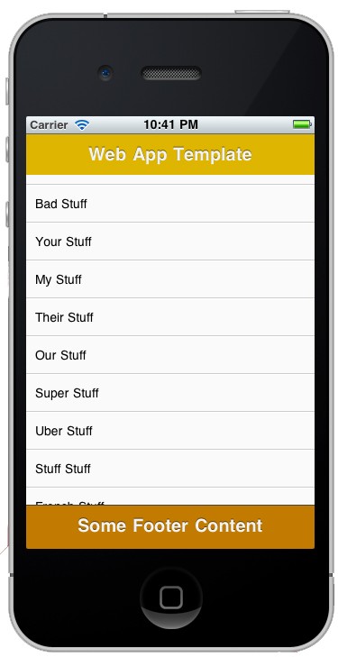
Step 6: Final Product
If you check your device now, you should have a lovely scrollable list with a fixed header and footer.
Step 7: Code Review
Here is the full written code used in this tip.
<!DOCTYPE html>
<html>
<head>
<meta http-equiv="Content-Type" content="text/html; charset=utf-8">
<meta name="viewport" content="width=device-width, initial-scale=1.0, user-scalable=0, minimum-scale=1.0, maximum-scale=1.0">
<meta name="apple-mobile-web-app-capable" content="yes" />
<title>Web App Template</title>

<style type="text/css" media="all">
body,ul,li {
	padding:0;
	margin:0;
	border:0;
}

body {
	font-family:helvetica;
}

header{
	background-color:#deb500;
	position:absolute;
	z-index:2;
	top:0; left:0;
	width:100%;
	height:45px;
	padding:0;
}

footer {
	background-color:#c27b00;
	position:absolute;
	z-index:2;
	bottom:0; left:0;
	width:100%;
	height:48px;
	padding:0;
	border-top:1px solid #444;
}

header, footer{
	font-size:20px;
	text-align:center;
	color:#f3f3f3;
	font-weight:bold;
	text-shadow:0 -1px 0 rgba(0,0,0,0.5);
	line-height:45px;
}

#wrapper {
	position:absolute;
	z-index:1;
	top:45px; bottom:48px; left:0;
	width:100%;
	background:#aaa;
	overflow:auto;
}

#scroll-content {
	position:absolute;
	z-index:1;
	width:100%;
	padding:0;
}

ul {
	list-style:none;
	padding:0;
	margin:0;
	width:100%;
	text-align:left;
}

li {
	padding:0 10px;
	height:40px;
	line-height:40px;
	border-bottom:1px solid #ccc;
	border-top:1px solid #fff;
	background-color:#fafafa;
	font-size:14px;
}
</style>
</head>
<body>

<header>
	Web App Template
</header>
<div id="wrapper">
	<div id="scroll-content">
		<ul>
		<li>Some Stuff</li>
		<li>More Stuff</li>
		<li>Big Stuff</li>
		<li>Small Stuff</li>
		<li>Geek Stuff</li>
		<li>Nerd Stuff</li>
		<li>Fast Stuff</li>
		<li>Slow Stuff</li>
		<li>Good Stuff</li>
		<li>Bad Stuff</li>
		<li>Your Stuff</li>
		<li>My Stuff</li>
		<li>Their Stuff</li>
		<li>Our Stuff</li>
		<li>Super Stuff</li>
		<li>Uber Stuff</li>
		<li>Stuff Stuff</li>
		<li>French Stuff</li>
		<li>German Stuff</li>
		<li>English Stuff</li>
		<li>American Stuff</li>
		<li>Stuff</li>
	</ul>
	</div>
</div>
<footer>
	Some Footer Content
</footer>

</body>
<script type="text/javascript" src="iscroll-lite.js"></script>

<script type="text/javascript">

var theScroll;
function scroll() {
	theScroll = new iScroll('wrapper');
}
document.addEventListener('DOMContentLoaded', scroll, false);
</script>
</html>
A Word of Warning
As we've seen in this tutorial, iScroll does solve an issue in some webkit based mobile browsers with fixed content positioning, but it should be noted that there are some potential pitfalls as well. iScroll doesn't support all mobile browsers currently available. For example, there's no support for Windows 7 phones. So, for now, this is pretty much an Android/iOS WebKit fix, and while it does offer a solution there, you may want to do more research into how iScroll works "underneath the hood" before implementing it accross your entire application.
More iScroll Tutorials?
We've only touched upon the functionality that iScroll can offer for developing mobile web apps. In addition to what I demonstrated in this tutorial, iScroll can also be used for 'Pull to Refresh', Horizontal Scrolling (for Carousels), Pinch and Zoom (on fixed content), and Snap-to-Element.
If you would like to see additional tutorials on this topic, please leave a comment below to let us know!

Comments