Most established mobile platforms have a set of design patterns, written or unwritten guidelines of how things should look, feel, and function. Applying proven design patterns improves the usability of your product, increases conversion, and provides a feeling of familiarity to users. Ignoring standards will confuse and frustrate users and is something every designer should try to avoid as much as possible.
In this article, we take a look at design patterns on iOS by showing you a number of examples that illustrate how existing applications apply some of these design patterns.
What Are Design Patterns?
In short, a design pattern is a recurring solution that solves a specific design problem. Because it's recurring and users come across it often, they quickly become familiar with the solution the pattern provides.

The hamburger icon, for example, has become a well-known design pattern. We all know that it will open a menu when the icon is tapped. This behavior is so ingrained that it would confuse the user if tapping the icon resulted in a different action.
Whenever designers don't follow design patterns, and instead choose to implement their own solution, two outcomes are possible:
- The user is annoyed or frustrated, because they don't understand what the design or interface is trying to tell them or because they were expecting a different result.
- The user is delighted, because the new solution is an improvement over the existing one. We often consider this innovative design, because it may be a game-changer, replacing existing design patterns.
Be careful, though, because the line between a frustrating experience and an innovative design is often thinner than you expect it to be.
With that in mind, let's focus on iOS and see how design patterns apply to Apple's mobile platform.
Apple's Guidelines
To cultivate consistent design standards for the iOS platform, Apple provides a document known as the Human Interface Guidelines or HIG. It defines standards to which developers and designers need to adhere. Examples include the standard keyboard layout, the date picker, and the status bar.
Design Vision
However, design standards aren't limited to using consistent user interface elements. Along with the release of iOS 7, Apple also outlined their new vision regarding design, which embodies three major themes as outlined in Apple's iOS Human Interface Guidelines:
- Deference. The user interface helps users understand and interact with the content, but never competes with it.
- Clarity. Text is legible at every size, icons are precise and lucid, adornments are subtle and appropriate, and a sharpened focus on functionality motivates the design.
- Depth. Visual layers and realistic motion impart vitality and heighten users' delight and understanding.
Look and Feel
The biggest change in iOS 7 was the way we visually present elements. Flat design was introduced to iOS users, which was a major change. Many people felt it wasn't necessarily an improvement.
Funnily enough, looking back at iOS 6, the general opinion is that skeuomorphic design is outdated. Our perceptions have clearly shifted.
When people get used to the flat design of iOS 7, it means that they get accustomed to a particular visual style. To put it differently, as a developer, you would preferably stick to the visual style of iOS 7, because that's what users have come to expect from iOS.
Of course, it isn't only about the look of your application. How it behaves and feels is also an important aspect to consider. Subtle animations have become a trademark of iOS 7. This has as much impact on the look and feel of your application as the visuals do.
The animations you use in your application matter and are part of design patterns. Users sense and appreciate refined animations, which means it's worth putting effort into them.

We use a lot of iconography during the design process of an application. Icons are an important tool for interface design patters as they have a global meaning, regardless of the context of the user.
Using icons correctly is a great start for applying design patterns, but the look and feel of these icons are also crucial. We've become familiar with flat and simple iconography. Very detailed iconography means that we don't meet the user's expectations and, as a result, break the effectiveness of the design.
Elements Supporting Design Patterns
One of the major new design patterns is the use of translucent user interface elements. The revamped control center is a good example. Apple uses translucency and blur to make the user aware of the content in the background. It helps to give the user context as they user the control center.
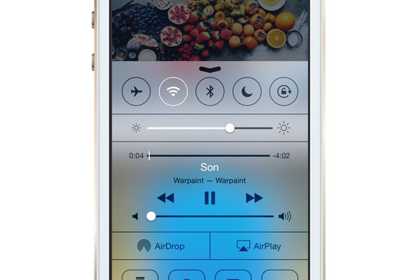
The use of negative space also helps making designs more efficient and usable. It's one of the key components that makes iOS 7 so much different from iOS 6. Combined with a limited set of key colors, this gives you the essential ingredients for well-thought-out user interface design. As designers and developers, we are forced to think more about the design choices we make—even the small ones.
A major, and perhaps controversial, change has been the switch to borderless buttons, a critical change in iOS design patterns. It's perhaps also one of the reasons why iOS 7 initially received a lot of criticism. It's a more extreme approach to flat design. That change perfectly illustrates the fine line between innovative design and design that results in frustration.
And then of course, for user interface elements, there are the nitty-gritty details you have to consider. Toolbar and navigation bar icons, for example, should have a tappable area of at least 44x44 points. For tab bar icons, 50x50 points is recommended. The maximum number of icons in a tab bar is five for the iPhone and iPod Touch. A complete list of recommended sizes of various user interface elements can be found in the Human Interface Guidelines.
The same applies to gestures. Using obscure or difficult-to-guess gestures for common actions leads to confused users. Using a pinch gesture to open a link seems like a pretty bad idea. Right?
Another major focal point of iOS 7 is typography. Apple encourages the use of a single, dynamic font instead of multiple fonts.
There's also a clear vision with regards to application branding. Even though we've become used to explicit branding in applications, Apple now prefers brands that are less explicit in the way they brand and promote themselves. In other words, the design or user interface should be the focus—not the brand. The application's key colors and design language are perfect for promoting a brand in a non-obtrusive manner.
iPad Interface

Design patterns not only dictate best practices for designs in general—they also get specific. Some devices have or require different standards. Some iPad interfaces are a great example.
Popovers and split view controllers, for example, are user interface elements you won't find on an iPhone or iPod Touch. These design patterns cater to larger screens like the one found on the iPad, iPad Air, and iPad Mini.

What To Remember
- Prioritize and present core features first. Identify the major user stories. These should require the least amount of navigation.
- Design patterns often use device-specific functionality to improve the relevance of an application and its contents. The location, for example, is often used to show relevant content to the user.
- Provide navigational clues so that users always know where they are in your application.
- Design patterns are often focused on optimizing the calls to action so users are repeatedly reminded of the next action they need to take. The Tumblr application illustrates this well.
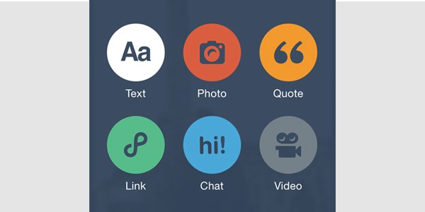
- User input should be as easy and simple as possible. Decrease the number of fields in a form and use default values whenever possible. Tumblr is a good example of smart defaults.
- If a user interface element is tappable, then make sure this is clear for the user through the element's design.
- Mobile design patterns often consist of horizontal flows rather than vertical ones. Automatically animate a new view in instead of waiting for the user to scroll down. It's important to make the experience smooth and seamless. Unlike a website, it's not necessary to confine a particular action (e.g., making a purchase) to a single view. It's often more efficient and elegant to guide the user through a series of views with a single call to action.
- Finally, understand the context of mobile devices. Mobile devices are mostly used in short bursts, which is very different from how we work with a desktop or notebook.
Conclusion
Design patterns rely on common sense and practice. It's pointless to aim for innovative design when chances are that you'll end up with a frustrated user. Stick to guidelines when they're available, use established design patterns, and improve the usability of your product.
Research what solutions other applications use to solve certain problems. How do most applications handle user registration? What are tested approaches for integrating e-commerce? How is social sharing best integrated in an application? Paying attention to detail while using applications is a great way to become familiar with various design patterns.

Comments