If you are interested in building an Android app that makes use of lists to display data, Android Lollipop features two new widgets to make your life easier, RecyclerView and CardView. Using these widgets, it is very easy to give your app a look and feel that conforms to the guidelines mentioned in Google's material design specification.
A great place to get started when building an app is to use an Android app template. You can find hundreds of them on Envato Market, for building everything from a YouTube app to a fun obstacle-avoidance game.
Or you can try this universal Android app template, which gives you a solid base for creating almost any kind of app.

Prerequisites
To follow along, you should be using the latest version of Android Studio. You can get it from the Android Developer website.
1. Support Older Versions
At the time of writing, less than 2% of Android devices run Android Lollipop. However, thanks to the v7 Support Library, you can use the RecyclerView and CardView widgets on devices that run older versions of Android by adding the following lines to the dependencies section in your project's build.grade file:
compile 'com.android.support:cardview-v7:21.0.+'
compile 'com.android.support:recyclerview-v7:21.0.+'
2. Creating a CardView
A CardView is a ViewGroup. Like any other ViewGroup, it can be added to your Activity or Fragment using a layout XML file.
To create an empty CardView, you would have to add the following code to your layout XML as shown in the following snippet:
<android.support.v7.widget.CardView
        xmlns:card_view="http://schemas.android.com/apk/res-auto"
        android:layout_width="match_parent"
        android:layout_height="wrap_content">

</android.support.v7.widget.CardView>
As a more realistic example, let us now create a LinearLayout and place a CardView inside it. The CardView could represent, for example, a person and contain the following:
- a
TextViewto display the name of the person - a
TextViewto display the person's age - an
ImageViewto display the person's photo
This is what the XML would look like:
<?xml version="1.0" encoding="utf-8"?>
<LinearLayout xmlns:android="http://schemas.android.com/apk/res/android"
    android:layout_width="match_parent" android:layout_height="match_parent"
    android:padding="16dp"
    >

    <android.support.v7.widget.CardView
        android:layout_width="match_parent"
        android:layout_height="wrap_content"
        android:id="@+id/cv"
        >

        <RelativeLayout
            android:layout_width="match_parent"
            android:layout_height="wrap_content"
            android:padding="16dp"
            >

            <ImageView
                android:layout_width="wrap_content"
                android:layout_height="wrap_content"
                android:id="@+id/person_photo"
                android:layout_alignParentLeft="true"
                android:layout_alignParentTop="true"
                android:layout_marginRight="16dp"
                />

            <TextView
                android:layout_width="wrap_content"
                android:layout_height="wrap_content"
                android:id="@+id/person_name"
                android:layout_toRightOf="@+id/person_photo"
                android:layout_alignParentTop="true"
                android:textSize="30sp"
                />

            <TextView
                android:layout_width="wrap_content"
                android:layout_height="wrap_content"
                android:id="@+id/person_age"
                android:layout_toRightOf="@+id/person_photo"
                android:layout_below="@+id/person_name"
                />

        </RelativeLayout>

    </android.support.v7.widget.CardView>

</LinearLayout>
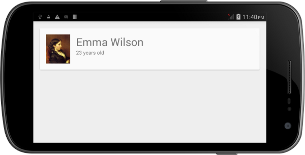
If this XML is used as the layout of an Activity, with the TextView and ImageView fields are set to meaningful values, then this is how it would render on an Android device:
3. Creating a RecyclerView
Step 1: Defining It in a Layout
Using a RecyclerView instance is slightly more complicated. However, defining it in a layout XML file is quite simple. You can define it in a layout as follows:
<android.support.v7.widget.RecyclerView
    android:layout_width="match_parent"
    android:layout_height="match_parent"
    android:id="@+id/rv"
    />
To obtain a handle to it in your Activity, use the following snippet:
RecyclerView rv = (RecyclerView)findViewById(R.id.rv);
If you are sure that the size of the RecyclerView won't be changing, you can add the following to improve performance:
rv.setHasFixedSize(true);
Step 2: Using a LayoutManager
Unlike a ListView, a RecyclerView needs a LayoutManager to manage the positioning of its items. You could define your own LayoutManager by extending the RecyclerView.LayoutManager class. However, in most cases, you could simply use one of the predefined LayoutManager subclasses:
LinearLayoutManagerGridLayoutManager-
StaggeredGridLayoutManager
In this tutorial, I am going to use a LinearLayoutManager. This LayoutManager subclass will, by default, make your RecyclerView look like a ListView.
LinearLayoutManager llm = new LinearLayoutManager(context);
rv.setLayoutManager(llm);
Step 3: Defining the Data
Just like a ListView, a RecyclerView needs an adapter to access its data. But before we create an adapter, let us create data that we can work with. Create a simple class to represent a person and then write a method to initialize a List of Person objects:
class Person {
    String name;
    String age;
    int photoId;

    Person(String name, String age, int photoId) {
        this.name = name;
        this.age = age;
        this.photoId = photoId;
    }
}

private List<Person> persons;

// This method creates an ArrayList that has three Person objects
// Checkout the project associated with this tutorial on Github if
// you want to use the same images.
private void initializeData(){
    persons = new ArrayList<>();
    persons.add(new Person("Emma Wilson", "23 years old", R.drawable.emma));
    persons.add(new Person("Lavery Maiss", "25 years old", R.drawable.lavery));
    persons.add(new Person("Lillie Watts", "35 years old", R.drawable.lillie));
}
Step 4: Creating an Adapter
To create an adapter that a RecyclerView can use, you must extend RecyclerView.Adapter. This adapter follows the view holder design pattern, which means that it you to define a custom class that extends RecyclerView.ViewHolder. This pattern minimizes the number of calls to the costly findViewById method.
Earlier in this tutorial, we already defined the XML layout for a CardView that represents a person. We are going to reuse that layout now. Inside the constructor of our custom ViewHolder, initialize the views that belong to the items of our RecyclerView.
public class RVAdapter extends RecyclerView.Adapter<RVAdapter.PersonViewHolder>{

    public static class PersonViewHolder extends RecyclerView.ViewHolder {
		CardView cv;
        TextView personName;
        TextView personAge;
        ImageView personPhoto;

        PersonViewHolder(View itemView) {
            super(itemView);
            cv = (CardView)itemView.findViewById(R.id.cv);
            personName = (TextView)itemView.findViewById(R.id.person_name);
            personAge = (TextView)itemView.findViewById(R.id.person_age);
            personPhoto = (ImageView)itemView.findViewById(R.id.person_photo);
        }
	}

}
Next, add a constructor to the custom adapter so that it has a handle to the data that the RecyclerView displays. As our data is in the form of a List of Person objects, use the following code:
List<Person> persons;

RVAdapter(List<Person> persons){
    this.persons = persons;
}
RecyclerView.Adapter has three abstract methods that we must override. Let us start with the getItemCount method. This should return the number of items present in the data. As our data is in the form of a List, we only need to call the size method on the List object:
@Override
public int getItemCount() {
    return persons.size();
}
Next, override the onCreateViewHolder method. As its name suggests, this method is called when the custom ViewHolder needs to be initialized. We specify the layout that each item of the RecyclerView should use. This is done by inflating the layout using LayoutInflater, passing the output to the constructor of the custom ViewHolder.
@Override
public PersonViewHolder onCreateViewHolder(ViewGroup viewGroup, int i) {
    View v = LayoutInflater.from(viewGroup.getContext()).inflate(R.layout.item, viewGroup, false);
    PersonViewHolder pvh = new PersonViewHolder(v);
    return pvh;
}
Override the onBindViewHolder to specify the contents of each item of the RecyclerView. This method is very similar to the getView method of a ListView's adapter. In our example, here's where you have to set the values of the name, age, and photo fields of the CardView.
@Override
public void onBindViewHolder(PersonViewHolder personViewHolder, int i) {
    personViewHolder.personName.setText(persons.get(i).name);
    personViewHolder.personAge.setText(persons.get(i).age);
    personViewHolder.personPhoto.setImageResource(persons.get(i).photoId);
}
Finally, you need to override the onAttachedToRecyclerView method. For now, we can simply use the superclass's implementation of this method as shown below.
@Override
public void onAttachedToRecyclerView(RecyclerView recyclerView) {
    super.onAttachedToRecyclerView(recyclerView);
}
Step 5: Using the Adapter
Now that the adapter is ready, add the following code to your Activity to initialize and use the adapter by calling the adapter's constructor and the RecyclerView's setAdapter method:
RVAdapter adapter = new RVAdapter(persons);
rv.setAdapter(adapter);
Step 6: Compile and Run
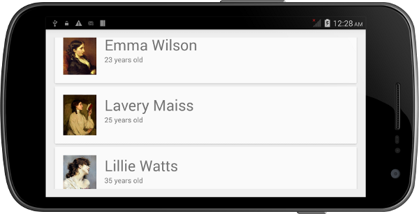
When you run the RecyclerView example on an Android device, you should see something similar to the following result.
Conclusion
In this tutorial, you have learned how to use the CardView and RecyclerView widgets that were introduced in Android Lollipop. You have also seen examples of how to make use of these widgets in Material Design apps. Note that even though a RecyclerView can do almost everything a ListView can, for small datasets, using a ListView is still preferable as it requires fewer lines of code.
You can refer to the Android Developers Reference for more information about the CardView and RecyclerView classes.
And if you want to speed up your app development, don't forget to check out those Android app templates on Envato Market.

Comments