If you're anything like me, you use YouTube to host any video you add to your WordPress site. It saves worrying about browser or device compatibility, it saves space on your servers, and it can be a lot more reliable.
In addition, it means your videos can be accessed by YouTube viewers as well as visitors to your site or blog.
However, adding streamed YouTube videos has two downsides:
- By default, they aren't responsive. Videos are contained in a
<iframe>element and with the best will in the world, you can't make one of those responsive. - If you're developing a site for clients who aren't coders, expecting them to open up the 'Text' tab of the Post Editor and copy in an embed code from YouTube may be too daunting for them, or - even worse - it may give them an opportunity to break the site.
In this tutorial I'll show you how to create a shortcode enabling you or your client to add embedded YouTube video in the 'Visual' editing view and will automatically make that video responsive.
What You'll Need to Complete This Tutorial
To complete this tutorial, you'll need:
- A development or test site with WordPress installed
- A code editor
- An FTP program to upload your plugin (which may be incorporated into your code editor)
Setting Up the Plugin
Start by opening a new file in your text editor, and naming it - mine is called wptutsplus-responsive-video-shortcode.php but you can call yours whatever you like.
In the file, insert the following code:
<?php
/*
Plugin Name: WpTuts+ Responsive Video Shortcode
Plugin URI: http://rachelmccollin.com
Description: This plugin provides a shortcode you wrap around the ID of a video in YouTube. The plugin then adds the necessary markup and CSS to make that video responsive. To use it, type [responsive-video]'source'[/responsive-video], where 'source' is the iframe embed code for your video.
Version: 1.0
Author: Rachel McCollin
Author URI: http://rachelmccollin.com
License: GPLv2
*/
?>
This sets up your plugin and tells WordPress its name and version.
Adding the Shortcode Function
Below this opening text, add the function which will create the shortcode and hook it to the add_shortcode action hook:
<?php
// register the shortcode to wrap html around the content
function wptuts_responsive_video_shortcode( $atts ) {
	extract( shortcode_atts( array (
		'identifier' => ''
	), $atts ) );
	return '<div class="wptuts-video-container"><iframe src="//www.youtube.com/embed/' . $identifier . '" height="240" width="320" allowfullscreen="" frameborder="0"></iframe></div>
	<!--.wptuts-video-container-->';
}
add_shortcode ('responsive-video', 'wptuts_responsive_video_shortcode' );
?>
This creates the shortcode itself. Let's look at what that shortcode will output:
- A containing
divwith the classwptuts-video-container, which will be used to add CSS to make the video responsive - An
iframeelement within that containingdiv - The link to the YouTube video within the embed code, with
$identifierin place of the unique identifying code for the video - An attribute of
$identifierwhich the user will specify when adding the shortcode to a page or post on the site. This means that he or she won't need to type or copy the whole embed code
Adding CSS to Make Things Responsive
The next step is to add the styling which will make that containing div responsive. Open a new file in your code editor and call it style.css. In the new stylesheet add the following:
/*
stylesheet for use with responsive video shortcode plugin.
Provides the CSS that makes the video responsive.
*/

.wptuts-video-container {
	position: relative;
	padding-bottom: 56.25%;
	padding-top: 30px;
	height: 0;
	overflow: hidden;
}

.wptuts-video-container iframe {
	position: absolute;
	top:0;
	left: 0;
	width: 100%;
	height: 100%;
}
What this does is the following:
- It makes the cointaining
divresponsive, usingpadding-bottomto define the aspect ratio (in this case 16:9). Thepadding-topdeclaration provides the space for the border at the top of the video. Usingpadding-bottominstead ofheightmeans that if thedivis resized, it will maintain its aspect ratio. - It adds absolute postiioning to the
iframeelement, ensuring that it fills the space taken up by the containingdiv. This makes the video responsive.
Now save your stylesheet.
Registering the Stylesheet in the Plugin
The final step is to register the stylesheet within the plugin so it makes use of the CSS you've just added.
Open the plugin file again. Above the code for the shortcode itself, add the following:
<?php
// Register stylesheet with hook 'wp_enqueue_scripts', which can be used for front end CSS and JavaScript
function wptuts_responsive_video_add_stylesheet() {
	wp_register_style( 'wptuts_responsive_video_style', plugins_url( 'style.css', __FILE__ ) );
	wp_enqueue_style( 'wptuts_responsive_video_style' );
}
add_action( 'wp_enqueue_scripts', 'wptuts_responsive_video_add_stylesheet' );
?>
This registers the stylesheet and enqueues it using wp_enqueue_scripts, which is the correct way to add stylesheets and scripts in WordPress.
Using the Shortcode
Now save both of your files in a folder with the name of your plugin - I'm calling my folder wptutsplus-responsive-video-shortcode. Save this and upload it to the plugins folder in your test site. Activate the plugin.
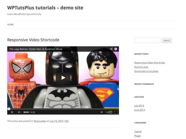
I'm going to use a Lego Superheroes video (as I know that will make my sons happy). Its unique identifier is O56p5nOYNHo, which you can copy from the URL when viewing the video on the YouTube site. In a new or existing post or page, add the shortcode as follows:
[responsive-video identifier="O56p5nOYNHo"]
Save the post and view it. You'll find that the video is streamed, as shown in the screenshot:
Now try resizing your browser window, or viewing the post on a mobile device. The video automatically resizes:
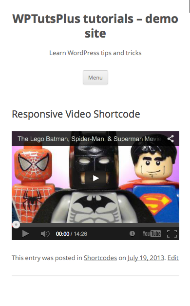
So you're now able to stream any YouTube video you want into your site without straying from the Visual Editor and without having to worry about users on different devices.

Comments