When creating a dynamic set of options, you should always provide an end user with a set of choices, and radio type options in Titan Framework can help in this regard. Let's see how you can create radio type options inside a WordPress custom admin panel, a meta box or the theme customizer.
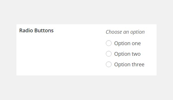
The Radio Type Button in Titan Framework
A set of radio type buttons can be added with Titan Framework, from which you can select a single option. It appears like this:
This option type supports the following parameters:
-
name: It shows the display name of the
radiotype option. - id: This parameter assigns a unique name which helps to get the saved options values.
- options: It is an associative array which takes up value–label pair options displayed as radio buttons.
-
default: (Optional) It assigns a default value.
- desc:(Optional) It displays a one-line description with the option name.
-
livepreview: (Optional) This parameter displays the live preview of changes when a
radiotype option is added inside a theme customizer section. - css: (Optional) Whenever you add this option inside an admin page and/or theme customizer section, this parameter automatically generates CSS.
All the parameters are of type string except the options parameter, which is array by type.
Available Containers for the Radio Type Option
The radio type option can be created inside:
- Admin Panel
- Admin Tabs
- Metabox
- Theme Customizer Section
The general format of adding this option is the same:
- Get a unique instance via the
getInstance()function. - Add an option via the
createOption()function. - Get saved values via the
getOption()function.
However, if you want to learn about how these containers are created with Titan Framework then skim through my previous articles.
Creating a Radio Type Option Inside an Admin Panel
Example Declaration
First I'll create this option type inside an admin panel.
<?php
    /**
     *
     * Create the options
     *
     */
    $aa_panel->createOption( array(

        'id'      => 'aa_radio', // The ID which will be used to get the value of this option
        'type'    => 'radio', // Type of option we are creating
        'name'    => 'Choose Radio Buttons', // Name of the option which will be displayed in the admin panel
        'desc'    => 'This is our option', // Description of the option which will be displayed in the admin panel
        'default' => 'aa_bdy', //Default value of radio buttons
        'options' => array(
                            'aa_hdr' => 'Header',
                            'aa_bdy' => 'Body',
                            'aa_ftr' => 'Footer'
                    )

    ) );
I'm adding a radio type option in an admin panel $aa_panel via the createOption() function in line #7. As you can see, this function takes up an array of parameters which this option supports. So, I've defined values for parameters id, type, name, desc, default and options.
In this code, I created a list of three radio buttons named Header, Body and Footer, each having a unique key, i.e. aa_hdr, aa_bdy and aa_ftr. Think of it like a set of options which you want an end user to choose from. For example, if you want to display a note, a user could choose if it should be displayed in the header, body or footer.
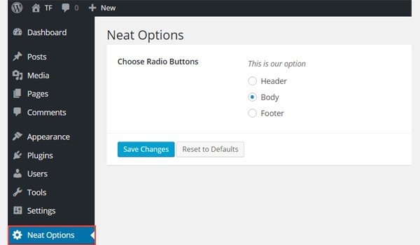
You can find a radio type option inside an admin panel Neat Options.
Example Usage
Let's get its saved values.
<?php
// 1. Get the titan framework instance and save it to a variable
$titan = TitanFramework::getInstance( 'neat' ); // we will initialize $titan only once for every file where we use it.

// 2. Get the value via ID using getOption function
$aa_radio_val = $titan->getOption( 'aa_radio' );

/**
 *
 * Print option values
 *
 */
if ( 'aa_hdr' == $aa_radio_val ) {

    echo 'You Selected Header';

} elseif ( 'aa_bdy' == $aa_radio_val) {

    echo 'You selected Body';

} else {

    echo 'You selected Footer';
}

?>
First of all, get a unique instance value in line #3. Then use the getOption() function, which takes up the ID aa_radio as a parameter (line #6). Finally, lines #14 to #28 are used to print the values at the front-end via simple if-else check statements in PHP.
According to these statements:
- If the value of variable
$aa_radio_valequals the labelaa_hdrthen print 'You Selected Header'. - If the value of variable
$aa_radio_valequals the labelaa_bdythen print 'You Selected Body'. - If the value of labels is not
aa_hdroraa_bdythen print 'You Selected Footer'.
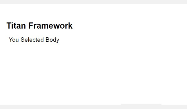
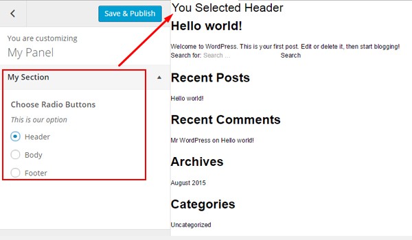
Displaying the Result at the Front-End
Suppose I selected Header as a demo value.
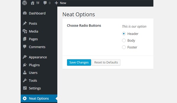
Now, this setting should print 'You Selected Header' like this:

Creating a Radio Type Option Inside an Admin Tab
Example Declaration
Let's create this option type inside an admin tab.
<?php

    /**
     *
     * Create radio type option in an admin tab
     *
     */
    $aa_tab1->createOption( array(

        'id'      => 'aa_radio_in_tab1_panel2', // IDs should always be unique. The ID which will be used to get the value of this option
        'type'    => 'radio', // Type of option we are creating
        'name'    => 'Choose Radio Buttons', // Name of the option which will be displayed in the admin panel
        'desc'    => 'This is our option', // Description of the option which will be displayed in the admin panel
        'default' => 'aa_bdy', //Default value of radio buttons
        'options' => array(
                            'aa_hdr' => 'Header',
                            'aa_bdy' => 'Body',
                            'aa_ftr' => 'Footer'
                    )
     ) );
Now I'll add this option in an admin tab $aa_tab1 via the createOption() function. Its ID is aa_radio_in_tab1_panel2.
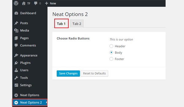
The above screenshot shows this option in Tab 1 of Neat Options 2.
Example Declaration
Let's write the code for getting the saved values.
<?php
// 1. Get the titan framework instance and save it to a variable
$titan = TitanFramework::getInstance( 'neat' ); // we will initialize $titan only once for every file where we use it.

// 2. Get the value via ID using getOption function
$aa_radio_in_tab1_panel2_val = $titan->getOption( 'aa_radio_in_tab1_panel2' );

/**
 *
 * Print option values
 *
 */
if ( 'aa_hdr' == $aa_radio_in_tab1_panel2_val ) {

    echo 'You Selected Header';

} elseif ( 'aa_bdy' == $aa_radio_in_tab1_panel2_val ) {

    echo 'You Selected Body';

} else {

    echo 'You Selected Footer';

}

?>
The process of getting the saved options values is pretty much the same. So, instead of going into details I'm listing the points:
- First call a unique instance via the
getInstance()function in line #3. - Then use the
getOption()function and register the IDaa_radio_in_tab1_panel2. - Save this value inside a new variable
$aa_radio_in_tab1_panel2_valin line #6. - Next print the values at the front-end via an if-else check, i.e. lines #14 to #28.
Displaying the Result at the Front-End
I selected Body. Now this setting should print 'You Selected Body' at the front-end. Here is the screenshot:
Creating a Radio Type Option Inside a Metabox
Example Declaration
Now I'll write the code for a metabox.
<?php
    /**
     *
     * Create the options
     *
     */
    $aa_metbox->createOption( array(

        'id'      => 'aa_mb_radio', // The ID which will be used to get the value of this option
        'type'    => 'radio', // Type of option we are creating
        'name'    => 'Choose Radio Buttons', // Name of the option which will be displayed
        'desc'    => 'This is our option', // Description of the option which will be displayed
        'default' => 'aa_bdy', //Default value of radio buttons
        'options' => array(
                            'aa_hdr' => 'Header',
                            'aa_bdy' => 'Body',
                            'aa_ftr' => 'Footer'
                        )

    ) );
This time I added a radio type option in a metabox $aa_metbox with ID aa_mb_radio.
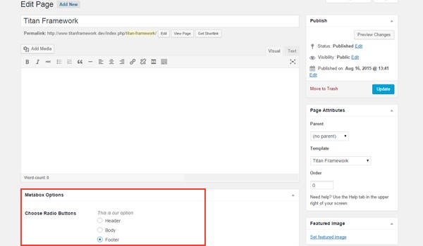
You can find this option named Choose Radio Buttons in a metabox. This screenshot is of a page editing screen. You will find similar option displayed in your post editing screens as well.
Example Usage
Now I'll show how you can get a saved value in a metabox.
<?php
// 1. Get the titan framework instance and save it to a variable
$titan = TitanFramework::getInstance( 'neat' ); // we will initialize $titan only once for every file where we use it.

// 2. Get the value via ID using getOption function
$aa_mb_radio_val = $titan->getOption( 'aa_mb_radio', get_the_ID() );

/**
 * Print option values
 *
 */
if ( 'aa_hdr' == $aa_mb_radio_val ) {

    echo 'You Selected Header';

} elseif ( 'aa_bdy' == $aa_mb_radio_val ) {

    echo 'You Selected Body';

} else {

    echo 'You Selected Footer';

}
The entire code is the same, except in line #6 where I've used the get_the_ID() function, which helps to fetch the saved value from any specific page or post ID.
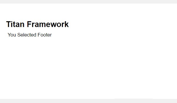
Displaying the Result at the Front-End
This time I chose Footer as the demo value. At the front-end, 'You Selected Footer' should print like this:
Creating a Radio Type Option in a Theme Customizer Section
Example Declaration
Here is its code.
<?php
    /**
     *
     * Create the option
     *
     */
    $aa_section1->createOption( array(

        'id'      => 'aa_sec_radio', // The ID which will be used to get the value of this option
        'type'    => 'radio', // Type of option we are creating
        'name'    => 'Choose Radio Buttons', // Name of the option which will be displayed
        'desc'    => 'This is our option', // Description of the option which will be displayed
        'default' => 'aa_bdy', //Default value of radio buttons
        'options' => array(
                            'aa_hdr' => 'Header',
                            'aa_bdy' => 'Body',
                            'aa_ftr' => 'Footer'
                        )

    ) );
In the end, I'll add this option in a theme customizer section $aa_section1 whose unique ID is aa_sec_radio.
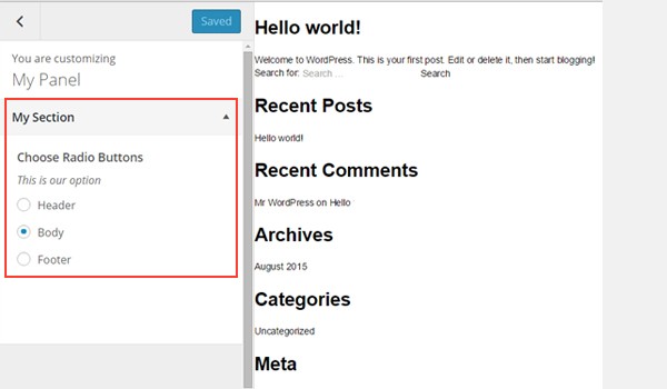
You can find a list of radio options inside the Section 1 tab.
Example Usage
Let's retrieve the values.
<?php
// 1. Get the titan framework instance and save it to a variable
$titan = TitanFramework::getInstance( 'neat' ); // we will initialize $titan only once for every file where we use it.

// 2. Get the value via ID using getOption function
$aa_sec_radio_val = $titan->getOption( 'aa_sec_radio', get_the_ID() );

/**
 *
 * Print option values
 *
 */
if ( 'aa_hdr' == $aa_sec_radio_val ) {

    echo 'You Selected Header';

} elseif ( 'aa_bdy' == $aa_sec_radio_val ) {

    echo 'You Selected Body';

} else {

    echo 'You Selected Footer';

}
Once again, getting the saved options values is done in the same manner. Only the ID and variable names are different.
Displaying the Result at the Front-End
Here's a screenshot of the live changes which take place when I change the option settings.
Now I'll show you how to display color palettes in the form of radio options inside a custom WordPress admin panel, a metabox, or a section of your theme customizer.
The Radio-Palette Type Option in Titan Framework
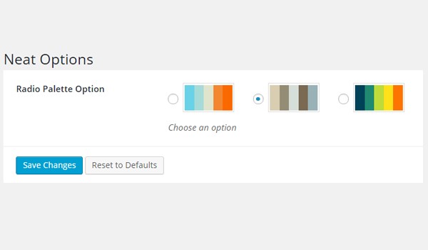
In Titan Framework, there is a cool option type, radio-palette. It can be used to offer color palettes inside your theme. Here is what it looks like:

Let's discuss the settings of this option.
- name: This parameter shows the display name.
- id: It defines a unique name which gets the saved values.
- desc: A brief description which appears with the option name.
- options: This defines a two-dimensional array which has sets of hex color values.
- default: (Optional) It defines the options index of the default palette/color array.
-
livepreview: (Optional) This parameter displays the live preview of changes when a
radio-palettetype option is added inside a theme customizer section. - css: (Optional) Whenever you add this option inside an admin page and/or theme customizer section, this parameter automatically generates CSS.
All the parameters are of type string, except the options which is array by type.
Available Containers for the Radio-Palette Type Option
You can add this option inside:
- Admin Panel
- Admin Tabs
- Metabox
- Theme Customizer Section
During its creation, you will follow a similar format:
- Get a unique instance via the
getInstance()function. - Add an option via the
createOption()function. - Get the saved values via the
getOption()function.
The explanation of creating these containers is beyond the scope of this article. However, you can find their detail in previous articles of this series.
Creating a Radio-Palette Type Option Inside an Admin Panel
Example Declaration
Let's create this option type inside an admin panel.
<?php
    /**
     * Create the radio-palette type option
     *
     *
     *
     */
    $aa_panel->createOption( array(


        'id'      => 'aa_rad_palette', // The ID which will be used to get the value of this option
        'type'    => 'radio-palette', // Type of option we are creating
        'name'    => 'Radio Palette Option', // Name of option we are creating
        'desc'    => 'Choose an option', // Brief description about the option
        'options' => array(              // A 2-dimentional array containing hex color values sets
                            array(
                                "#69D2E7",
                                "#A7DBD8",
                                "#E0E4CC",
                                "#F38630",
                                "#FA6900",
                            ),

                            array(
                                "#D9CEB2",
                                "#948C75",
                                "#D5DED9",
                                "#7A6A53",
                                "#99B2B7",
                            ),

                            array(
                                "#004358",
                                "#1F8A70",
                                "#BEDB39",
                                "#FFE11A",
                                "#FD7400",
                            ),

    ) ) );
In line #8, I'm adding a radio-palette type option in an admin panel $aa_panel via the createOption() function. This function takes up an array of parameters which I've defined above.
I defined the unique ID as aa_rad_palette in line #11. The most important parameter is defined in line #15 which is the options parameter. It's a two-dimensional array, which takes up multiple hex color values. Each array set adds a color palette. So between line #16 and #38 there are three such arrays; hence three options of color palette.

In the above screenshot, there are three color palettes which appear against the name Radio Palette Option inside admin panel Neat Options.
Example Usage
Now I'll write the code for getting the saved options values.
<?php
// 1. Get the titan framework instance and save it to a variable
$titan = TitanFramework::getInstance( 'neat' ); // we will initialize $titan only once for every file where we use it.
// 2. Get the value via ID using getOption function
$aa_rad_palette_val = $titan->getOption( 'aa_rad_palette' );
<?php
/**
* Print Admin panel option values
*/
?>
<div>
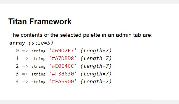
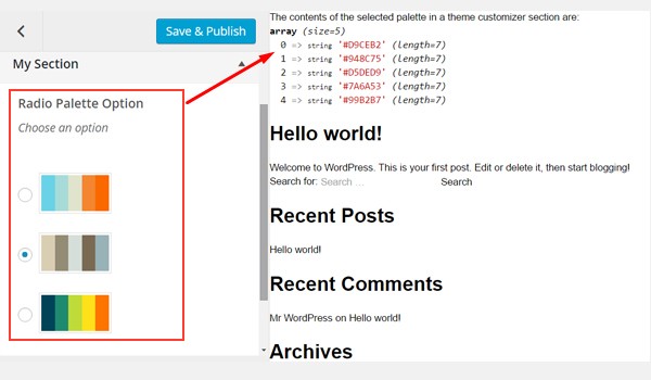
The contents of the selected palette in an admin panel are: <?php var_dump($aa_rad_palette_val); ?>
</div>
The return value mechanism of this option works in such a way that it returns all the colors' hex values of the selected palette. So, to get these values, call an instance via the getInstance() function in line #3. Make sure that you register a unique parameter with this function. I'll recommend keeping your theme name. That's why I used neat here.
In line #6, use the getOption() function, which retrieves the saved values by registering the option ID, i.e. aa_rad_palette. I saved its result to a new variable, $aa_rad_palette_val.
As I've mentioned, the return values are the colors of the selected palette. So, adopt a method which prints the array contents, for example:
- using the
var_dump()function - using the
print_r()function
I'm using the var_dump() function to see what gets saved in $aa_rad_palette_val.
Displaying the Result at the Front-End
Suppose I selected the second color palette:
Here's the screenshot of the front-end:
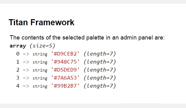
All the array contents of the second color palette get printed as shown above. Now you can easily use these values by accessing any element of this array, e.g. $aa_rad_palette_val[0] will provide you with #D9CEB2 hex color.
Creating a Radio-Palette Type Option Inside an Admin Tab
Example Declaration
Now I'll add this option inside an admin tab.
<?php
    /**
     * Create the radio-palette type option
     *
     *
     *
     */
    $aa_tab1->createOption( array(


        'id'      => 'aa_rad_palette_in_tab1_panel2', // The ID which will be used to get the value of this option
        'type'    => 'radio-palette', // Type of option we are creating
        'name'    => 'Radio Palette Option', // Name of option we are creating
        'desc'    => 'Choose an option', // Brief description about the option
        'options' => array(              // A 2-dimentional array containing hex color values sets
                            array(
                                "#69D2E7",
                                "#A7DBD8",
                                "#E0E4CC",
                                "#F38630",
                                "#FA6900",
                            ),

                            array(
                                "#D9CEB2",
                                "#948C75",
                                "#D5DED9",
                                "#7A6A53",
                                "#99B2B7",
                            ),

                            array(
                                "#004358",
                                "#1F8A70",
                                "#BEDB39",
                                "#FFE11A",
                                "#FD7400",
                            ),

    ) ) );
This time I'm adding a radio palette inside an admin tab $aa_tab1 with ID aa_rad_palette_in_tab1_panel2. Once again, I'm defining three arrays of color values, i.e. three color palette options.
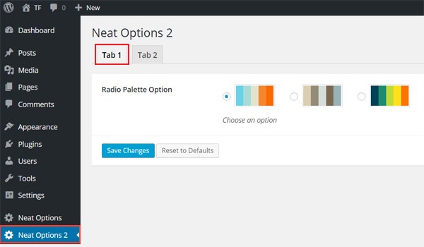
Here is the screenshot, where you can find a radio-palette type option in Tab 1 of admin panel Neat Option 2.
Example Usage
Let's get the saved options values.
<?php
// 1. Get the titan framework instance and save it to a variable
$titan = TitanFramework::getInstance( 'neat' ); // we will initialize $titan only once for every file where we use it.

// 2. Get the value via ID using getOption function
$aa_rad_palette_in_tab1_panel2_val = $titan->getOption( 'aa_rad_palette_in_tab1_panel2' );

<?php
/**
 *  Print Admin tab option values
 */

?>

<div>
    The contents of the selected palette in an admin tab are: <?php var_dump($aa_rad_palette_in_tab1_panel2_val); ?>
</div>
The code is exactly the same, so I'm summarizing all its points:
- Get a unique instance in line #3.
- Retrieve the saved value via the
getOption()function in line #6. - Print the array contents via the
var_dump()function in line #16.
Displaying the Result at the Front-End
This time I choose the first palette, and here are its contents.
Creating a Radio-Palette Type Option Inside a Metabox
Example Declaration
Let's create a radio-palette type option in a metabox.
<?php
    /**
     *
     * Create the radio-palette type option
     *
     */
    $aa_metbox->createOption( array(


        'id'      => 'aa_mb_rad_palette', // The ID which will be used to get the value of this option
        'type'    => 'radio-palette', // Type of option we are creating
        'name'    => 'Radio Palette Option', // Name of option we are creating
        'desc'    => 'Choose an option', // Brief description about the option
        'options' => array(              // A 2-dimentional array containing hex color values sets
                            array(
                                "#69D2E7",
                                "#A7DBD8",
                                "#E0E4CC",
                                "#F38630",
                                "#FA6900",
                            ),

                            array(
                                "#D9CEB2",
                                "#948C75",
                                "#D5DED9",
                                "#7A6A53",
                                "#99B2B7",
                            ),

                            array(
                                "#004358",
                                "#1F8A70",
                                "#BEDB39",
                                "#FFE11A",
                                "#FD7400",
                            ),

    ) ) );
A radio-palette type option exists in a metabox $aa_metbox with a unique ID aa_mb_rad_palette. The createOption() function in line #8 takes up the same list of parameters which I've mentioned in previous examples.
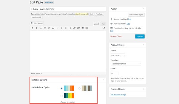
The above screenshot shows a page editing screen, and right at the end, a Radio Palette Option is displayed in a metabox.
Example Usage
Here is the code.
<?php
// 1. Get the titan framework instance and save it to a variable
$titan = TitanFramework::getInstance( 'neat' ); // we will initialize $titan only once for every file where we use it.
// 2. Get the value via ID using getOption function
$aa_mb_rad_palette_val = $titan->getOption( 'aa_mb_rad_palette', get_the_ID() );
<?php
/**
* Print Metabox option values
*/
?>
<div>
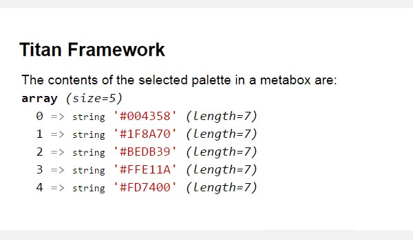
The contents of the selected palette in a metabox are: <?php var_dump($aa_mb_rad_palette_val); ?>
</div>
In line #6, there is an additional get_the_ID() function which provides the ID for a specific page/post or a post_type. The rest of the code is same.
Displaying the Result at the Front-End
Choose the third color palette, for example, and save the results. Here are the array contents:
Creating a Radio-Palette Type Option Inside a Theme Customizer Section
Example Declaration
In the end, I'll add this option in a customizer section.
<?php
    /**
     *
     * Create the radio-palette type option
     *
     */
    $aa_section1->createOption( array(


        'id'      => 'aa_sec_rad_palette', // The ID which will be used to get the value of this option
        'type'    => 'radio-palette', // Type of option we are creating
        'name'    => 'Radio Palette Option', // Name of option we are creating
        'desc'    => 'Choose an option', // Brief description about the option
        'options' => array(              // A 2-dimentional array containing hex color values sets
                            array(
                                "#69D2E7",
                                "#A7DBD8",
                                "#E0E4CC",
                                "#F38630",
                                "#FA6900",
                            ),

                            array(
                                "#D9CEB2",
                                "#948C75",
                                "#D5DED9",
                                "#7A6A53",
                                "#99B2B7",
                            ),

                            array(
                                "#004358",
                                "#1F8A70",
                                "#BEDB39",
                                "#FFE11A",
                                "#FD7400",
                            ),

    ) ) );
This code adds a radio-palette type option in a theme customizer section$aa_section in pretty much the same way.
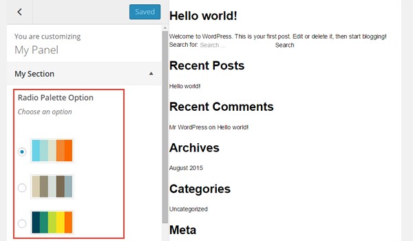
There is a My Section theme customizer section in which there are three options of color palettes named Radio Palette Option.
Example Usage
Let's write the code to get the options values.
<?php
// 1. Get the titan framework instance and save it to a variable
$titan = TitanFramework::getInstance( 'neat' ); // we will initialize $titan only once for every file where we use it.

// 2. Get the value via ID using getOption function
$aa_sec_rad_palette_val = $titan->getOption( 'aa_sec_rad_palette' );

<?php
/**
 * Print Customizer option values
 */
?>

<div>
    The contents of the selected palette in a theme customizer section are: <?php var_dump($aa_sec_rad_palette_val); ?>
</div>
The code for getting the values from a theme customizer section is almost the same. Only the ID and variable names are different. So, you may refer to the details written above.
Displaying the Result at the Front-End
Here is a screenshot of the live changes which take place.
Finally, we're going to explore yet another option type in Titan Framework, theradio-image option, which displays a set of radio buttons with image labels. Today, I am going to write about how you can use the radio-image type option inside a custom admin panel, a metabox, or the theme customizer.
The Radio-Image Type Option in Titan Framework
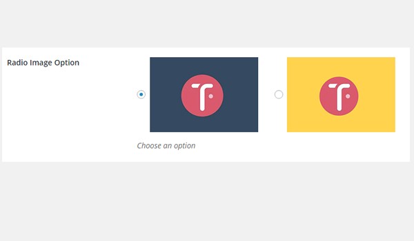
This option type allows the user to select any image from a list of options which appear as radio buttons. The radio-image option in Titan Framework looks like this:
Let's list the parameters of this option:
- name: It displays the name of the option type.
- id: It assigns a unique name which gets the values.
- desc: This parameter adds a brief description to the option type.
- options: (Optional) This defines a two-dimensional array which contains value and image URL pairs.
- default: (Optional) It defines the default value of the option.
-
livepreview: (Optional) This parameter displays a live preview of changes when a
radio-imagetype option is added inside a theme customizer section. - css: (Optional) Whenever you add this option inside an admin page and/or theme customizer section, this parameter automatically generates CSS.
The options parameter is array by type, while the rest are string.
Available Containers for the Radio-Image Type Option
This option type can be added inside:
- Admin Panel
- Admin Tabs
- Metabox
- Theme Customizer Section
Irrespective of the container type, the option is added via the following method:
- Get a unique instance through the
getInstance()function. - Add an option through the
createOption()function. - Get the saved values through the
getOption()function.
If you don't know how to create these containers, head back to previous articles in this series.
Creating a Radio-Image Type Option Inside an Admin Panel
Example Declaration
First of all I'll create this option type inside an admin panel.
<?php
    /**
     * Create the options
     */
    $aa_panel->createOption( array(

            'id'      => 'aa_rad_image', //Unique ID value which gets saved values
            'type'    => 'radio-image', //Type of the option which you create
            'name'    => 'Radio Image Option', //Name of the option which you create
            'desc'    => 'Choose an option', //Brief description about the option
            'options' => array(              //Two-dimensional array with image URLs

                            'aa_hdr_img' => get_template_directory_uri() . '/images/aa_image1.jpg',
                            'aa_bdy_img' => get_template_directory_uri() . '/images/aa_image2.jpg',
                            'aa_ftr_img' => get_template_directory_uri() . '/images/aa_image3.jpg'

                        ),

            'default' => 'aa_bdy_img' //Default value of the option

        ) );
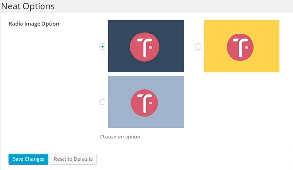
In line #8, I'm adding a radio-image type option with the createOption() function inside an admin panel $aa_panel. This function takes up an array of parameters, i.e. name, id, desc, type, options and default. The ID (line #10) is aa_rad_image, which should always be unique.
The options parameter at line #14 takes an associative array which defines image URLs and their labels. Each of these key-value pairs creates a radio-image option. So, I added three radio image options with labels: aa_hdr_img aa_bdy_img and aa_ftr_img.
The get_template_directory_uri() function is used to fetch the path of the images for each label.
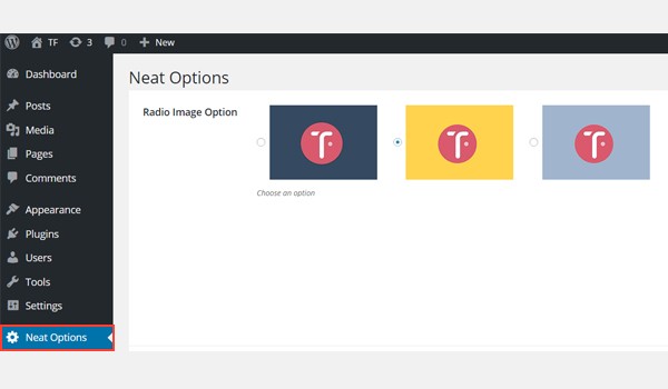
In the above screenshot, you can view three radio-image options inside an admin panel Neat Options.
Example Usage
Let's get the saved values.
<?php
// 1. Get the titan framework instance and save it to a variable
$titan = TitanFramework::getInstance( 'neat' ); // we will initialize $titan only once for every file where we use it.

// 2. Get the value via ID using getOption function
$aa_rad_image_val = $titan->getOption( 'aa_rad_image' );

/**
 *
 * Print Admin panel option values
 *
 */

if ( 'aa_hdr_img' == $aa_rad_image_val ) {

    echo "You've selected Header image.";

} elseif ( 'aa_bdy_img' == $aa_rad_image_val ) {

    echo "You've selected Body image.";

} else {

    echo "You've selected Footer image.";

}

?>
The process of retrieving the saved values starts from getting an instance in line #3 via thegetInstance() function. Then I used the getOption() function in line #6 with a parameter, i.e. an ID aa_rad_image, and saved its value to a new variable$aa_rad_image_val.
Up to this point, the label of the selected radio image gets stored in this variable. This means that the user has selected an image from the dashboard and saved the setting. Now there are several ways in which you can display the saved setting values.
Let's take a look at this simple example. I've used if-else check statements in lines #15 to #26:
- If the value of variable
$aa_rad_image_valis equal to the labelaa_hdr_imgthen print 'You've selected Header image.' - If the value of variable
$aa_rad_image_valis equal to the labelaa_bdy_imgthen print 'You've selected Body image.' - If the value of labels is not
aa_hdr_imgoraa_bdy_imgthen print 'You've selected Footer image.'
Displaying the Result at the Front-End
Suppose I select the first image.
The front-end appears like this:
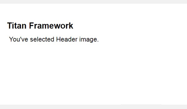
The saved setting was for the label aa_hdr_img, so the corresponding statement was printed.
Creating a Radio-Image Type Option Inside an Admin Tab
Example Declaration
Now I'll create this option inside an admin tab.
<?php
    /**
     *
     * Create the options
     *
     */
    $aa_tab1->createOption( array(

            'id'      => 'aa_rad_image_in_tab1_panel2', //Unique ID value which gets saved values
            'type'    => 'radio-image', //Type of the option which you create
            'name'    => 'Radio Image Option', //Name of the option which you create
            'desc'    => 'Choose an option', //Brief description about the option
            'options' => array(              //Two-dimensional array with image URLs

                            'aa_hdr_img' => get_template_directory_uri() . '/images/aa_image1.jpg',

                            'aa_bdy_img' => get_template_directory_uri() . '/images/aa_image2.jpg',

                            'aa_ftr_img' => get_template_directory_uri() . '/images/aa_image3.jpg'

                        ),

            'default' => 'aa_bdy_img' //Default value of the option

        ) );
This time I'm adding a radio-image type option in an admin tab $aa_tab1 whose ID isaa_rad_image_in_tab1_panel2. Once again, there are three image options.
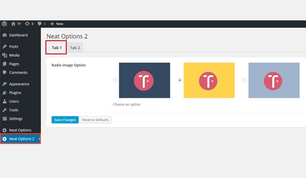
You can find this option inside Tab 1 of the Neat Options 2 panel.
Example Usage
Here is the code for getting the values:
<?php
// 1. Get the titan framework instance and save it to a variable
$titan = TitanFramework::getInstance( 'neat' ); // we will initialize $titan only once for every file where we use it.

// 2. Get the value via ID using getOption function
$aa_rad_image_in_tab1_panel2_val = $titan->getOption( 'aa_rad_image_in_tab1_panel2' );

/**
 *
 * Print Admin tab option values
 *
 */

if ( 'aa_hdr_img' == $aa_rad_image_in_tab1_panel2_val ) {

    echo "You've selected Header image.";

} elseif ( 'aa_bdy_img' == $aa_rad_image_in_tab1_panel2_val ) {

    echo "You've selected Body image.";

} else {

    echo "You've selected Footer image.";

}
 ?>
The code is almost the same, so I'm listing the steps in bullet points:
- Get a unique instance in line #3 via the
getInstance()function. - Retrieve the saved options values in line #6 via the
getOption()function. - Print the saved user settings via
if-elsecheck statements in lines #15 to #27.
Displaying the Result at the Front-End
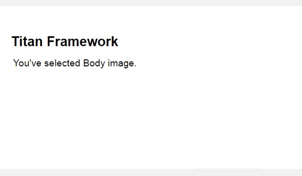
Now I choose the second image. The front-end looks like this:
Creating a Radio-Image Type Option Inside a Metabox
Example Declaration
Now I'll be adding the same radio images in a metabox.
<?php
    /**
     *
     * Create the options
     *
     */
    $aa_metbox->createOption( array(

            'id'      => 'aa_mb_rad_image', //Unique ID value which gets saved values
            'type'    => 'radio-image', //Type of the option which you create
            'name'    => 'Radio Image Option', //Name of the option which you create
            'desc'    => 'Choose an option', //Brief description about the option
            'options' => array(              //Two-dimensional array with image URLs

                            'aa_hdr_img' => get_template_directory_uri() . '/images/aa_image1.jpg',

                            'aa_bdy_img' => get_template_directory_uri() . '/images/aa_image2.jpg',

                            'aa_ftr_img' => get_template_directory_uri() . '/images/aa_image3.jpg'

                        ),

            'default' => 'aa_bdy_img' //Default value of the option

        ) );
A radio-image type option exists inside a metabox $aa_metbox with unique IDaa_mb_rad_image.
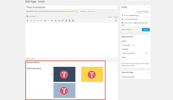
The image above shows a page editing screen, and right at the end there is a metabox within which this option exists.
Example Usage
Let's retrieve the saved values.
<?php
// 1. Get the titan framework instance and save it to a variable
$titan = TitanFramework::getInstance( 'neat' ); // we will initialize $titan only once for every file where we use it.

// 2. Get the value via ID using getOption function
$aa_mb_rad_image_val = $titan->getOption( 'aa_mb_rad_image', get_the_ID() );

/**
 *
 * Print Metabox option values
 *
 */

if ( 'aa_hdr_img' == $aa_mb_rad_image_val ) {

    echo "You've selected Header image.";

} elseif ( 'aa_bdy_img' == $aa_mb_rad_image_val ) {

    echo "You've selected Body image.";

} else {

    echo "You've selected Footer image.";

}

 ?>
The only difference in the above code is found in line #6 where I've defined a new parameter inside the getOption() function. This is the get_the_ID() function which retrieves the value of a specific page or post ID.
Displaying the Result at the Front-End
This time, I selected the third image and preview what appears at the front-end.

The desired result is printed as shown in the above image.
Creating a Radio-Image Type Option Inside a Theme Customizer Section
Example Declaration
Finally, let's add this option in a customizer section.
<?php
    /**
     *
     * Create the options
     *
     */
    $aa_section1->createOption( array(

            'id'      => 'aa_sec_rad_image', //Unique ID value which gets saved values
            'type'    => 'radio-image', //Type of the option which you create
            'name'    => 'Radio Image Option', //Name of the option which you create
            'desc'    => 'Choose an option', //Brief description about the option
            'options' => array(              //Two-dimensional array with image URLs

                            'aa_hdr_img' => get_template_directory_uri() . '/images/aa_image1.jpg',

                            'aa_bdy_img' => get_template_directory_uri() . '/images/aa_image2.jpg',

                            'aa_ftr_img' => get_template_directory_uri() . '/images/aa_image3.jpg'

                        ),

            'default' => 'aa_bdy_img' //Default value of the option

        ) );
A radio-image option whose ID is aa_sec_rad_image is created inside a theme customizer section $aa_section1.
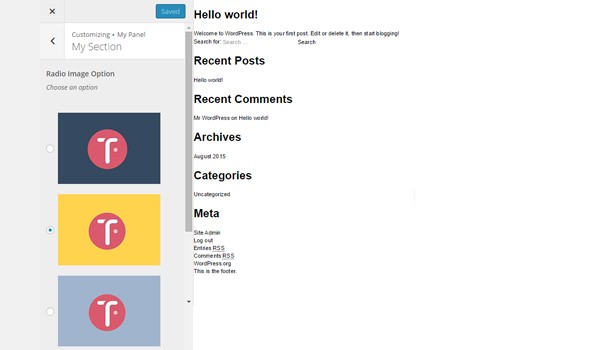
There is a My Section customizer section, within which exists a Radio Image Option field.
Example Usage
Here is the code:
<?php
// 1. Get the titan framework instance and save it to a variable
$titan = TitanFramework::getInstance( 'neat' ); // we will initialize $titan only once for every file where we use it.

// 2. Get the value via ID using getOption function
$aa_sec_rad_image_val = $titan->getOption( 'aa_sec_rad_image' );

/**
 *
 * Print Customizer option values
 *
 */

if ( 'aa_hdr_img' == $aa_sec_rad_image_val ) {

    echo "You've selected Header image.";

} elseif ( 'aa_bdy_img' == $aa_sec_rad_image_val ) {

    echo "You've selected Body image.";

} else {

    echo "You've selected Footer image.";

}

?>
This entire code is the same—only the ID and variable names are different.
Displaying the Result at the Front-End
Here's a screenshot of the live changes which took place as I saved my settings:

The radio-image type option can be used to help a user choose different layouts of your theme.
For example, most commercial themes allow the end user to choose between a left sidebar, right sidebar or no sidebar with a full-width page. This can be done with a radio-image type option in a metabox. You can also create several layouts for the output of a plugin, or provide the user with different background patterns to choose from.
Conclusion
So this is how you can add a set of radio buttons in different containers. These buttons can be used to achieve an extended level of functionality in various places in your themes.
Additionally, this was quite a handy way of introducing some easy styling properties within your WordPress themes. You can add radio palettes to allow users to change the theme's skins. In the next article, we'll explore another option which is related to this radio type.
For example, in a plugin, I gave a user two radio buttons to choose a full-width button or not. I named the option "Make The Buttons Full Width?" with options "Yes" or "No". But I used an associative ID for these options to be 100% or auto, which I used to output the CSS. Check the code below to see if you can understand the trick here:
<?php

$sec_btn->createOption( array(

    'id'      => 'cfc_btn_width',
    'type'    => 'radio',

    'options' => array(
            '100%' => 'YES',
            'auto' => 'NO'
        ),

    'name'    => 'Make The Buttons Full Width?',
    'css'     => '#aa_btn--primary{ width: value; }'

) );
Cool, eh?
In the next article, we will explore some more options which are related to this radio type. Let me know if you have any questions via comments, or reach out on Twitter.

Comments