A strong web presence can make a significant contribution to a successful mobile app launch. For iPhone applications, iTunes provides a description of your application and screenshots. It also provides a website link, and the site you list will say a lot about the development company or individual behind the app. Making a custom landing page will also help you drive sales from other marketing methods, such as search engine traffic or paid advertising. In this article, we will explore 7 great examples of how successful iPhone developers and development companies are using websites to promote their mobile applications. Next week, we will followup with another article showing website templates available for you to quickly create your own promotional sites!
Tap Tap Tap
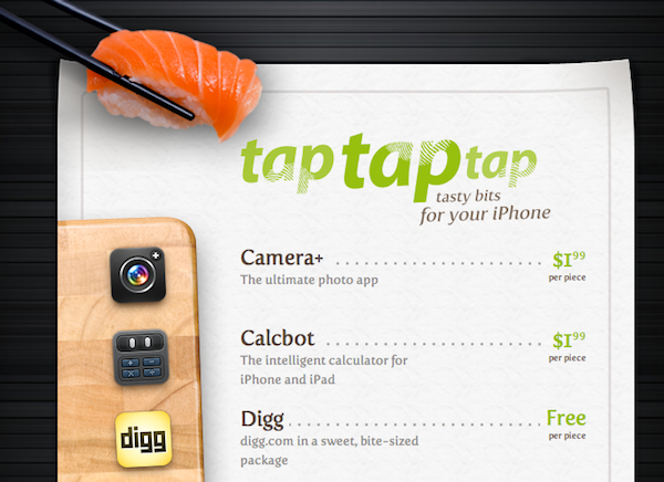
tap tap tap is a well known iPhone app development company that has made many popular applications, including: Camera+, Classics, Calcbot, Digg, and Voices. On their homepage, they have a cleverly designed list of all their apps with the icon, and, when clicked, they show a small page with a description, well placed screenshots, and a buy link. Within the site, they do contests and maintain a blog for further promotion.
Wheel of Tea
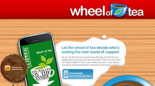
Wheel of Tea’s site takes a simple approach for displaying their app. The creator of the site decided to feature a single app on the site rather then a company or directory of applications. The site has sections for features, screenshots, reviews and a link to download the app in iTunes.
Taptivate

Taptivate is another well known development company. Similarly to tap tap tap, their homepage is largely a place to navigate to sub pages with information on each their apps. They also have a blog to help with promotion.
Filmscore
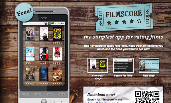
Filmscore, an Android app developed by stroke apps, has an excellent promotional lander page. The page is largely similar to the Wheel of Tea app, where they have a section to show screenshots of the app and a link to the android marketplace, all within a themed design.
Classics

Classics is an iPhone app that was built previous to iBooks and was once the leading ebook reader on the app store. On their site, they have a video slideshow of the app in action, in addition to a link to the app store, and a brief description. The whole site is themed like a bookshelf, and since their app interface is similar, both fit nicely together. Having a site like this is a great landing page for search engines, and it is also a great place to explain your app in more detail then its description in the store.
Snow Reports
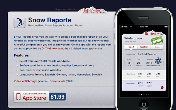
Snow Report’s site is very minimalistic, with a screenshot of the app off to the right, and a description on the left. It’s a great way to show your app when aiming for a minimal site, and not having enough content for multiple pages. The site is simple and too the point.
Sketches

Latenitesoft's Sketches app is given its own page within their site. They nicely display the name of the app next to its icon and an iPhone with a screenshot of Sketches in action. On the right of the page, there is a sidebar, with the icon repeated, info on the app and localization and a buy now link. Further down the sidebar they display reviews from popular blogs. This is a good idea as it provides a respected opinion on your app. They also show more screenshots of additional features to compliment the App Store page with additional media.

Comments