Tablets are becoming more popular as each day passes and more people are turning to them for the consumption of web-based content. Across Tuts+, we've already discussed in several articles how to design with these new tablet devices in mind. Today, we're going to revisit the topic of considered tablet design and look at it in the context of WordPress.
Should We Care?
Before we even look at designing and optimising for tablets, we should first look at whether our time should be best spent doing so.
Just recently, it was revealed that Apple holds about a quarter of the entire computer market, but only if the iPad was taken into account. While, at the time of writing, Apple is yet to announce last quarter's earnings, analysts expect Apple to report record iPad sales from somewhere between 11.7 and 19.5 million units. That's a pretty big number, and it's showing quarter-on-quarter growth, meaning tablet sales are becoming ever-more significant.
Hopefully how notable the iPad is, not only by itself but as part of the whole computer industry, is some indication to how seriously designers should be taking the platform. Plus, as designers and developers creating themes for WordPress, we should take extra note, considering how many different blogs the software powers.
Understanding the Differences
Before we dive into looking at how we should start taking the tablet into better account - both from a designer's and a blogger's perspective - we should really understand how a tablet differs from a traditional computing experience.
The biggest and most obvious is the method of input, being primarily touch-based on a tablet instead of cursor controlled. This is going to mean big differences in the level of precision a user has over a website seeing as the tip of your finger is a lot larger than the tip of a cursor.
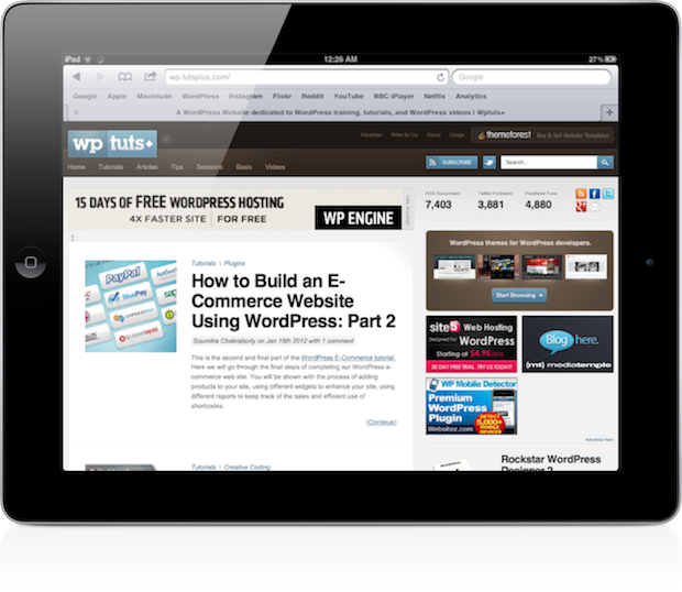
Resolution is another difference, being majorly smaller on tablets than on computers. The iPad has a resolution of 1024 x 768px and if we look back at some figures from last year, only 3.54% of visitors visited on a resolution of that size. The most popular sizes were 1680 x 1050px, 1280 x 800px and 1440 x 900px, which are a lot larger than the iPad's. This tells us that traditional computers are being used at much higher resolutions than a tablet device.
One final difference is the range of technologies available to the platform. As we all know, the iPad doesn't support Flash (or any kind of plugin-based web technology for that matter), which means some of your options are limited. Apple's recommended path is HTML5, which many major services have started to adopt for video content.
Before we get into the main content of the article, I should note that I'm writing with the iPad in mind. While there are many different tablets available, the iPad is the clear market leader and is, therefore, one of the most important to take into consideration. While I will be referring to the iPad, most of what we discuss can be applied to any ~10" tablet.
The Designer's Perspective
There's two important perspectives to consider when looking at WordPress on tablets. The first is that of the designer, who is designing the front end of a WordPress blog and the user experience of it.
Tips for Optimising Your Designs
As we've evidenced by the strong sales numbers and market share of the iPad, the platform is something that needs to be seriously looked at when designing. At WebDesignTuts+, I wrote an article looking at designing with the tablet in mind, and it's recommended reading since the same principles apply to WordPress design. Let's just recap a few of these optimisation tips...
- Finger-Optimised Navigation – Users can't achieve the same degree of precision with the tip of their finger as they can with a cursor, so web designs should accommodate this. Key navigational elements like menus need to be able to accommodate someone's finger and not require them to zoom in heavily just to tap on their desired link.
- Stick to Standards – As we all surely know, the iPad doesn't support Flash. Whether you think this is an advantage or disadvantage will not change anything so you're going to need to accommodate this into your theme. Avoid using Flash and other plugin-based web technology, instead opting for more universal solutions like HTML5. If you're designing a theme for a client, you may want to consider adding shortcodes to services that you know are compliant, such as YouTube, so the client is encouraged not to include any of these incompatible elements in at a later date.
- Remember Multiple Orientations – Tablets work in more than one orientation so your themes will not only be viewed in a 1024 x 768px resolution on an iPad, but also a much thinner 768 x 1024px. You should take this into account and test how your design will adapt when a device is rotated.
- Test. Test. Test. – One of the best ways to optimise your theme for a tablet is to actually test it on a tablet. By doing so, you'll get the best grasp on how well you've optimised it for that platform.
As long as you take these three points into account, it's likely your WordPress theme will be in the best position to handle tablet-originated traffic.
The Alternative: Tablet Sites and WordPress Plugins
If you take the aforementioned points into consideration when designing your next theme, you should be good to go. However, there is another alternative: tablet-dedicated sites.
You've probably visited a site on your smartphone where you are presented not with the regular site, but instead a scaled down, mobile one. This offers users faster access to content on a smaller screen, while being able to enlarge or otherwise modify certain core interface elements without changing the desktop appearance. There's a number of WordPress plugins which will do this for you, including WPtouch.
I keep going back and forth on whether I think tablet-only designs are a good idea; there's pros and cons. A tablet site would allow you to properly optimise and design for a specific device, and not have to try to accommodate other platforms at the same time. However, it means your design will be different across devices so what a user might find applicable on their desktop won't necessarily apply when they're browsing on a tablet. This doesn't matter so much on mobile because we don't expect it to be the same as a desktop, but it's a different story for the much larger tablet.
Like WPtouch and other mobile theme plugins, there's a number of WordPress plugins which will enable an optimised theme for tablet visitors. Onswipe is one such plugin.
The WordPress.com Case Study
WordPress.com in March launched integration with the Onswipe plugin across all their hosted sites, which was a pretty bold move. Onswipe detects when a user is browsing the site with an iPad and displays a completely different theme, one that's said to be better optimised for the platform.
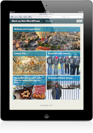
An example site using the Onswipe theme.
The iPad-optimised theme is designed to look like a magazine, whatever type of content your blog publishes. It does so well with a handful of nice animations thrown in there to make it feel almost like a native app. However, the solution isn't at all suited to each and every blog and the visual difference to the blogger's chosen theme makes it feel unconnected, distancing it from your original design.
While the steps WordPress.com have taken show that they are considering the platform seriously, I'm just not too keen on the idea of presenting my visitors with a completely different theme that shows no connection to my original blog, aside from the content.
The Blogger's Perspective
I spend a lot of my day in the WordPress dashboard across a number of sites. I'm also trying to use my iPad a lot more as a writing tool while away from my desk, but, until recently, the dashboard has left me with many problems when trying to do the two at once. Fortunately, there's a number of native iPad apps that work with WordPress in addition to a dashboard that's been recently updated with optimisations for tablets. Let's take a look at the blogger's perspective of WordPress on tablets...
The WordPress 3.3 Dashboard
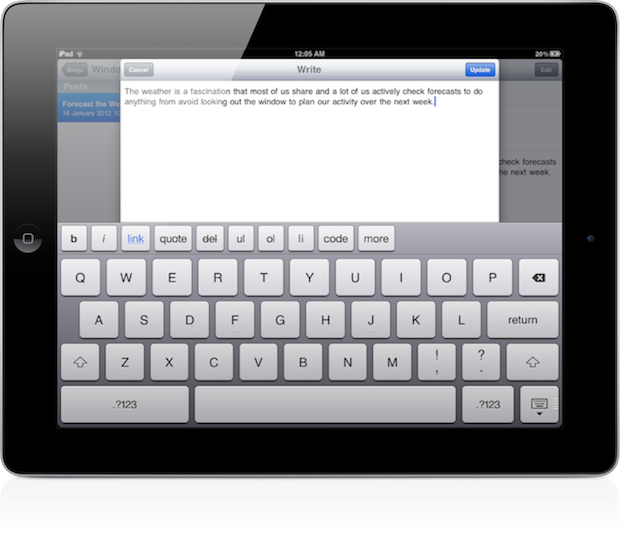
WordPress Version 3.3 included "responsive design for some screens, including iPad/tablet support", an update I was very excited to see.
The WordPress dashboard looks much better and is a lot more responsive on my iPad with 3.3, compared to earlier versions. One of the most significant changes is in the post editor, where bloggers are no longer restricted to just the HTML view. If you're happy with a virtual keyboard, composing posts in the editor on a tablet is a breeze. You can easily write extensive articles, including using the modal tools for image insertion or linking.
Tablet Apps
The alternative to simply using the newly-updated, responsive dashboard is to use a native app available on your tablet. The iPad has quite a few, including the official WordPress app.
The official WordPress app has come far with recent updates, and I can happily compose a post in it. It is, however, a simpler, "dumbed down" interface that lacks some fundamental features like access to your blog's media library, or the ability to add a featured image.

Comments