In this article, I’m going to spotlight some of the key features introduced in OpenCart 2.3.
If you’re an OpenCart developer who is familiar with earlier OpenCart versions, OpenCart 2.3 brings a couple of surprises for you. Of course, it’s expected to have something exciting in each new version along with bug fixes, but OpenCart 2.3 brings something that needs your attention for sure.
As an OpenCart extension developer, you’ll be interested in the directory structure changes that I'll discuss in the very next section. Apart from that, it is the back-end related UI changes that I'll be explaining throughout the rest of the article.
Let’s quickly go through the recipe:
- Directory structure changes
- Changes in the extensions navigation section
- More intuitive layout editing
- Introduction of dashboard management UI
- Addition of new payment gateways
Directory Structure
One of the major changes you’ll notice in OpenCart 2.3 is the restructuring of the extensions directory structure. In the earlier versions, you would have noticed that there were separate directories for the following extensions:
- Captcha
- Feed
- Module
- Openbay
- Payment
- Total
As you can see in the following screenshot, a new extension directory layer is added under the controller directory.
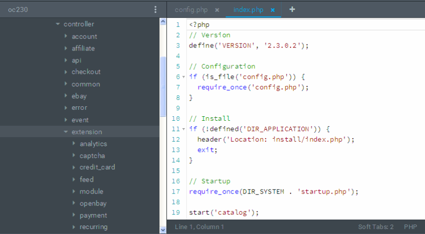
The extension directory contains the extensions listed above. Earlier, they were just under the controller directory itself. And yes, it’s not just the controller directory; the same hierarchy is implemented for the rest of the MVC-L components as well—Model, View, and Language. Thus, if you go ahead and explore the model, view and language directories, you should notice a similar restructuring.
The extension directory contains the components that could be easily extended and adds new ones as needed. For example, the payment directory contains all the payment gateway extensions available on the site. In the same way, the captcha directory contains various captcha method related files.
So, if you need a new payment gateway method for your store, it should go under extension/payment, and in the same way new captcha challenge method related files should go under extension/captcha. Of course, you would have done something similar in the older version by placing the files in the payment and captcha directories. The new extension directory layer adds that extra sense of separation from the core files.
Finally, the rest of the directories like account, checkout, tool, product and so on are kept one level up from the extensions that we’ve discussed, since they belong to more of the core functionality of the shopping cart rather than something extensible.
Revamped Extensions Section
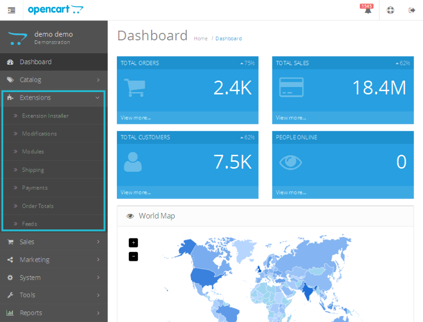
Before we dig into this section, let’s have a look at screenshots of the Extensions navigation in both versions of OpenCart.
You’re already familiar with this navigation:
And, to your surprise, it looks like this in OpenCart 2.3:
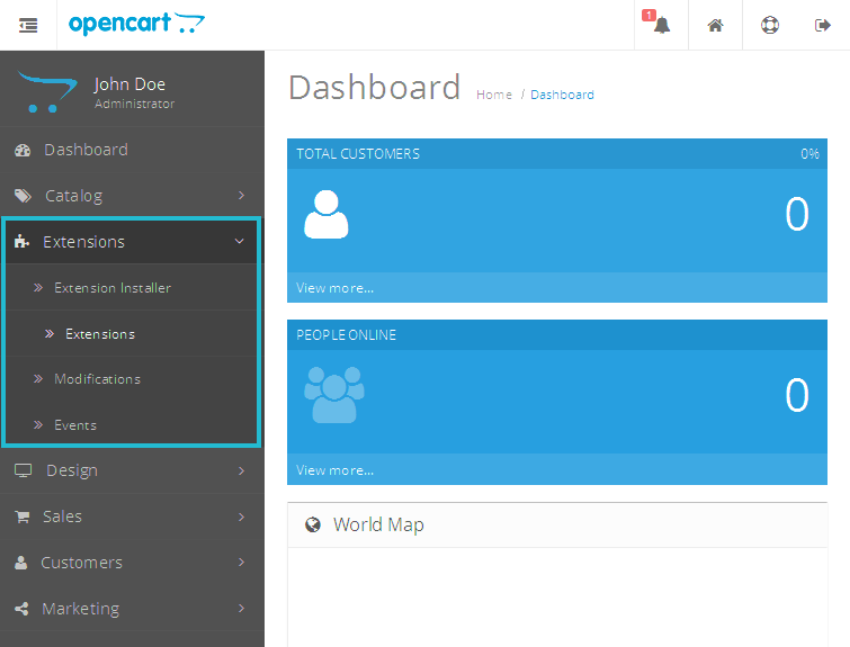
You must be wondering, where are those links for Payment, Order Totals, and Modules? Head over to the back-end in OpenCart 2.3 and click on Extensions > Extensions, and here’s what it looks like:
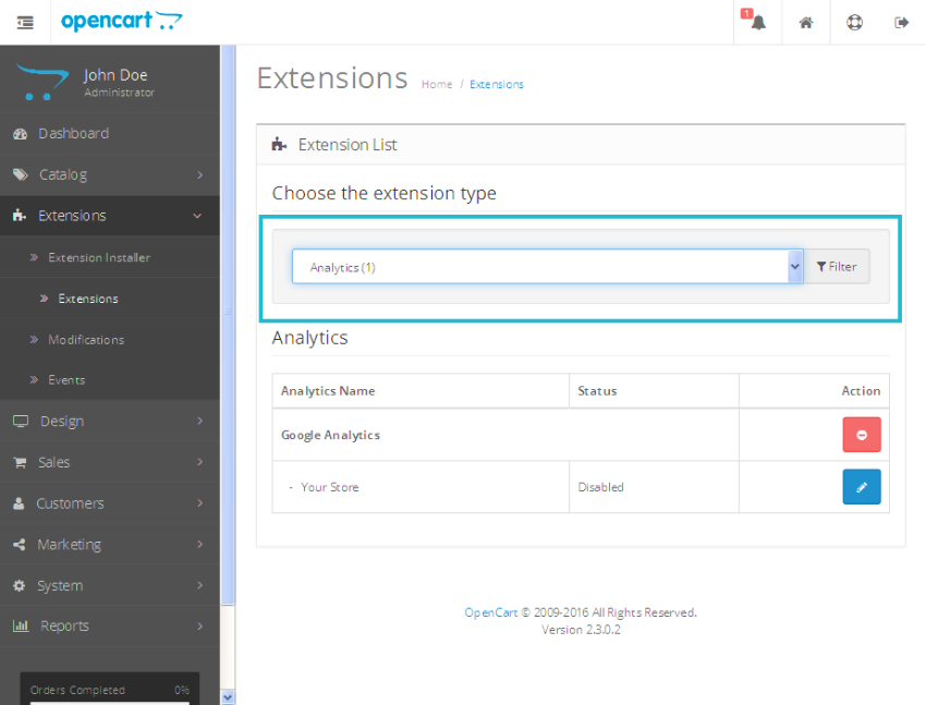
As you can see in the above screenshot, it’s a brand new interface introduced for extension management. The drop-down box contains types of extensions you could manage on this page.
- Analytics
- Captchas
- Dashboard
- Feeds
- Anti-Fraud
- Modules
- Payment
- Shipping
- Themes
- Order Totals
In the earlier versions of OpenCart, most of the above sections were placed in the main navigation menu itself. Select any extension type in the drop-down box, and it’ll display the list of corresponding extensions. In the above screenshot, it’s displaying the analytics kind of extensions. Also, the installation of extensions is AJAX based now.
Users with sharp eyes would have noticed a couple of new candidates in the above list—Dashboard and Themes. We’ll discuss the Dashboard in the next section, but let’s have a look at what Themes is all about.
In the earlier versions, if you wanted to change the default theme of your store and related settings, you would go to System > Settings. Then, you would edit your store and change the Default layout setting under the Store tab. Also, the Option and Image tabs allowed you to configure theme-related settings like the number of products per page, image size settings, and the like.
In the recent version, the different theme-related settings are brought under a single roof, making things much easier. Select Themes in the drop-down box, and that will display the list of themes available in your store.
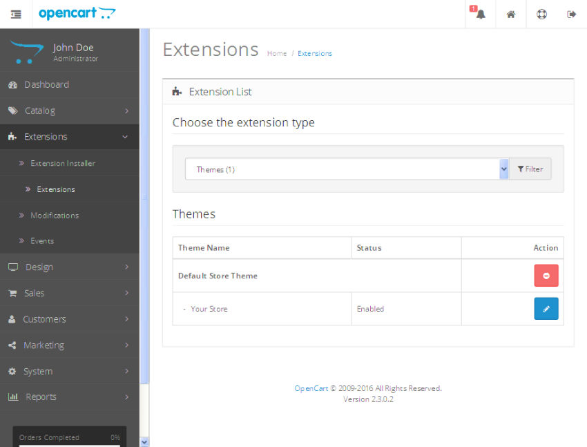
Edit the default store, and that brings you to the following page.
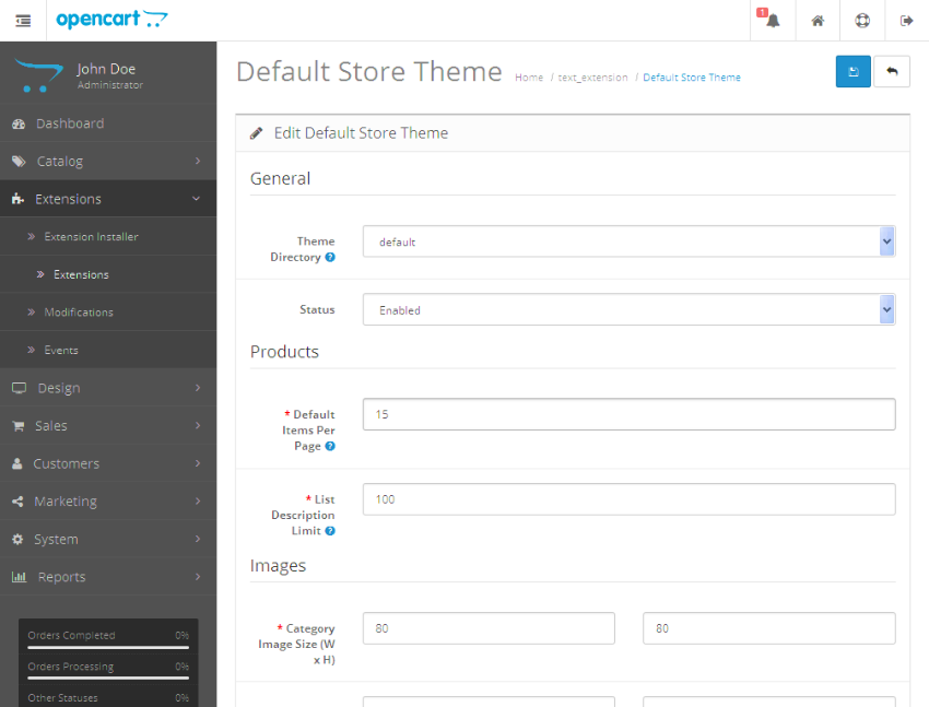
On this page, you could configure the default theme for your store and other theme-related settings. So it’s a welcome change as it makes things more visible as far as theme settings are concerned.
Although it’s a brand new interface for extension management, I believe it’s a follow-up of the directory structure changes that we discussed earlier in this article. So it was intuitive and meant to be introduced.
Dashboard Management
As promised in the earlier section, this section describes the introduction of the Dashboard modules management interface. When you log in to the back-end section, you’ll see the different modules displayed in the dashboard section.
- World Map
- Sales Analytics
- Recent Activity
- Recent Orders
- and more
In the earlier version, there was no back-end interface to manage these modules. In the new version, you can manage these modules in the same way you would do it for other extension type modules.
Go to Extensions > Extensions, and select Dashboard from the extension drop-down box. It brings you something like this.

So, as you can see, it’s an identical interface to that of the modules listing page. Now, you have total control of what’s being displayed on your admin dashboard page. Of course, you could make your custom dashboard modules in the same way you do it for other OpenCart modules.
Intuitive Layout Management
Again, I'll let the screenshots speak—this is what you’re used to in the earlier versions of OpenCart:
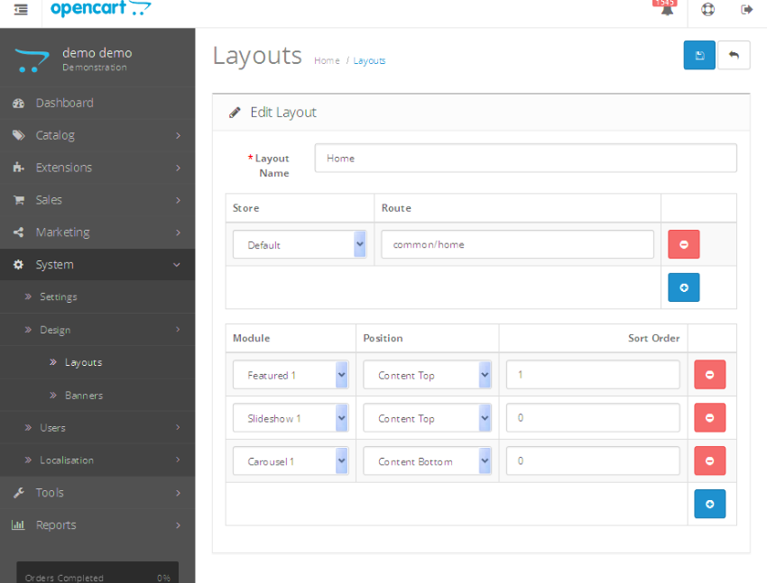
OpenCart 2.3 brings something like this for you.
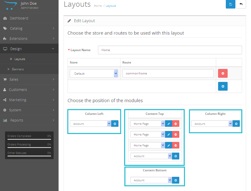
The module assignment interface is more visually appealing compared to the older version. Although it’s just a rearrangement of module field positions, it helps you to easily visualize the order and position of enabled modules on your site. It’s a minor but a great improvement, I would say.
Payment Gateways
The list of supported payment gateways is ever growing, and a few welcome additions are:
- Skrill
- CardConnect
- Divido
- Pilibaba for Chinese Checkout
Conclusion
So those are some of the major changes as far as the OpenCart 2.3 version is concerned. I hope we’ll have more exciting and useful features in the upcoming version, and till then stay tuned!
Of course, go ahead and explore these new features, and don’t forget to share your queries and feedback using the feed below.
Today, we discussed a couple of new features in OpenCart 2.3. Although that's something expected from the OpenCart team with every new release, this release was special in the sense that it introduced a couple of major changes in the territory of extension management.
So, that's it from my side today. Feel free to post your thoughts, and you can also reach me via Twitter.


Comments