In my previous article, I showed you how to prototype an Internet of Things system using Johnny-Five and PubNub. In that tutorial, you learned how to create a web-controlled LED, à la Philips HUE.
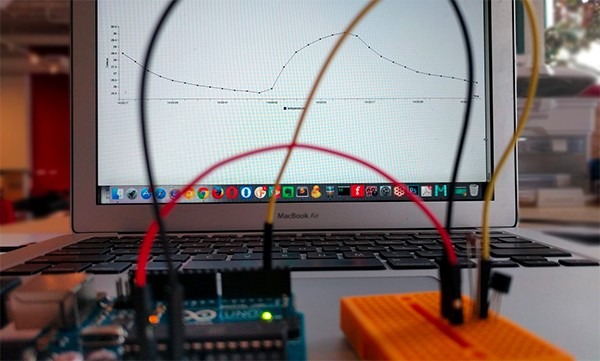
This time, I would like to show you how to read data from sensors attached to an Arduino and plot a graph on the web!
In this exercise, you are going to:
- build a circuit with a temperature sensor, and read the values from the sensor
- read the data and plot them
Prerequisites
You need an Arduino (Genuino) Uno board and basic knowledge of how to set up the Arduino for Johnny-Five. It is a good idea to review the Setting Up Arduino section in the step-by-step tutorial, but you do not need to install StandardFirmata because you are going to install something else this time.
Also, make sure that Node.js is running on your computer.
Easy and Simple Data Visualization With EON
Project EON is an open-source JavaScript framework for charting and mapping, created by PubNub.
Since the charting and graphing component of EON is based on C3.js, which is a wrapper for D3.js, EON allows you to build real-time graphs easily without knowing how to use the far more complicated D3 library.
The basic steps to visualize the sensor data are as simple as the following:
Publish data from a source:
PUBNUB.publish({
  channel:  'my-graph',
  message:  {'eon':
  {'My data 1': 39, 'My data 2': 23}}
});

2. Embed a graph on web:

eon.chart({
  channel: 'my-graph',
  generate: {
    bindto: '#myGraph'
  }
});
I will walk through the details of how to use EON, as we work on both a hardware and a software exercise here. So let's begin!
Wiring Up the Circuit With a Temperature Sensor
Let's build a circuit for the temperature sensor first! The generic sensor and parts should be pretty inexpensive.
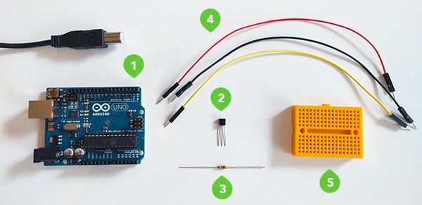
Hardware You Need:
- 1 Arduino Uno
- 1 DS18B20 1-Wire digital temperature sensor
- 1 resistor (4.7kΩ)
- 3 male/male jumper wires
- 1 breadboard
About the DS18B20 Digital Temperature Sensor
A typical DS18B20 digital temperature sensor measures from -55°C to 125°C (Celsius) with ±0.5°C accuracy over much of the range. A built-in analog-to-digital converter (ADC) converts this analog temperature measurement into a digital value with up to 12 bits of precision.
Loading Arduino With ConfigurableFirmata
The DS18B20 sensor communicates over a proprietary 1-Wire bus. When you are using devices with the special protocol, Johnny-Five requires the 1-Wire specific module, which utilizes the ConfigurableFirmata sketch.
So let's load your Arduino up with ConfigurableFirmata before wiring the sensor:
- Connect your Arduino to your computer with a USB cable.
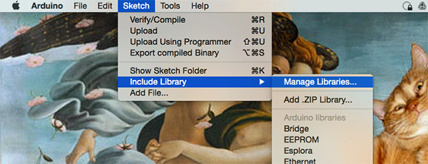
- On Arduino IDE, go to Sketch > Include Library > Manage Libraries.
- Search for "ConfigurableFirmata".
- Click the result, select the latest version, and click Install.
- Go to File > Examples > ConfigurableFirmata.
- Upload the code to the board.

Assembling a Circuit
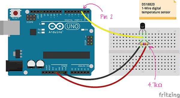
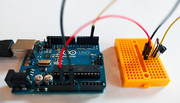
Now, let’s wire them up. The circuit is pretty simple—just make sure that you use a 4.7kΩ resistor when you are powering the sensor up with the 5V source from the Arduino.
Reading the Temperature From the Sensor
Let's move on to the software side. Reading the digital values from the sensor is super easy when you are using Johnny-Five.
Make sure Node.js is installed on your computer. In an appropriate dev directory, install Johnny-Five using the npm package manager.
$ npm install johnny-five
Create a file, temperature.js, and use the code below to print out the values:
var five = require('johnny-five');

five.Board().on('ready', function() {
  var temperature = new five.Thermometer({
    controller: 'DS18B20',
    pin: 2
  });

  temperature.on('data', function() {
    console.log(this.celsius + '°C', this.fahrenheit + '°F');
  });
});
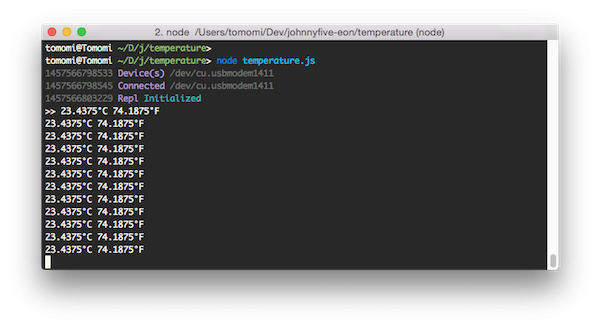
Run the code from a console with node temperature.js. Once the hardware board is ready, you should see the temperature values printed out on the console like this:
Now, let's publish the data from the temperature sensor and plot the values in a graph!
Sending the Temperature Data From the Sensor to PubNub
First, you need to install the pubnub Node.js module using npm:
$ npm install pubnub
PubNub Data Stream Network (DSN) provides the global infrastructure and allows you to build and scale real-time apps and IoT devices quite easily. In my previous article, you used PubNub to receive data from a web browser, but this time, you are using PubNub to publish the sensor data to be read in the browser.
Initializing PubNub
Once you install the pubnub module, you need to initialize it with your API keys.
var pubnub = require('pubnub')({
  publish_key: 'pub-c-156a...',
  subscribe_key: 'sub-c-f762f...'
});
Also let's create a channel name.
var channel = 'temperature-ds18b20';
When you plot a graph, you will need to grab the published data from the same channel name.
Publishing Data to PubNub
Once you obtain temperature data on the data event with Johnny-Five that you have created in the previous section of the tutorial, keep the data as a variable, instead of just console.log.
var temp = 0;

temperature.on('data', function() {
  temp = this.celsius;
});
You can publish every piece of data to PubNub, but the sensor may fire the event too frequently. So let's send the data every three seconds.
setInterval(publish, 3000);
In the publish function, use the PubNub publish() method to send the data in object (or JSON).
function publish() {
  var data = {
    'temperature': temp,
  };
  pubnub.publish({
    channel: channel,
    message: data,
  });
}
The entire code for the Arduino is available in this GitHub repo.
Plotting a Bar Graph From the Sensor Data
Now forget about Arduino. You will now create a separate web page to draw a graph.
First, include eon.css in your HTML file:
<link type="text/css" rel="stylesheet" href="//pubnub.github.io/eon/v/eon/0.0.9/eon.css">
Then include pubnub.js:
<script src="//cdn.pubnub.com/pubnub-3.10.2.js"></script>
Then create an empty element with some ID:
<div id="chart"></div>
This is where the graph will be generated in your page. Now, you need to initialize PubNub, just like you did in the node.js file earlier for Arduino:
var pubnub = PUBNUB.init({
  publish_key: 'pub-c-156a...',
  subscribe_key: 'sub-c-f762f...'
});
Then, generate a simple bar graph using EON's chart(), as soon as it receives the data from PubNub. You can receive the data sent from the temperature sensor by using the same channel name, temperature-ds18b20:
eon.chart({
  pubnub: pubnub,
  {
    channel: 'temperature-ds18b20',
    generate: {
      bindto: '#chart'
    }
  },
  transform: function(m) {
    return { eon: {
      temperature: m.temperature
    }}
  }
});
The transform() function tailors the raw data sent from the sensor to fit in the schema that EON can understand.
Run both the HTML and the Node.js code for Arduino.
Voilà, you've got a real-time data visualization in your browser!
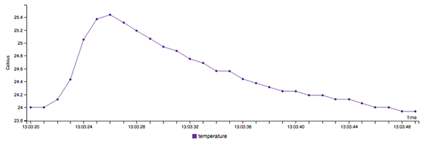
You can customize the graph more with optional C3.js parameters, such as line colors and width!
For example, to change the bar color to purple like this gif animation above, you can add the color of the data parameter:
...
  generate: {
    bindto: '#chart,
    data: {
      type: 'line',
      colors: {
        temperature: '#663399'
      }
    },
You can use the axis parameter to label and format the x-axis and y-axis, too.
If you want a different kind of graph, try changing the ‘line’, which is a default value for type, to ‘spline’, and see what happens.
For the complete code, please refer the GitHub repo. There are a few more examples if you would like to try different sensors such as an ambient light sensor, and different types of charts.
I hope you enjoyed the tutorial!
References
- How to Create a Smart Device With Arduino and Node.js Using PubNub
- Johnny-Five: The original JavaScript Robotics programming framework
- PubNub: The global real-time Data Stream Network for IoT, mobile, and web applications
- Project EON: Open-source chart and map framework for real-time data by PubNub


Comments