Google's new design efforts are vast and justify a significant amount of conversation. But instead of talking about the theory of Material Design and the implications of Google's newest efforts, we're going to focus on an interesting technique Google has employed on their Design landing page.

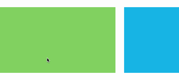
When the user clicks on one of the blocks, an SVG circle expands from the point of the user's click to fill most of the box. Google refer to this as the touch ripple. We're going to recreate this effect using a few lines of jQuery, some simple HTML and CSS.
Let's get started!
The Basic Grid
Before we start, we need to set up a basic grid. We are going to build the grid elements without using a framework, but this technique would work with a framework perfectly fine.
<div class="row">
    <div class="col col-1-3 blue"></div>
	<div class="col col-1-3 orange"></div>
	<div class="col col-1-3 green"></div>
</div>
<div class="row">
	<div class="col col-1-2 gray"></div>
	<div class="col col-1-2 blue"></div>
</div>
<div class="row">
	<div class="col col-1-4 orange"></div>
	<div class="col col-1-2 green"></div>
	<div class="col col-1-4 blue"></div>
</div>
The column classes map to fractions, so that "col-1-3" means 1/3 the width of the containing element.
Basic CSS
Next, we will set up our column classes. We're using LESS, which allows us to nest rules and utilize the &operator. We won't get into the specifics of LESS, but for the sake of this tutorial, we'll explain how the & operator works. But first, here is the LESS for the columns.
.col {
  position: relative;
  display: block;
  float: left;
  margin: 1.25%;
  background-color: #444;
  color: #fff;
  padding: 100px;
  box-sizing: border-box;
  &.orange {
    background-color: #EF8130;
  }
  &.blue {
    background-color: #00ADE2;
  }
  &.gray {
    background-color: #444;
  }
  &.green {
    background-color: #76CE51;
  }
  &-1- {
    &2 {
      width: 47.5%;
    }
    &3 {
      width: 30.8333%;
    }
    &4 {
      width: 22.5%;
    }
  }
}
Notice the & rules. The & operator appends the string following it to the parent item. In other words, this LESS:
.col {
    &-1 {
		&-3 {
			color: #fff;
		}
	}
}
Would result in this CSS:
.col-1-3 { color: #fff; }
And this LESS:
&.col {
    &.orange {
		background-color: #EF8130;
	}
}
Would result in this CSS:
.col.orange {
    background-color: #EF8130;
}
If you'd like to learn more about LESS, take a look at these tutorials here on Tuts+:
 LESSGet Into LESS: the Programmable Stylesheet Language
 LESSPractical Tips For Using LESS
 Complete WebsitesBuilding a "Coming Soon" Page With HTML and LESS
 Complete WebsitesStyling Our Behance Portfolio Website Using LESS
How the SVG Will Work
Next, let's plan how the click will work, and how the SVG will be placed inside each of the boxes.

When the user clicks on any of the boxes, we will calculate the offset of the mouse position from the corner of that box. We'll then use those coordinates to place the circle. We will also absolutely position the SVG element inside the boxes, and the boxes themselves will be positioned relative. We'll utilize SVG's native <circle> element, along with a custom jQuery animation function.
First, let's set up the CSS for the SVG elements.
svg {
  position: absolute;
  top: 0;
  left: 0;
  width: 100%;
  height: 100%;
}
circle {
  fill: rgba(255,255,255,0.1);
}
The fill utilizes RGBa, which in effect fills the circle element with white at 10%.
The JavaScript
First, we will set up a click listener on the .col elements, and grab the mouse's position relative to the document (this disregards the scroll position).
Mouse Position
The position is relative to the box itself; the top left corner of the box is fetched using $(this).offset().
$(".col").on("click", function(e){
    	var x = e.pageX;
		var y = e.pageY;
		var clickY = y - $(this).offset().top;
		var clickX = x - $(this).offset().left;
    var box = this;
    // ...
});
Note: we are using jQuery for this example.
Next, we will convert the clickX and clickY variables to integers, as they show up as floats in some browsers. This makes sure that we avoid any rendering issues resulting from subpixel aliasing. Note, however, that this wouldn't necessarily be required for the effect to work.
    var setX = parseInt(clickX);
    var setY = parseInt(clickY);
Remove Existing SVG Elements
Next, we will remove any existing SVG elements from our clicked box. If you plan to add an SVG to the content of the box, be certain that you use something like jQuery's.not() in combination with a class to avoid removing your content.
$(this).find("svg").remove();
Append New SVG
Next, we append our SVG, which we are creating by passing text into the jQuery function.
$(this).append('<svg><circle cx="'+setX+'" cy="'+setY+'" r="'+0+'"></circle></svg>');
The setX and setY position the center of the circle at the point of the click that we derived earlier.
Animate Circle Radius
Next, we animate the r property (which sets the radius) using jQuery's animate function. The animate function doesn't support animating properties, so we use the step option, which is called after every step of the animation itself.
var c = $(box).find("circle");
c.animate(
  {
    "r" : $(box).outerWidth()
  },
  {
    easing: "easeOutQuad",
    duration: 400,
       step : function(val){
			c.attr("r", val);
		}
  }
);
Remember that box is defined earlier as the box that was clicked. We are also utilizing jquery.easing, which is what allows us to define "easeOutQuad" for the easing property.
The JavaScript, All Together
The final JavaScript will look like this:
$(".col").on("click", function(e){
    var x = e.pageX;
	var y = e.pageY;
	var clickY = y - $(this).offset().top;
	var clickX = x - $(this).offset().left;
  var box = this;

  var setX = parseInt(clickX);
  var setY = parseInt(clickY);
  $(this).find("svg").remove();
  $(this).append('<svg><circle cx="'+setX+'" cy="'+setY+'" r="'+0+'"></circle></svg>');


  var c = $(box).find("circle");
  c.animate(
    {
      "r" : $(box).outerWidth()
    },
    {
      easing: "easeOutQuad",
      duration: 400,
     	step : function(val){
				c.attr("r", val);
			}
    }
  );
});
Conclusion
This simple effect can be used in a number of ways beyond our example. Imagine, for instance, identifying where in an image a person clicked, and creating a popover to comment on that portion of the image, and subsequently saving the coordinates. What uses can you find for this effect?
In the Wild
- Polymer paper elements paper-ripple - using web components for the real deal
- Ripples Effect Button - on CodePen
- Google Material Design - on CodePen
- Material Design Buttons - on CodePen


Comments