Introduction
When tablets and smart phones first began to emerge, many publishers developed distinctly separate websites, or at least distinctly generated HTML code trees, to customize the experience for visitors on different devices. Certainly solutions emerged to make it easier, such as this mobile WordPress theme plugin:
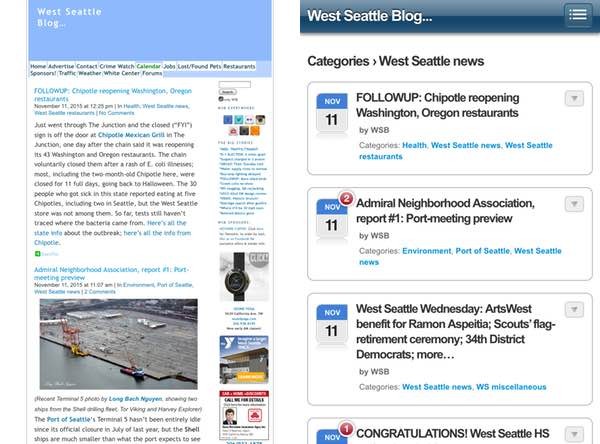
But, to really provide a solid experience for visitors on all devices, most projects required duplicate or triplicate design, coding and testing efforts.
The concept of responsive web design sought to unify the code tree, eliminate code forks, and provide a simpler approach to providing a high-quality user experience across devices. At first, it required a bit of experimenting and some early expertise, but today, it's become mainstream. It's a testament to orientation around DRY engineering.
When I launched my personal WordPress site, choosing responsive design was still a bit of a leap—and many sites performed with different levels of quality for your visitor's experience.
Twitter's open-source release of Bootstrap helped transform responsiveness in web design tremendously. Probably, like me, you run a responsive theme on your website and are familiar with the general concepts of dynamic presentation. But do you know how responsive web design works under the hood? Do you know how to build something responsive from scratch? Would you like to learn more?
The DNA of Responsive Web Design
In this tutorial, we're encouraging you to check out Telerik's latest white paper on responsive web design (RWD). Must-know Techniques for Building HTML5 Apps for Any Screen Size, which you can download for free right now, provides an outstandingly detailed guide to answer these questions and help you come up to speed.
There are many reasons why responsive web design has gone from being called a trend to being synonymous with web best practices. It’s a fast and cost-effective way to serve a tailored experience to desktop and mobile web users. You can use your existing skill set, have one code base, one set of URLs and one design language.
The white paper teaches you what you must know about responsive web practices so you can build apps for any screen size. It teaches you how to:
- leverage the basic building blocks of responsive web design—grid systems, media queries and flexible content—to create responsive layouts that change and conceal or show items based on the visitor's device
- choose a responsive web design framework such as Bootstrap or Zurb's Foundation
- use advanced Bootstrap features, such as fluid containers, offsets, push/pull and more, to achieve even the most complex responsive web scenarios
In this tutorial, I'll just give you a brief summary of what the white paper offers. Also, I do participate in the discussions below. If you have a question or topic suggestion, please post a comment or tweet at me @reifman or email me directly.
Here are some of the areas that the white paper will teach you about.
Media Queries
Media queries are a part of CSS3, and they are what make responsive web design possible.
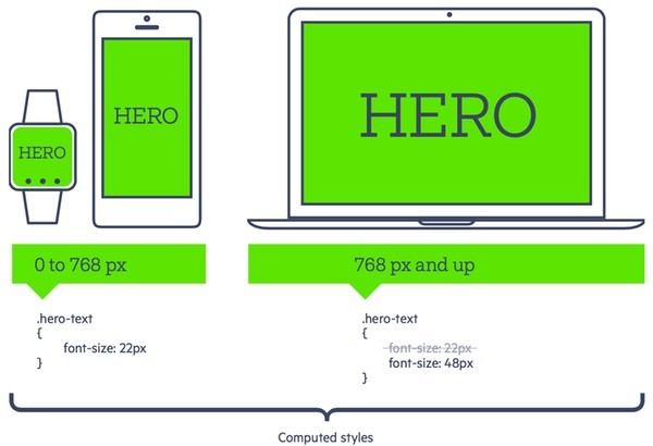
Essentially, media queries help the browser tell conditionals in your CSS code how to style, hide or reveal elements of content.
Here's an example for the smallest device size on up to one with a width greater than 768 px:
/* Base style for small devices small and up */
.hero-text { font-size: 22px; }
/* For large and up */
@media only screen and (min-width: 768px) {
    .hero-text { font-size: 48px; }
}
Popular frameworks like Bootstrap, Foundation and Telerik RadPageLayout make extensive use of media queries to create their powerful grid systems.
Grids and Breakpoints
Using media queries within your code, you can construct stylesheets with grids that respond fluidly to devices—dynamically adjusting what and how the visitor sees your content based on their device and the width of their browser.
The syntax may vary between frameworks, but the general concept is the same. Each device size has a corresponding media query and style properties that create the desired layout effect. These media queries are referred to as break points. Bootstrap identifies its break points as xs (extra small), sm (small), md (med), lg (large). These refer to the device size.
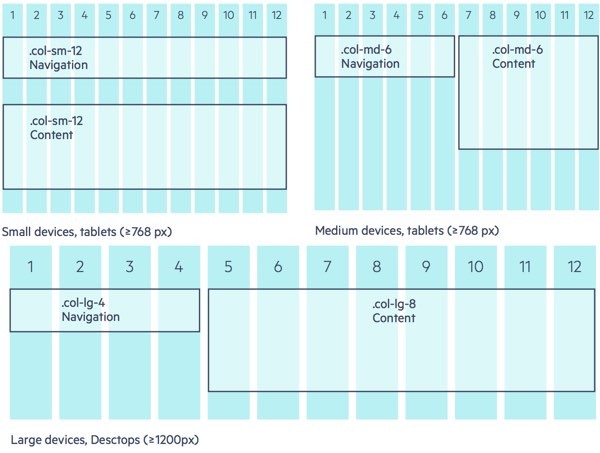
Here are some Bootstrap examples and what they might render as on different sized devices:
<div class="col-sm-12 col-md-6 col-lg-4"> <!-- some navigation -->
</div>
<div class="col-sm-12 col-md-6 col-lg-8">
<!-- some content -->
</div>
Upper left is small devices and smaller tablets, upper right is medium sized devices. Lower is larger devices and desktops.
Another common concept is the basic content container. The container element is the outermost element of the layout. Its purpose is to create white space between the layout and the edge of the browser window.

Working With Content
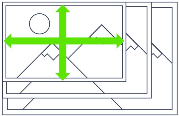
The white paper also shows you responsive web design instructs content to expand or contract based on the visitor's display size:
Selecting a Framework
I believe that choosing standards is incredibly important in successful software development. It helps teams communicate and allows new people to come up to speed quickly. It makes hiring people easier knowing their skill set in standard technologies. And it makes upgrading for security, performance and features easier over time—especially when using open-source technologies.
Choosing a standard framework in responsive web design can make a huge difference to your project's success or failure. The Telerik white paper walks you through the pros and cons of one of the most popular, Bootstrap:
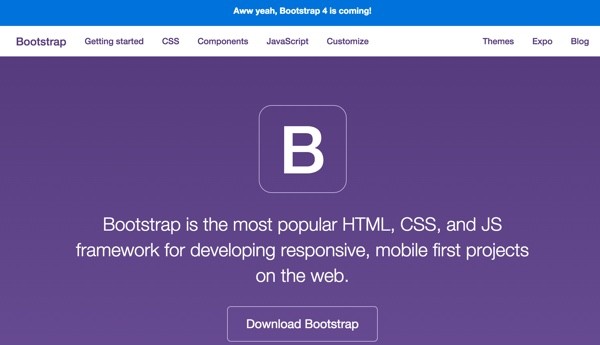
Bootstrap offers best in class features like a solid responsive grid, mobile first design, CSS helper classes, adaptive JavaScript components and much more. The grid is, by default, a standard 12 column grid with a simple syntax for creating layouts that support multiple screen sizes.
The white paper also highlights Zurb Foundation. It's an open-source framework that evolved from Bootstrap.

Foundation is packed with advanced features suitable for teams with experienced front-end developers, particularly those who use Sass.
Advanced Layout Features
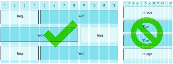
The white paper goes into a number of advanced topics as well:
- Fluid containers
- Nested rows
- Offsets
- Push/Pull
Without going too far, it gives most of us a very detailed introduction of the most important aspects you need to know.
Download the Whitepaper Now!
I hope I've intrigued you enough that you want to learn more. As a project manager who regularly manages people with expertise in these issues, I found this to be a super, easily understandable guide to responsive web design and how it works.
Want to dive in? Visit Telerik's White Paper collection and download Must-know Techniques for Building HTML5 Apps for Any Screen Size now.
One More Thing...
These responsive frameworks are important starting points and include UI components to get your project started. The components usually contain the basic features needed to operate and build prototypes. However, your more advanced and feature-complete applications require more robust user interface features. Soon, you're looking for a responsive-web-compatible UI suite.
Telerik Kendo UI
The Telerik Kendo UI has a responsive grid, charts, scheduler, and more—components that work seamlessly with any responsive web design framework that you're using. It's made by our sponsor who created the RWD white paper above.

I just want to give you a quick visual tour of what you can expect from the Kendo UI:
Grids
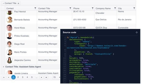
Building advanced interactive grid controls is never easy. Kendo UI provides a powerful, flexible grid out of the box:
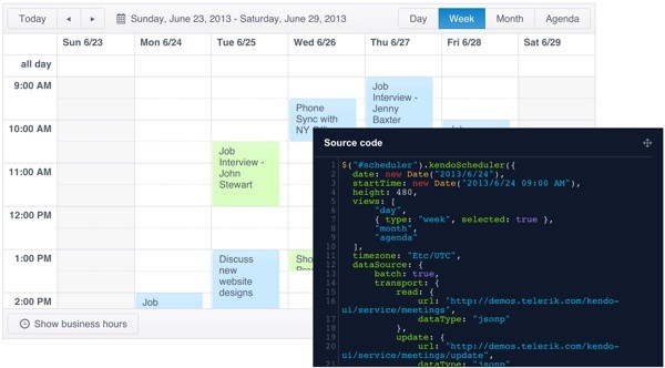
Scheduler
There's a schedule (or calendar) view:
Charts
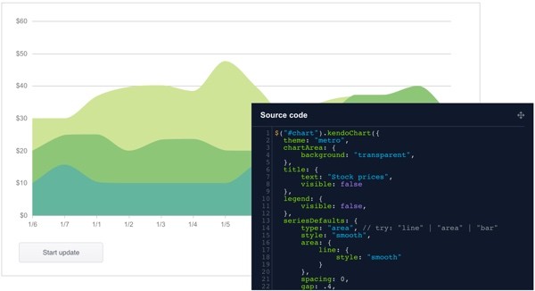
Kendo UI includes built-in charts:
Editor
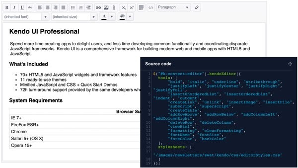
And there's a feature-rich, easily configurable editor:
Widgets
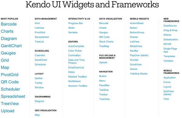
In fact, there's a library full of 73 more UI widgets to add on:
What's Next?
Basically at this point, there are two things for you to do:
- Download the Must-know Techniques for Building HTML5 Apps for Any Screen Size to learn about responsive web design and frameworks.
- Sign up for the Kendo UI Framework Free Trial and get started with downloading the code.
I hope you're intrigued by what Telerik's HTML5 whitepaper can offer (and by the Kendo UI Framework). Please feel free to post your experiences below, as well as questions and comments. You can also tweet at me @reifman or email me directly, and browse my Envato Tuts+ instructor page to see other tutorials I've written.


Comments