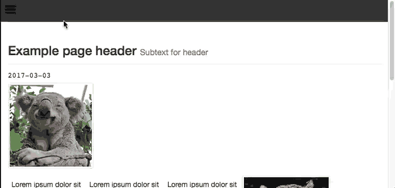
In this tutorial, you will be creating an expandable side navigation menu with JavaScript and CSS. The final product will appear as shown below:

The Markup
To get started, let's add some markup for our side menu:
<div id="sideNavigation" class="sidenav">
<a href="javascript:void(0)" class="closebtn" onclick="closeNav()">×</a>
<a href="#">About</a>
<a href="#">Features</a>
<a href="#">Contact Us</a>
</div>
<nav class="topnav">
<a href="#" onclick="openNav()">
<svg width="30" height="30" id="icoOpen">
<path d="M0,5 30,5" stroke="#000" stroke-width="5"/>
<path d="M0,14 30,14" stroke="#000" stroke-width="5"/>
<path d="M0,23 30,23" stroke="#000" stroke-width="5"/>
</svg>
</a>
</nav>
<div id="main">
<!-- Add all your websites page content here -->
</div>
Here you can see we created a side menu div with the class sidenav. Next we added the actual top bar navigation via a <nav> tag, and we are using an SVG for our side menu icon.
The onclick attribute of the icon and close button will trigger some JavaScript, which we will add next.
Remember to put all of your website's content inside the div id="main" container so that it will slide to the right.
JavaScript
Next, let's add the JavaScript to make the openNav and closeNav functions.
<script>
function openNav() {
    document.getElementById("sideNavigation").style.width = "250px";
    document.getElementById("main").style.marginLeft = "250px";
}

function closeNav() {
    document.getElementById("sideNavigation").style.width = "0";
    document.getElementById("main").style.marginLeft = "0";
}
</script>
CSS
Finally, we will need to style our page with some CSS for the side menu and our links:
/* The side navigation menu */
.sidenav {
    height: 100%; /* 100% Full-height */
    width: 0; /* 0 width - change this with JavaScript */
    position: fixed; /* Stay in place */
    z-index: 1; /* Stay on top */
    top: 0;
    left: 0;
    background-color: #111; /* Black*/
    overflow-x: hidden; /* Disable horizontal scroll */
    padding-top: 60px; /* Place content 60px from the top */
    transition: 0.5s; /* 0.5 second transition effect to slide in the sidenav */
}

/* The navigation menu links */
.sidenav a {
    padding: 8px 8px 8px 32px;
    text-decoration: none;
    font-size: 25px;
    color: #818181;
    display: block;
    transition: 0.3s
}

/* When you mouse over the navigation links, change their color */
.sidenav a:hover, .offcanvas a:focus{
    color: #f1f1f1;
}

/* Position and style the close button (top right corner) */
.sidenav .closebtn {
    position: absolute;
    top: 0;
    right: 25px;
    font-size: 36px;
    margin-left: 50px;
}

/* Style page content - use this if you want to push the page content to the right when you open the side navigation */
#main {
    transition: margin-left .5s;
    padding: 20px;
    overflow:hidden;
    width:100%;
}
body {
  overflow-x: hidden;
}

/* Add a black background color to the top navigation */
.topnav {
    background-color: #333;
    overflow: hidden;
}

/* Style the links inside the navigation bar */
.topnav a {
    float: left;
    display: block;
    color: #f2f2f2;
    text-align: center;
    padding: 14px 16px;
    text-decoration: none;
    font-size: 17px;
}

/* Change the color of links on hover */
.topnav a:hover {
    background-color: #ddd;
    color: black;
}

/* Add a color to the active/current link */
.topnav a.active {
    background-color: #4CAF50;
    color: white;
}

/* On smaller screens, where height is less than 450px, change the style of the sidenav (less padding and a smaller font size) */
@media screen and (max-height: 450px) {
    .sidenav {padding-top: 15px;}
    .sidenav a {font-size: 18px;}
}

a svg{
  transition:all .5s ease;

  &:hover{
    #transform:rotate(180deg);
  }
}

#ico{
  display: none;
}

.menu{
  background: #000;
  display: none;
  padding: 5px;
  width: 320px;
  @include border-radius(5px);

  #transition: all 0.5s ease;

  a{
    display: block;
    color: #fff;
    text-align: center;
    padding: 10px 2px;
    margin: 3px 0;
    text-decoration: none;
    background: #444;

    &:nth-child(1){
      margin-top: 0;
      @include border-radius(3px 3px 0 0 );
    }
    &:nth-child(5){
      margin-bottom: 0;
      @include border-radius(0 0 3px 3px);
    }

    &:hover{
      background: #555;
    }
  }
}
Note: The body {overflow-x: hidden;} is required to ensure a horizontal scroll does not appear when using this with your existing CSS.
You can now take a look at your menu and give it a try in your browser.
Using jQuery
If you want to create the side menu JavaScript using jQuery, you can do this by replacing the JavaScript I provided earlier with the following section:
$('.topnav a').click(function(){
  $('#sideNavigation').style.width = "250px";
  $("#main").style.marginLeft = "250px";
});

$('.closebtn').click(function(){
  $('#sideNavigation').style.width = "0";
  $("#main").style.marginLeft = "0";
});
Removing the Slide
To make the menu appear with no slide animation, simply make changes to the CSS property transition, as shown in an abbreviated form below:
.sidenav {
    transition: 0s;
}

#main {
    transition: margin-left 0s;
}
This will make the change appear instantly as there is no delay specified in the transition. The default we used is 0.5s.
Conclusion
Creating a side menu only takes a few lines of code and does not need to use much resources. Also, if jQuery is already on the page for other tasks, the job can be made with slightly fewer lines of code and customised further.
Making the code responsive to work with different device screen resolutions is merely a case of modifying the CSS by adding media queries for the specific cases.
To take this further, you may wish to style your menu with a CSS framework such as Bootstrap or Bulma.


Comments