One of the most significant changes to Android design was introduced during the 2014 Google I/O conference, material design. Even though Google had introduced a set of guidelines for their new design philosophy, developers were responsible for implementing the new patterns from scratch.
This led to many third party libraries that achieved the goals of material design with similar, but different, implementations. To help alleviate some of the development pain of material design, Google introduced the Design support library during the keynote of the 2015 Google I/O conference.
As with many things in software development, the Design support library improved with time, adding support for bottom sheets with the 23.2 release. In this article, you learn how to easily implement the bottom sheet pattern into your own apps. A sample project for this article can be found on GitHub.
1. Setting Up a Bottom Sheet
To implement the bottom sheet, you have two options, a container view with a BottomSheetBehavior in the layout file or a BottomSheetDialogFragment. To use either, you need to import the Design support library into your project, with a minimum version of 23.2. You can do this in build.gradle by including the following line under dependencies:
compile 'com.android.support:design:23.2.0'
Once you have synced your project with the Design support library, you can open the layout file that needs to include a bottom sheet. In our sample project, I use the following XML, which displays three buttons in activity_main.xml.
<android.support.design.widget.CoordinatorLayout
    xmlns:android="http://schemas.android.com/apk/res/android"
    xmlns:app="http://schemas.android.com/apk/res-auto"
    android:id="@+id/main_content"
    android:layout_width="match_parent"
    android:layout_height="match_parent"
    android:fitsSystemWindows="true">

    <ScrollView
        android:layout_width="match_parent"
        android:layout_height="match_parent"
        app:layout_behavior="@string/appbar_scrolling_view_behavior">

        <LinearLayout
            android:layout_width="match_parent"
            android:layout_height="match_parent"
            android:orientation="vertical"
            android:paddingTop="24dp">

            <Button
                android:id="@+id/button_1"
                android:layout_width="match_parent"
                android:layout_height="wrap_content"
                android:text="Button 1"
                android:padding="16dp"
                android:layout_margin="8dp"
                android:textColor="@android:color/white"
                android:background="@android:color/holo_green_dark"/>

            <Button
                android:id="@+id/button_2"
                android:layout_width="match_parent"
                android:layout_height="wrap_content"
                android:padding="16dp"
                android:layout_margin="8dp"
                android:text="Button 2"
                android:textColor="@android:color/white"
                android:background="@android:color/holo_blue_light"/>

            <Button
                android:id="@+id/button_3"
                android:layout_width="match_parent"
                android:layout_height="wrap_content"
                android:padding="16dp"
                android:layout_margin="8dp"
                android:text="Button 3"
                android:textColor="@android:color/white"
                android:background="@android:color/holo_red_dark"/>

        </LinearLayout>

    </ScrollView>

    <android.support.v4.widget.NestedScrollView
        android:id="@+id/bottom_sheet"
        android:layout_width="match_parent"
        android:layout_height="350dp"
        android:clipToPadding="true"
        android:background="@android:color/holo_orange_light"
        app:layout_behavior="android.support.design.widget.BottomSheetBehavior"
        >

        <TextView
            android:layout_width="match_parent"
            android:layout_height="match_parent"
            android:text="@string/ipsum"
            android:padding="16dp"
            android:textSize="16sp"/>

    </android.support.v4.widget.NestedScrollView>

</android.support.design.widget.CoordinatorLayout>
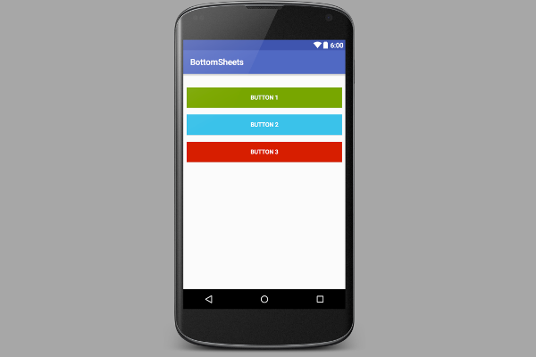
When run on a device, the layout looks like this:

There are a few key points within the layout file that you need to be aware of. To use the bottom sheets widget, you must use a CoordinatorLayout container for the views. Towards the bottom of the file, you notice that there is a NestedScrollView containing a TextView. While any container view can be used in a bottom sheet, scrolling can only properly occur if you use a container that supports nested scrolling, such as the NestedScrollView or a RecyclerView.
For a container to be recognized by the Design support library as a bottom sheet container, you need to include the layout_behavior attribute and give it a value of android.support.design.widget.BottomSheetBehavior. You can see this used above in the NestedScrollView.
Another key attribute to notice for the bottom sheet container is the layout_height. Whatever dimensions your container item uses, controls how your bottom sheet is displayed. There is one caveat to be aware of with the bottom sheet height. If you use the CoordinatorLayout, to move other View objects around, such as with a CollapsingToolbarLayout, then the height of your bottom sheet changes. This can cause an undesirable jumping effect.
2. Showing a Layout Based Bottom Sheet
Once you have added a view container and properly set it up within your layout file, you can open the Activity or Fragment that uses the bottom sheet. In the sample project, this is MainActivity.java.
For your bottom sheet to be displayable, you need to create a BottomSheetBehavior. This is created by getting a reference to the container view and calling BottomSheetBehavior.from() on that container. For this sample, you also reference the three buttons from the layout and call setOnClickListener() on them.
private BottomSheetBehavior mBottomSheetBehavior;

@Override
protected void onCreate(Bundle savedInstanceState) {
    super.onCreate(savedInstanceState);
    setContentView(R.layout.activity_main);

    View bottomSheet = findViewById( R.id.bottom_sheet );
    Button button1 = (Button) findViewById( R.id.button_1 );
    Button button2 = (Button) findViewById( R.id.button_2 );
    Button button3 = (Button) findViewById( R.id.button_3 );

    button1.setOnClickListener(this);
    button2.setOnClickListener(this);
    button3.setOnClickListener(this);

    mBottomSheetBehavior = BottomSheetBehavior.from(bottomSheet);
}
Now that you have created a BottomSheetBehavior, the last thing you need to do is show your bottom sheet View. You can do this by setting the state of your BottomSheetBehavior to STATE_EXPANDED, which we do in the sample app when the top Button is clicked.
@Override
public void onClick(View v) {
    switch( v.getId() ) {
        case R.id.button_1: {
            mBottomSheetBehavior.setState(BottomSheetBehavior.STATE_EXPANDED);
            break;
        }
    }
}
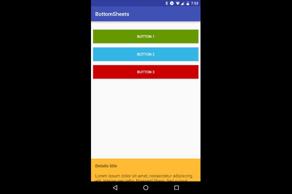
When this is done, your app should look like this:

To hide the bottom sheet, the user can swipe it down to hide it from the screen or you can set the BottomSheetBehavior to STATE_COLLAPSED.
3. Peeking a Bottom Sheet
You may have noticed in various Android apps and widgets from Google, such as the Place Picker from the Places API, that the bottom sheet pattern is used to display a preview of the bottom sheet that can be expanded for more details. This can be achieved with the Design support library bottom sheet by setting the collapsed size of the View with the setPeekHeight() method. If you want to show the shorter version of the bottom sheet, you can set the BottomSheetBehavior to STATE_COLLAPSED.
mBottomSheetBehavior.setPeekHeight(300);
mBottomSheetBehavior.setState(BottomSheetBehavior.STATE_COLLAPSED);
When the middle button is clicked, you end up with a bottom sheet in peek mode that can be expanded to its full height by dragging it up.

You may notice that when you attempt to drag the bottom sheet down, it only collapses down to its peek size. You can solve this by adding a BottomSheetCallback to the BottomSheetBehavior, setting the peek size to zero when the user collapses the sheet. In the example app, this is added at the end of onCreate().
mBottomSheetBehavior.setBottomSheetCallback(new BottomSheetBehavior.BottomSheetCallback() {
    @Override
    public void onStateChanged(View bottomSheet, int newState) {
        if (newState == BottomSheetBehavior.STATE_COLLAPSED) {
            mBottomSheetBehavior.setPeekHeight(0);
        }
    }

    @Override
    public void onSlide(View bottomSheet, float slideOffset) {
    }
});
4. Using a Bottom Sheet Fragment
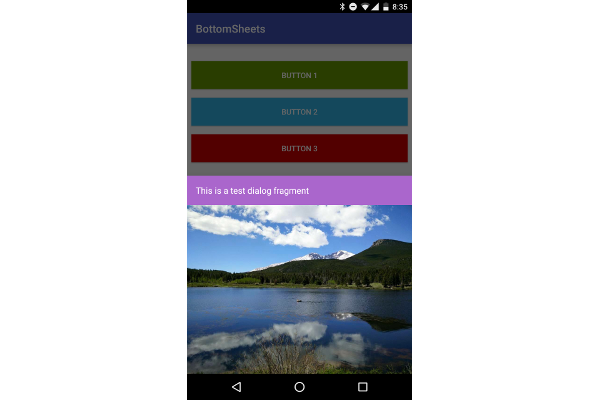
As I mentioned earlier in this article, you can also display a BottomSheetDialogFragment in place of a View in the bottom sheet. To do this, you first need to create a new class that extends BottomSheetDialogFragment.
Within the setupDialog() method, you can inflate a new layout file and retrieve the BottomSheetBehavior of the container view in your Activity. Once you have the behavior, you can create and associate a BottomSheetCallback with it to dismiss the Fragment when the sheet is hidden.
public class TutsPlusBottomSheetDialogFragment extends BottomSheetDialogFragment {

    private BottomSheetBehavior.BottomSheetCallback mBottomSheetBehaviorCallback = new BottomSheetBehavior.BottomSheetCallback() {

        @Override
        public void onStateChanged(@NonNull View bottomSheet, int newState) {
            if (newState == BottomSheetBehavior.STATE_HIDDEN) {
                dismiss();
            }

        }

        @Override
        public void onSlide(@NonNull View bottomSheet, float slideOffset) {
        }
    };

    @Override
    public void setupDialog(Dialog dialog, int style) {
        super.setupDialog(dialog, style);
        View contentView = View.inflate(getContext(), R.layout.fragment_bottom_sheet, null);
        dialog.setContentView(contentView);

        CoordinatorLayout.LayoutParams params = (CoordinatorLayout.LayoutParams) ((View) contentView.getParent()).getLayoutParams();
        CoordinatorLayout.Behavior behavior = params.getBehavior();

        if( behavior != null && behavior instanceof BottomSheetBehavior ) {
            ((BottomSheetBehavior) behavior).setBottomSheetCallback(mBottomSheetBehaviorCallback);
        }
    }
}
Finally, you can call show() on an instance of your Fragment to display it in the bottom sheet.
BottomSheetDialogFragment bottomSheetDialogFragment = new TutsPlusBottomSheetDialogFragment();
bottomSheetDialogFragment.show(getSupportFragmentManager(), bottomSheetDialogFragment.getTag());

Conclusion
Using the Design support library to display a bottom sheet is both versatile and simple. They can be used to display details or pickers without getting in the way, as well as act as a great replacement for the DialogFragment in the proper situation. Understanding how the bottom sheet can be used in your app will give you an additional tool to make great apps.


Comments