Atom, the new code editor released by GitHub, is one of an emerging flavor of apps that allow web technologies such as LESS, JavaScript and HTML to run natively in a desktop environment. Atom installs and runs like a "regular" desktop app, but once it opens up it behaves in a way that any web developer will find familiar.
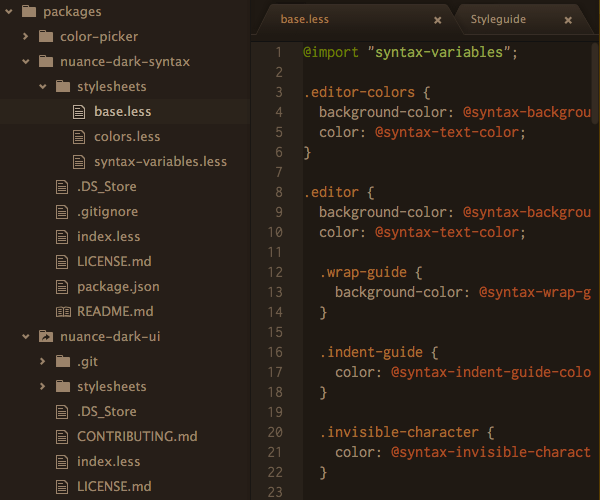
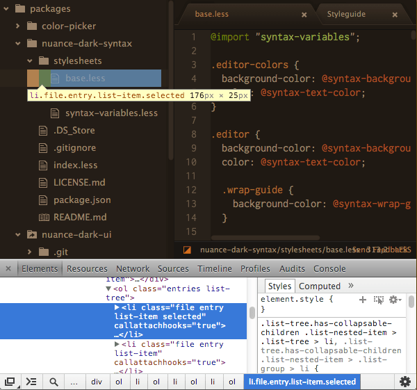
Atom is a "specialized variant of Chromium" and when run in developer mode gives access to the same "Developer Tools" you might be used to from Chrome. So, just as you could with any online web application, you're able to inspect the code behind any element of the app's interface and see what makes it tick:
What this means in practical terms is that anyone experienced with web design and development will immediately find familiarity with the way Atom works, and will likely be far more comfortable creating modifications and tweaks than with comparable programs. Atom's visual styling is driven by CSS, generated from LESS, so you can modify its appearance in the same way you would any LESS powered website.
Atom has two types of "themes" responsible for its presentation style:
Syntax themes control everything in the editor's inner space, i.e. the gutter, line numbers and code area.
UI themes control everything else, i.e. tabs, sidebar, buttons, overlays, messages etc.
In this tutorial you'll learn how to create both of these types of themes, producing them in tandem so the entire interface is uniformly restyled. Let's begin!
Getting Started
At the moment Atom is Mac only, and during its beta phase access is via invitation. If you don't yet have an invitation my suggestion is to put a request out on Twitter or at the Atom forum and someone is bound to send one your way. Download and install it as you would any other app.
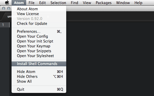
Developing themes will involve some Atom-specific command line usage, so the first thing you'll need to do is install the packages which enable these commands. After running Atom for the first time go to and select Atom > Install Shell Commands, which installs the atom and apm (atom package manager) commands.
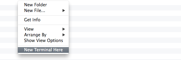
I also suggest using an app that will allow you to open a terminal from any folder you're viewing in Finder, as it will make it easier to run commands in the right location. I personally use the free XtraFinder to add a "New Terminal Here" option to my Finder context menu.
Create a New UI Theme
The basic process for creating a new Atom UI theme is to fork one of the two available default themes from GitHub, give it your own name, and edit the included files.
To do this, start by making sure you have both an account at GitHub, and GitHub for Mac (unless you prefer to use the command line) installed. Then head to the repository for either Atom Dark UI theme or Atom Light UI theme. In this tutorial we'll be using a dark color palette, so we'll fork the dark default theme.
At the top right corner of the original UI repository click the "Fork" button:

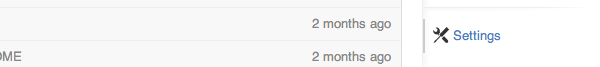
This will create a duplicate of the repo under your own account, i.e. youraccount / atom-dark-ui. The next thing you'll need to do is give the repository your own name. In the right sidebar of your forked repository click the "Settings" menu item.
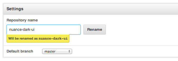
At the top of the "Settings" page you will see a field for the repository name. Type a new name of your choice, (in my case "nuance-dark-ui), into this field being sure to retain the "-ui" at the end, then click "Rename":
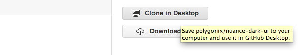
You're now ready to download your theme into your offline environment so you can start editing it. To do this, go back to your repository's main page then locate and click the "Clone in Desktop" button in the sidebar:
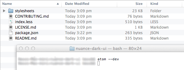
"GitHub for Mac" will then download the repository for you, into your default GitHub location. From your list of repositories in "GitHub for Mac", right click your newly cloned UI theme and select "Show in Finder":

A Finder window will open showing your UI theme folder inside your GitHub folder. Double click it to go into the actual folder and view the contents within.
Open Atom in Dev Mode
Open a new terminal in this location then run the command atom --dev
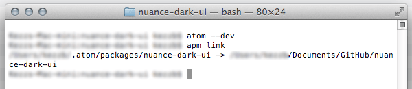
This command will open Atom in developer mode, showing your theme's file and folder structure in the sidebar. In this sidebar, click the "package.json" file to open it for editing, then change the name, version number and description. Again, make sure you preserve the "-ui" at the end of the theme name, then save:

Finally, you need to let Atom know how to access your theme folder from its local GitHub folder. Go back to your terminal, which should still be in the folder of your theme, and run the command apm link
Selecting Your Theme
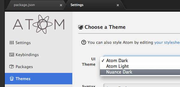
Now head back to Atom and press cmd-alt-ctrl-L or select View > Reload from the top menu to reload the interface, which will refresh the list of available UI themes, allowing yours to be selected.
From the top menu, select Atom > Settings to open the settings page and click "Themes" in the panel's left sidebar. You should see your theme in the list labelled "UI Themes" so go ahead and select it:
Your new UI theme is now active and ready for editing, however before we proceed we're going to generate a syntax theme too so you can edit both at the same time, keeping an eye on how they work in together.
Create a Syntax Theme
Creating a new syntax theme is an easier process than for a UI theme.
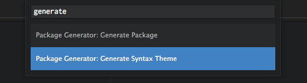
In Atom, press cmd-shift-P to bring up the command palette, then start typing "Generate Syntax Theme". When you see Package Generator: Generate Syntax Theme appear click it to execute the command:
A window will appear in which you can enter the path and name for your syntax theme. Whatever you decide to name your theme it should end in "-syntax". Given my UI theme was named "nuance-dark-ui" I named my syntax theme "nuance-dark-syntax".
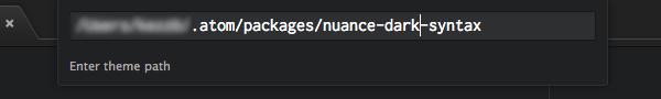
After entering your path and theme name press Enter to proceed.
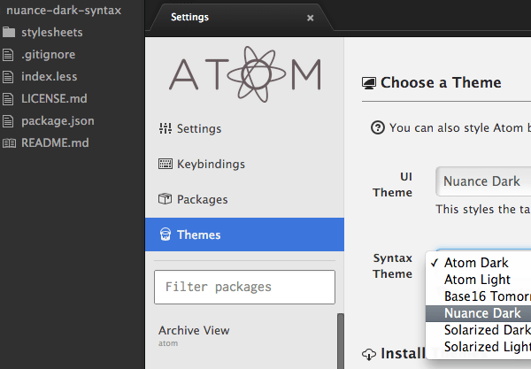
Atom will generate a new syntax theme for you and open it up in the sidebar. You should now be able to go to Atom > Settings again and choose your new syntax theme next to the Syntax Theme label:
Opening UI and Syntax Theme in Dev Mode
As we'll be working on both the UI and syntax themes together, we want to be able to access both of their files from the sidebar. We also want to be in "Dev Mode" while we're editing these files as this will mean Atom will automatically refresh its appearance whenever we save our changes.
Follow these steps to open both themes in dev mode, and use this same process any time in the future you need to come back and edit your themes.
Open Settings
Go to Atom > Preferences to open the settings page.
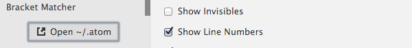
Open Local Atom Folder
Click Open ˜/.atom at the bottom of the settings left sidebar to open your local Atom folder in in the Atom sidebar:
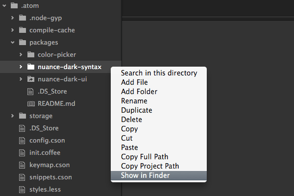
Show in Finder
In the Atom sidebar, right-click either your syntax theme or UI theme folder and choose Show in Finder:
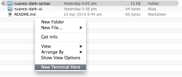
Go to Terminal
Quit Atom to close the existing instance (it's not in dev mode so we don't need it), then in the Finder window showing your theme folders open a new terminal:
Open in Dev Mode
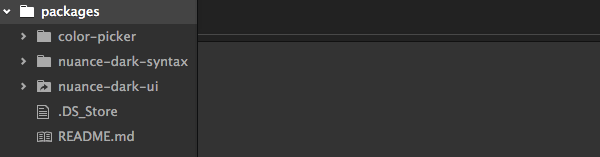
Run the command atom --dev to open the folder in Atom in dev mode. You should now see both theme folders in the sidebar:
As we are in dev mode, we can now open any theme file from the sidebar and changes will automatically become visible in the Atom interface.
Now we're ready to start the design process!
Mockup Your UI and Syntax Theme
You might find it takes a little tweaking to get the colors of your theme just how you want them, so designing directly in code is probably not the most efficient approach.
In the source files attached to this tutorial you'll find a PSD named "colormockup.psd", which contains enough interface elements and code simulations to facilitate your color palette selection. Use this PSD to visualize the colors you'd like to use in your UI and syntax themes.
I personally like earthy colors, low light and low contrast that doesn't burn out my eyes, so I ended up with this:
This is my personal preference, but you can of course go with any style that works for you.
When your mockup is done you're ready to start transferring your color values into your themes' LESS code. We'll start with the syntax theme due to it being simpler, using fewer variables than the UI theme.
Coding in Your Syntax Theme Colors
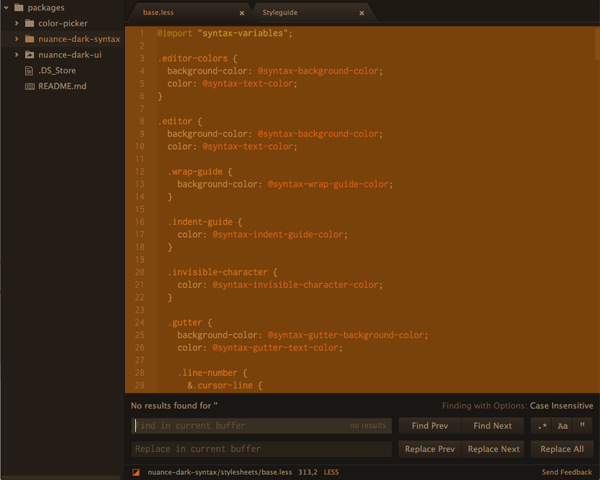
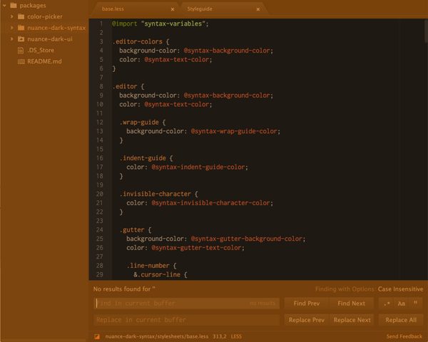
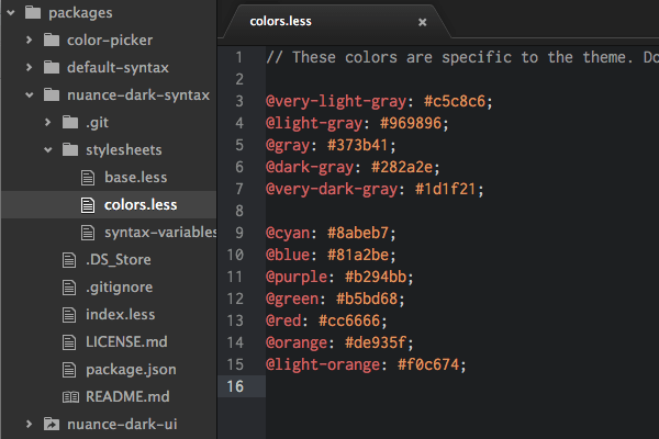
In your Atom sidebar, expand your syntax theme's folder and open up stylesheets > colors.less. You should see this:
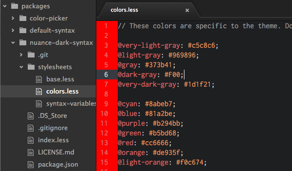
If you change the value of any of these variables, then save the file, you should instantly see the syntax area update. For example, if you change the value of @dark-gray to #F00 you should see the gutter background change color:
The colors listed in this file are in turn mapped to various aspects of the syntax via the "syntax-variables.less" and "base.less" files. Open these files up and take a moment to have a quick glance through them. In the "syntax-variables.less" file you'll see variables taken from the "colors.less" file. However in the "base.less" file you'll see variables from both the "colors.less" and "syntax-variables.less" file.
A Note on LESS Variables
As we add our new color scheme into this theme we'll be changing the value of variables in "colors.less" in a way that means their names may no longer reflect the color they contain. For example, where the variable @purple was used, we'll instead be using a shade of green.
To be thorough, you would ideally create new variable names that do reflect the new color scheme, however for the purposes of this tutorial I don't want to put you through having to replace every instance of the old variable names in the "syntax-variables.less" and "base.less" file.
So even though it might seem a little odd, we'll just allocate the colors of our new scheme directly against the existing variable names in "colors.less". This way you only have to edit a single file to create your syntax theme.
Figuring out Where Each Color Variable is Used
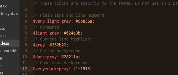
To help you understand which variables influence which aspects of the color scheme, replace the full code of the "colors.less" file with this:
// These colors are specific to the theme. Do not use in a package!

// Plain text and line numbers
@very-light-gray: #c5c8c6;
// Comments
@light-gray: #969896;
// Current line highlight
@gray: #373b41;
// Gutter background
@dark-gray: #282a2e;
// Code area background
@very-dark-gray: #1d1f21;

@cyan: #8abeb7;
@blue: #81a2be;
@purple: #b294bb;
@green: #b5bd68;
@red: #cc6666;
@orange: #de935f;
@light-orange: #f0c674;
The comments added to the first section tell you where each of the "gray" color variables are used in the syntax area.
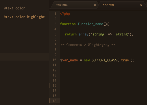
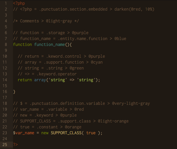
The second section with the seven color variables is a little more complicated as each one effects a different type of code. To get a rough idea of how these variables will appear create a new PHP file and paste in this:
<?php
// <?php = .punctuation.section.embedded > darken(@red, 10%)

/* Comments > @light-gray */

// function = .storage > @purple
// function_name = .entity.name.function > @blue
function function_name(){

  // return = .keyword.control > @purple
  // array = .support.function > @cyan
  // string = .string > @green
  return array('string' => 'string');

}

// $ = .punctuation.definition.variable > @very-light-gray
// var_name = .variable > @red
// new = .keyword > @purple
// SUPPORT_CLASS = .support.class > @light-orange
// true = .constant > @orange
$var_name = new SUPPORT_CLASS( true );

?>
Note: this file is also included in the source files.
When you view the above code in Atom you will see examples of how each of the seven color variables look when applied to syntax. The same code is used in the provided "colormockup.psd" so you can see how the colors correlate.
Check out the included comments for a description of which color variables are associated with each element of the code. You can use this code along with the PSD to help you figure out which variables the colors you chose should be mapped to in your "colors.less" file.
Modify the "Gray" Color Variables
We'll begin by carrying the "gray" colors over from your PSD mockup.
The first variable listed in "colors.less" is @very-light-gray which we know, (from the comments you just added), is used on "Plain text and line numbers". Go to your PSD and copy the hexcode of the color you chose for your line numbers. Paste that value, which in this case is #9b836a, into "colors.less" to replace the default for @very-light-gray.
Next, get the color hexcode you chose for comment text and add it against the variable @light-gray. Continue on in this fashion until all five "gray" variables are updated. For the "nuance-dark-syntax" theme I used:
// Plain text and line numbers
@very-light-gray: #9b836a;
// Comments
@light-gray: #624e3b;
// Current line highlight
@gray: #352b22;
// Gutter background
@dark-gray: #28211a;
// Code area background
@very-dark-gray: #1f1913;
Save the "colors.less" file and you should immediately see your syntax area looking quite different:
Modify the Seven "Color" Variables
Now to carry over the seven color variables in the second section.
The first of these variables is @cyan, and the content of the PHP file we created earlier contains the comment array = .support.function > @cyan, telling us this color is used on the word "array". Go to your PSD and copy the hexcode you applied to the word "array" there. In the "nuance" theme this was #446675.
Repeat the same process of finding each variable name in the comments of your PHP file to see which type of code it applies to, then copy over the color you chose from your PSD.
For the "nuance" theme I used:
@cyan: #446675;
@blue: #40796b;
@purple: #6a7c02;
@green: #93a14a;
@red: #a55027;
@orange: #a56b32;
@light-orange: #b5a163;
After saving, take another look at your PHP file and you should see all your new colors reflected in it, matching your PSD:
Your syntax theme is now complete! Now it's time to move on to the UI theme.
Coding in Your UI Theme Colors
Adding your color scheme into the UI theme is a little trickier than the syntax theme as it uses quite a lot more variables. Additionally, not all colors in the default theme are defined as variables so in some case you'll need to edit the actual styles.
Most of the colors used in the UI theme are defined in the "ui-variables.less" file. Go ahead and expand your syntax themes folder and open the file up for editing from the "stylesheets" folder.
Descriptive Variable Names and the Styleguide
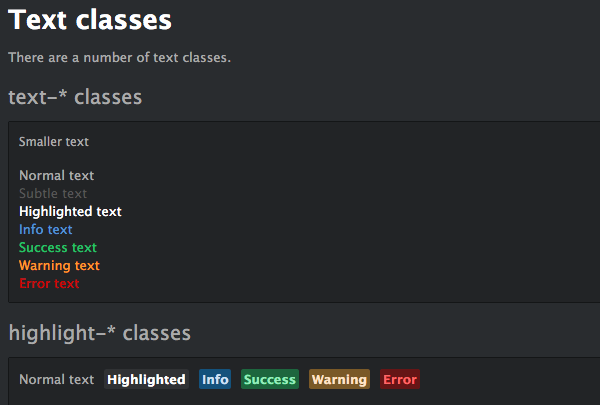
Atom ships with a very useful "Styleguide" that gives you a preview of all the UI elements influenced by your theme. Open it up by going to Packages > Styleguide > Show.
For the most part you'll find the variable names in the "ui-variables.less" file to be descriptive and to correlate, in order, with the UI elements listed in the Styleguide. For example the first several variables are prefixed @text-color and correlate with the first section of the Styleguide, labelled "Text classes".
If you're not sure which variable will affect what, don't be afraid to change variables randomly to see which aspects of the Styleguide are altered.
Finding UI Colors Which Aren't Defined as Variables
Not all colors in the default UI theme have associated LESS variables in the "ui-variables.less" file. Some colors are coded directly into other LESS files in the theme.
If you're not sure where a UI color is coming from and it doesn't seem to have an associated variable, use the element inspector on the area in question to find the class name responsible for the color. Then run a search in Finder for that class name to try and determine which of the theme's LESS files contains the class.
For example, the sidebar has a color hexcode of #303030 in the default theme which is not defined anywhere in "ui-variables.less". Inspecting the element shows the hexcode is coming from the class .focusable-panel.
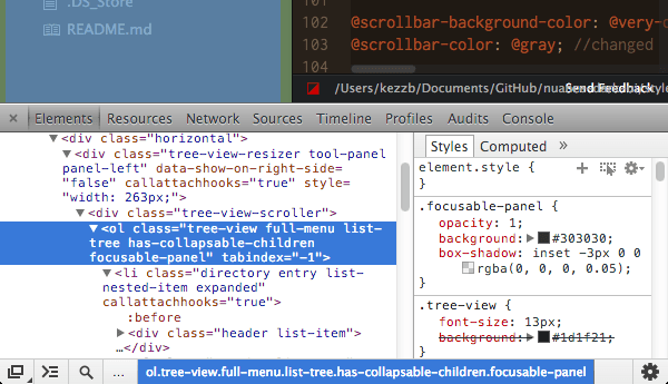
Running a Finder search within the UI's folder for "focusable-panel" reveals that this class is contained in the "tree-view.less" file.

The file can then be edited, placing a variable from the "ui-variables.less" file instead of a hardcoded hex value.
Sometimes your search won't yield any results, for whatever reason, and you might have to do things the hard way and manually go through each UI theme file until you find the class you want to change.
Adding Your Color Variables to the UI Theme
The UI theme cannot access the color variables defined by the syntax theme, however we want to use the same colors across both themes so they match. As such, we will need to duplicate the color variables from our syntax theme into our UI theme.
At the top of the "ui-variables.less" theme paste in all the variables from your syntax theme:
@very-light-gray: #9b836a;
@light-gray: #624e3b;
@gray: #352b22;
@dark-gray: #28211a;
@very-dark-gray: #1f1913;

@cyan: #446675;
@blue: #40796b;
@purple: #6a7c02;
@green: #93a14a;
@red: #a55027;
@orange: #a56b32;
@light-orange: #b5a163;
As well as these variables, there are an additional five custom variables I defined in order to carry over all the colors from my mockup, also pasted at the top of the "ui-variables.less" file:
// BG of selected file in sidebar
@n_selected: #2b231b;
// BG of sidebar
@n_defaultbg: #241d17;
// BG of bottom toolbar and "find" panel
@n_darkerbg: #191613;
// Color of selected text in sidebar
@n_highlight: #a37748;
// Border color of tabs
@n_tabborder: #372d26;
These variables will be used in multiple locations, but the comments included give you an example of the usage of each, which will help you determine which color codes you should copy from your PSD. Also, wherever possible, the layers in the PSD have been named with reference to the variable they effect.
Defining Extra Variables and Tweaking LESS Files
As I mentioned above, some of the default theme's color values are hard coded rather than being accessible as variables. In some cases variables are defined, but in files other than the main "ui-variables.less" file. To make it easier to apply our color scheme centrally via the "ui-variables.less" file we're going to define some extra variables and make some adjustments to a few theme files.
Paste the following code into your "ui-variables.less" below the color variables you added in the previous step:
// CUSTOM COLORS/VARS ADDED TO LESS FILES
//tree-view.less
@tree-view-selected-bg: @n_selected; //new > line 8
@sidebar: @n_defaultbg; //new > line 15
@sidebar-focus: lighten(@n_defaultbg, 0.5%); //new > line 19
//tabs.less
@tab-default-bg: @n_defaultbg; //new > line 45
//tooltips.less
@tip-background-color: lighten(@very-light-gray, 10%); //variables taken out of tooltips.less and placed here for access
@tip-text-color: @very-dark-gray; //variables taken out of tooltips.less and placed here for access
Make note of the comments included keep track of which files are to be modified and on what line in order to use these variables.
With your new variables in place, you can now make the following edits to your theme files:
tree-view.less > line 8: change to background: @tree-view-selected-bg;
tree-view.less > line 15: change to background: @sidebar;
tree-view.less > line 19: change to background: @sidebar-focus;
tabs.less > line 45: change to:
background-image: -webkit-linear-gradient(top, lighten(@tab-default-bg, 7%), @tab-default-bg);
tooltips.less > delete lines 4 and 5:
@tip-background-color: #fff;
@tip-text-color: #333;
These two lines are deleted from "tooltips.less" as the variables are now defined in the main "ui-variables.less" file instead.
We've now made all the required adjustments to go along with our newly defined variables, but there are a few more tweaks to replace hard coded colors and get all the theme files working well with our variables.
utilities.less > line 6: change to background: darken(@button-background-color, 5%);
tree-view.less > line 29: change to color: lighten(@very-light-gray, 15%) !important;
panels.less > line 50: change to
background-image: -webkit-linear-gradient(@panel-heading-background-color, darken(@panel-heading-background-color, 5%));
...makes the gradient more subtle to suit our new colors.
tooltips.less > line 11: change to color: saturate(darken(@red, 10%), 5%);
Mapping our Color Variables
We now have all the colors from our PSD mockup defined as variables, and all the theme files ready to respond to the definitions in "ui-variables.less".
The only thing left now is to map our custom color variables against the default variables that were already in place when we first opened up the "ui-variables.less" file. It's not necessary to change the value of every single default variable, because some of them piggy-back their values from others in the same file. For example we have @text-color-highlight: #fff; and this value is piggy backed on the next line in @text-color-selected: @text-color-highlight;.
Replace all the code between the comment // Colors and the comment // Sizes with this code:
@text-color: @very-light-gray; //changed
@text-color-subtle: @light-gray; //changed
@text-color-highlight: @n_highlight; //changed
@text-color-selected: @text-color-highlight;

@text-color-info: @cyan; //changed
@text-color-success: @blue; //changed
@text-color-warning: lighten(@orange, 15%); //changed
@text-color-error: saturate( lighten(@red, 10%), 10%); //changed

@text-color-ignored: @text-color-subtle;
@text-color-added: @text-color-success;
@text-color-renamed: @text-color-info;
@text-color-modified: @text-color-warning;
@text-color-removed: @text-color-error;

@background-color-info: @cyan; //changed
@background-color-success: @blue; //changed
@background-color-warning: lighten(@orange, 15%); //changed
@background-color-error: saturate( lighten(@red, 10%), 10%); //changed
@background-color-highlight: rgba(255, 255, 255, 0.07);
@background-color-selected: @n_selected; //changed

@app-background-color: #333;

@base-background-color: lighten(@tool-panel-background-color, 5%);
@base-border-color: @n_darkerbg;

@pane-item-background-color: @base-background-color;
@pane-item-border-color: @n_darkerbg; //changed

@input-background-color: @dark-gray; //changed
@input-border-color: @base-border-color;

@tool-panel-background-color: @n_darkerbg; // changed
@tool-panel-border-color: @base-border-color;

@inset-panel-background-color: @n_defaultbg; //changed
@inset-panel-border-color: @base-border-color;

@panel-heading-background-color: @gray; //changed
@panel-heading-border-color: fadein(@base-border-color, 10%);

@overlay-background-color: @dark-gray; //changed
@overlay-border-color: @background-color-highlight;

@button-background-color: @gray; //changed
@button-background-color-hover: lighten(@button-background-color, 5%);
@button-background-color-selected: @dark-gray; //changed
@button-border-color: @base-border-color;

@tab-bar-background-color: @very-dark-gray; //changed
@tab-bar-border-color: darken(@tab-background-color-active, 10%);
@tab-background-color: @n_defaultbg; //changed
@tab-background-color-active: @very-dark-gray; //changed
@tab-border-color: @n_tabborder; //changed

@tree-view-background-color: @tool-panel-background-color;
@tree-view-border-color: @tool-panel-border-color;

@scrollbar-background-color: @very-dark-gray; //changed
@scrollbar-color: @gray; //changed

@ui-site-color-1: @background-color-success; // green
@ui-site-color-2: @background-color-info; // blue
@ui-site-color-3: @background-color-warning; // orange
@ui-site-color-4: @purple; // changed
@ui-site-color-5: @red; // changed
It would be a little excessive to explain every line of this code, but look for the comment // changed at the end of a line to see where our custom color variables have been mapped against the theme's default variables.
Remember, if you're not sure where these variables apply you can check on their correlation with the Styleguide, as described above.
After saving your "ui-variables.less" file, (and the others you edited), your interface should now look like this:
If you press ctrl-shift-P to bring up the command palette it should look like:
And if you press ctrl-F the "find" panel at the bottom of the editor should look like:

Wrapping Up
You can download the completed "Nuance" UI and syntax themes at GitHub:
And you can install them directly in Atom by going to Atom > Preferences > Themes and typing "Nuance" into the filter field.
Once you've completed your own custom syntax and / or UI theme you have the option to share it with other Atom users as a package. To do this you'll need to have an up to date GitHub repository for each. For instructions on how to publish an Atom package see Atom Docs: Publishing a Package
In this tutorial we've kept the existing LESS file code unchanged as much as possible, focusing on working with variables. That said, if you want to dive deeper into the theme code you can control the presentation of virtually any aspect of the syntax and UI, from the shape of your tabs to the color of your curly braces and operators.
If you find yourself wishing some piece of code or UI element were different, just open up Atom in dev mode and use the element inspector to see if there is a class in place that you can target. As a general rule, you can customize pretty much everything.
Already, even in beta mode, Atom looks extremely promising in its ability to make customization accessible for anyone with a background in web technologies. Try your hand at working with Atom, you'll be blown away by what you can do!

Comments