1. Setting the Stage
As you create applications with Xamarin.Forms, you will no doubt like the simplicity of creating user interfaces. Using Xamarin.Forms, you are able to use the same terminology for controls across multiple platforms.
While this concept can be very powerful, as a designer or a developer, it can be somewhat limiting. It may seem like we're forced to use the native user interface controls that come with each of the platforms without the ability to add customization. This is not the case.
In order to get into the process of customizing the user interface for specific platforms, you must first understand the rendering process of Xamarin.Forms.
2. Control Rendering
When it comes to using Xamarin.Forms to create a user interface for your cross platform mobile application, there are two important pieces to the puzzle that you must understand.
Element
The first piece of the puzzle is the element. You can think of an element as the platform agnostic definition of a control within Xamarin.Forms. If you have read through the documentation at all, you will know that these controls are also referred to as View objects. To be even more specific, every element within Xamarin.Forms derives from the View class.
These elements are used to describe a visual element. The elements provide a platform agnostic definition of characteristics of how the control should look and behave. An element on it's own can't actually create a control that is displayed to the user. It needs some help. This is where the second piece of the rendering process comes in, a renderer.
Renderer
A renderer comes into play when you run your application. The job of the renderer is to take the platform agnostic element and transform it into something visual to present to the user.
For example, if you were using a Label control in your shared project, during the running of your application, the Xamarin.Forms framework would use an instance of the LabelRenderer class to draw the native control. If you are starting to wonder how this happens from a shared code project, that's a very good question. The answer is, it doesn't.
Let's illustrate this with an example. Start by opening either Xamarin Studio or Visual Studio. The process and concepts are the same for both. If you are using Xamarin Studio, there is no support for Windows Phone projects so you will only create three projects in your solution. If you are using Visual Studio, you will create four projects.
In Visual Studio, create a new project and select the Mobile Apps project family on the left and choose the Blank App (Xamarin.Forms Portable) project template on the right. You can name your project anything you like, but if you wish to follow along with me, then use the name Customization, and the click OK.
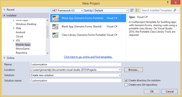
Now, depending on your IDE, you should see either three or four projects in your solution. If you expand the References folder in your Customization (Portable) project, you will see an assembly reference to Xamarin.Forms.Core. This is where all the different elements are defined for you to use in your shared user interface project. Nothing out of the ordinary there.
If you open each of the platform specific projects and expand their References folders, you'll see that each one contains a platform specific implementation of that Xamarin.Forms library, named Xamarin.Forms.Platform.Android, Xamarin.Forms.Platform.iOS, and Xamarin.Forms.Platform.WP8 respectively.
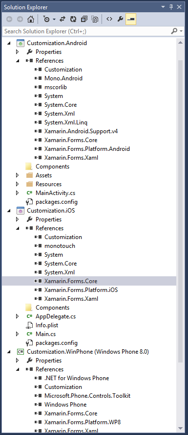
It's in these assemblies that you'll find the renderers for each of the Xamarin.Forms elements. Now you are beginning to see the layout of the process. The platform agnostic elements, or View objects, are in the shared code project, but all the specific renderers for the elements are in the platform specific projects.
This means that for each of the elements you use, there will be two renderers created in Xamarin Studio, and three in Visual Studio. Now that you see how this is structured in Xamarin.Forms, the next logical question is usually, "When should I use customizations?".
3. When to Customize
There are definitely a good number of properties and characteristics that are defined within Xamarin.Forms elements that can be used to customize the final control on each of the platforms. Having said that though, not every customization available in each of the platforms exists in Xamarin.Forms. That being the case, there are two main scenarios when you will want to create customizations.
The first scenario when customizations will be needed is when you want to create a completely custom control. Let's say you wanted to create a calendar control or maybe some sort of graphing control. Unfortunately nothing like that exists today in Xamarin.Forms, which is not to say that it never will.
This is definitely a situation where you will need to start from square one and create everything from scratch. You will need to define the element you are going to use to describe the characteristics of the control in a platform agnostic manner. Then you will also need to create a custom renderer for each of the platforms you wish to support.
Depending on what you are building, this can be a rather extensive project. That being the case, I will save that for another tutorial in and of itself. Instead, in this tutorial, we will be focusing on the second scenario in which you will need some customization.
The second situation that you'll find yourself needing some customization is when a built-in element doesn't support a specific feature of a platform you wish to support. An example of this would be on the Label control. In Xamarin.Forms, there is no mechanism, or property, that allows you to create the equivalent on each of the platforms to make the text bold or italic. This may seem like a very simple scenario, but you will find that the basic process of making this change available in the element and have the renderer understand it will be the same here as in some of the more complex scenarios.
With the second scenario in mind, you have two options. You can either replace the existing renderer for a specific platform (or for all platforms) and create your own functionality and drawing logic for all the capabilities of the element. Alternatively, you can create your own element that derives from the existing element and associate that new element with a custom renderer. This way, you will retain all the default logic and rendering capabilities of the base element and customize it as you wish. This will be the route we take for this example. Now, let's see how to add this functionality to our own project.
4. Adding Customization
Let's start this process by setting up the basic structure of our application so we can see our baseline and then make changes. Start by opening your App.cs file in the Customization (Portable) project in the Solution Explorer. Modify the GetMainPage method to look like this:
public static Page GetMainPage() {
            var iLabel = new Label {
                TextColor = Color.Black,
                Text = "I want to be italicized!",
                HorizontalOptions = LayoutOptions.CenterAndExpand
            };
            var bLabel = new Label
            {
                Text = "I want to be bold!",
                TextColor = Color.Black,
                HorizontalOptions = LayoutOptions.CenterAndExpand
            };
            var bothLabel = new Label
            {
                Text = "I want to be italicized and bold!",
                TextColor = Color.Black,
                HorizontalOptions = LayoutOptions.CenterAndExpand
            };
            return new ContentPage
            {
                BackgroundColor = Color.White,
                Content = new StackLayout {
                    Padding = 100,
                    Spacing = 100,
                    Children = { iLabel, bLabel, bothLabel }
                }
            };
        }
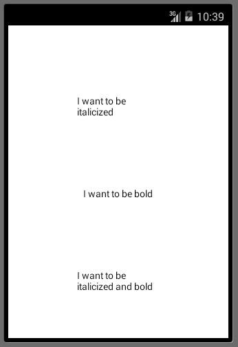
As you can see here, we have created three simple Label controls. One wants to be italicized, one wants to be bold, and the third is greedy and wants to be both. If you were to run this application on iOS, Android, and Windows Phone, they would look something like this:
iOS

Android
Windows Phone
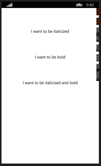
As you can see, they don't want to be this boring. Well, don't just sit there, help them out.
Step 1: Creating a New Element
The first thing we need to do is create a new element that we can use to provide additional customizations to the existing Label control. Start by adding a new class to your Customization (Portable) project and name it StyledLabel. Replace its contents with the following:
public enum StyleType {
        Italic,
        Bold,
        BoldItalic
    }

    public class StyledLabel : Label
    {
        public StyleType Style { get; set; }
    }
We define a very simple enumeration and class. We have defined the enumeration to allow for italic, bold, and bold plus italic values. We then create a class StyledLabel that derives from the Label base class and add a new property, Style, to hold the appropriate style we want to apply to the control.
To make sure everything still works, and it should, let's modify the App.cs file once more and replace the Label elements in our first example with our new StyledLabel elements. Because the StyleLabel class inherits from the Label class, everything should still work.
public static Page GetMainPage() {
            var iLabel = new StyledLabel {
                TextColor = Color.Black,
                Text = "I want to be italicized!",
                HorizontalOptions = LayoutOptions.CenterAndExpand,
                Style = StyleType.Italic
            };
            var bLabel = new StyledLabel
            {
                Text = "I want to be bold!",
                TextColor = Color.Black,
                HorizontalOptions = LayoutOptions.CenterAndExpand,
                Style = StyleType.Bold
            };
            var bothLabel = new StyledLabel
            {
                Text = "I want to be italicized and bold!",
                TextColor = Color.Black,
                HorizontalOptions = LayoutOptions.CenterAndExpand,
                Style = StyleType.BoldItalic
            };
            return new ContentPage
            {
                BackgroundColor = Color.White,
                Content = new StackLayout {
                    Padding = 100,
                    Spacing = 100,
                    Children = { iLabel, bLabel, bothLabel }
                }
            };
        }
Once again, here are the results of this change.
iOS

Android

Windows Phone

As you can see, nothing has changed. Now that we have a new custom element, it is time to create the custom renderers to take care of the native controls.
Step 2: Android Renderer
The first step to creating a renderer is to add a new class to the platform you are targeting. We will be starting with the Xamarin.Android project. Within this project, create a new class file and name it StyledLabelRenderer and replace its contents with the following:
using Android.Graphics;
using Customization;
using Customization.Droid;
using Xamarin.Forms;
using Xamarin.Forms.Platform.Android;

[assembly: ExportRenderer(typeof(StyledLabel), typeof(StyledLabelRenderer))]

namespace Customization.Droid
{
    public class StyledLabelRenderer : LabelRenderer {
        protected override void OnElementChanged( ElementChangedEventArgs<Label> e ) {
            base.OnElementChanged( e );

            var styledLabel = (StyledLabel)Element;

            switch (styledLabel.Style)
            {
                case StyleType.Bold:
                    Control.SetTypeface(null, TypefaceStyle.Bold);
                    break;
                case StyleType.Italic:
                    Control.SetTypeface(null, TypefaceStyle.Italic);
                    break;
                case StyleType.BoldItalic:
                    Control.SetTypeface(null, TypefaceStyle.BoldItalic);
                    break;
            }

        }
    }
}
Let's take a closer look at this code block.
[assembly: ExportRenderer(typeof(StyledLabel), typeof(StyledLabelRenderer))]
We start with a special assembly attribute that tells Xamarin.Forms to use this StyledLabelRenderer class as the renderer every time it tries to render StyledLabel objects. This is required for your customizations to work properly.
Just like when we created a new StyledLabel element, we inherited from the Label class, we will have our new StyledLabelRenderer class inherit from the LabelRenderer class. This will allow us to keep the existing functionality so we only have to override what we want to change or customize.
In order to apply our new formatting, we are going to need to jump into the rendering process and we do that via the OnElementChanged method. In this method, we can do all of our customizations.
When doing your customizations, there are two very important properties you will be using. First, you will need to get a reference to the original element that you created and that is being rendered in our custom renderer method. You do this by using the Element property. This is a generic object so you will have to cast this to whatever type you are rendering. In this case, it is a StyledLabel.
var styledLabel = (StyledLabel)Element;
The second important property you need is the Control property. This property contains a typed reference to the native control on the platform. In this case, since you have inherited from the LabelRenderer class, the code already knows that the Control in this case is a TextView.
From this point, you will use some simple logic to determine which customization to perform and apply the appropriate native customizations. In this case, you will use the Android mechanism for modifying the typeface of a TextView by using the SetTypeface method.
switch (styledLabel.Style)
            {
                case StyleType.Bold:
                    Control.SetTypeface(null, TypefaceStyle.Bold);
                    break;
                case StyleType.Italic:
                    Control.SetTypeface(null, TypefaceStyle.Italic);
                    break;
                case StyleType.BoldItalic:
                    Control.SetTypeface(null, TypefaceStyle.BoldItalic);
                    break;
            }
If you were to run this application now, you should see something like the following in the Android Emulator, which is exactly what we aimed for.
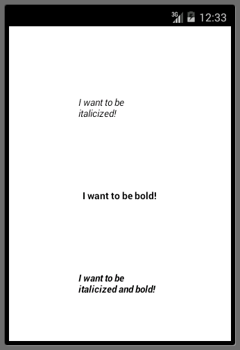
Step 3: iOS Renderer
The process of creating the iOS renderer is exactly the same up until the point of overriding the OnElementChanged method. Begin by creating a new class in your Customization.iOS project. Name it StyledLabelRenderer and replace the contents with the following:
using Customization;
using Customization.iOS;
using MonoTouch.UIKit;
using Xamarin.Forms;
using Xamarin.Forms.Platform.iOS;

[assembly: ExportRenderer(typeof(StyledLabel), typeof(StyledLabelRenderer))]

namespace Customization.iOS
{
    public class StyledLabelRenderer : LabelRenderer
    {
        protected override void OnElementChanged(ElementChangedEventArgs<Label> e)
        {
            base.OnElementChanged(e);

            var styledLabel = (StyledLabel)Element;

            switch (styledLabel.Style)
            {
                case StyleType.Bold:
                    Control.Font = UIFont.BoldSystemFontOfSize( 16.0f );
                    break;
                case StyleType.Italic:
                    Control.Font = UIFont.ItalicSystemFontOfSize( 16.0f );
                    break;
                case StyleType.BoldItalic:
                    Control.Font = UIFont.FromName( "Helvetica-BoldOblique", 16.0f );
                    break;
            }
        }
    }
}
As you can see, everything is exactly the same. You have the same assembly attribute, you are overriding the same OnElementChanged method, you are casting the Element property to a StyledLabel, and you have the same shell of a switch statement to work through the Style property.
The only difference comes in where you are applying the styling to the native UILabel control.
switch (styledLabel.Style)
            {
                case StyleType.Bold:
                    Control.Font = UIFont.BoldSystemFontOfSize( 16.0f );
                    break;
                case StyleType.Italic:
                    Control.Font = UIFont.ItalicSystemFontOfSize( 16.0f );
                    break;
                case StyleType.BoldItalic:
                    Control.Font = UIFont.FromName( "Helvetica-BoldOblique", 16.0f );
                    break;
            }
The way you make a UILabel's Font property either bold or italic in iOS is through a static helper method on the UIFont class named either BoldSystemFontOfSize or ItalicSystemFontOfSize. That will work in the case of either a bold font or an italic font, but not both. If you try to apply both of these to a UILabel, only the last one will render.
To get both styles, we will cheat a little and use a built-in font in iOS named Helvetica-BoldOblique. This font has both bold and italic built-in so we don't have to do them individually.
Running this in the iOS Simulator will give you the following result:
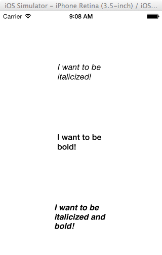
Step 4: Windows Phone Renderer
Finally, we come to Windows Phone. As you may have already guessed, the process is exactly the same. Create a new class in the Customization.WinPhone project, name it StyledLabelRenderer and replace the contents with the following:
using System.Windows;
using Customization;
using Customization.WinPhone;
using Xamarin.Forms;
using Xamarin.Forms.Platform.WinPhone;

[assembly: ExportRenderer(typeof(StyledLabel), typeof(StyledLabelRenderer))]

namespace Customization.WinPhone
{
    public class StyledLabelRenderer : LabelRenderer
    {
        protected override void OnElementChanged( ElementChangedEventArgs<Label> e ) {
            base.OnElementChanged( e );

            var styledLabel = (StyledLabel) Element;

            switch ( styledLabel.Style ) {
                case StyleType.Bold:
                    Control.FontWeight = FontWeights.Bold;
                    break;
                case StyleType.Italic:
                    Control.FontStyle = FontStyles.Italic;
                    break;
                case StyleType.BoldItalic:
                    Control.FontStyle = FontStyles.Italic;
                    Control.FontWeight = FontWeights.Bold;
                    break;
            }
        }
    }
}
Once again, everything is the same except for the logic. In this case, to make the text italic, you set the TextBlock's FontStyle property to Italic. Then to make the text bold, you set the FontWeight property to Bold. If you want to apply both, you simply set both.
Running this application in the Windows Phone emulator will give you the following result:
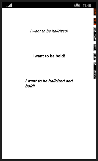
You have now successfully created a fully functional, customized, cross platform element that renders itself perfectly on all three platforms. You should now feel ready to take on the world. Well, almost.
The process that we have followed throughout this tutorial is completely valid and in most cases is going to work perfectly. There is a very specific case, though, in which we will be missing out on some functionality if we use that approach. That case is data-binding in XAML.
5. XAML and Data-Binding
One of the very cool features of Xamarin.Forms is the fact that you get to use XAML and data-binding just as you would if you were creating a Windows Phone, WPF, or Silverlight application. Unfortunately data-binding and XAML are beyond the scope of this tutorial, but I encourage you to read more about this topic on the XAML for Xamarin.Forms page.
Step 1: Building the XAML Page
Let's start by building a simple XAML page that duplicates the user interface we've previously created in code. Start by adding a new file to your Customizations (Portable) project, selecting the Forms XAML Page file type and giving it a name of StyledLabelPage.
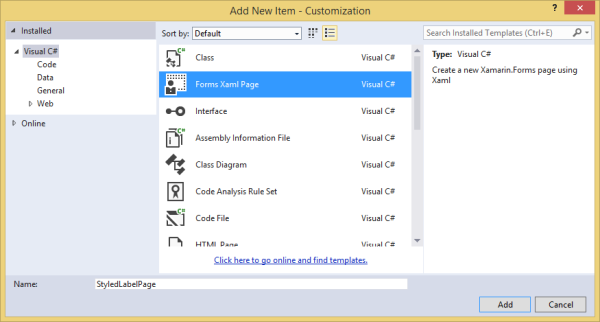
Once the file is created, replace the contents with the following:
<?xml version="1.0" encoding="utf-8" ?>
<ContentPage xmlns="http://xamarin.com/schemas/2014/forms"
    				   xmlns:x="http://schemas.microsoft.com/winfx/2009/xaml"
             xmlns:local="clr-namespace:Customization;assembly=Customization"
					   x:Class="Customization.StyledLabelPage">
  <StackLayout BackgroundColor="White" Spacing="100" Padding="100">
    <local:StyledLabel Text="I want to be italicized" TextColor="Black" HorizontalOptions="CenterAndExpand" Style="Italic" />
    <local:StyledLabel Text="I want to be bold" TextColor="Black" HorizontalOptions="CenterAndExpand" Style="Bold" />
    <local:StyledLabel Text="I want to be italicized and bold" TextColor="Black" HorizontalOptions="CenterAndExpand" Style="BoldItalic" />
  </StackLayout>
</ContentPage>
This XAML will create the exact same page that we have been working with before. Note the addition of the xmlns:local namespace declaration at the top of the file as well as the local: prefix before each reference to the StyledLabel objects. Without these, the XAML parser won't know what a StyledLabel is and ultimately won't be able to run.
In order to run this, you will need to make two small modifications. First, open the App.cs file and modify the GetMainPage method to look like this:
public static Page GetMainPage() {
            return new StyledLabelPage();
        }
Second, open the StyledLabelPage.xaml.cs file and change it to look like this:
public partial class StyledLabelPage : ContentPage
    {
        public StyledLabelPage()
        {
            InitializeComponent();
        }
    }
Now, when you run your applications, you should get the same results on all three platforms. Pretty neat, huh?
iOS

Android

Windows Phone

Step 2: Adding Data-Binding
If you are familiar with the concept of the Model View View-Model pattern (MVVM), you will know that one of its primary characteristics is data-binding. In fact, this pattern was designed around the use of XAML.
Data-binding is the process of allowing the properties of two objects to be linked together so that a change in one will create a change in the other. The process of data-binding within XAML is achieved through the use of the Binding Markup Extension.
Markup extensions are not a feature of Xamarin.Forms, or even of XAML. It is actually a feature of XML that allows additional functionality to be applied to the process of setting the value of an attribute in an element.
For example, let's give a closer look to the first StyledLabel element in the above example.
<local:StyledLabel Text="I want to be italicized" TextColor="Black" HorizontalOptions="CenterAndExpand" Style="Italic" />
The problem with this markup is that all of the properties (attributes) are being explicitly assigned. This creates a rather inflexible design. So what happens if for some reason during the execution of our application, we want to change the Style attribute to have a value of Bold? Well, in our code-behind file, we would need to watch for an event, catch that event, get a hold of this instance of the StyledLabel element and modify this attribute value. That sounds like a lot of work. Wouldn't it be nice if we could make that process easier? Well, we can.
Binding Markup Extension
The way that you are able to make this design more flexible for modification is through the use of the Binding markup extension. The way you use this extension is by modifying the markup to look like the following:
<local:StyledLabel Text="I want to be italicized" TextColor="Black" HorizontalOptions="CenterAndExpand" Style="{Binding FirstStyle}" />
As you can see, we've changed the value of the Style property to {Binding FirstStyle}. The use of a markup extension is typically signified by the use of curly braces {}. This means that whatever is contained inside the curly braces is going to be a markup extension.
In this case, we are using the Binding extension. The second part of this extension is the name of a property that we want to bind to this property (attribute). In this case, we will call it FirstStyle. That doesn't exist yet, but we will take care of that in a moment. First, let's completely update this file to take advantage of data-binding.
<?xml version="1.0" encoding="utf-8" ?>
<ContentPage xmlns="http://xamarin.com/schemas/2014/forms"
    				   xmlns:x="http://schemas.microsoft.com/winfx/2009/xaml"
             xmlns:local="clr-namespace:Customization;assembly=Customization"
					   x:Class="Customization.StyledLabelPage">
  <StackLayout BackgroundColor="White" Spacing="100" Padding="100">
    <local:StyledLabel Text="I want to be italicized" TextColor="Black" HorizontalOptions="CenterAndExpand" Style="{Binding FirstStyle}" />
    <local:StyledLabel Text="I want to be bold" TextColor="Black" HorizontalOptions="CenterAndExpand" Style="{Binding SecondStyle}" />
    <local:StyledLabel Text="I want to be italicized and bold" TextColor="Black" HorizontalOptions="CenterAndExpand" Style="{Binding ThirdStyle}" />
  </StackLayout>

</ContentPage>
BindingContext
Since we are creating a binding, by definition we are trying to link this XAML attribute to something else that will allow these two properties to share their data. To do that, you will first need to create a class that contains properties with the same names that we are using in the XAML example above.
Create a new class within the Customizations (Portable) project and name it SampleStyles and replace the contents with the following:
public class SampleStyles
    {
        public StyleType FirstStyle { get; set; }
        public StyleType SecondStyle { get; set; }
        public StyleType ThirdStyle { get; set; }
    }
This is a very simple class that contains three properties of type StyleType with the same names that we used in our Binding of the attributes. We now have the XAML using the Binding markup extension and a class that contains properties with the same name as we see in the bindings in the XAML. We just need glue to put them together. That glue is the BindingContext.
To link the properties of these objects together, we need to assign an instance of the SampleStyles class to the BindingContext property of StyledLabelPage. Open the StyledLabelPage.xaml.cs file and modify the constructor to look like the following:
public StyledLabelPage()
        {
            InitializeComponent();
            BindingContext = new SampleStyles {
                FirstStyle = StyleType.Italic,
                SecondStyle = StyleType.Bold,
                ThirdStyle = StyleType.BoldItalic
            };
        }
In theory, if you were to run your application, the XAML file would get populated with the values from our SampleStyles properties and everything would be rendered on the screen as we saw before. Unfortunately that is not the case. You wind up getting an exception at runtime that looks like this:
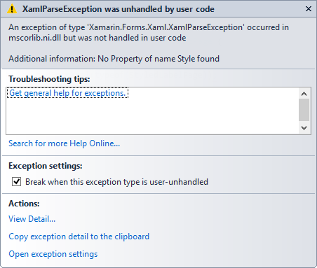
If you look at Additional information, you will see the problem is that No Property of name Style found. This is a result of the way we created the StyledLabel in the beginning. To take advantage of data-binding, your properties need to be of type BindableProperty. To do this, we will need to make a small modification to our StyledLabel class.
public class StyledLabel : Label {
        public static readonly BindableProperty StyleProperty = BindableProperty.Create<StyledLabel, StyleType>( p => p.Style, StyleType.None );

        public StyleType Style {
            get { return (StyleType)base.GetValue( StyleProperty ); }
            set { base.SetValue(StyleProperty, value);}
        }
    }
As you can see, we have added a static property named StyleProperty of type BindableProperty. We then assigned to it the result of a the CreateMethod that defines the owner of the property we are working with.
The property is Style, but the owner is StyledLabel. The second generic parameter is the return type of the property, which is a StyleType. Then the only argument we are supplying to the method is an expression that defines what is being returned and a default value. In our case, we are returning the value of the Style instance property and the default will be None, or no styling.
We then need to modify the Style property implementation to defer the getting and setting functionality to the base class so that the BindingProperty is updated properly if the value of the Style property changes.
Now, if you were to run your application again, you should see that everything is working as expected.
iOS

Android

Windows Phone

Conclusion
In this tutorial, you learned about a very important concept in the world of Xamarin.Forms, customization. Customization is one of the key features that allows them to stand out from the competition.
Knowing how, when, and where to customize is a very important skill to have as a mobile developer. I hope you find these skills useful and are able to put them to good use in your next project.


Comments