If you dream of creating the next big thing in Android apps, then I'm not going to lie: you’ve got your work cut out for you!
You only need to take a quick peek at the Google Play store to see that pretty much every app you can think of has already been created—usually, multiple times and with varying degrees of success.
In such a competitive market, your app has to offer the full package—simply having a great set of features isn’t going to cut it! Your app also has to be responsive, easy to use, completely free of bugs, and (as shallow as it may seem) it has to look nice, too.
So when you jolt awake in the middle of the night with a brilliant idea for an Android app, resist the temptation to leap out of bed, boot up Android Studio and start bringing your vision to life. If you’re going to do your idea justice, then you need to put some thought into your application’s design.
In this two-part series, I’m going to show you how to turn a great idea into a great app. You’ll learn how to plan, test and perfect every part of your app’s design, and how to iron out as many issues as possible before you even write a single line of code.
In this first installment, we’re going to look at how to answer all of those big, burning questions every developer has to tackle whenever they start a new Android project. Then, we’ll create a list of all the screens we need to build, plus a screen map that shows exactly how all these screens fit together.
In part 2, you’ll master some powerful, designed-minded techniques, including wireframing and prototyping. By the end of part 2 you’ll have created a digital prototype that you can install and test on your Android smartphone, tablet, or emulator.
To help you see exactly how you’d take an idea from ‘spark of inspiration’ to working digital prototype, I’m going to imagine I’ve come up with an idea for an Android app that I want to create, and then develop this idea throughout the series.
Since we're (supposedly) heading into summer, I’m going to design an app that’ll help people plan and book the ultimate summer holiday with all their friends.
So we have our idea—what’s the first thing we need to do?
1. Write a Product Statement
Your typical app has lots of nice-to-have added extras, but it also has a clearly defined primary task. For example, our finished travel app might include social media functionality so users can share a snap of that awesome cocktail they had on the beach, or the cat they petted outside their hotel, but these features aren’t the app’s primary task.
A good trick for getting to the core of what your app is really about is to write a product statement. This is a single sentence that communicates what your app is, what it does, and why it’s imperative that the user boots up Google Play and downloads your app right now. It might help to imagine you’re pitching your app to a potential user, and you only have a single sentence to get your message across.
After much deliberation, I’ve decided on the following product statement:
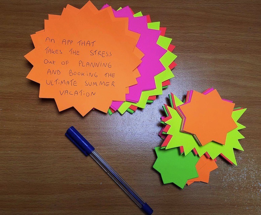
An app that takes the stress out of planning and booking the ultimate summer vacation.
It’s crucial that you never lose sight of this product statement, so you may want to scribble it on a post-it note and stick it above your desk.

2. Identify Your Target Audience
The next big question you need to tackle is: who exactly am I building this thing for?
Hopefully you already have a rough idea of the kind of person who might want to use your app, but for the best results you need to design your app with a very specific target audience in mind. The old saying is true: try to please everyone, and you’ll end up pleasing no one.
Who you’re trying to appeal to should influence every part of your app—from the features you include to the look and feel of your UI, right through to the tone of your application’s text. That’s why it’s crucial you identify your target audience as early in the design process as possible.
I already have a rough idea of who I’m targeting: young adults aged 18-25 who are either on summer break from college or university, taking a full-blown gap year, or are planning one final adventure before it’s time to start looking for that first full-time job. This is a good start, but we can get more specific than that!
One simple but effective trick for zeroing in on your audience is to create a user persona.
A user persona is a single user who epitomizes the kind of person you’re targeting. What characteristics would this person have? Although the exact characteristics will vary depending on the kind of app you have in mind, you can start by answering the following questions:
- How old is your user persona? This could be an exact age or an age bracket such as people over 60, or young adults.
- Where do they live? This might be a specific country or city, or a type of place such as by the sea or in the big city.
- Do they have any children?
- What are their hobbies?
- Do they have a job? And if so, what is it?
- Are they currently in education?
- What is their favourite type of application?
- What is their least favourite type of application?
- What factors motivate them to download an app?
- Do they ever pay for mobile apps?
- How experienced are they with mobile apps? Are they a power user, or a beginner?
- How experienced are they with technology in general?
Let’s create a user persona for our travel app. For the best results, it helps to think of your persona as a real person. You might even want to give your user persona a name, which is exactly what I'm going to do: meet Sasha!
- She’s 20.
- She’s a university student on summer break.
- She’s living with her parents over the summer, but will be returning to student halls at the start of the academic year.
- She’s single, with no children.
- She doesn’t have a job, so her student loan is her sole source of income.
- As someone who has grown up with social media, her favourite apps are anything and everything that lets her share photos and status updates with her friends, family, and the World Wide Web in general.
- She’s a pro with technology, especially mobile apps.
Since my app is all about organising a holiday, I also need to define Sasha’s experiences surrounding travel. Is my “typical” user likely to be well-travelled? Have they been responsible for planning their own holidays before, or is this all new to them?
I’m going to add the following characteristics to my user persona:
- Sasha has been abroad several times, but only ever with her family.
- This is the first time she’s planned her own holiday.
- Sasha can be fairly organised when she wants to be, but since this is the first time she’s been involved in planning and booking a holiday, she'd definitely appreciate a helping hand!
Use Cases
So now we have the who, but what about the when? Under what circumstances might Sasha feel compelled to whip out her phone and boot up our app?
Here are a few that spring to my mind:
- Sasha is hanging out with university pals, and inevitability the conversation turns to how much fun they're going to have over the summer. Everyone gets over-excited, and before you know it Sasha has opened our app, and she and her friends are eagerly planning what is sure to be the trip of a lifetime.
- Sasha has just popped into the group chat she and her friends leave running in their favourite instant messaging app, and she sees that—finally!—everyone has agreed on a destination. Excited, Sasha boots up our app and starts researching fun things to do in that area.
- Sasha is feeling frustrated. She and her friends seem to spend hours talking about how great their trip is going to be, but never actually get around to booking anything. Someone needs to take charge, and it looks like that person is going to have to be her. The only problem is she’s never arranged anything like this before. What she needs is some kind of app that can take the stress out of planning and booking the perfect summer vacation….
3. Create a Features List
It’s time to have some fun: let your imagination run wild and write down every feature you would include in your app if you had infinite time, money and a whole army of developers ready and raring to help you out. For now, don’t worry about whether these features are practical—think of this as your ultimate features list.
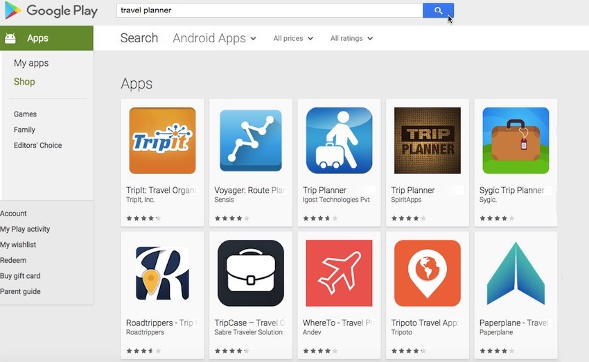
If you're struggling for inspiration, then head over to the Google Play store and download a few examples of Android applications that cover similar content, or have the same target audience as your application.

Here are a few of the features I’ve jotted down:
- The ability to book everything the user could ever need for their trip, from plane, train and bus tickets, to hotel reservations, and even miscellaneous things like reserving a table at that local restaurant that has particularly great reviews on TripAdvisor.
- Read reviews left by other users, and post your own reviews.
- The user defines their budget in advance, and the app subsequently filters all its suggestions based on this budget.
- Be spontaneous! Planning a holiday is supposed to be fun, so why not leave everything up to fate by sticking a virtual pin in a virtual map?
- Okay, so planning a holiday is supposed to be fun, but it can also be hard work—especially if this is the first trip you’ve ever booked. Our app should provide a checklist of everything the user needs to book and arrange, in order to plan the perfect vacation.
- Social media functionality, so users can make all their friends and family jealous by posting photos and status updates about how much fun they’re having on holiday.
- A travel journal for those users who want to share more than simple photos and status updates.
- Since my target audience is young adults, this may be the first time many of them have been responsible for booking their own holiday. They might appreciate some general advice aimed at the first-time traveller, such as how to apply for a passport, or the kind of things you can and can’t carry in your hand luggage.
- A countdown, so users can track the weeks, day, hours and minutes until it’s holiday o’clock.
Now it’s time for a reality check: there’s no way anyone can cram all their ideas into a single app. Even if all your ideas are sensible, well thought out and would appeal to your target audience, throwing everything but the kitchen sink into an app would be a nightmare for you as a developer, and would likely lead to a terrible user experience.
Imagine launching an app for the first time and instantly being confronted by a huge, complicated menu packed with a tonne of options. Choice is a good thing, but too much choice just becomes confusing! Since the last thing you want to do is confuse your users, we need to whittle our ultimate features list down to the bare essentials.
So how do we decide which features live, and which features die?
For the initial release, you should concentrate on features that are essential for delivering your app’s core functionality. And remember that just because a feature doesn’t make it into Version 1.0, doesn’t mean it won’t find its way into a subsequent update. If you come across a feature in your list that has potential, but isn’t essential for fulfilling your app’s primary task, then make a note of it as something that’s worth revisiting once you’ve got your app’s fundamentals down.
Your user persona and use cases should also play a role in determining what features you include in Version 1.0 (and in subsequent releases). What features are most likely to appeal to Sasha?
After re-reading the user persona, use cases and product statement, I’ve settled on the following features:
- Booking travel and accommodation. This is an absolute must—if Sasha doesn’t at least arrange transport and a place to sleep, then she’s going nowhere.
- Setting a budget. Sasha is funding the entire trip on the dregs of her student loan, so setting a budget is a top priority for our money-conscious student.
- Sticking a virtual pin in a virtual map. Sasha is a young student looking to book a summer adventure with all her friends, so the thought of doing something a bit crazy and spontaneous might appeal to her. Also, remember our use case where Sasha is hanging out with her friends and they’re all egging each other on about how much fun they’re going to have this summer? This is the perfect opportunity for Sasha to really get the ball rolling by booting up our app and sticking a virtual pin in a virtual map.
- A checklist. Since this is the first time Sasha has been involved in planning her own holiday, having a clear checklist to work through would make the whole thing much less intimidating.
Our list contains other features that would appeal to Sasha, such as being able to post photos from her trip, as we already know that Sasha is a fan of all things social media. However, for this initial release I’m going to keep things simple and remain focused on the app’s primary goal. Once you’ve delivered your app’s core functionality and fulfilled your product statement, you can turn your attention to all those nice-to-have added extras.
4. Sketch Out the High-Level Flow
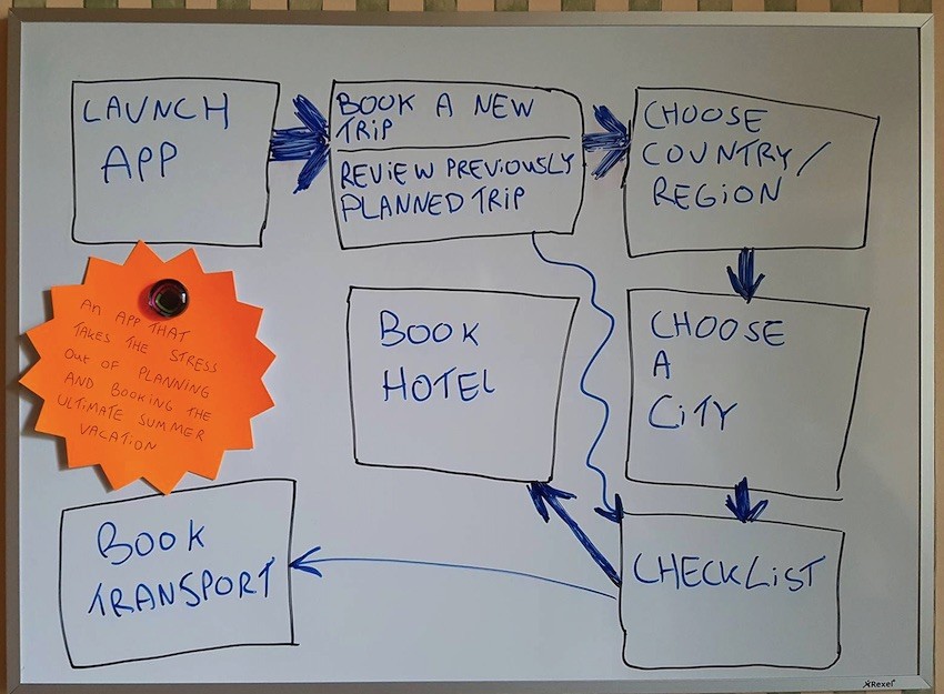
You next task is to start thinking about the screens that you’ll need to create, in order to deliver this list of features, so grab a piece of paper and a pen or pencil. Sketch some rough flowcharts of the routes your users might take through your app, in order to accomplish core tasks.
For my travel app, the core tasks are:
- Booking a trip.
- Reviewing details about any trips the user has already planned.
You’ll typically represent screens with shapes, and express navigation using lines or arrows.

This exercise is mainly intended to get you thinking about the different screens you’ll need to create, in order to deliver the features you cherry-picked from your ultimate features list. Don’t spend too much time on your flowchart, as you’ll refine this flow when you come to create your screen map.
5. Create a Screen List
Next, come up with a list of all the screens you’ll need to create, based on your flowchart.
Here’s my screen list, plus a brief overview of what I plan to include in each screen:
- Homescreen. This screen contains a menu of any trips the user has already planned via our app. The user can tap any item in this menu, to view the checklist for that particular trip. Alternatively, they can give the ‘Plan A New Adventure!’ link a tap.
-
Map. This screen contains a map and a virtual pin. The user can tap a section of the map, or if they’re feeling spontaneous they can grab the virtual pin, close their eyes and leave it all up to fate.
- Select a city. Once the user has selected the country they want to visit, this screen suggests some cities where they might want to stay. This screen also contains a slider where the user can let the app know what kind of budget they’re working with.
- Checklist. This screen contains a checklist for the user to work through. Tapping any item in this list launches a screen where the user can complete this task, including:
- Book transport.
- Book a hotel.
6. Create a Screen Map
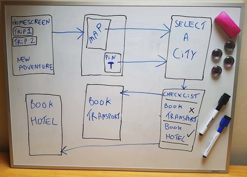
Now it’s time to combine our flowchart and screen list into a screen map that expresses the navigational relationship between all of these screens.
Start with the first screen the user sees when they launch your app, and work outwards.

It’s never too early to start looking for ways to improve the user experience, so once you’ve created your screen map, take a moment to look at it with a critical eye. One factor that has a huge impact on the user experience is the number of screens the user needs to navigate in order to complete the app’s core tasks.
Generally speaking, the fewer steps, the better the user experience. This map is the perfect opportunity to identify places where you can reduce the number of screens the user needs to navigate. This may involve removing screens, combining screens, reordering screens, or identifying places where it would make sense to add a navigational ‘shortcut’ so the user can jump straight from screen A to screen E.
Conclusion
So far, we've made some big decisions about the app we’re going to create, including who our target audience is, and what features we’re going to include in Version 1.0 (with some features left over for subsequent releases). We’ve also made a list of all the screens we need to design, and sketched out how these screens are going to be arranged in our finished app.
At this point we have our app all planned out, albeit at a very high level. In part 2 I’m going to dig deeper and design the individual screens that make up this screen map, before putting these screens to the test by building a digital prototype.


Comments