Introduction
Creating applications with flexible layouts has become essential, especially since the release of the iPhone 5 with its 4" screen and the introduction of Dynamic Type in iOS 7, allowing users to change text size across the operating system. Flexible layouts also come in handy with internationalization in mind.
1. What is it?
Auto Layout, which was introduced in iOS 6, enables you to create such flexible layouts. It's a great alternative to autoresizing masks or manually laying out the application's user interface.
Auto Layout enables you to add constraints to views and define the relationships between views. The relation can be between a view and its superview, one of its siblings, or even in relation to itself.
Instead of explicitly specifying a view's frame, Auto Layout lets you define the spacing between and relative positioning of two views using constraints. Auto Layout uses those constraints to calculate the runtime positions of the user interface elements.
You have to set enough constraints on the view to prevent ambiguity about the layout. It is also possible to set too many constraints, which can cause conflicts and make the application crash.
In Xcode 4, whenever you set incomplete or invalid constraints on a view, Interface Builder would replace them with new constraints that mostly did not give you the effect you were after. This led to significant frustration with developers. In Xcode 5, though, it's much easier to use Auto Layout. Xcode no longer forces constraints on a view, instead you get hints and warnings when a view's constraints are invalid.
While it is possible to work with Auto Layout programmatically, this tutorial will be looking at how to use Interface Builder to create layouts using Auto Layout.
2. Auto Layout Basics
For a simple demonstration of what Auto Layout can do for you, we'll create a simple application and set some constraints on its views. Create a new Xcode project, choose the Single View Application template and set Devices to iPhone.
Storyboards and XIB files created with Xcode 4.5 or later have Auto Layout enabled by default. You can disable it in the File Inspector on the right by unchecking the checkbox labeled Use Auto Layout.
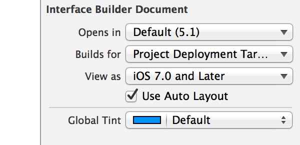
A good reason for disabling Auto Layout is supporting iOS 5 or lower. Auto Layout is only supported by iOS 6 and above. But other than that, Apple recommends to use Auto Layout as it makes the creation of flexible user interfaces faster and easier.
Open the project's main storyboard, Main.storyboard, add a text view to the View Controller Scene, and position it as shown below.
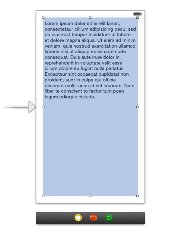
No constraints have been set on the text view and this has some implications. When you run the application, the text view is positioned just like in Interface Builder. However, when the device is rotated to landscape mode, the text view continues to stick to the left edge of the view and its width is fixed.
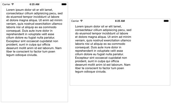
At build time, constraints are automatically generated for views that don't have constraints, which explains the behavior that we're seeing. The constraints added to the text view, for example, are a left and top constraint that pin the text view to the top left, and a width and height constraint that fix the text view's size.
Once you start defining constraints, however, it's up to you to make sure that the constraints for a view don't cause conflicts. In the next section, we add a few constraints to the text view to adjust its position and size when the device is rotated or when we run the application on, for example, an iPhone 5 that has a larger screen.
3. Adding Constraints
There are several ways layout constraints can be added to a view.
Control and Drag
Hold down the Control key and drag from the view you want to add the layout constraint to to another view. When you release the mouse, a menu with options should appear. The options depend on the direction and the view you dragged to.
To illustrate this, drag from the text view to the top of the view controller's view. Xcode will highlight both views to indicate the layout constraint includes both views. When you release the mouse, the menu shows the layout constraints that can be added to the source view, the text view. To center the text view horizontally in the view controller's view, select Center Horizontally In Container from the menu. An orange line appears as a result, signifying the layout constraint you just added.
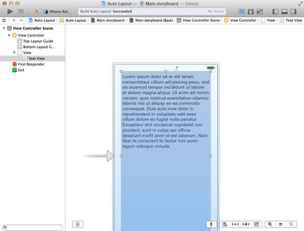
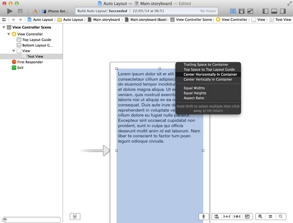
Auto Layout Menu
You can also add and edit layout constraints using the Auto Layout menu at the bottom of the Interface Builder workspace.
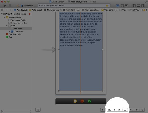
Beginning from the left, the menu allows you to align and pin views, resolve Auto Layout issues, and the the resizing behavior for the selected view. Let me explain what each menu option does.
- Align creates alignment constraints that let you center a view in its container or align the edges of two views.
-
Pin creates spacing constraints. You can set the height and width of the selected view or specify the view's distance to another view.
- The Resolving Auto Layout Issues menu adds the ability to resolve Auto Layout issues, for example by updating the view's frame or add missing constraints.
- The Resizing menu lets you specify the resizing behavior of the selected view and how siblings and descendants are affected.
Editor Menu
Each of the aforementioned menu options can also be found in Xcode's Editor menu.
Adding Constraints
To add layout constraints to the text view, select the view in Xcode, hold down the Control key, and drag from the text view to the top of the view controller's view. Select Center Horizontally In Container from the menu that appears. This adds a layout constraint that ensures the text view is always centered in the view controller's view, regardless of the device's orientation.
You may have noticed that the text view has an orange outline. Xcode tells us that the text view's layout constraints are invalid or incomplete. We've specified that the text view should be centered horizontally in its parent view, but the Auto Layout system doesn't know what size the text view should be. Let's add a few more constraints until the text view's outline turns blue to indicate the text view's layout constraints are valid.
Note that it's possible to ignore the warnings and run an application with incomplete layout constraints. However, you should never ship an application with ambiguous layout constraints, because you don't know for sure what the application's user interface will look like on different devices in different orientations.
With the text view selected, Control-Drag from the text view to the top of the view controller's view and select Top Space to Top Layout Guide. This sets a vertical space constraint from the view controller's top layout guide to the text view's top.
Next, Control-Drag from the text view to the view controller's view and select Leading Space to Container to set the distance from the parent view to the left of the text view. Control-Drag from the text view to the view controller's view and select Bottom Space to Bottom Layout Guide to set a vertical space constraint from the view controller's bottom layout guide to the text view's bottom.
The text view's outline should be blue, indicating the layout constraints of the text view are valid and complete. Run the application in the iOS Simulator and change its orientation to inspect the result.
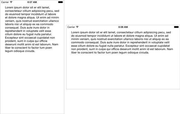
Note that we didn't need to add a horizontal space constraint to specify the distance from the text view's right edge and its superview, because we specified the text view's leading space and centered the text view horizontally in its superview. The Auto Layout system has enough information to correctly lay out the text view. We can accomplish the same result by specifying four space constraints and omitting the alignment constraint.
This example has showed you how to set layout constraints between a view and its parent view. Let's look at another example in which we set layout constraints between sibling elements.
Begin by deleting the text view. This will also delete the text view's layout constraints. Add a text field, a slider, and a segmented control to the view controller's view as shown below.
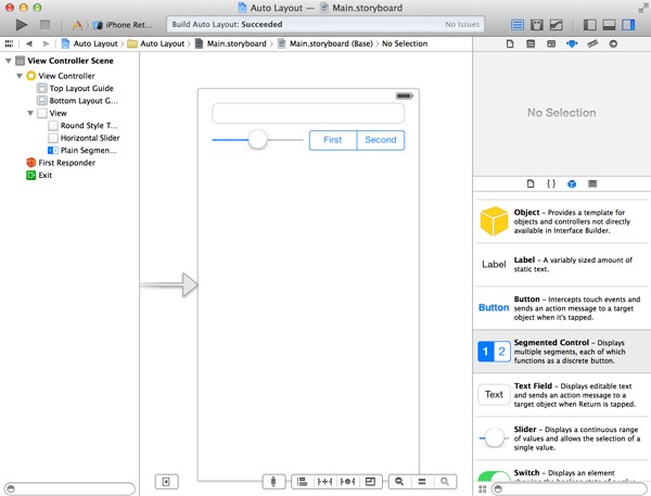
When you run the application without setting any constraints, the three elements will stick to the left edge of their parent view in landscape.
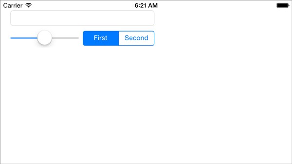
However, we want the elements to fill the screen's full width as shown below. The text field should expand horizontally and the slider should also expand to take advantage of the screen's width. The segmented control, however, should have a fixed width.
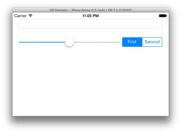
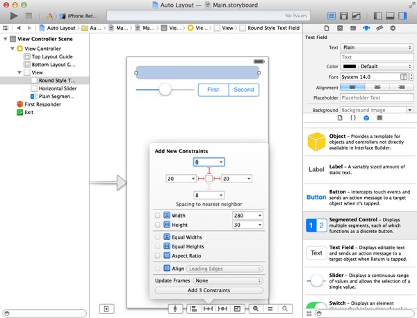
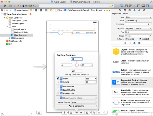
Select the text field and click the Pin button of the Auto Layout menu at the bottom. In the section Spacing to nearest neighbor at the top of the menu, click the top, right, and left lines that surround the square. The lines should turn red as a result. Next, click the button at the bottom labelled Add 3 Constraints to add the specified space constraints.
Select the slider and repeat the same steps by setting a top, left, and right space constraint. This ensures the distance between the slider and the text field and the slider and the segmented control is fixed.
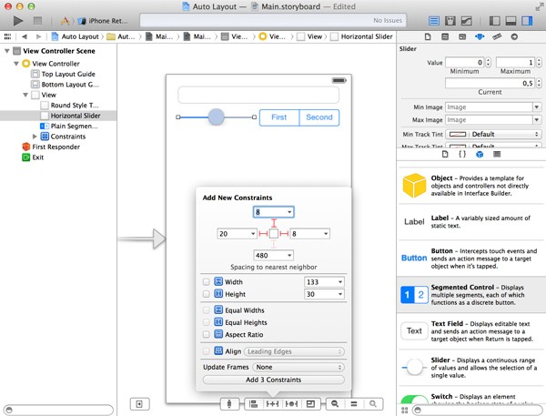
Repeat the same steps for the segmented control, but only add a top and right (trailing) space constraint. In addition, check the Width checkbox and click the Add 3 Constraints button at the bottom. We don't want the segmented control to expand when the screen size changes, which is why we give it a fixed width.
4. Fixing Auto Layout Issues
Fixing Issues
When Xcode gives us errors or warnings about missing or invalid layout constraints, it may not always been clear what constraints need to be added or updated. Xcode helps us by showing us which constraints are missing in the Document Outline.
When a layout is invalid or incomplete, a red arrow is visible in the Document Outline. When you click the arrow, a window slides in from the right showing which constraints are missing or invalid. This gives you a clue how to fix the layout.

On the right of each error or warning is a red circle (error) or a yellow triangle (warning). When you click the error or warning, a menu appears with suggestions to fix the problem.
You can also use the Resolve Auto Layout Issues menu to add missing constraints, reset a view's constraints, or to clear constraints. Xcode will automatically add constraints to the selected view for you. This can save you time, but note that it's also possible that the resulting layout isn't what you intended.
Misplaced Views
If you've added layout constraints to a view and you change its size or position, Xcode highlights the view in orange to indicate that the current position and/or size is not in line with its layout constraints.
If you run the application, you'll see that the Auto Layout system enforces the view's layout constraints and ignores the view's new size and position you've set. This is a so-called misplaced view. The screenshot below shows a button that I moved after having specified its layout constraints.
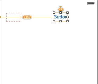
To fix this, you can either delete the layout constraints and set new ones, or you can let Xcode fix it for you. You have two options to fix a misplaced view.
- You can move and resize the view to match its layout constraints by selecting Resolve Auto Layout Issues > Update Frames from Xcode's Editor menu.
- Or you can update its layout constraints to match the view's new size and position by selecting Resolve Auto Layout Issues > Update Constraints from Xcode's Editor menu.
In the above example, we select Update Constraints to update the layout constraints to the button's new size and position, because we wish to preserve the button's new size and position.
Conclusion
The Auto Layout system makes laying out user interfaces much simpler and faster. Before Auto Layout was introduced, developers had to hard code an application's user interface by setting a view's frame and autoresizing mask. With Auto Layout, this is no longer necessary.
By correctly setting a view's layout constraints, its position is automatically updated regardless of the screen size or orientation. Another area where Auto Layout is useful is application localization. Words and sentences have a different length in different languages. This too can be solved with Auto Layout.


Comments