Consider a situation where you have to have high-contrast, blurred or brighter versions of particular images on your website. Prior to CSS filters, your only options were either to upload different versions of these images or manipulate the images with JavaScript.
Unless you want to manipulate the pixels in the original image, CSS filters provide an easy way out. Let's begin this tutorial with a brief discussion of all available filters.
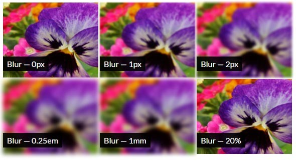
Blur Filter
This filter will apply a Gaussian blur to your images. You will have to provide a length value which will determine how many pixels need to blend into each other. This implies that a larger value will provide a more blurry image. Keep in mind that you can't use percentage to determine the blur radius. If you don't specify a parameter, then the value 0 is used. The proper syntax for using this filter is:
filter: blur( <length> )
The blur() filter does not accept negative values.
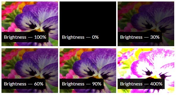
Brightness Filter
This filter will apply a linear multiplier to your images, making them brighter or dimmer compared to the original images. It accepts a number as well as a percentage value. At 0% you will get a completely black image. At 100% you get the original image without any changes. Higher values will result in brighter images. A sufficiently high value will turn the image mostly white. The proper syntax to use this filter is:
filter : brightness( [ <number> | <percentage> ] )
This filter does not accept any negative values either.
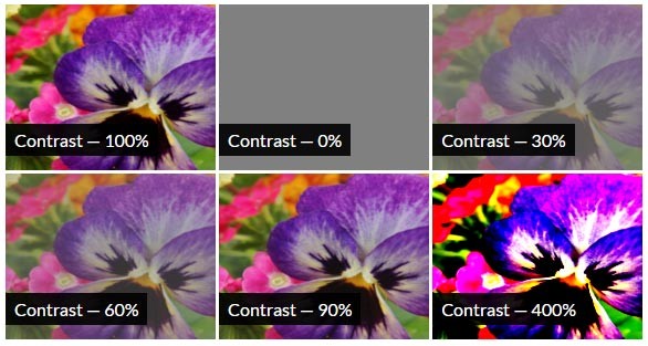
Contrast Filter
This filter changes the contrast of your images. Just like the brightness filter, it accepts a number as well as percentage values. A 0% value will result in a completely gray image. Setting the value to 100% does not have any effect. Values higher than 100% will produce high-contrast images. You are not allowed to use negative values with the contrast() filter. The proper syntax to use this filter is:
filter : contrast( [ <number> | <percentage> ] )
Drop-Shadow Filter
Almost every one of you might have used box-shadows at least once. The problem with box-shadows is that they are boxy. You can't use them to create shadows of irregular shapes. On the other hand, the drop-shadow filter creates shadows around the boundary of an image. It is basically a blurred version of the alpha mask of the input image. The proper syntax to use drop-shadow is:
filter : drop-shadow( <length>{2,3} <color>? )
The first two length values are required, and they set the horizontal and vertical shadow offset. The third <blur-radius> value is optional. A bigger value will create a lighter shadow. The demo below shows this filter in action. If you hover over the penguin, the color of the shadow will change from orange to red.
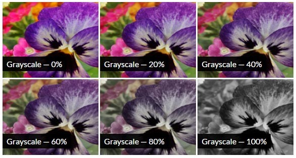
Grayscale Filter
This filter will make your images grayscale. A 0% value will leave the image unchanged, while a 100% value will make the image completely grayscale. Any value between these two effects will be a linear multiplier on this effect. You can't use negative values with the grayscale() filter. The proper syntax to use this filter is:
filter : grayscale( [ <number> | <percentage> ] )
Hue-Rotate Filter
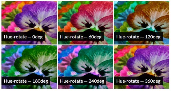
This filter will apply a hue rotation on your images. The parameter (passed as an angle) will determine the number of degrees around the color circle the images will be adjusted. With a 0deg value the final image will be unchanged. If you specify a value beyond 360deg, the filter just wraps around. The proper syntax to use this filter is:
filter : hue-rotate( <angle> )
Invert Filter
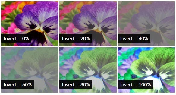
This filter will invert your images. The amount of inversion depends on the value of the parameter that you passed. A 0% inversion will have no effect on the image. On the other hand, a value of 100% will completely invert the image. A 50% value will produce a completely gray image. Any value between the extremes will be a linear multiplier of the effect. This filter does not accept negative values. The proper syntax to use the invert() filter is:
filter : invert( [ <number> | <percentage> ] )
Opacity Filter
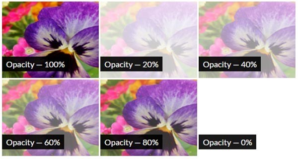
The opacity filter applies transparency to input image. A value of 0% implies you want 0% opacity, which results in complete transparency. Similarly, a 100% value results in a completely opaque image.
The filter is similar to the opacity property in CSS. The only difference is that in this case some browsers may provide hardware acceleration for improved performance. The proper syntax to use this filter is:
filter: opacity( [ <number> | <percentage> ] );
Saturate Filter
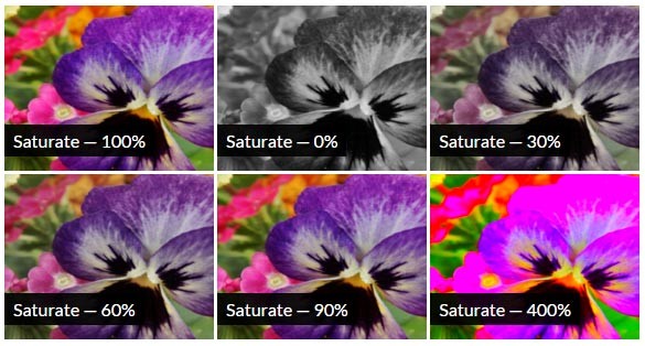
This filter determines the saturation of your images. The saturation itself depends on the value of the parameter. You can't use negative values with this filter. At 0%, the minimum possible value, the image will be completely unsaturated. With a saturation value of 100%, the image remains unchanged. To get super-saturated images, you will have to use values over 100%. The proper syntax to use this filter is:
filter : saturate( [ <number> | <percentage> ] )
Sepia Filter
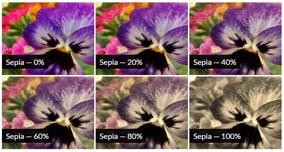
This filter will transform your original images to sepia. At 100% value you will get a complete sepia, and a 0% value will not have any effect on the image. All other values that lie in between will be linear multipliers of this filter. You are not allowed to use negative values with this filter. The proper syntax to use the sepia() filter is:
filter : sepia( [ <number> | <percentage> ] )
URL Filter
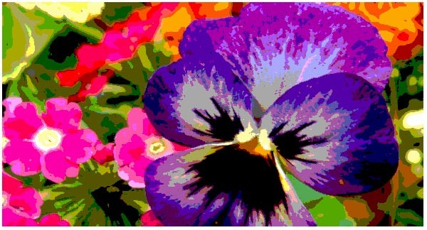
There might be situations when you want to use your own filters on images. The url filter will take the location of an XML file that specifies an SVG filter. It also accepts an anchor to a specific filter element. Here is an example which results in posterization of our image:
// The filter

<svg>
  <filter id="posterize">
    <feComponentTransfer>
      <feFuncR type="discrete" tableValues="0 0.33 0.66 0.99" />
      <feFuncG type="discrete" tableValues="0 0.33 0.66 0.99" />
      <feFuncB type="discrete" tableValues="0 0.33 0.66 0.99" />
    </feComponentTransfer>
  </filter>
</svg>

// Required CSS to apply this filter

filter: url(#posterize);
The final result after applying the filter would look similar to the following image:
Using Multiple Filters
If you are not satisfied with the output of an individual filter, you can apply a combination of them on a single image. The order in which you apply the filters can produce marginally different results. Multiple filters can be applied in the following manner:
filter : sepia(0.8) contrast(2);
filter : saturate(0.5) hue-rotate(90deg) brightness(1.8);
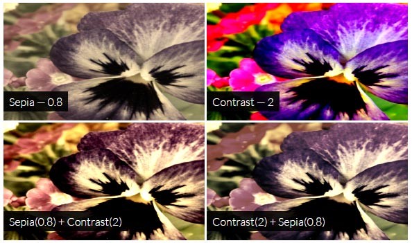
When you use multiple filters together, the first filter function in the list is applied on the original image. Subsequent filters are applied to the output of the previous filters. This demo shows two other filter combinations in action.
In some special circumstances, the order of filters can produce completely different results. For instance, using sepia() after grayscale() will produce a sepia output, and using grayscale() after sepia() will result in a grayscale output.
Animating the Filters
The filter property can be animated. With the right combination of image and filters, you can exploit this feature to create some stunning effects. Consider the code snippet below:
@keyframes day-night {
  0% {
    filter: hue-rotate(0deg) brightness(120%);
  }
  10% {
    filter: hue-rotate(0deg) brightness(120%);
  }
  20% {
    filter: hue-rotate(0deg) brightness(150%);
  }
  90% {
    filter: hue-rotate(180deg) brightness(10%);
  }
  100% {
    filter: hue-rotate(180deg) brightness(5%);
  }
}
I am using the hue-rotate() and brightness() filter together to create the illusion of day and night. The original image itself has an orange hue. For up to 20% of the animation, I increase the brightness gradually and keep the hue-rotation at zero. This creates the effect of a sunny day. By the time the animation ends, I rotate the hue by 180 degrees. This results in a blue hue. Combining this with very low brightness creates the effect of night.
Final Thoughts
Besides the 11 filters we discussed above, there is also a custom() filter. It allows you to create completely different kinds of effects using shaders. There are a few issues with custom() filters which have halted their development. Adobe is working actively to come up with solutions to problems that crop up when using custom() filters. Hopefully, they will soon be available for developers to use in their projects.
Now, let's get back on track. Filters are applied on all the parts of the target element, including any text, background, and borders. Here is a basic demo for you to try out a combination of filters on various images.
As you saw in the last two sections, CSS filters can completely change the images they are applied to. However, sometimes that's not enough. In the next part of this series, I will discuss how to use blend modes to edit images.


Comments