In the previous tutorial of this series we discussed how to use CSS filters to edit images. While filters can produce great results, they are limited to just a single layer.
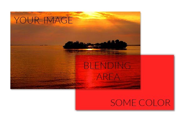
Let's say you have an image and you want to overlay it with red color. You can't do that with filters. However, blend modes are perfect for this job. They are actually meant to take the foreground and background color values, perform some calculations, and then return a final color. The final image that you get is the result of all such calculations over every overlapping pixel.

Blend modes allow you to blend not only images and colors but also text and images. In this tutorial, I will show how to use blend modes to manipulate images and create some cool effects.
Available Blend Modes
- Normal: In this mode, the final color will be the top color. The value of the bottom color won't have any effect on the final result.
- Multiply: In this mode, the top and bottom colors are multiplied to get the final color. The resultant color will always be at least as dark as either of the constituents. This implies that with a black layer the final result will always be black. Using a white layer will have no effect on the final result whatsoever.
- Screen: In this mode, the final color is obtained by inverting the top and bottom colors, multiplying them, and then again inverting the result. The final color will always be as light as the top or bottom color. This implies that using a white layer will turn everything white, and a black layer will have no effect on the final result.
- Overlay: In this mode, the final color is obtained by either multiplying or screening the original colors based on the bottom color. If the bottom color is darker, the original colors are multiplied, and if it is lighter, they are screened. The highlights and shadows of the bottom color are preserved in this mode.
- Darken: This one is pretty basic. The final color in this mode is the darker color between the top and bottom layers.
- Lighten: This is the inverse of darken, and the final color is, therefore, the lighter color between the top and bottom layers.
- Color-dodge: In this mode, the bottom color is divided by the inverse of the top color to get the final value. You won't see any changes with a black background in this mode. If the top color is the inverse of the bottom color, the final color will be a fully lit version of the top color.
- Color-burn: The final color in this mode is produced by dividing the inverse of the bottom color by the top color value and inverting the resultant value. If the top color is white, you won't see any changes. A top color that is the inverse of the bottom color will result in a completely black image.
- Hard-light: Hard-light mode is the inverse of overlay mode. In this case, if the top color is darker, the original colors are multiplied, and if it is lighter, they are screened. It is basically overlay mode with the layers swapped.
- Soft-light: This mode is just like hard-light but produces softer final results.
- Difference: This mode subtracts the value of the darker color from the lighter color to get the final value. This implies that the color black will have no effect, while white will invert the color of the other layer.
- Exclusion: This blend mode is similar to difference, but the final result has a lower contrast.
- Hue: This blend mode uses the hue of the top color and the saturation and luminosity of the bottom color to create the final color.
- Saturation: In this mode, the final color has the saturation of the top color and the hue and luminosity of the bottom color.
- Color: This blend mode produces a final color with the hue and saturation of the top color and the luminosity of the bottom color. This mode preserves the gray levels of the bottom color and can be used to tint colored images.
- Luminosity: The final color in this mode has the luminosity of the top color, while the hue and saturation values come from the bottom color. It is just like the color mode but with the layers swapped.
Additionally, there are two ways to use blend modes. You can use the mix-blend-mode, which determines how an element's content blends with the contents of the element below it as well as with the element's background. The background-blend-mode, on the other hand, determines how an element's background images blend with each other and with the element's background color.
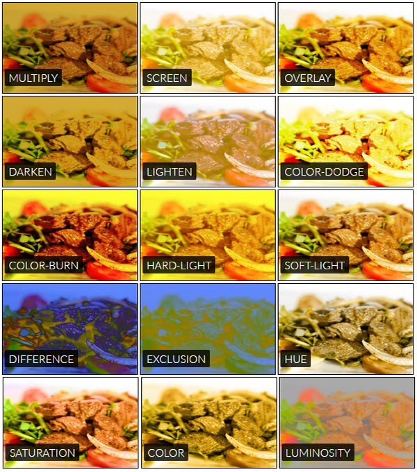
You can play with this demo in order to see how different images and colors interact based on the blend modes applied. I have also attached an image below that shows the blending of a yellowish color with the source image.

Creating Irregular Borders
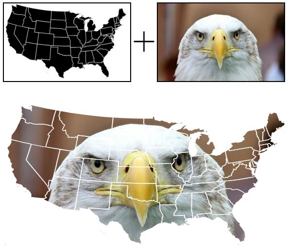
While images in general are mostly rectangular, using images with irregular boundaries can make them visually more appealing and give them a completely different meaning. Consider this image of a bald eagle blended with the map of United States. It signifies the American values represented by the bald eagle. You could also combine some other images in a similar fashion.

Here I have combined two images in such a way that the final result has the shape of the first image and the colors of the second image. Which blend mode(s) do you think can achieve this effect?
One hint here is that the map is all black and white. So, whichever blend mode we decide to use must hide all the portion over the white part and show all the portion over the black part. The lighten blend mode does this job perfectly. Since the color white is lighter compared to the colors in the eagle, it hides the eagle whenever it extends beyond the United States map.
You should try to guess the other blend mode that can achieve this effect as an exercise. You can try out different blend modes in this eagle demo to see if you guessed the blend mode correctly.
Blending Colorful Gradients
Believe it or not, the colorful image below is the result of carefully chosen gradients and blend modes. You can hover over the image to see the original version.
If you want to recreate this effect, you will have to start with an image having a dark background for best results. Next, decide the colors you want to blend in and create a linear gradient with all those colors. You can optionally add more gradients at different angles. In the end, set the first background-blend-mode to luminosity. Your final CSS should look something like this:
div {
  background: url('image-url'), linear-gradient(red, orange, yellow, green, blue, indigo, violet), linear-gradient(to right, red, orange, yellow, green, blue, indigo, violet);
  background-blend-mode: luminosity, overlay;
  // More CSS rules
}
You should experiment with different blend modes and images in the original demo to figure out the best combination of blend modes for different kinds of images.
Blending Text Together
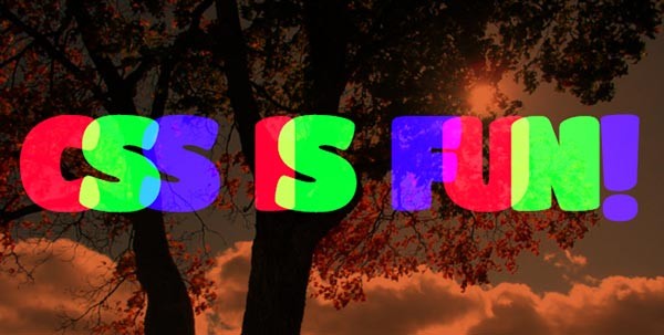
Blend modes are not limited to images. You can apply blend modes on a piece of text as well. In the image below, I have applied a blend mode to all the characters as well as the background image.
The characters use the mix-blend-mode property, and the body uses background-blend-mode. Here is the relevant CSS:
body {
  background: #D63 url('image-url') no-repeat;
  background-blend-mode: multiply;
  background-size: cover;
}

h1 span {
  mix-blend-mode: hard-light;
}

As with previous demos, I would suggest that you experiment with various blend modes in this demo as well.
Final Thoughts
With a little imagination, the possibilities with blend modes are endless. I hope this tutorial taught you something useful about blend modes and image editing. Keep practicing and you will get really good at using different blend modes.
If you have created something interesting with blend modes, please share your work in the comments below.


Comments