In part one of this two-part series, I showed you how to take an initial idea for an Android app, and develop it into a detailed plan—right down to mapping out the individual screens that'll make up your finished app.
Using the example of a travel app that'll help users plan and book a fun-filled summer adventure with all their friends, we identified our target audience by creating a user persona (remember our friend Sasha?) and then created a list of features that would be perfect for Version 1.0 of our app (and perfect for Sasha). Finally, we created a screen list and a map showing exactly how all these screens will fit together.
We covered a lot of ground in part one, but up until now all our planning has been a bit high-level and abstract. In part two we’re going to get up close and personal by wireframing and prototyping the individual screens that'll make up our app.
By the end of this tutorial you’ll have created a digital prototype that you can install and test on your own Android smartphone or tablet.
Let’s dive right in and start creating some wireframes!
What Is Wireframing?
Wireframing is where you sketch out all the major UI components you want to place on a particular screen. The purpose of wireframing is to outline a screen’s structure—it’s not about the finer details of how a screen looks, so try not to get sucked into the specifics of graphic design. For now, it’s enough to know that you’re going to place a menu on Screen A; you don’t need to worry about what colour this menu is going to be, or how you’re going to style the menu's text.
For more information on wireframing, check out the following resources:
 WireframingA Beginner’s Guide to Wireframing
 UXA Beginner’s Guide to Wireframing in Omnigraffle
 UX10 Tips for Building Wireframes With Illustrator
 WireframingWireframing With Sketch
Wireframes are pretty deceptive—they may look like quick, rough-and-ready sketches, but they’re actually a powerful tool for exploring, defining and refining your app’s user interface. They can also help you identify any flaws with your initial screen designs, before you invest too much time into perfecting these designs.
It’s much easier to put a big cross through a wireframe, turn the page in your notebook and start again than it is to completely rewrite code you already spent hours working on.
So, I’ve sung the praises of wireframing long enough! How do you go about creating a wireframe?
You have a few options:
- Sketch your wireframes using pencil and paper.
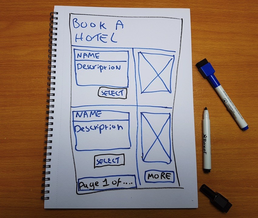
Create digital wireframes using professional image-editing software such as Adobe Photoshop, or a dedicated wireframing program such as Pidoco, Axure, InDesign, Sketch, Omnigraffle, or Balsamiq Mockups.
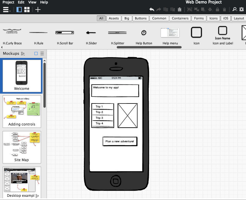
But why restrict yourself to one tool, when you can reap the benefits of both? Paper and digital wireframes each have their own unique set of strengths and weaknesses. Digital wireframing is perfect for creating polished and precise wireframes, but navigating multiple menus isn’t always the best way to get those ideas flowing—and it certainly isn’t ideal when you want to quickly test out multiple different ideas! On the other hand, paper wireframes are great for a rapid-fire brainstorming session, but you may struggle to create paper wireframes that are accurate and detailed enough to serve as blueprints for the kind of screens you're going to create.
I recommend creating your first drafts using pen and pencil (which is ideal for getting those creative juices flowing) and then, once you have a set of paper wireframes you’re happy with, you can spend some time refining these drafts using digital wireframing software.
This is the approach I’ll be using in this tutorial, but bear in mind that wireframing is a creative exercise, so there are no hard and fast rules here. Use whichever method works the best for you.
Creating Your First Wireframe
To give you the best possible overview of the wireframing and prototyping process, I’m going to pick one screen from my travel app and work on it throughout the rest of this article. The screen I’m going to select as my guinea pig is the checklist, as I think this particular screen contains some challenging UI elements that’ll make for an interesting example.
Just to refresh your memory, in part one I wrote the following description of how I imagined the finished checklist screen:
In its default state this screen displays a checklist of all the tasks the user needs to complete, in order to plan a successful trip. Tapping any task will take the user to a screen where they can complete this task. Whenever the user completes a task, this item is ticked off their checklist.
To create a first draft wireframe, grab some paper and your writing implement of choice, and then draw the rectangular outline of a typical smartphone or tablet.
I’m going to start by adding all the navigational elements to my wireframe. Looking at my screen map, I can see that the user needs to be able to reach three screens from the checklist:
- Select A City.
- Book Transport.
- Book Hotel.
These screens represent two different kinds of navigation: backwards navigation and forwards navigation.
‘Select A City’ is the previous screen in my application’s flow, so it represents the user moving backwards through the application’s history. Android handles this kind of backwards navigation automatically (usually via the smartphone or tablet's ‘Back’ softkey) so you don’t need to add any explicit ‘Select A City’ navigation to your UI.
The other two screens are a bit different, as they represent the user moving forward in our application. The system doesn't handle forwards navigation automatically, so it’s our responsibility to provide the user with everything they need to be able to navigate to these screens.
These navigational elements are going to take the form of two TextViews, which I’m going to arrange in the style of a checklist (okay, so two items isn’t much of a list, but if I continued working on this project I’d eventually add more tasks to this list). In their default state, each TextView will remind the user that they need to complete this task, for example “You still need to book a hotel!” When the user taps either TextView, it’ll take them to the Book Transport or Book a Hotel screen, so they can complete this task.
When the user completes a task, the corresponding TextView will update to display information about the user’s hotel or their transport arrangements (I’m not going to add any of this info to my wireframe for now, but it’s something to bear in mind).
To create a checklist effect, I’m going to create a corresponding ImageView for each TextView. In its default state, each ImageView will display a red cross, but once the user completes a task this will be replaced by a green checkmark.
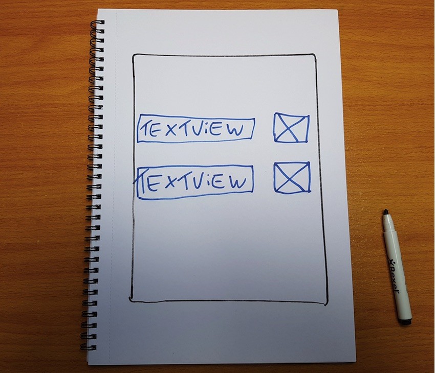
Finally, I’m going to add a title TextView, which will display whatever the user has chosen to call this particular trip.
As you’re building your wireframe, you may encounter UI elements that could work in numerous positions and at different sizes. Creating a paper wireframe takes pretty much no time at all, so if you have any other ideas then take a few moments to wireframe them. In fact, you should aim to sketch out a few alternatives for every screen so you can decide which idea has the most potential.
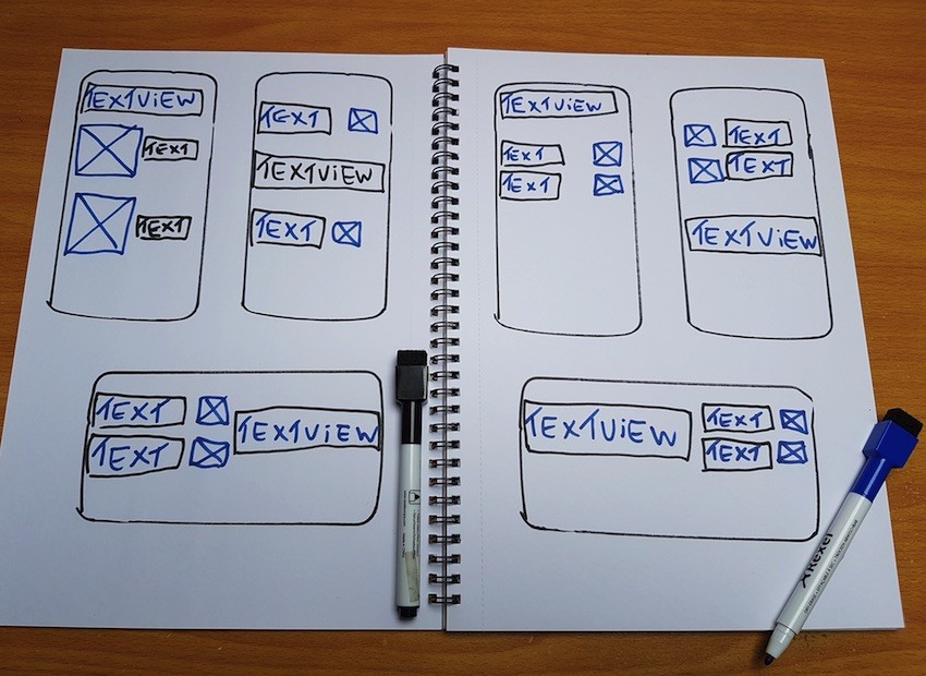
Rinse and repeat for every screen that makes up your app, until you have a complete set of paper wireframes. The next step is turning these first drafts into more polished digital wireframes.
There’s plenty of software out there that was created specifically for wireframing, so it’s well worth spending some time researching your options on Google, although if you prefer you can use your favourite image-editing software instead, such as Adobe Photoshop.
Personally, I’m a fan of Balsamiq Mockups!
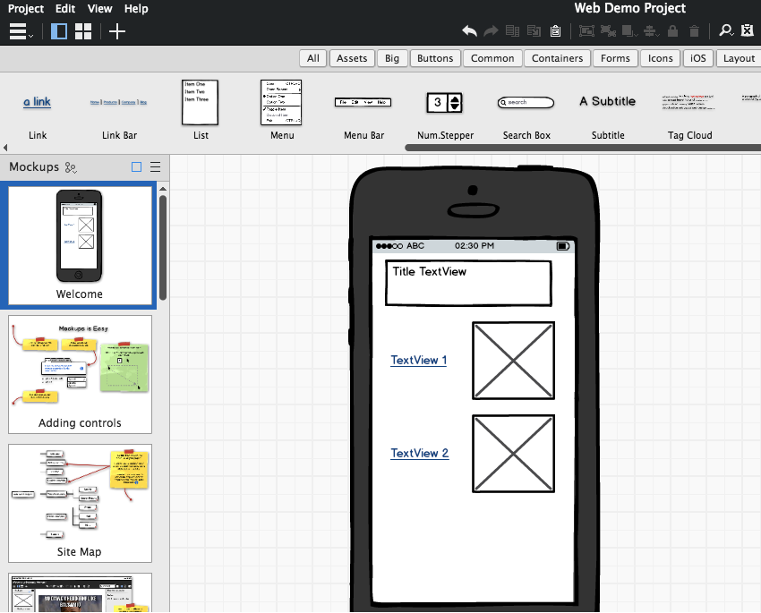
Spend some time creating and perfecting your design in the software of your choice, and be on the lookout for any opportunities to tweak and refine your wireframe. Working with a new tool can also throw up some new ideas, so if you’re suddenly struck by a flash of inspiration about how you can improve your design, then grab some paper and wireframe these ideas. If they stand up to the scrutiny of paper wireframing, then go ahead and fold these changes into your digital wireframe.
Once again, rinse and repeat for the rest of your screens.
Prototyping Your Project
Time to put your designs to the test by creating a digital prototype based on your wireframes.
Prototyping gives you the chance to get some hands-on experience with how your design looks and functions on a real Android device, but it also allows you to test how your design translates across multiple screen configurations, via Android Virtual Devices (AVDs).
So how do you create a digital prototype?
The easiest way is to use Android Studio, which doubles up as a powerful digital prototyping tool thanks to the IDE’s built-in graphical layout editor. Throughout this section, I’ll be using many of the new features introduced in Android Studio 2.2, so if you want to follow along then make sure you’re running Android Studio 2.2 Preview 1 or higher.
To create our prototype, boot up Android Studio and create a new project. To keep things simple, I’m going to use the ‘Empty Activity’ template. Since you’ll be testing this prototype on your own Android device, make sure you set your project’s minimum SDK to something that’s compatible with your Android smartphone or tablet.
Once Android Studio has created your project, open its activity_main.xml file and delete that annoying ‘Hello World’ TextView that Android Studio adds to this layout by default. Make sure you have the ‘Design’ tab selected so you can see Android Studio’s palette and canvas.
Now we’re ready to bring our wireframe to life! Let’s start at the top, with the screen’s title. It’s pretty obvious that this is going to be a TextView, but what about its contents? When the user starts planning a trip, they can call said trip whatever they like, so how do we know what text to use in our prototype?
Dealing with variable text is a recurring theme in this prototype, so let’s take a few moments to explore this problem in more detail now.
Prototypes are a powerful tool in the app developer’s arsenal, but let’s not get carried away—when a screen contains variable elements, there’s no way you can prototype every single version of that screen. This is certainly the case with our checklist, as the user could name their trip anything, from the pithy Trip 1 to the rambling and overly-excited Fun-filled ultimate summer vacation of dreams, and everything in-between.
While it’s impossible to test every conceivable title, a prototype is the perfect opportunity to put your design under some serious pressure by testing the most weird and wonderful variables you can think of.
For my checklist prototype, I’m going to create three string resources: one representing the “typical” title I imagine most users will opt for, one that’s unusually short, and one that’s seriously long-winded. Testing these extremes is one of the most effective ways of flushing out any potential problems that may be lurking in your screen designs.
Once you’ve created these string resources, you need to give this text somewhere to live, so grab a TextView from the palette and drop it onto the canvas.
Android Studio 2.2 introduced the concepts of constraints, which are handy for quickly building digital prototypes (and user interfaces in general). You can create constraints manually, but why go to all that effort when Android Studio can do the hard work for you?
There are two ways of getting Android Studio to create constraints for you, so let's explore both. The first method is to use autoconnect, so make sure you have this mode enabled by toggling the Autoconnect button (where the cursor is positioned in the screenshot below).
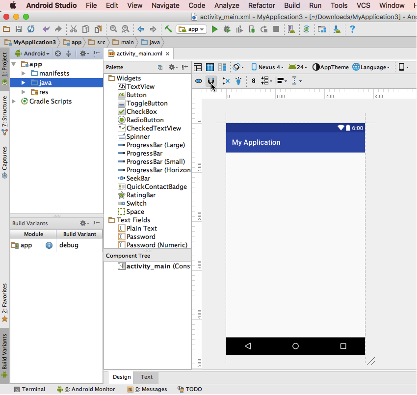
Now, drag your TextView to the place it should appear in your layout. I want my title to be centred, so I’m going to drag the TextView to the middle of the canvas and release. When you release the TextView, Android Studio will respond by creating all the constraints required to hold this TextView in place.
Note, when two constraints are pulling a widget in opposing directions, those constraints appear as jagged lines, which is why these constraints look different to regular constraints.
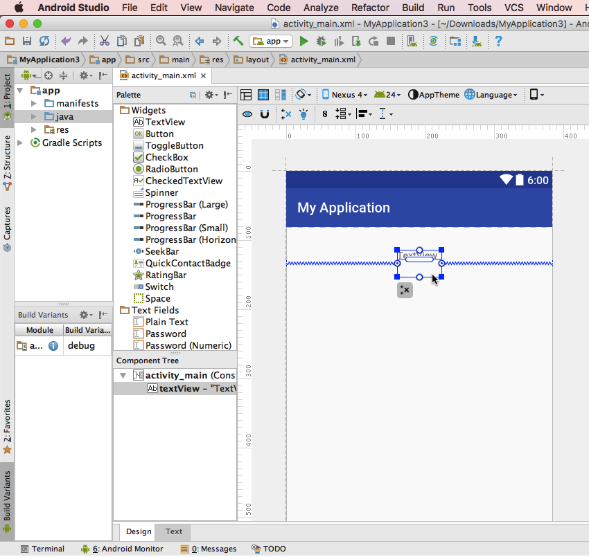
If you’re unsure whether your TextView is perfectly centred, drag it slightly along the horizontal axis. Tooltips will appear either side of the widget, displaying its current position along the horizontal left and right axis. Drag the TextView until you get an even 50/50 split.
Set this TextView to display one of the string resources you created for your title—it doesn’t really matter which string you start with, as you’ll be testing them all anyway!
Next, we’re going to build our checklist. I’m going to use two images in my checklist: a green tick that’ll appear when the user has completed a task, and a red cross to signify that this item is still firmly on the user’s ‘To Do’ list. Create these images and add them to your project’s drawable folder.
Next, open your strings.xml file and create the two default messages:
- You need to book a hotel!
- You need to sort out transport!
Drag two TextViews from the palette and drop them onto the canvas—don’t worry about getting everything perfectly aligned just yet. Set these TextViews to display your default string resources.
Next, grab two ImageViews from the palette and drop them onto the canvas. As you release each ImageView, Android Studio will prompt you to select a drawable to display. We’re going to start by prototyping the default version of this screen, so select the red cross image for both ImageViews.
At this point, we’ve added all the necessary UI elements, but since we randomly dropped all of them onto the canvas, chances are your prototype doesn't bear much resemblance to your wireframe. Once again it’s constraints to the rescue!
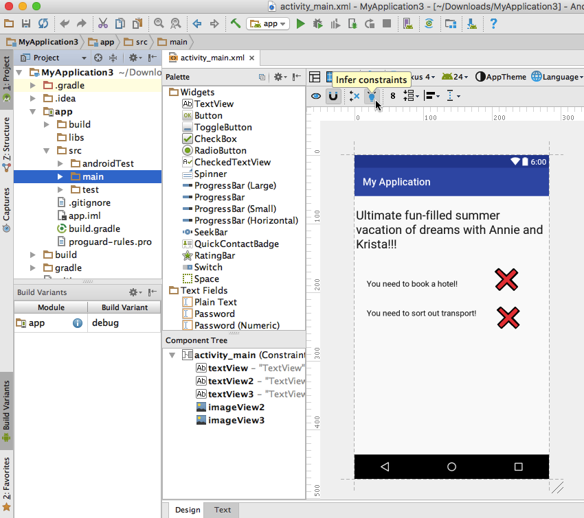
The second way that Android Studio can automatically create constraints is via the inference engine. Spend some time dragging your TextViews and ImageViews into the perfect position on the canvas, and then give Android Studio's Infer constraints button a click (where the cursor is positioned in the screenshot below).
When you click this button, Android Studio will automatically create all the constraints required to deliver your current layout.
That’s the default version of this screen sorted, but we also need to test how this screen adapts once the user starts checking tasks off their ‘To Do’ list. Ultimately, I want these TextViews to display some basic information about the user’s hotel reservations and travel arrangements. This pits us against an old foe: variable text.
This screen needs to be flexible enough to display information about hotels (and airports, train stations, etc.) with seriously long names, but at the same time it shouldn’t look odd if the user books into a hotel that’s so cool and trendy that its name is a single letter, or the pi symbol (yep, it's that kind of hotel).
Once again, the solution is to create multiple strings that represent the most awkward text your layout might conceivably have to handle. If you’re unsure about just how extreme you should get with your string resources, then you can always turn to your friend the Internet for guidance. In this scenario, I’d spend some time researching hotels and airports, specifically looking for ones with long, short or just downright weird names, and then use the best examples in my string resources.
Once you’ve created all your resources, you can do a bit of preliminary testing by switching between the different string resources and drawables, and then checking the output in Android Studio’s built-in layout editor.
While this doesn’t give you the same level of insight as testing your app on a real Android device or AVD, it’s much quicker, making it the perfect way to identify any immediate, glaring issues with your layout.
Chances are you’ll need to shuffle your TextViews and ImageViews around a bit in order to find that perfect balance between a layout that can display a large amount of text and a layout that doesn’t look odd when it only has to display a few letters.
If you do need to make some tweaks (I know I had to!) then simply grab the widgets in the canvas and drag them into a new position. Once you’re happy with the results, just give the Infer constraints button another click and Android Studio will create an entirely new set of constraints for you.
Here’s my finished prototype.
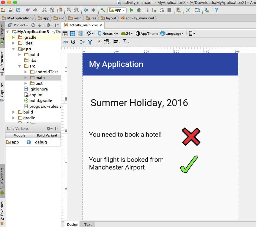
Not bad, but the real test is how well this layout translates across Android smartphones, tablets and AVDs with different screen configurations, so this is exactly what we're going to do next.
Testing Your Digital Prototype
There’s no substitute for getting some hands-on experience with how your prototype looks and functions on a real device, so start by installing your project on your own Android smartphone or tablet and spending some time interacting with it, just to get a feel for the overall user experience. Don’t forget to test your prototype in both landscape and portrait mode!
If you identify any issues or opportunities to improve your screen design, then make a note of them, so you’ll know exactly what changes you need to apply once you’ve finished testing your prototype.
If your app is going to provide the best experience for all your users, then it needs to be flexible enough to adapt to a range of screen configurations. Once you’ve thoroughly tested your prototype on your own Android device, you should create multiple AVDs that have different screen sizes and densities, and then test your prototype across all of them. Again, if you notice anything ‘off’ about your prototype, or have an idea about how you could improve the design, then make a note of these changes so you won’t forget them.
Once you’ve thoroughly tested the default version of your layout, you need to test how your prototype will adapt once the user starts ticking tasks off their checklist.
Update both ImageViews to display the green tick drawable, and switch the default text for two of the alternate string resources—again, since we’ll be testing all our string resources, it doesn’t really matter which two you start with.
Put this new version of your prototype through the same vigorous testing process, which means installing it on your Android device for some hands-on experience, and then testing it across AVDs with different screen configurations. As always, make a note of your findings. Then, rinse and repeat for all the string resources you created for your checklist and title TextViews.
Once you’ve finished testing, you should review your notes. If you only need to make small tweaks, then you may be able to get away with applying these changes directly to your prototype and digital wireframes. However, if these changes are more dramatic or amount to a complete redesign, then you should spend some time exploring them in more detail first. Ideally, you should put your new ideas through the same wireframing, prototyping and testing process as your initial ideas, as this is still the most effective way of ironing out any issues with your designs.
Sure, it’s frustrating to find yourself back at the wireframing stage when it seemed as if you were almost done with the whole design process, but time spent exploring new ideas is always time well spent.
Even if you end up discarding these ideas in favour of your original design, at least you’ll know that you really are working with the best screen designs you could come up with. There’s nothing worse than investing a ton of time and effort into a project, when the whole time you have a nagging doubt in the back of your mind that maybe, just maybe, you should have gone down a different route.
Basically, if prototyping has stirred up any new ideas, then now’s the time to explore them!
Once you’ve tested all versions of your prototype across a range of AVDs, there's just one thing left to do: create a prototype of every other screen in your screen map, and subject every last one to the same level of scrutiny.
Summary
In this two-part series, we looked at how to take an initial idea and develop it into a detailed design.
This may sound like a lot of work (because, let’s be honest, it is a lot of work) but every step in this process will help you flush out any problems with your design and zero in on opportunities to improve your app.
Planning, wireframing and prototyping can actually save you time in the long run by reducing your chances of having to deal with major problems further down the line. As soon as you start writing code, fixing design issues becomes much more difficult.
But ultimately, investing so much time and energy into perfecting your app’s underlying design will help you deliver a better experience for your users. That means more downloads, more positive reviews, and more people recommending your app to their friends and family—and who wouldn’t want that?


Comments