Introduction
Over the past months, Material Design has grown in a large design movement. Different components of Material Design, such as content cards and improved use of animation, can be found in many applications we use today.
As many blog posts have covered, on one side this is a good evolution as it's becoming easier than ever to create a solid design. On the other hand, there are voices who disprove the lack of originality as everyone is using a similar style. Besides, having access to a good design language doesn't mean that it's applied correctly.
In this tutorial, we'll be covering how you can take concepts of Material Design and improve them to create better interfaces that are at the same time more distinct in their visual style. We'll also look at a few general tips before you start designing by using Material Design as a starting point.
Material Design as Foundation
First and foremost, starting from Material Design to design interfaces shouldn't be disapproved. Not at all. I, in fact it helps set a foundation which Android users are costumed to.
When it comes to building a good user experience, reinventing the wheel is often not recommended.
Using standards is a particularly great start to assure that you're building something which works. The structure of the interface and its interactions are proven to work. That said, that doesn't mean that there's no room for error or for improvement.
Using Cards In Design
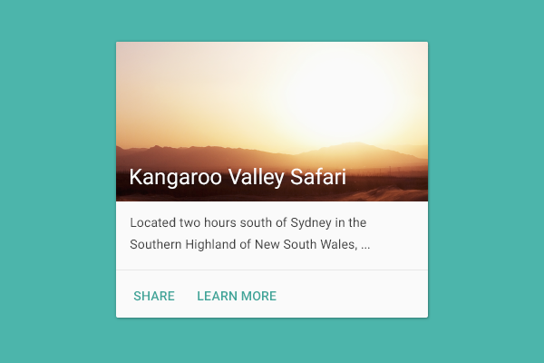
The crux of Material Design comes back to the use of content cards. Now, cards are definitely a component that is applicable in a lot of situations hence them being very useful design patterns. Simultaneously, it can be a good design challenge for you to think if there could be more interesting design alternatives. As we're seeing more and more card-based designs, it's good to think how you can design something better.
Take the calendar as an example. Instead of a list per day with a card for each appointment, notice how Sunrise has a combination view in which you see both the monthly view as well as the daily view.
.png)
Games are another great source of inspiration if you're trying to find unique interfaces as a form of inspiration. Check out inspirational websites such as UIMovement to see fresh and new types of interfaces as inspiration.
When you're constructing an interface, would content cards be the most optimal solution or could there be other interesting ways of displaying content that might be a better solution?
Each app is attempting to solve a problem in their own, unique way. With this train of thought, it might make sense that your solution requires a different kind of interface.
Well, how do you proceed? It all begins with content and navigation, which I'll discuss in more detail below.
Beware the Floating Action Button
.png)
Another design pattern introduced by Material Design is the floating action button. A floating action button is a great way of prominently featuring an action in an interface. At the same time, it can be one of the worst possible design mechanisms. There are plenty of ways to use a floating action button in the wrong way:
- placing it on a screen that has multiple core user actions instead of just one
- hiding a menu in a floating action button
- obstructing important design elements
Personally, I see a couple of instances where a floating action button is a great addition to the product, primarily in apps that have one core interaction for the user. A messaging app is a great example. The floating action button lets the user compose a new message. Uber would be another great example where it makes sense. The core interaction of the product is to hail a car.
The trick is to be careful and see if it makes sense in the context of your product. It's not because it's a standard interface element that it might be a good fit for your app. For more complicated products, where a user is frequently taking multiple actions, a floating action button is rarely a good fit.
User Conversion & Retention Strategies
With a strong design direction to start from, Material Design, it's sometimes fairly easy to forget a strategic foundation before you start designing. How do you decide what you can use from Material Design and what you can improve?
Certain design choices, such as using content cards for example, might limit you early on.
Below, you can find a brief checklist of certain elements of your application that need to be defined well before making these kinds of design decisions.
Asking the right questions gives you a better understanding of what you're trying to build and based upon that you can create interfaces that work better.
Navigation
- What is the most important user action in my product?
- On which screen(s) does this occur?
- What does a flowchart of my product look like?
To conclude, there are two simple rules I tend to keep in mind while structuring the navigation of a product.
Rule 1: 80/20
Apply the 80/20 rule. 80% of my users will use only 20% of my functionality. How can I assure that those 20% of my features are the easiest to access in my product?
Rule 2: Consistency
If there are multiple ways to access a screen in a product, assure that it occurs in a very consistent way. For example, moving from an overview screen to a detail screen should occur in the same fashion.
Based on the above, you can decide what would be the most optimal for users to navigate through a product. If you have a complicated product with a lot of options, a drawer is the right choice. Simple product? Working with tabs is typically your answer. For more information about navigation and Material Design, I recommend browsing the Material Design guidelines.
Content
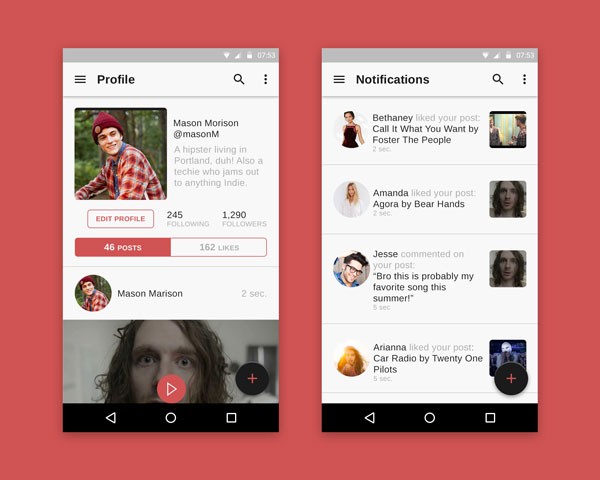
Every app has content. The following questions should help you decide how to structure and display content from a design perspective:
- What types of content do I have?
- How many level(s) of content do I have (for example, an overview screen, followed by a detail screen, and finally an action screen)?
- What is the typical length of each type of content?
- What would be the most optimal way of displaying this content? Is it a list? Is it a slideshow? Is it something more unique?
Once you have your content figured out, it's going to be much easier to make design decisions. That's the moment where you can define whether using cards makes sense or if there are better or more interesting alternatives to use for your interface.
Putting Different Types of Users First
The biggest design challenge you can face is the following:
How do I assure that my application is equally gratifying for new users as well as for returning users? How would this affect my content and navigation?
This is a difficult challenge and often comes down to effective onboarding and assuring that the main screen of your product is the screen where most of the value is for your users. Do you need some examples? Take a look at the following products. What is their main screen and what value does it give? How do they approach user onboarding?
- Espresso by The Economist
The above products should give you some inspiration. Don't be discouraged if this feels daunting at first. It has taken the above products multiple iterations to get where they are today.
Onboarding is a subject on its own. I recommend checking out some resources that give you valuable insight, such as User Onboard.
Interface Improvements
Now that we have a good idea how your product fundamentally is going to work plus what possible elements you can use from Material Design, it's time to spice things up a little bit. There are a variety of ways to improve your app aesthetically, some of which are listed below.
Typography
Your font selection contributes tremendously to the look and feel of your product. Picking a custom font can strongly help create a more diverse design and apply a unique look and feel to your product without making a big change. Finding the right fonts can be tricky and much of it also comes down to design taste. My personal favorite resource is Typewolf.
Iconography
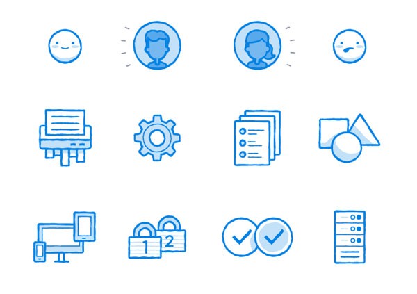
Adding custom icons is another way to embed your own custom look and feel within an application. Using custom iconography is tricky as Material Design has created a great standard. For icons, this means that certain actions, navigations, and other elements have the same icon.
If you decide to start working with your own set of icons, there are two important aspects to remind yourself of:
- Recognizability: Make sure that people understand what each icon implies.
- Consistency: Typically, it's avoided to combine multiple sets of icons.
Visual Assets
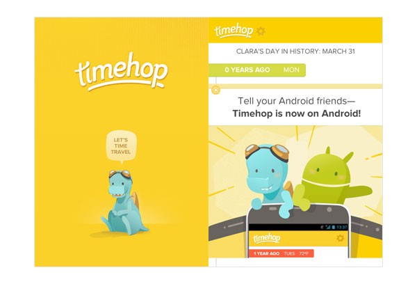
How you display photographic content or the use of illustrations can easily add character to your app. Be creative.
Unique Animations & Interactions
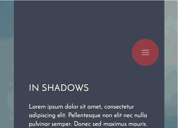
Custom animations and interactions require the most effort, but it's gratifying work to see come alive in a product. Unique animations built on unique interfaces that just work are some of the most gratifying design work you can find online.
Unique Color Schemes
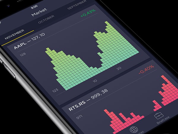
Material Design provides a great selection of colors you can pick from. That doesn't mean you can't get very creative with your usage of color to create something really unique.
A Word of Caution
There's a reason why most of the interfaces we know on a daily basis are fairly simple designs, it's proven to work and it's something users feel familiar with as they use it.
Experimental design can hurt your app.
That said, with some minor tweaks by, for example, only focusing on typography and color, you can go a long way to design something unique for your app.
Conclusion
Material Design has created a comfortable fallback when you're stuck on a design problem. Until then, you have all the creative freedom to rethink how an interface should work. Snapchat built a gesture-focused product, Facebook Paper (iOS) rethought hierarchy and animation, and Medium effectively reduced an interface to focus on just reading (and writing).
With that in mind, go ahead and design. Any comments or questions? Leave them in the comments or reach out to me on Twitter.


Comments