Wordpress, as a content management system, is often used for creating portfolio websites. With the evolution of user interface design and functionalities, a new trend has emerged: displaying portfolio items in different layouts. This tutorial details the process of creating a dedicated portfolio section in WordPress' backend, and using jQuery and CSS3 to display the portfolio in a classy manner.
In this tutorial, we are going to extensively use powerful features of WordPress, such as custom posts, custom taxonomies, and we'll also write a function to fetch our own custom excerpts.
Step 1 - Installing Wordpress and Initializing the Theme.
The first step in creating our portfolio website is to install Wordpress. This is a simple task, and, even better, most web hosts out there provide one click installers. However, if you are new to this, here is an awesome guide to help you out with the installation.
Once the installation has completed, we should next create our custom theme which will display our portfolio. There are various methods for creating custom themes. Some prefer to create a new blank white template, while others choose to create child themes of the new TwentyTen template. For this tutorial, we will use the Starker's theme, by Elliot Jay Stocks. It's a completely blank theme with no styling; it's a great base to build our theme on. Edit the styles.css file, and change the theme name referenced at the top. To install the theme, simply paste the theme folder in thewp-content > themes folder. Once the theme is installed, you can activate it by going to the themes page.

Step 2 - Planning the Layout
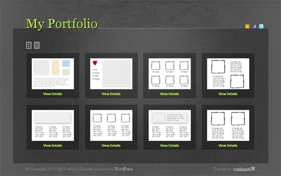
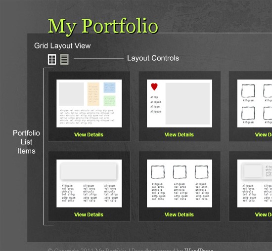
Our portfolio site will not contain much data. A basic portfolio site contains images of the projects, some tags to identify the projects, and a short description of each. The multi-layout theme will function in such a way that the user can select between a grid and list layout. Like many multi layout websites available, we are not going to load a different page when the user clicks on the list view or the grid view. Instead, we'll use AJAX to asynchronously load in the new viewer. This is the basic design of how our portfolio site will appear in grid mode:
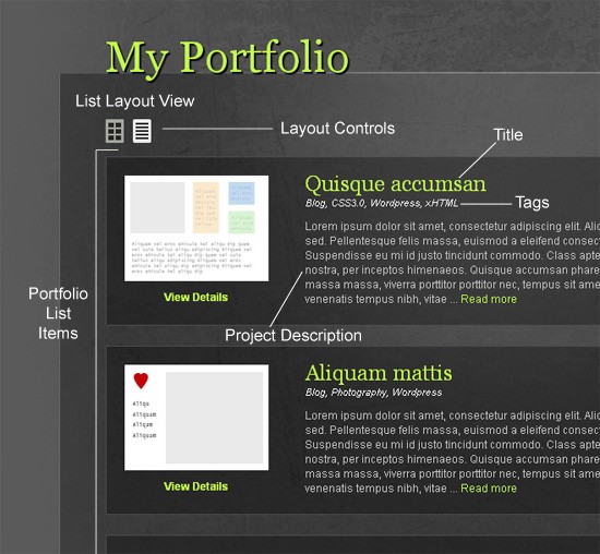
Once the user clicks on the list view control, the whole layout will smoothly change to a list view which will contain the title of the project, the tags associated with it, and a short description.
Step 3 - Setting up the Backend
For our portfolio, we need to register a custom post type, called "project." We can customize every aspect of a WordPress post. For example, we can change the labels involved, select various features for the post like comments, thumbnails, excerpts, etc.
To implement a custom post, edit the functions.php file located within the theme folder. It contains a lot of predefined code, as the naked Starkers theme provides some functionalities of the default TwentyTen template. Don't be scared or confused; you can append the following code either at the bottom or top of the functions.php file.
Don't leave any empty space at the end of the
functions.phpfile.
We hook our custom function to the initialization (init) action in the following way:
/*--- Creating custom post type for project --*/
add_action('init', 'project_custom_init');
This project_custom_init method will be used to register the custom post type in the WordPress database.
You can learn in detail about the method involved in registering a custom post type here.
The register_post_type method requires a name for the custom post, and a set of arguments, which define the characteristics of the custom post. Firstly, we need to define the labels for the custom post. These labels will be used for the custom post in the WordPress admin.
/*-- Custom Post Init Begin --*/
function project_custom_init()
{
  $labels = array(
    'name' => _x('Projects', 'post type general name'),
    'singular_name' => _x('Project', 'post type singular name'),
    'add_new' => _x('Add New', 'project'),
    'add_new_item' => __('Add New Project'),
    'edit_item' => __('Edit Project'),
    'new_item' => __('New Project'),
    'view_item' => __('View Project'),
    'search_items' => __('Search Projects'),
    'not_found' =>  __('No projects found'),
    'not_found_in_trash' => __('No projects found in Trash'),
    'parent_item_colon' => '',
    'menu_name' => 'Project'

  );
Once we've defined the labels, we need to define the set of arguments for the custom post type. The labels array defined earlier is going to be an argument as well. Once the arguments are defined, we register the custom post type as "project".
 $args = array(
    'labels' => $labels,
    'public' => true,
    'publicly_queryable' => true,
    'show_ui' => true,
    'show_in_menu' => true,
    'query_var' => true,
    'rewrite' => true,
    'capability_type' => 'post',
    'has_archive' => true,
    'hierarchical' => false,
    'menu_position' => null,
    'supports' => array('title','editor','author','thumbnail','excerpt','comments')
  );
  // The following is the main step where we register the post.
  register_post_type('project',$args);
}
/*-- Custom Post Init Ends --*/
Create Custom Messages for the 'Project' Post
We can also optionally add custom messages for the custom post type. These messages will be displayed in the WordPress dashboard when we edit or update the custom post. We can do this by creating a filter for the post updated messages in the following manner:
// Add filter to ensure the text Project, or project, is displayed when a user updates a book
add_filter('post_updated_messages', 'project_updated_messages');
function project_updated_messages( $messages ) {
  global $post, $post_ID;

  $messages['project'] = array(
    0 => '', // Unused. Messages start at index 1.
    1 => sprintf( __('Project updated. <a href="%s">View project</a>'), esc_url( get_permalink($post_ID) ) ),
    2 => __('Custom field updated.'),
    3 => __('Custom field deleted.'),
    4 => __('Project updated.'),
    /* translators: %s: date and time of the revision */
    5 => isset($_GET['revision']) ? sprintf( __('Project restored to revision from %s'), wp_post_revision_title( (int) $_GET['revision'], false ) ) : false,
    6 => sprintf( __('Project published. <a href="%s">View project</a>'), esc_url( get_permalink($post_ID) ) ),
    7 => __('Project saved.'),
    8 => sprintf( __('Project submitted. <a target="_blank" href="%s">Preview project</a>'), esc_url( add_query_arg( 'preview', 'true', get_permalink($post_ID) ) ) ),
    9 => sprintf( __('Project scheduled for: <strong>%1$s</strong>. <a target="_blank" href="%2$s">Preview project</a>'),
      // translators: Publish box date format, see http://php.net/date
      date_i18n( __( 'M j, Y @ G:i' ), strtotime( $post->post_date ) ), esc_url( get_permalink($post_ID) ) ),
    10 => sprintf( __('Project draft updated. <a target="_blank" href="%s">Preview project</a>'), esc_url( add_query_arg( 'preview', 'true', get_permalink($post_ID) ) ) ),
  );

  return $messages;
}
Registering a Custom Taxonomy
We next need to define a custom taxonomy for the tags to be used with each of the portfolio items. You can learn more about the register taxonomy method here.
// Initialize New Taxonomy Labels
  $labels = array(
    'name' => _x( 'Tags', 'taxonomy general name' ),
    'singular_name' => _x( 'Tag', 'taxonomy singular name' ),
    'search_items' =>  __( 'Search Types' ),
    'all_items' => __( 'All Tags' ),
    'parent_item' => __( 'Parent Tag' ),
    'parent_item_colon' => __( 'Parent Tag:' ),
    'edit_item' => __( 'Edit Tags' ),
    'update_item' => __( 'Update Tag' ),
    'add_new_item' => __( 'Add New Tag' ),
    'new_item_name' => __( 'New Tag Name' ),
  );
// Custom taxonomy for Project Tags
register_taxonomy('tag',array('project'), array(
    'hierarchical' => false,
    'labels' => $labels,
    'show_ui' => true,
    'query_var' => true,
    'rewrite' => array( 'slug' => 'tag' ),
  ));
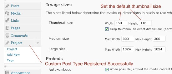
Return to your WordPress dashboard, and open the media settings from the settings tab. Here, you have to set the default size for the portfolio image thumbnails. You'll also notice in the sidebar that the "Project" custom post type has been successfully registered, along with the custom taxonomy, "tags." We can register the default thumbnail size using the set_post_thumbnail method, but I'll demonstrate another way to achieve this. You can learn more about how to set post thumbnail sizes programmatically here.
Create Demo Portfolio Items
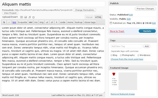
Create some demo portfolio items by going to projects and clicking on add new. We require a title for the project, the content, and a thumbnail. We can see that a tag section has also appeared and confirms that our custom taxonomy was successfully registered. Add some tags for the portfolio items, as well.
Step 4 Coding and Styling The Template
Coding the static template
To create the theme, we will first create a static HTML/CSS3 template for the website. This separates the two tasks of making the website look consistent with the design, and fetching the content from the database. Coding the theme directly may be a bit confusing for beginners sometimes - specially, if a lot of content is present in the theme. Create three folders, named
"css", "images" and "js," respectively. The general structure for the main content area will be like so:
<body>
	<div id="page-wrap">
		<div id="header">
			<!-- Header Content Comes Here -->
		</div>
		<div id="main-content">
			<div id="layout-controls">
				<!-- Layout Controls Area -->
				<a href="#" class="grid"><span>Grid</span></a>
				<a href="#" class="list"><span>List</span></a>
				<div class="clear"></div>
			</div>
			<ul id="folio" class="grid">
				<li> <!-- Portfolio Item -->
					<div class="image">
						<!-- Project Thumbnail Area -->
						<span>
							<a href="#"><img src="" alt=""/></a>
						</span>
						<a href="#" class="link">View Details</a>
					</div>
					<div class="content">
						<!-- Project Content Area -->
						<h2><a href="#">Project Title</a></h2>
						<span class="tags">Tags, Tags</span>
						<p> The Project Description / Excerpt</p>
					</div>
					<div class="clear"></div>
				</li>
			</ul>
			<div class="clear"></div>
		</div><!-- End of Main Content -->
		<div id="footer">
			<!-- Footer Content Comes Here -->
		</div>
	</div><!-- End of Page Wrap -->
</body>
Style the Template
Styling the template is dependent on you. You can experiment with different colors and images to suit your needs. But for this template, we are going to create a dark grunge theme and use some fun CSS3 to achieve those subtle hover effects and transparency. The slicing up of the design into images is rather. As such, I won't go over the details here.
body{
	background: #5a5a5a url('images/bg.jpg') no-repeat center top;
	height: 100%;
}
a{
	text-decoration: none;
	color: #C2FC48;
}
a:hover{
	color:#fff;
}
.clear{
	clear: both;
}
#page-wrap{
	width: 960px;
	position: relative;
	margin: 0 auto 40px;
}
#header{
	height: 111px;
	padding: 0 10px 0 50px;
}
#header h1{
	float:left;
}
#header h1 a{
    font-family: Georgia,Arial,Helvetica,sans-serif;
    font-size: 48px;
    position: relative;
    text-decoration: none;
    text-shadow: 2px 2px 1px #000000;
    top: 64px;
    width: auto;
    z-index: 1000;
	-moz-transition: all 0.3s ease-in-out;
	-webkit-transition: all 0.3s ease-in-out;
	-o-transition: all 0.3s ease-in-out;
	transition: all 0.3s ease-in-out;
}
#header h1 a:hover{
	color:#f4f6f0;
}
ul#social{
	float: right;
	top: 95px;
	position:relative;
}
ul#social li{
	float: left;
	margin-right: 10px;
	display: inline;
}
ul#social li a{
	width: 16px;
	height: 16px;
	display: block;
	background-image: url('images/layout-icons.png');
	text-indent: -99999px;
}
ul#social li a.feed{
	background-position: -16px 32px;
}
ul#social li a.facebook{
	background-position: 0 32px;
}
ul#social li a.twitter{
	background-position: 0 16px;
}
The basic styling for the main container and the layout controls are as follows
/*--Main Content Styles Start here --*/
#main-content{
	padding: 50px 50px 28px 50px;
	background-color: #000;
	border-bottom: 1px #696969 solid;
	border-left: 1px #696969 solid;
	border-right: 1px #696969 solid;
	/* Fallback for web browsers that doesn't support RGBa */
	background: rgb(0, 0, 0);
	/* RGBa with 0.3 opacity */
	background: rgba(0, 0, 0, 0.3);
	font-family: Helvetica, Arial, sans-serif;
	font-size: 12px;
	color:#c7c7c7;
	line-height: 16px;
}
#main-content a:hover{
	color: #fff;
}
#layout-controls{
	margin-bottom: 15px;
}
#layout-controls span{
	width: 20px;
	height: 26px;
	display: block;
	background-image: url('images/layout-icons.png');
	-moz-transition: all 0.3s ease-in-out;
	-webkit-transition: all 0.3s ease-in-out;
	-o-transition: all 0.3s ease-in-out;
	transition: all 0.3s ease-in-out;
	text-indent: -99999px;
}
#layout-controls a{
	width: 20px;
	height: 26px;
	display: block;
	float: left;
	background-image: url('images/layout-icons.png');
	margin-right: 10px;
	display: inline;
}
#layout-controls a.grid span{
	background-position: left 0;
}
#layout-controls a.grid{
	background-position: left -26px;
}
#layout-controls a.list span{
	background-position: right 0;
}
#layout-controls a.list{
	background-position: right -26px;
}
#layout-controls a:hover span{
	opacity: 0; /* other browsers */
	filter: progid:DXImageTransform.Microsoft.Alpha(opacity=0); /* this works in IE6, IE7, and IE8 */
}
The following are the general styles for the project list. We will later do specific styling for each grid layout mode and a list layout mode depending on the current class of the folio list.
/*-------------General Folio Styles Starts Here---------------*/
ul#folio li a{
	-moz-transition: all 0.3s ease-in-out;
	-webkit-transition: all 0.3s ease-in-out;
	-o-transition: all 0.3s ease-in-out;
	transition: all 0.3s ease-in-out;
}
ul#folio li{
	/* Fallback for web browsers that doesn't support RGBa */
	background: rgb(0, 0, 0);
	/* RGBa with 0.3 opacity */
	background: rgba(0, 0, 0, 0.3);
	padding: 20px;
	border: 1px #4c4c4c solid;
	margin-bottom: 22px;
	-moz-transition: all 0.3s ease-in-out;
	-webkit-transition: all 0.3s ease-in-out;
	-o-transition: all 0.3s ease-in-out;
	transition: all 0.3s ease-in-out;
}
ul#folio li:hover{
	/* Fallback for web browsers that doesn't support RGBa */
	background: rgb(0, 0, 0);
	/* RGBa with 0.3 opacity */
	background: rgba(0, 0, 0, 0.1);
}
ul#folio li .image{
	text-align: center;
}
ul#folio li .image span{
	width: 158px;
	height: 116px;
	display: block;
	overflow: hidden;
	background-color: #fff;
	margin-bottom: 10px;
}
ul#folio li .image span a{
	width: 158px;
	height: 116px;
	display: block;
}
ul#folio li .image a{
	font-weight: bold;
}
Also make note that we are not using the general opacity method of achieving transparency using CSS3. Using the opacity method also affects the children of the parent container on which the opacity is applied. Instead, we are using the RGBa method of adding background colors to the container, and using the alpha value to control the transparency of the container.
You can read more about the RGBa Property in this awesome article.
This does not affect the transparency of the children elements. We also need to create IE specific CSS code to support the alpha transparency.
<!--[if IE]>
<style>
#main-content, ul#folio li{
	background:transparent;
    filter:progid:DXImageTransform.Microsoft.gradient(startColorstr=#30000000,endColorstr=#30000000);
    zoom: 1;
}
ul#folio li:hover{
	background:transparent;
    filter:progid:DXImageTransform.Microsoft.gradient(startColorstr=#10000000,endColorstr=#10000000);
    zoom: 1;
}
</style>
<![endif]-->
In the HTML structure, you will notice that there is a class given to the portfolio list.
<ul id="folio" class="grid">
Basically, the "grid" class is used to display the list in a grid view and the "list" class is used to display the list in a list view. In the grid mode, all the extra content is hidden from the user, and in the list mode, all the content is visible to the user. We have two separate sets of styling for each mode. The styles for the grid mode are as follows:
/*------------------Grid Layout Starts Here-------------------*/
ul#folio.grid li{
	width: 158px;
	height: 130px;
	float: left;
	margin-right: 19px;
	display: inline;
}
ul#folio.grid li .content{
	display: none;
}
ul#folio.grid li .image span a{
	width: 158px;
	height: 116px;
	display: block;
}
ul#folio.grid li.rightmost{
	margin-right: 0;
}
List mode styles are as follows. At any moment, only one of the grid or list styles is active.
/*------------------List Layout Starts Here-------------------*/
ul#folio.list li{
	display: block;
}
ul#folio.list li .image,ul#folio li.details .image{
	width: 158px;
	height: 130px;
	float:left;
}
ul#folio.list li .content{
	float: left;
	padding: 0 10px 0 40px;
	width: 598px;
}
ul#folio.list li .content h2,ul#folio li.details .content h2{
	font-size: 24px;
	color: #C2FC48;
	margin-bottom: 6px;
	font-family: Georgia, Arial, Helvetica, sans-serif;
}
ul#folio.list li .content span.tags,ul#folio li.details .content span.tags{
	color: #fff;
	font-size: 11px;
	font-style: italic;
	margin-bottom: 10px;
	display: block;
}
Use jQuery to Add Effects
We next will use jQuery UI to change the class of the folio list with respect to the layout button clicked by the user. We're detecting the click event of the layout control buttons, fetching the current class and the new class to be activated, and then using the add and remove class methods to change the classes. We also have a set of parameters which define the speed of the events taking place.
	var animateSpeed = 500;
	jQuery("#layout-controls a").click(function(){
               var folio = jQuery('#folio'),
		     curClass = folio.attr('class'),
		     newClass = jQuery(this).attr('class');

		folio.fadeOut(animateSpeed,function(){
			folio
                          .removeClass(curClass,animateSpeed);
			  .addClass(newClass,animateSpeed);
		}).fadeIn(animateSpeed);
		return false;
	});
Step 5 Integration with the WordPress Theme
Now that we have completed the static version of the site, we can integrate it with the WordPress theme in a matter of minutes. All we need to do is loop through the posts using a wp_query object with a query for the custom post type. Then, we place the content in the respective position in the template.
Edit header.php
First, we need to modify the header.php template, and include our custom JavaScript files. In this tutorial, we'll include jQuery using the Google's CDN version. We will deregister the jQuery provided by WordPress, and register Google's CDN version of jQuery. Paste the following snippet in your functions.php file.
<?php
/*--- Registering jQuery using Google's CDN */
if( !is_admin()){
   wp_deregister_script('jquery');
   wp_register_script('jquery', ("https://ajax.googleapis.com/ajax/libs/jquery/1.6.0/jquery.min.js"));
   wp_enqueue_script('jquery');
}
?>
Move the css, js and images folders - that you created previously for the static template - to the WordPress theme folder. Insert the jQuery UI custom file, and the main script file in the header. Make sure it is inserted below the wp_head method.
<script src="<?php bloginfo('template_url');?>/js/jquery-ui-1.8.11.custom.js"></script>
<script src="<?php bloginfo('template_url');?>/js/script.js"></script>
Create the Main Template
Now, you can either create another template in the theme - for example, page-home.php - or you can modify the index.php already present in the theme folder. If you choose the former method, then:
- Create a page
- Set the page's template as the template you just created.
- Go to the reading settings in the
settingstab. - Select the homepage as a static one.
- Select the page you just created as the homepage.
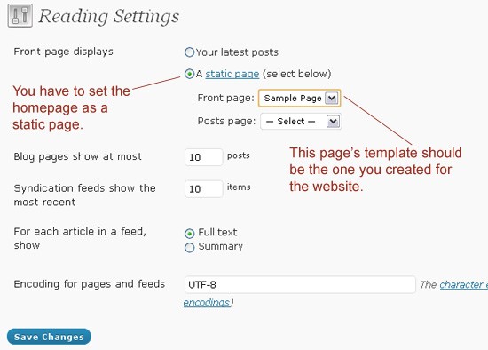
The template will first contain the header, which you can call using the get_header() method, then the main content, which you will code within the template itself. Lastly, the footer, which you can be included, via the get_footer() method.
The following code demonstrates how you can create a custom query using the wp_query object.
<?php $loop = new WP_Query(array('post_type' => 'project', 'posts_per_page' => -1));
  $count =0;
?>
We are using a variable, count to count the number of items in the list. We need this because we will keep only four items in each row and assign a 'rightmost' class to every fourth list element. The 'rightmost' class eliminates any right margin to the list elements. Alternatively, we could, in our CSS file, use the li:nth-child(4n) selector.
The following code shows how we can loop through the posts and insert the content, as required.
<?php if($loop) { ?>
	<ul id="folio" class="grid">
		<?php while ( $loop->have_posts() ) : $loop->the_post(); ?>
Inside the loop, we insert the content in the normal WordPress way, using the $loop wp_query object, of course. The following code shows how we can fetch the thumbnail of the project post and insert it into the template. Make proper note of how we use the $count variable to insert the 'rightmost' class on every fourth list element.
		<li class="item-<?php the_ID() ?> <?php if(++$count%4==0) echo 'rightmost'?> ">
				<div class="image">
					<span>
						<a href="<?php the_permalink() ?>">
							<?php
								if(has_post_thumbnail()){
									the_post_thumbnail('thumbnail');
								}
							?>
						</a>
					</span>
					<a href="<?php the_permalink() ?>" class="link">View Details</a>
				</div>
Now comes the content section where we need to insert the title, tags, short description and fetch the excerpt for the post with a custom excerpt method. Inserting the title is rather easy, as are the tags. Remember, we previously created a custom taxonomy by the name of tags.
				<div class="content">
					<h2><a href="<?php the_permalink() ?>"><?php the_title() ?></a></h2>
					<span class="tags">
						<?php
							// Fetching the tag names with respect to the post and displaying them
							$args = array('orderby' => 'name', 'order' => 'ASC', 'fields' => 'names');
							echo implode(wp_get_object_terms( $post->ID, 'tag', $args),', ');
						?>
					</span>
					<p>
						<?php
							// Using custom excerpt function to fetch the excerpt
							folio_excerpt('folio_excerpt_length','folio_excerpt_more');
						 ?>
					</p>
				</div>
				<div class="clear"></div>
			</li>
		<?php endwhile; ?>
	</ul>
<?php } ?>
<?php wp_reset_query(); ?>
You will notice that we are not using the general the_excerpt() method, provided by WordPress. Instead, we are defining our own custom method by adding some filters. The general excerpt method returns a greater length of excerpt than we require. Hence, the custom version. We're also modifying the 'Continue Reading...' text added at the end of the default excerpt, and replacing it with 'Read More'. The following snippet serves our purpose. This custom excerpt method comes in handy for plenty of situations.
<?php
// Adding Variable Excerpt Length
function folio_excerpt_length($length) {
    return 80;
}
function folio_excerpt_more($more) {
	return ' ... <span class="excerpt_more"><a href="'.get_permalink().'">Read more</a></span>';
}
function folio_excerpt($length_callback='', $more_callback='') {
    global $post;
    if(function_exists($length_callback)){
        add_filter('excerpt_length', $length_callback);
    }
    if(function_exists($more_callback)){
        add_filter('excerpt_more', $more_callback);
    }
    $output = get_the_excerpt();
    $output = apply_filters('wptexturize', $output);
    $output = apply_filters('convert_chars', $output);
    $output = '<p>'.$output.'</p>';
    echo $output;
}
?>
Step 6 Conclusion
The above method of creating a multi-layout portfolio is quite simple, and uses basic CSS and jQuery tricks to achieve the result. Even better, these techniques can be applied to a variety of projects. Other techniques in this tutorial, like custom post types, custom taxonomies and adding filters to the excerpt method, can be used in various other innovative ways, as well!


Comments