This tutorial is part of the Building Your Startup With PHP series on Envato Tuts+. In this series, I'm guiding you through launching a startup from concept to reality using my Meeting Planner app as a real-life example. Every step along the way, I'll release the Meeting Planner code as open-source examples you can learn from. I'm also addressing startup-related business issues as they arise.
Mobile Apps vs. the Responsive Web
Strategically, building mobile apps for Meeting Planner on iOS and Android makes sense, but financially I haven't raised the resources for this yet. Mathew Ingram recently wrote in Fortune that due to the plethora of offerings for mobile users, "statistically speaking at least—no one is going to download your app." So while certainly I could enhance the Meeting Planner experience with an app, its likelihood of adoption doesn't make immediate sense with my current resources.
However, it's extremely important to make Meeting Planner a great web experience on mobile devices.
In today's episode, I'll review and discuss making changes oriented to doing just that—essentially making our web application more of a responsive website, easily usable on mobile devices and tablets. Check out the results (on your phone or tablet)!
One of the challenges coding for today's episode was that I'm not a designer or CSS coder. Some days I feel like I shouldn't even be coding myself; at Microsoft I was a Group Program Manager, i.e. we had graphic designers, a fully-staffed usability lab, CSS didn't exist, etc.
Leading up to this work, I felt intimidated trying to learn media queries, breakpoints, and specialized CSS—it's not a subject matter I'm skilled at, and it's time consuming and very detail oriented. Yet, within 48 hours, everything came together quickly and beautifully. If you scan to the bottom of the story, you'll see how few lines of CSS were ultimately needed for all the changes. Suddenly as I began to browse Meeting Planner on my phone, I grew excited for how well the new responsive web experience was working.
Frankly, it made me feel that a dedicated mobile app just isn't necessary at the moment. We can build our audience with the mobile web experience for now, especially through the critical upcoming alpha and beta phases.
In the meantime, if you haven't tried out Meeting Planner yet, go ahead and schedule your first meeting from your phone or tablet. I do participate in the comment threads below, so tell me about your experience! You can also reach me on Twitter @reifman. I'm always interested in new feature requests and suggested tutorial topics.
As a reminder, all of the code for Meeting Planner is written in the Yii2 Framework for PHP. If you'd like to learn more about Yii2, check out our parallel series Programming With Yii2.
The Current Mobile Status
To begin, I browsed the current state of the Meeting Planner service with my iOS phone and took screenshots of the initial application. It's not terrible, but it's not great. Let's review what I found.
The Home Page
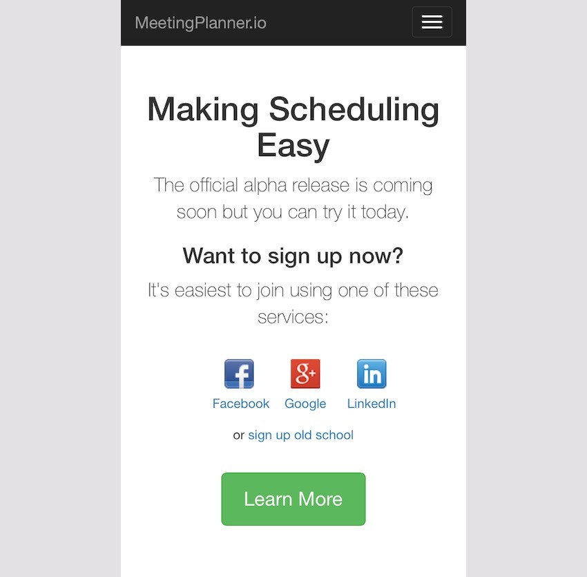
The home page looks good, although aesthetically I wish the lead text, "Making Scheduling Easy", would break a bit differently, i.e. on three approximately equal length lines. However, Bootstrap manages the drop-down menu well, and the rest of the page works functionally:
The Sign-Up Page
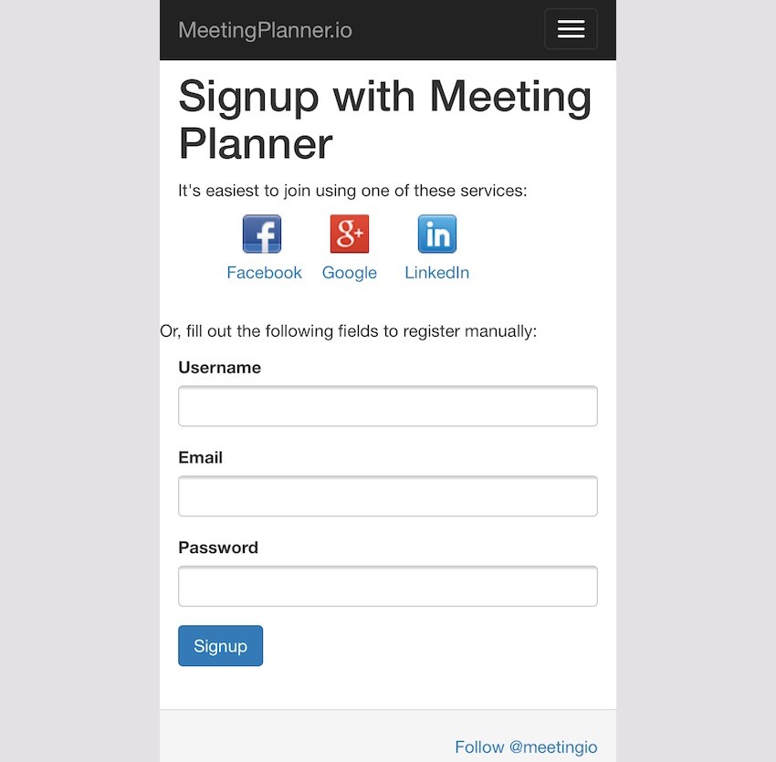
Again, other than the headline's aesthetic layout and left margin consistency, the sign-up page is basically functional:
Planning Meetings
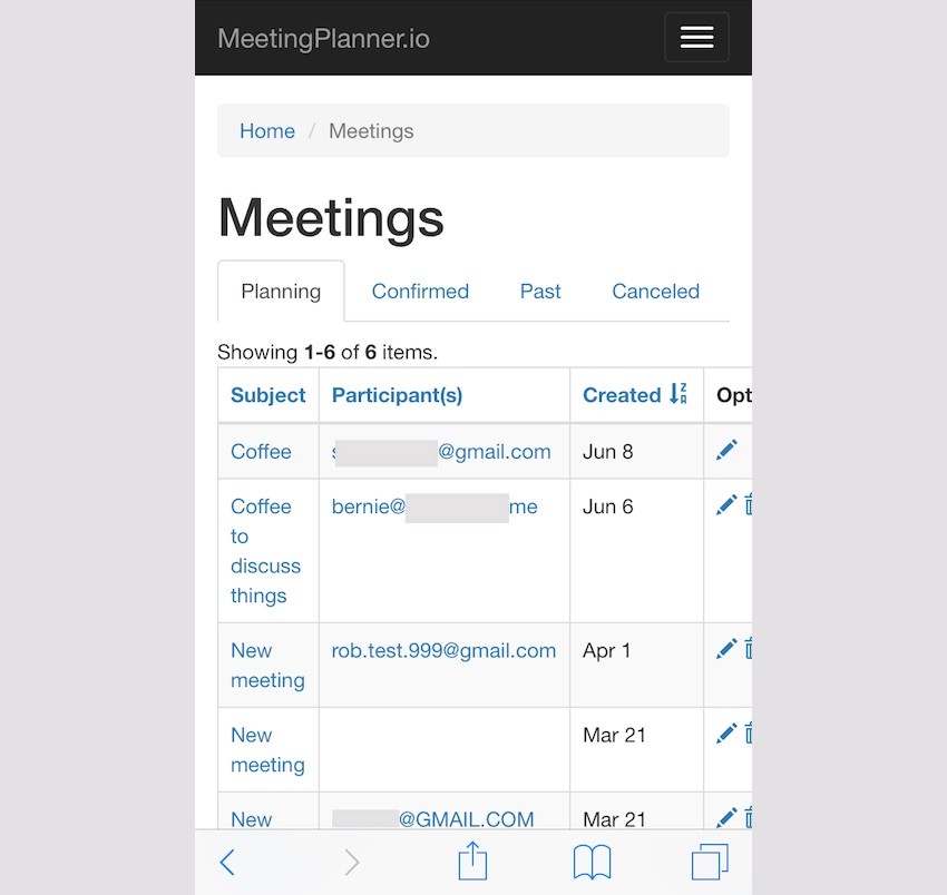
Once the person begins planning meetings, the current index page needs improvement. There are too many columns. The subject is squished. Perhaps the information I chose to display here in the first place isn't essential. And, certainly, the command options aren't in view. The page needs to be adjusted for mobile more significantly.
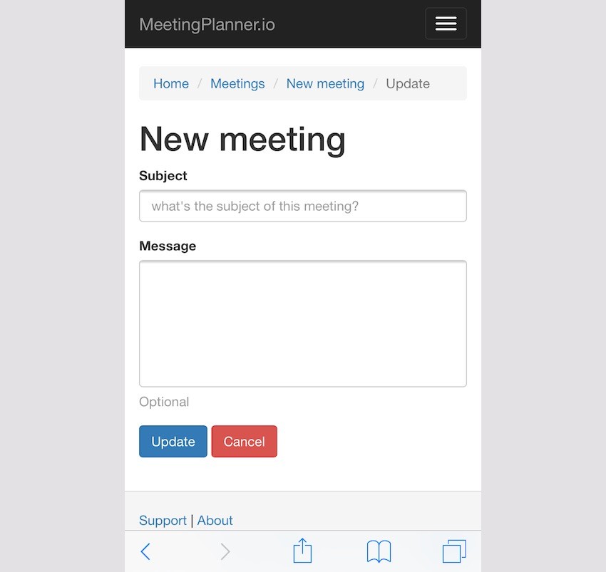
Other pages function well, such as the new meeting request for a subject. However, mobile users probably don't want to be offered a textarea field to type in a longer message introducing the meeting:
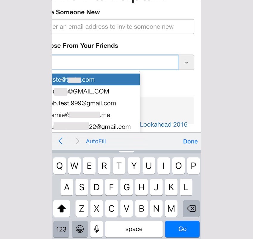
Adding participants also becomes a bit dysfunctional with the bootstrap extensions we're using:
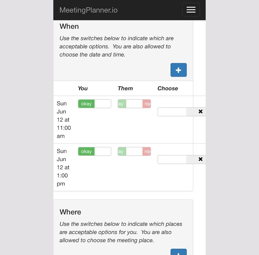
And the planning views for places and times begin to break down. Again, the desktop design offers too much detail and too many options for mobile:
Other Areas
The Places page functionally works but needs an improved layout of the buttons. And perhaps this functionality isn't needed for mobile users.
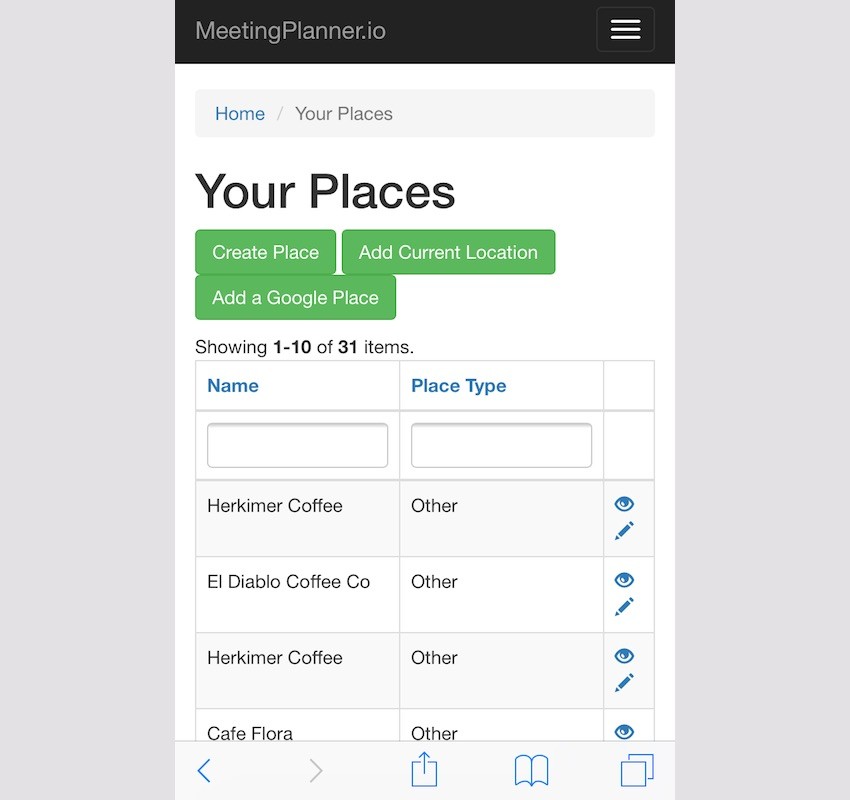
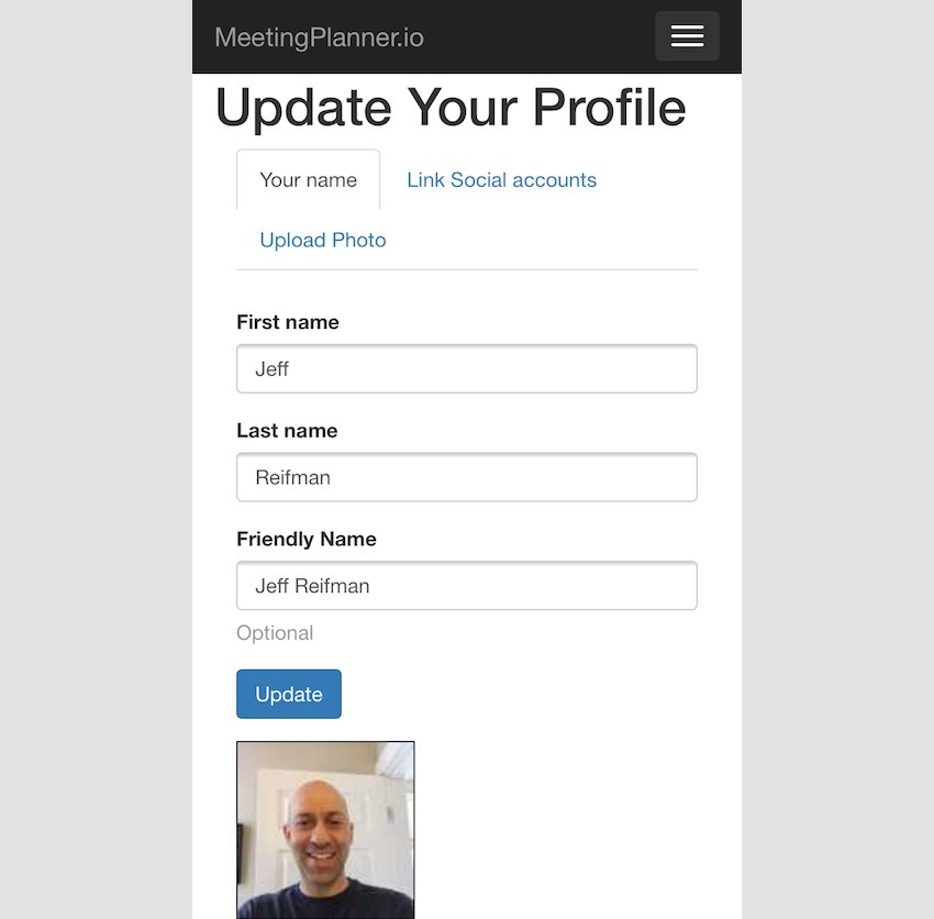
Similarly, the desktop tab and photo layout breaks down on mobile. It also needs to be rethought:
Developing Solutions
Certainly, there are a lot of areas of the site that can be improved. Some areas need to be rethought for mobile, some minimized, and others just aesthetically adjusted. Let's get to work.
Different Approaches
I had pretty much zero experience with media queries and breakpoints when I began this task. For a few days before, I procrastinated over diving into what I feared was an unfamiliar quagmire. I began with a practice media query to tease my editor:
@media only life
   and (max-energy-level: 60%)
   and (-caffeine-ratio: 2) {
      .editorBossperson {
         available-to:false;
         visible-to:false;
   }
}
Joking around helped break the mental ice in my head. I'm always available and visible to Envato's editorial gods.
There were a number of areas I began to consider:
- Simplifying functionality, especially with the meeting planning process
- Identifying the critical information to display for mobile
- Concealing some functionality on mobile devices, such as elements, columns and menu options
- Working with media-queries and breakpoints
- Staying focused on the most important areas for the alpha release
One helpful concept I kept running into on the web was "Design for Mobile First." Unfortunately, I'm old school and hadn't done that. But it was helpful to rethink every page with this theme: Mobile First.
For example, the meeting index with four table columns had to go and was disorienting on portrait phones.
I kept asking myself how I would have designed all the pages to work from a phone.
Warming Up to Media Queries
Drop-Down Menus
It took me some effort to overcome my hesitation at diving into deep CSS. To warm up, I began working on minimizing the drop-down menus and simplifying the scope of mobile functionality.
For now, I decided to create a single basic media query for smaller devices and use that across the site. Here's frontend/site.css:
/* ----------- mobile displays ----------- */

@media only screen
  and (min-device-width: 320px)
  and (max-device-width: 667px)
  and (-webkit-min-device-pixel-ratio: 2) {
    /* hides drop down menu items and footer items */
    .itemHide,li.menuHide {
      display:none;
      visible:false;
    }
Making changes turned out to be relatively simple. For any menu item I wanted to hide on mobile, I just needed to add a CSS property, e.g. menuHide.
Here's the menuHide property added to /frontend/views/layouts/main.php:
$menuItems[] = [
      'label' => 'Account',
      'items' => [
        [
          'label' => Yii::t('frontend','Places'),
           'url' => ['/place/yours'],
           'options'=>['class'=>'menuHide'],
         ],
         [
            'label' => Yii::t('frontend','Friends'),
            'url' => ['/friend'],
            'options'=>['class'=>'menuHide'],
        ],
           [
             'label' => Yii::t('frontend','Profile'),
             'url' => ['/user-profile'],
             'options'=>['class'=>'menuHide'],
         ],
         [
            'label' => Yii::t('frontend','Contact information'),
            'url' => ['/user-contact'],
            'options'=>['class'=>'menuHide'],
        ],
        [
           'label' => Yii::t('frontend','Settings'),
           'url' => ['/user-setting'],
           //'options'=>['class'=>'menuHide'],
       ],
       [
          'label' => Yii::t('frontend','Reminders'),
          'url' => ['/reminder'],
          'options'=>['class'=>'menuHide'],
      ],
           [
              'label' => Yii::t('frontend','Logout').' (' . \common\components\MiscHelpers::getDisplayName(Yii::$app->user->id) . ')',
              'url' => ['/site/logout'],
              'linkOptions' => ['data-method' => 'post']
          ],
      ],
  ];
  echo Nav::widget([
      'options' => ['class' => 'navbar-nav navbar-right'],
      'items' => $menuItems,
  ]);
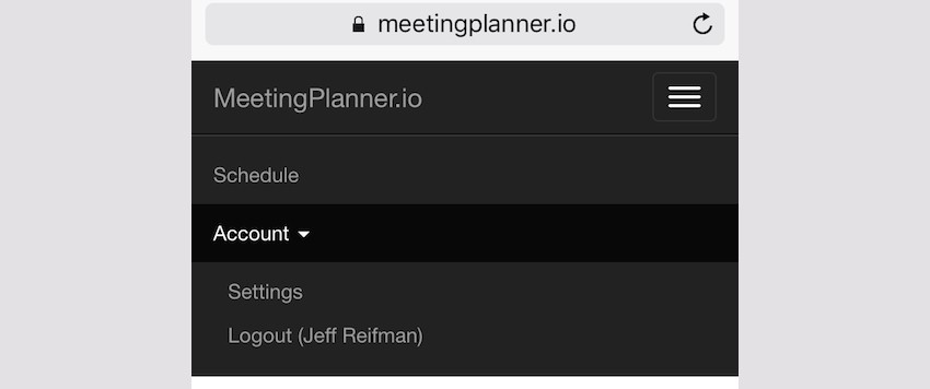
Suddenly, the drop-down menu had less complexity:
Gradually, I realized that simplifying and reducing functionality in the mobile web would create the best experience. People can always go back to their desktop to access other features, at least for now. This would also be an opportunity to gather feedback from people during the alpha and beta phases.
Breadcrumbs
Yii's default layout includes a breadcrumb widget which is loaded via composer and harder to customize. I experimented with adding CSS to hide the first element and the first "/" divider:

It took some time but got me diving deeper into CSS, e.g. nth-child content, and built my confidence:
/* removes home and / from breadcrumb */
    ul.breadcrumb li:first-child, li.tabHide {
      display:none;
      visible:false;
    }
     ul.breadcrumb li:nth-child(2)::before {
       content:'';
    }
I had no idea that CSS could modify content.
Here's the result:

Enhanced Button Spacing for Fingertips
Next, I added CSS to provide additional padding for buttons on mobile to make fingertip presses less error-prone. For example, here are the submit and cancel buttons on desktop devices:
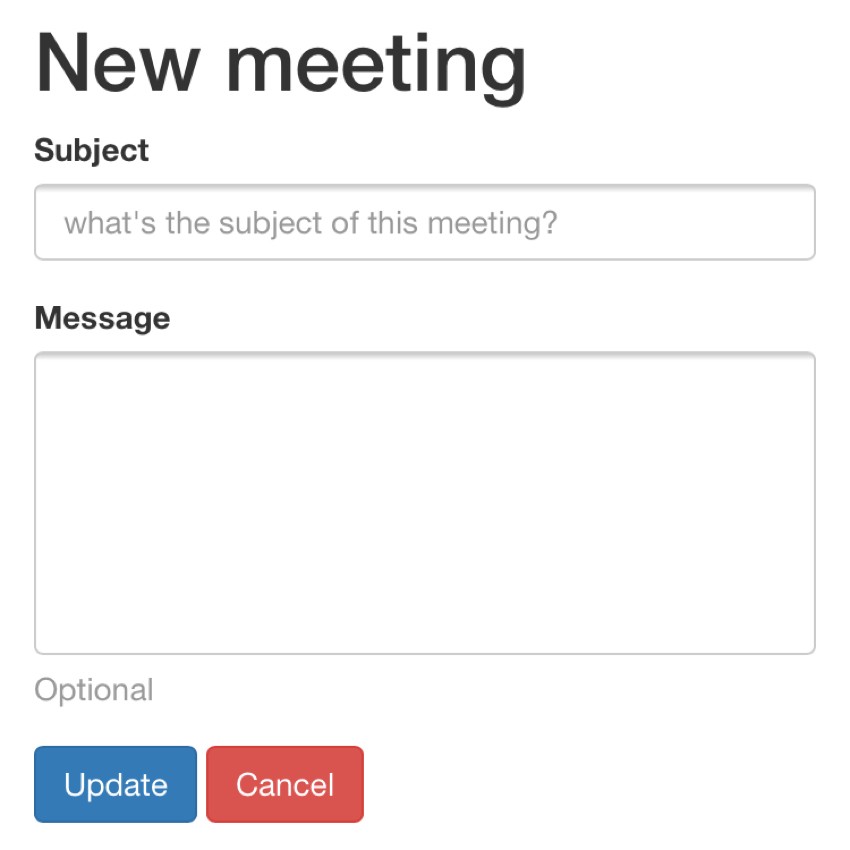
This is the CSS I used and began adding to various buttons and clickable icons around the site:
    /* fingertip spacing for buttons */
    a.icon-pad {
      padding: 0 5px 0 2px;
    }
    .button-pad {
      padding-left:7px;
    }
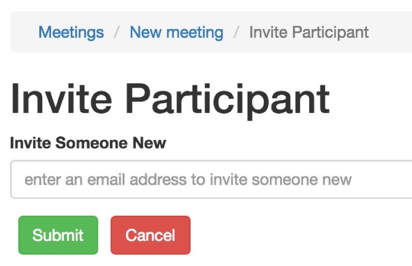
Here's what that form looks like on mobile—notice the new padding between Submit and Cancel:
Responsive Text Wrapping
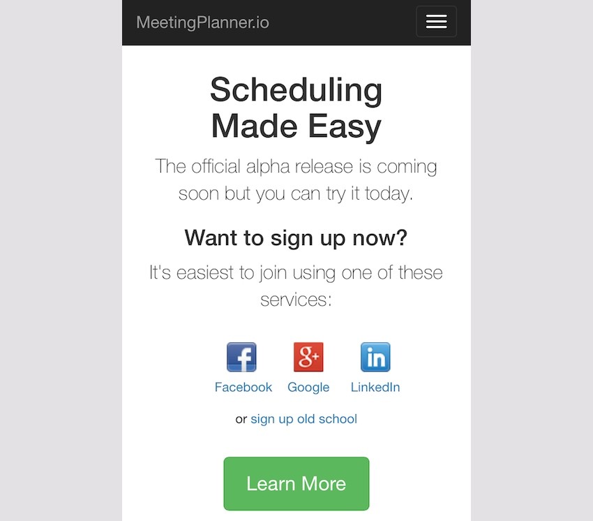
Making the home page heading, "Scheduling Made Easy," wrap actually turned out to take a bit more time. Ultimately, I added a <br /> tag to the text and hid it by default when not on mobile. But I also had to add a space in a span tag with the itemHide class.
<h1>
<?php echo Yii::t('frontend','Scheduling'); ?>
<br class="rwd-break" />
<span class="itemHide"> </span>
<?php echo Yii::t('frontend','Made Easy') ?>
</h1>
Here's the CSS for .rwd-break. It's hidden by default and only appears in responsive displays, breaking the header text the way I want.
.rwd-break {
  display:none;
}
/* ----------- mobile displays ----------- */
@media only screen
  and (min-device-width: 320px)
  and (max-device-width: 667px)
  and (-webkit-min-device-pixel-ratio: 2) {
  ...
    .rwd-break {
      display:block;
    }
}
Without the span tag space, the text would break without proper centering.
Simplifying the Meetings List Page
As I thought "mobile first" more and more, I realized that the phone-based user doesn't need all the functionality on my pages. They don't need all the tabs, they don't need the table of data about meetings, and they don't need all the icon button options. In fact, for the meeting page, they just need to be able to open meetings (they can cancel meetings from the meeting view page itself).
I combined the subject and participant columns into a single vertical column, and the result looks much better.
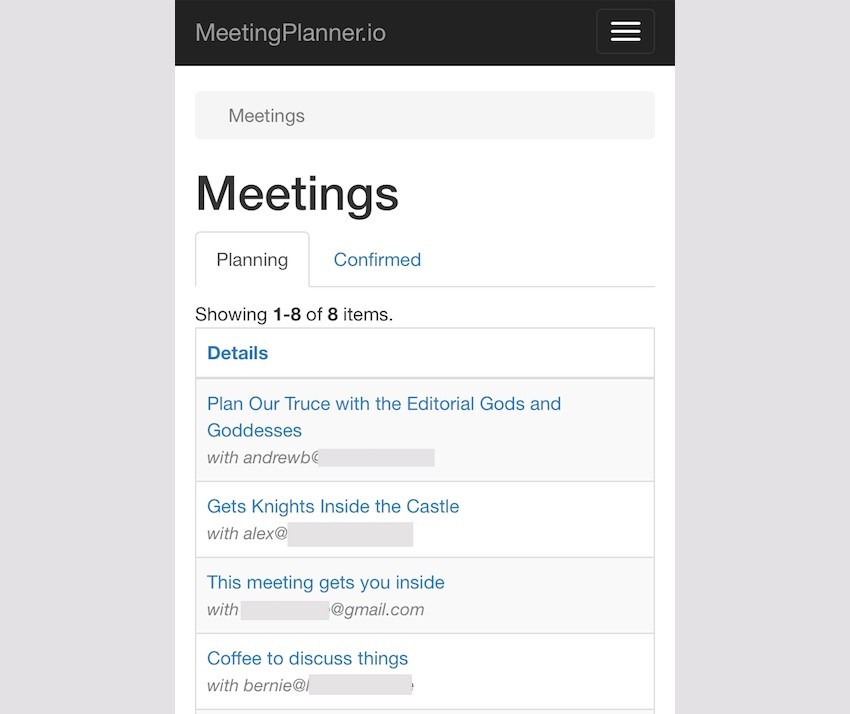
In /frontend/views/meeting/index.php, I added .tabHide to two of the four tabs:
<!-- Nav tabs -->
<ul class="nav nav-tabs" role="tablist">
  <li class="active"><a href="#planning" role="tab" data-toggle="tab">Planning</a></li>
  <li ><a href="#upcoming" role="tab" data-toggle="tab">Confirmed</a></li>
  <li class="tabHide"><a href="#past" role="tab" data-toggle="tab" >Past</a></li>
  <li class="tabHide"><a href="#canceled" role="tab" data-toggle="tab">Canceled</a></li>
</ul>
And, in /frontend/views/meeting/_grid.php, I restructured the column to combine subject and participant:
if ($mode =='upcoming' || $mode =='past') {
  echo GridView::widget([
      'dataProvider' => $dataProvider,
      //'filterModel' => $searchModel,
      'columns' => [
      [
        'label'=>'Details',
          'attribute' => 'meeting_type',
          'format' => 'raw',
          'value' => function ($model) {
              // to do - remove legacy code when subject didn't exist
                if ($model->subject=='') {
                  return '<div><a href="'.Url::to(['meeting/view', 'id' => $model->id]).'">'.$model->getMeetingHeader().'</a><br /><span class="index-participant">'.$model->getMeetingParticipants($model->id).'</span></div>';
                } else {
                  return '<div><a href="'.Url::to(['meeting/view', 'id' => $model->id]).'">'.$model->subject.'</a><br /><span class="index-participant">'.$model->getMeetingParticipants($model->id).'</span></div>';
                }
              },
      ],
Hiding the ActionColumn required a bit of research, but looks like this:
['class' => 'yii\grid\ActionColumn','header'=>'Options','template'=>'{view}  {decline}  {cancel}',
    'headerOptions' => ['class' => 'itemHide'],
    'contentOptions' => ['class' => 'itemHide'],
    'buttons'=>[
        'view' => function ($url, $model) {
          return Html::a('<span class="glyphicon glyphicon-eye-open"></span>', $url,
          [
                  'title' => Yii::t('frontend', 'view'),
                  'class' => 'icon-pad',
          ]);
        },
        'decline' => function ($url, $model) {
          return ($model->status==$model::STATUS_SENT ) ? Html::a('<span class="glyphicon glyphicon-thumbs-down"></span>', $url, [
                  'title' => Yii::t('frontend', 'decline'),
                  'class' => 'icon-pad',
          ]) : '';
        },
        'cancel' => function ($url, $model) {
          return ($model->status==$model::STATUS_SENT || $model->status==$model::STATUS_CONFIRMED ) ? Html::a('<span class="glyphicon glyphicon-remove-circle"></span>', $url, [
                  'title' => Yii::t('frontend', 'cancel'),
                  'data-confirm' => Yii::t('frontend', 'Are you sure you want to cancel this meeting?'),
                  'class' => 'icon-pad',
          ]) : '';
        },
      ]
    ],
Ultimately, these changes simplified the desktop interface in the process of improving mobile.
The Big Challenge: Meeting Scheduling

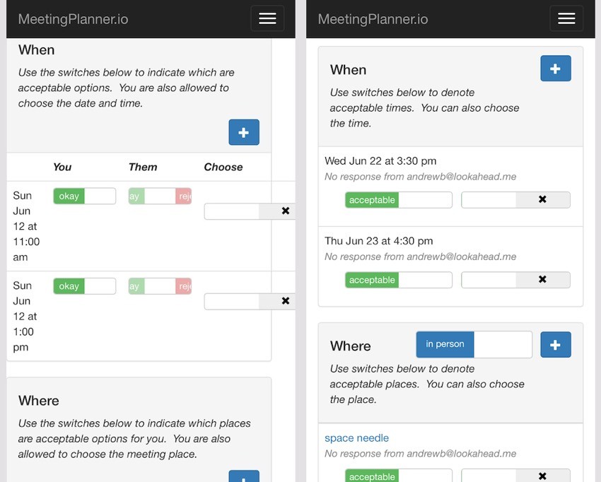
By far the most challenging task for me was to adapt the meeting scheduling page above for mobile. It was a mess on phones, and I was daunted. Separately, I've always worried how I would adopt this interface for multiple participants in the future—responsive requirements might just make this more difficult.
My use of Kartik's Bootstrap Switch Widget extension for Yii has its own limitations when it comes to modifying layout. Placing these elements in table columns worked well, but making table columns responsive wasn't as straightforward with media queries.
Certainly as I showed with the Meetings list page above, hiding columns is easy, but modifying the placement not so much.
I began by moving away from a horizontal table design for showing time and place options and towards a vertical, portrait style. And, apparently, tables and columns have their own capacity to wrap with HTML5 and CSS without media queries.
You can see the improved, empty meeting plan page here:
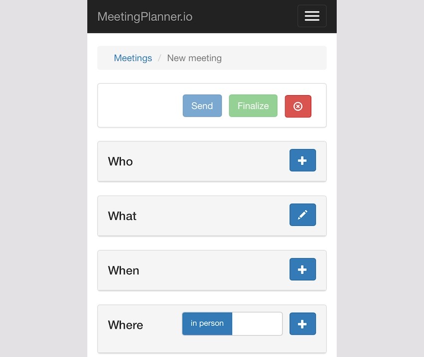
Each partial view required additional css columns for pre-defined Bootstrap grid layouts to work well, e.g. left col-xs4 and right col-xs-8. Here's an example:
<div class="panel panel-default">
  <!-- Default panel contents -->
  <div class="panel-heading">
    <div class="row">
      <div class="col-lg-4 col-md-4 col-xs-4"><h4>What</h4></div>
      <div class="col-lg-8 col-md-8 col-xs-8"><div style="float:right;">
      <?php
        if ($isOwner) {
            echo Html::a('', ['update', 'id' => $model->id], ['class' => 'btn btn-primary glyphicon glyphicon-pencil','title'=>'Edit']);
          }
        ?>
      </div>
    </div>
    </div>
  </div>
Making the place and time scheduling forms responsive was the most difficult. I experimented and ultimately succeeded in using table columns that naturally wrap as the content window (or device) shrink.
I also eliminated showing participant status in its own column with disabled switches—you can't change them, so why show them as switches? Instead, I created a textual summary of the status of your participants for places and times. Here's the code for getWhenStatus():
public static function getWhenStatus($meeting,$viewer_id) {
      // get an array of textual status of meeting times for $viewer_id
      // Acceptable / Rejected / No response:
      $whenStatus['text'] = [];
      $whenStatus['style'] = [];
      foreach ($meeting->meetingTimes as $mt) {
        // build status for each time
        $acceptableChoice=[];
        $rejectedChoice=[];
        $unknownChoice=[];
        // to do - add meeting_id to MeetingTimeChoice for sortable queries
        foreach ($mt->meetingTimeChoices as $mtc) {
          if ($mtc->user_id == $viewer_id) continue;
          switch ($mtc->status) {
            case MeetingTimeChoice::STATUS_UNKNOWN:
              $unknownChoice[]=$mtc->user_id;
            break;
            case MeetingTimeChoice::STATUS_YES:
              $acceptableChoice[]=$mtc->user_id;
            break;
            case MeetingTimeChoice::STATUS_NO:
              $rejectedChoice[]=$mtc->user_id;
            break;
          }
        }
        $temp ='';
        // to do - update for multiple participants
        // to do - integrate current setting for this user in style setting
        if (count($acceptableChoice)>0) {
          $temp.='Acceptable to '.MiscHelpers::getDisplayName($acceptableChoice[0]);
          $whenStatus['style'][$mt->id]='success';
        } else if (count($rejectedChoice)>0) {
          $temp.='Rejected by '.MiscHelpers::getDisplayName($rejectedChoice[0]);
          $whenStatus['style'][$mt->id]='danger';
        } else if (count($unknownChoice)>0) {
          $temp.='No response from '.MiscHelpers::getDisplayName($unknownChoice[0]);
          $whenStatus['style'][$mt->id]='warning';
        }
        $whenStatus['text'][$mt->id]=$temp;
      }
      return $whenStatus;
    }
Here's what it looks like on desktop —notice the landscape layout of the rows of text and switches:
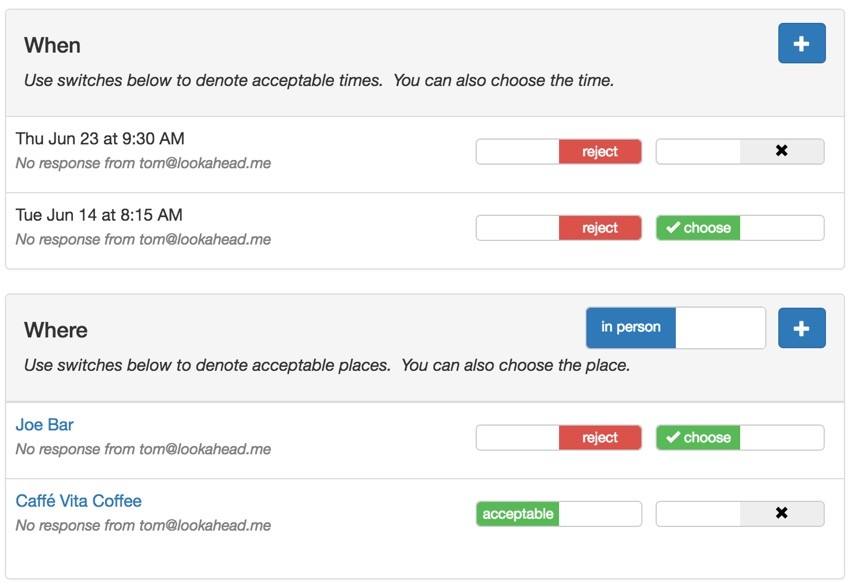
And here's the mobile version, more portrait and stacked without media queries:
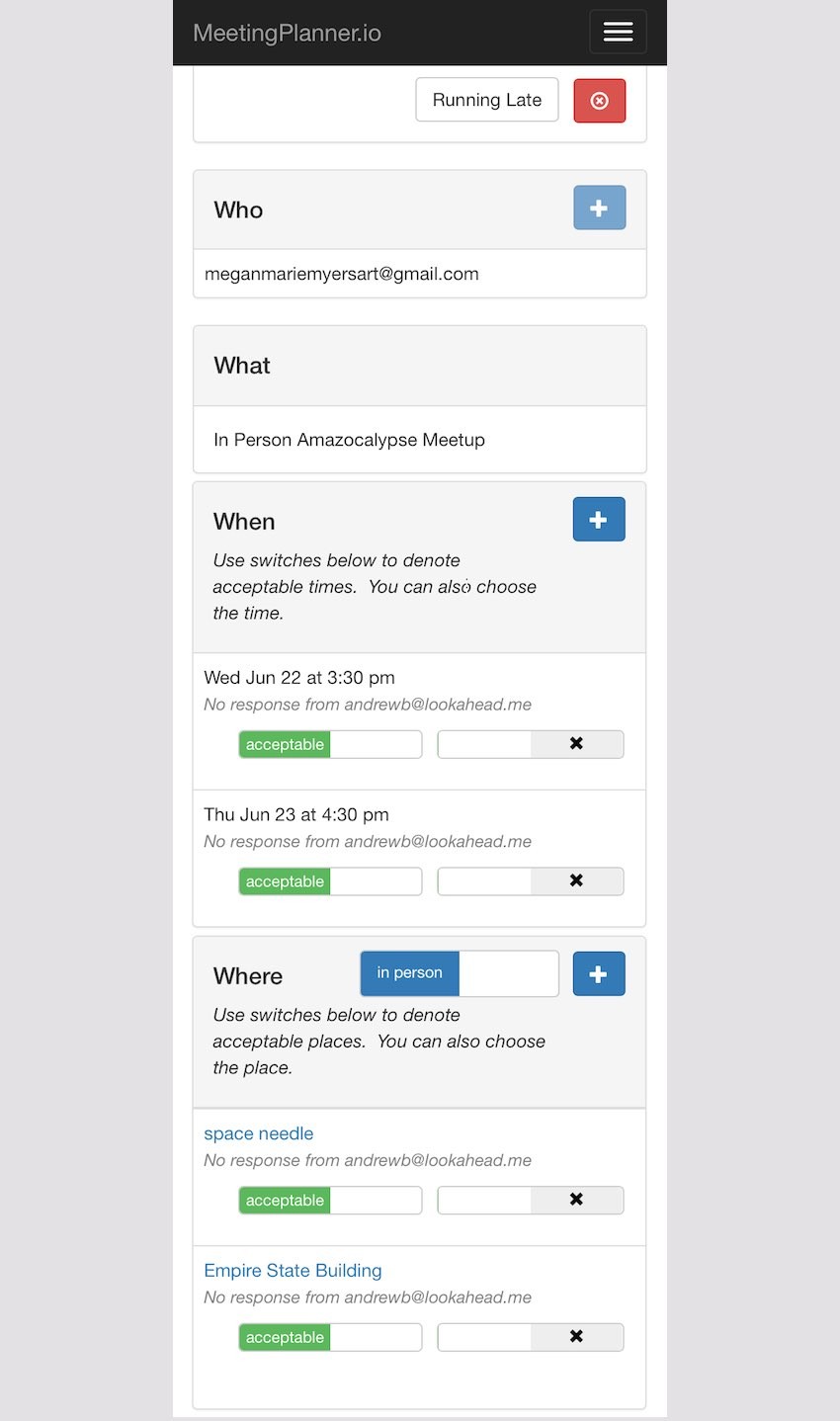
As an example, here's the CSS for the way I coded the table columns on the When (times) panel:
table.table-list {
  width:100%;
}
table.table-list td.table-list-first {
    float: left;
    display: inline;
    width: auto;
  }
table.table-list td.table-switches {
    width: auto;
    float: right;
    display: inline;
    padding-top: 10px;
  }
.switch-pad {
    padding-left:7px;
  }
.smallStatus {
  font-size:90%;
  color: grey;
  font-style: italic;
}
And here's the code for this partial form from /frontend/views/meeting-time/_list.php:
<?php
use yii\helpers\Html;
use frontend\models\Meeting;
use \kartik\switchinput\SwitchInput;
?>
<tr > <!-- panel row -->
<td >
<table class="table-list"> <!-- list of times -->
<tr>
<td class="table-list-first"> <!-- time & status -->
<?= Meeting::friendlyDateFromTimestamp($model->start,$timezone) ?>
<?php
if ($whenStatus['text'][$model->id]<>'') {
?>
<br /><span class="smallStatus">
<?php
echo $whenStatus['text'][$model->id];
?>
</span><br />
<?php
}
?>
</td>
<td class="table-switches"> <!-- col of switches to float right -->
<table >
<tr>
<td >
<?php
if ($isOwner) {
showTimeOwnerStatus($model,$isOwner);
} else {
showTimeParticipantStatus($model,$isOwner);
}
?>
</td>
<td class="switch-pad">
<?php
if ($timeCount>1) {
if ($model->status == $model::STATUS_SELECTED) {
$value = $model->id;
} else {
$value = 0;
}
if ($isOwner || $participant_choose_date_time) {
// value has to match for switch to be on
echo SwitchInput::widget([
'type' => SwitchInput::RADIO,
'name' => 'time-chooser',
'items' => [
[ 'value' => $model->id],
],
'value' => $value,
'pluginOptions' => [ 'size' => 'mini','handleWidth'=>60,'onText' => '<i class="glyphicon glyphicon-ok"></i> choose','onColor' => 'success','offText'=>'<i class="glyphicon glyphicon-remove"></i>'], // $whenStatus['style'][$model->id],
'labelOptions' => ['style' => 'font-size: 12px'],
]);
}
}
?>
</td>
</tr>
</table>
</td> <!-- end col with table of switches -->
</tr>
</table> <!-- end table list of times -->
</td>
</tr> <!-- end panel row -->
The best thing about these meeting view changes is that they'll simplify the UX design challenge for future meetings with many participants. Regardless of the number of people in a meeting, the view will remain basically the same as above. Essentially, this solved the greatest barrier to me expanding to multiple participant meetings—UX design.
What's Next?
I hope you've enjoyed following along as I work on the minutiae of responsive web design. As the code and visual changes to the site came together, I felt extremely satisfied and impressed with how little CSS was required. Taken together, you can see it here:
.rwd-break {
  display:none;
}
table.table-list {
  width:100%;
}
table.table-list td.table-list-first {
    float: left;
    display: inline;
    width: auto;
  }

table.table-list td.table-switches {
    width: auto;
    float: right;
    display: inline;
    padding-top: 10px;
  }
.switch-pad {
    padding-left:7px;
  }
.smallStatus {
  font-size:90%;
  color: grey;
  font-style: italic;
}
.setting-label label, #preferences label {
  font-weight:normal;
}

/* ----------- mobile displays ----------- */

@media only screen
  and (min-device-width: 320px)
  and (max-device-width: 667px)
  and (-webkit-min-device-pixel-ratio: 2) {
    /* hides drop down menu items and footer items */
    .itemHide,li.menuHide {
      display:none;
      visible:false;
    }
    /* removes home and / from breadcrumb */
    ul.breadcrumb li:first-child, li.tabHide {
      display:none;
      visible:false;
    }
     ul.breadcrumb li:nth-child(2)::before {
       content:'';
    }
    /* fingertip spacing for buttons */
    a.icon-pad {
      padding: 0 5px 0 2px;
    }
    .button-pad {
      padding-left:7px;
    }
    .rwd-break {
      display:block;
    }
}
My future design efforts will begin, "What should this look like on mobile?"
As mentioned, I'm currently working feverishly to prepare Meeting Planner for alpha release. I am primarily focused on the key improvements and features that will make the alpha release go smoothly.
I'm tracking everything in Asana now, which I'll write about in another tutorial; it's been incredibly helpful. There are also some interesting new features still on their way.
I'm also beginning to focus more on the upcoming investment gathering effort with Meeting Planner. I'm just beginning to experiment with WeFunder based on the implementation of the SEC's new crowdfunding rules. Please consider following our profile. I will also write more about this in a future tutorial.
Again, while you're waiting for more episodes, schedule your first meeting (from your phone!). Also, I'd appreciate it if you share your experience below in the comments, and I'm always interested in your suggestions. You can also reach me on Twitter @reifman directly. You can also post them at the Meeting Planner support site.
Watch for upcoming tutorials in the Building Your Startup With PHP series.


Comments