In this tutorial I am going to run through the process of creating the simple Instagram based portfolio as designed in a previous tutorial by Tomas Laurinavicius.
Thomas has done a great job keeping the design simple, spacious and functional so I think it's only fair we do the same when building it. To make our lives easier we are going to rely on a few tools and libraries so let's begin by taking a look at them.
Tools of the Trade
There are a few things we need to prepare before starting our build. They are:
- Sass
- Twitter Bootstrap (Sass version)
- Instafeed.js
- Modernizr
First of all, you will need to get Sass up and running on your machine. The easiest way to do that is by using one of the excellent apps available to do all of the watching and compiling. I am currently using Koala which is cross platform and free so it's a very good option to get up and running quickly. There are alternatives such as Scout, Prepros and Compass app. They all provide near enough the same functionality so the choice is yours!
Next up is Bootstrap. We are going to use Bootstrap on a very basic level, to handle some of the responsive elements of the page. We specifically want to download the Sass version so we can include it in our own stylesheet and make use of the available variables. Go ahead and download the latest version.
Nearly there! We now need to grab a copy of Instafeed.js which will handle all of the work grabbing photos from Instagram. It's worth noting here that in order to get anything from Instagram you need to provide the plugin with a client ID which can be generated by signing up to Instagram and filling out the form in the developer section.
Lastly, we should download the latest version of Modernizr so, if needed, we can target certain browser features and so we also have the HTML5 shim for older browsers. This isn't strictly necessary but I like to include it in projects just to be sure.
Now we have these assets we can begin our build!
File and Folder Structure
We need to create some files and folders for our project, so go ahead and create the following in the root directory of the project.
- css/
- images/
- js/
- index.html
This is our basic starting block. Next, find the Bootstrap archive you downloaded earlier and extract it somewhere you can find easily. Inside the extracted folder should be a folder named assets. Open this folder up and you will see something similar to the following:
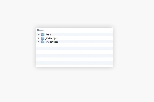
Copy the fonts directory into the root of the project with the other folders we just created. Open up javascripts and copy the bootstrap.js file into the js folder of our project. Lastly, open the stylesheets directory and copy the bootstrap.scss file and bootstrap folder into the css folder of our project. Our files and folders should now look like this...
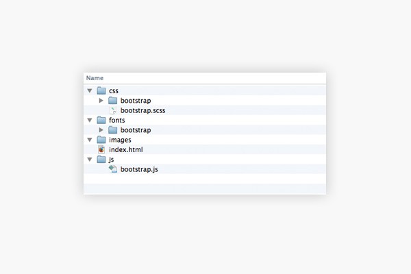
Good work! Now, find the instafeed.min.js and Modernizr files you downloaded earlier and copy them into the js folder. We just need to set up a few more things before we can begin to build the layout.
Sass Setup
Now is the time to set our project up in the Sass app you've chosen to use. In Koala this is a question of dragging the folder into the app window. I believe it is a similar process for the others as well. The next thing I always do when setting things up is look at the Sass compile options and, if available, check the box to use Autoprefixer. This handy addition will parse our Sass file and add any vendor prefixes we need so we don't need to worry about writing them ourselves. Feel free to play about with the settings your Sass app provides to get the best set up for you. I like to keep things simple and will normally just check on Autoprefix and an output style of Expanded (Compressed in production).
Adding Files
Open up the project in whatever editor you use so we can add a few files.
First of all under the css directory add a file called style.scss. Then inside the js folder add a file called app.js.
Make sure you refresh the Sass app you are using so it picks up the new files. Some do this automatically but it's best to check and manually refresh if needed.
I think that is all the file set up for now. We can get on with building the layout!
Begin the Build
Open up index.html and enter (or copy/paste) the following base HTML:
<!DOCTYPE html>
<html>
<head>
    <meta name="viewport" content="width=device-width,user-scalable=no">
    <title>Instagram Portfolio</title>
    <link href='http://fonts.googleapis.com/css?family=Lato:400,700|Kaushan+Script|Montserrat' rel='stylesheet' type='text/css'>
    <link rel="stylesheet" type="text/css" href="css/style.css">
    <script type="text/javascript" src="js/modernizr.js"></script>
</head>
<body>
    <header>

    </header>
    <section class="instagram-wrap">

    </section>
    <footer>

    </footer>
    <section class="footer-bottom">

    </section>

</body>
</html>
We have our first bit of code! Let's break it down.
The <head> section contains the necessary viewport tag so our media queries work correctly. Next, we give the page a title and include a <link> tag for the various Google fonts we want to use. The fonts here are based on those used in the design by Thomas. The next line may seem strange because we haven't created a style.css file yet, but generating that file will be handled by our Sass compiler. Lastly, we include Modernizr.
The <body> element contains four other elements to hold each of the bands which appear on the design. I have applied some descriptive classes to the <section> elements so we can clearly see what they will be used for.
Referencing JavaScript Files
Add the following snippet below the footer-bottom section:
    <script src="https://ajax.googleapis.com/ajax/libs/jquery/1/jquery.min.js"></script>
    <script type="text/javascript" src="js/bootstrap.js"></script>
    <script type="text/javascript" src="js/instafeed.min.js"></script>
    <script type="text/javascript" src="js/app.js"></script>
These <script> tags point to our various JavaScript libraries including jQuery from Google's CDN which is required by Bootstrap.
Styles
We have our basic building blocks so let's continue by setting up our style.scss file a bit.
/*
* Custom variables
*/
$main-font: 'Lato', sans-serif;
$sub-font: 'Montserrat', sans-serif;
$fancy-font: 'Kaushan Script', cursive;
$font-size: 16px;

$black: #000;
$white: #FFF;
$grey: #585c65;
$mediumgrey: #9b9b9b;
$lightgrey: #eeeeee;
$blue: #3466a1;

$padding: 10px;
$margin: 10px;

/*
* Override Bootstrap variables
*/
$font-family-sans-serif: $main-font;

@import 'bootstrap';
Here we are setting up some variables that we can use in our stylesheet later. First up are some font related variables. This is where we bring in the Google fonts we included earlier and give each one a fallback if for some reason the font doesn't load or work.
We then have some colour variables which have been picked from the design. This is one reason I love Sass so much as we can set up our colours here and forget about remembering or copying hex values all over the place.
Finally, for our custom variables, we have some simple margin and padding. I like to include these even I don't always use them. It's nice to have a base value to work with and gives us the ability to make uniform changes to elements that use the variables.
The next section is where we include Bootstrap, but before we do we should set the Bootstrap main font variable $font-family-sans-serif to equal our previously created $main-font variable. This means that when Bootstrap is compiled it will use our main font rather than its own.
The @import statement here doesn't include the .scss on the end of the file as this isn't needed when including other Sass files. Sass is clever enough to search for and find the right file. Save the file and, hopefully, your Sass app will realise you've saved a Sass file and compile style.css.
More Styles
Let's carry on adding some styles:
* {
    position: relative;
    box-sizing: border-box;
}

body {
    color: $grey;
    font-size: $font-size;
}


header {
    max-height: 600px;
    height: 600px;
    overflow: hidden;
}
Here we use the universal selector * to set everything as position: relative so there are no surprises when using absolutely positioned elements. It's also handy to universally set the box-sizing property to border-box so that we can use percentage widths and not worry about any padding the element has influencing the layout.
We then set a default font colour and size for our body and give the <header> element some height.
That's it for our Sass file for now. Head back into the index.html file so we can start work on the header.
Fleshing Out the Header
The header for this design is uncomplicated in design, which makes building it easier. The markup we will work with is as follows:
<img src="images/mountains.jpg" alt="Mountains">
<div class="name fancy-font">
            Jonathan
</div>
<div class="titles">
    <h1>Hello! <span>I'm Jonathan</span></h1>
    <h2>I love to travel all around the world and design beautiful things</h2>
</div>
<div class="social">
    <a class="facebook" href="#">Facebook</a>
    <a class="twitter" href="#">Twitter</a>
    <a class="instagram" href="#">Instagram</a>
</div>
This should go in between our <header> tags. You'll notice the image tag first referencing an image that doesn't exist. We will need to slice this image out of the PSD. I won't go into the details about how to do that in this tutorial but if you need help with the process check out this quick tip.
The rest of the header code comprises three div elements containing the name, the titles and social links. I have applied some classes to these elements which we will be using next in our Sass file.
Header Styles
Let's start by adding a few lines of code inside our header declaration.
img {
    position: fixed;
    top: 0px;
    left: 50%;
    margin-left: -600px;
    width: 1200px;

    @media screen and (min-width: $screen-lg) {
        top: auto;
        left: auto;
        margin: 0;
        width: 100%;
    }
}
This should be nested inside the header section of our Sass file right underneath the declarations for the header itself.
Fixed Image
You'll see here that we have set the position of the img tag to fixed. This means the image will stay in position when the user scrolls, thus creating a feeling of depth. The idea is that the content scrolls up over the image in the header. As we are adopting a mobile first methodology our base styles give the image a set width and position it in the centre by applying a negative left margin exactly half its width. This works because the transform point of the image in CSS is the top left corner, so when we give a left: 50% declaration it will place the left edge of the element in the centre of the screen. The little negative margin trick helps us properly centred elements with absolute or fixed positioning.
Media Query
We then have the first use of one of our screen size variables. We are saying here: on large window sizes make the image fill the browser width and position it back in the top left corner. Importantly, we must reset the margin so the image isn't pulled off to the left slightly.
Let's take a first look at our work in the browser!
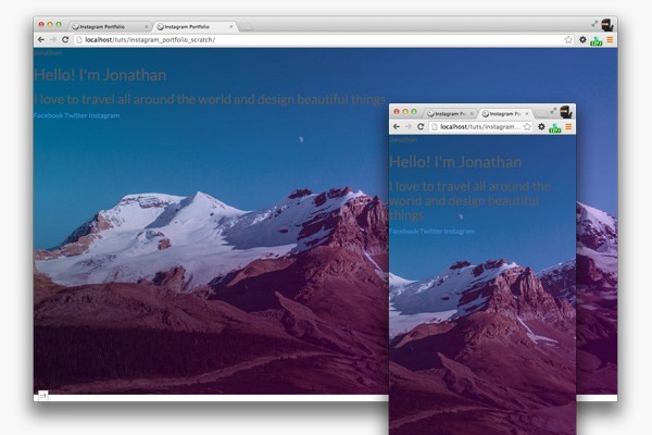
Let's carry on...
.name {
        font-size: 21px;
        position: absolute;
        top: 50px;
        left: 50px;
        color: $white;
    }

    .titles {
        position: absolute;
        bottom: 40%;
        width: 100%;
        text-align: center;

        @media screen and (min-width: $screen-lg) {
            bottom: 50%;
        }
    }

    h1, h2 {
        width: 100%;
        color: $white;
        margin: 0;
    }
Here we set up the name and titles elements' position and font styles. We need to use a media query on the titles element to push it up a little bit more on large screens. Let's perform a quick refresh in the browser.
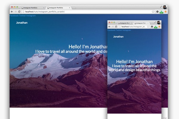
That's looking better already! Let's tidy up those headings a little bit more.
h1 {
        text-transform: uppercase;
        font-weight: 700;
        font-size: 36px;
        letter-spacing: 0.06em;
        margin-bottom: $margin;

        span {
            display: block;

            @media screen and (min-width: $screen-md) {
                display: inline;
            }
        }
     }

     h2 {
        font-size: 16px;
        width: 70%;
        margin: 0 auto;

        @media screen and (min-width: $screen-lg) {
            width: 100%;
            margin: 0;
        }
     }
The main thing to note here would be the style for the span element. We're using the span tag in our code to wrap a portion of the main heading. This allows us to target it in the CSS and, as we've done here, change its layout. On mobile we need it to be a block level element so it stacks underneath, but on larger screens it's fine for it to run alongside like normal text. This should be looking much better now...
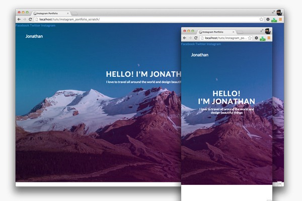
Fancy Font
A quick style we should add in is for the name in the top left corner. Place the following code at the very end of the Sass file, outside of the header block.
.fancy-font {
    font-family: $fancy-font;
}
We are applying our fancy font to any element with this class. This is so we can reuse this whenever we need to and it's not limited to any particular element.
Social Icons
We should turn attention to the social icons which, in this case, will involve making sprites for normal resolution displays and high resolution (Retina) displays.
Head on over to Iconfinder and grab each of the icons in the design. It's best to pick a bigger size than we will need so there are no issues scaling them. I always opt for the 256px size.
In your graphic editing software (such as Photoshop) create a new file that is 152px by 52px. Drag in each of the icons and scale each one down to 48px by 48px. The icons come black, but we need them to be white, so apply a filter to each one.
Now we need to position them. We'll have two pixels of space around each one, so move the first to the left edge and nudge it away by two pixels. Likewise nudge it away from the top edge by two pixels. Position the next icons two pixels from the top edge and two pixels away from each other. You should end up with this:

This will be our Retina version. Ignore the black background here, I added this in just so we could actually see the icons in the image.
Using Photoshop's Save for Web function (or equivalent in your application) save this image with the filename [email protected]. Make sure you place it in the images folder of our project. Now we need to resize the sprite image to make the standard resolution size. We can do this in Photoshop directly in the Save for Web dialog box. The important thing is the image must be resized to 76px by 52px. Save this size as social-sprite.png and place it in the images folder as well.
With that, we have our sprites so let's write some code to use them! Place the following code back inside the header section right after the styles for the h1 and h2.
.social {
        position: absolute;
        top: 55px;
        right: 50px;
        overflow: hidden;

        a {
            float: left;
            width: 26px;
            height: 26px;
            margin: 0 5px;
            text-indent: -9999px;
            background: url(../images/social-sprite.png) no-repeat;
            opacity: 0.8;

            &:hover {
                opacity: 1.0;
            }

            @media screen and (-webkit-min-device-pixel-ratio: 2), screen and (-min-device-pixel-ratio: 2) {
                background: url(../images/[email protected]) no-repeat;
                background-size: 76px 26px;
            }

            &.facebook {
                background-position: 0px 0px;
            }

            &.twitter {
                background-position: -25px 0px;
            }

            &.instagram {
                background-position: -50px 0px;
            }
        }
     }
Wow, that looks complicated, though it isn't really, honest! To start with we position the wrapping .social element in the top right corner.
Next, we apply some styles to the <a> tags to set up the height and width of each one and to remove the text from view by using a large text-indent. We also set the base opacity to 0.8 which we change to 1.0 on hover. This gives a simple rollover effect.
The next section is for our sprites. We need to let devices with high DPI screens know where to find the higher resolution asset which the media query takes care of nicely. We have to sure to set the background-size property so the image scales down to the "correct" size. Now we need to set the background-position for each icon. Save, save, save and refresh!
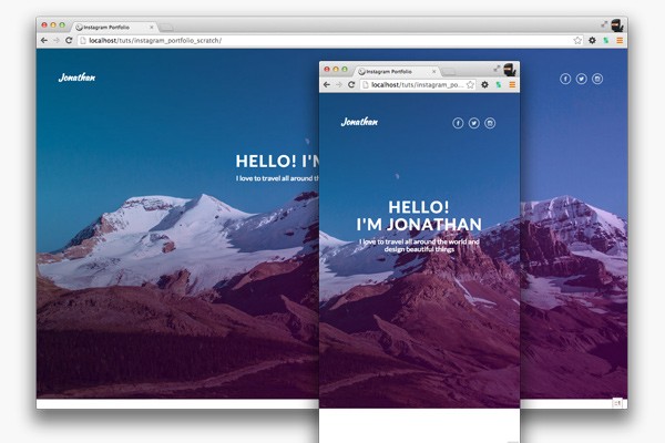
As you can see our fancy-font style is working on the name and our social icons look lovely. Good job!
The next section is going to deal with the main content where we will use Instafeed.js to hook into Instagram's API and pull through some images for our page.
Instagram Feed
We'll begin by adding some markup to our index.html page, so open it up and copy/paste the following inside the <section class="instagram-wrap"> tag:
<div class="container">
        <div class="row">
            <div class="col-xs-12">
                <div class="instagram-content">
                    <h3>Latest Photos</h3>
                    <div class="row photos-wrap">
                    <!-- Instafeed target div -->
                    <div id="instafeed"></div>
                    <!-- The following HTML will be our template inside instafeed -->
                    <div class="col-xs-12 col-sm-6 col-md-4 col-lg-3">
                        <div class="photo-box">
                            <div class="image-wrap">
                                <img src="images/test_img.jpg">
                                <div class="likes">309 Likes</div>
                            </div>
                            <div class="description">
                                Fantastic Architecture #architecture #testing
                                <div class="date">September 16, 2014</div>
                            </div>
                        </div>
                    </div>
                        </div>
                </div>
            </div>
        </div>
    </div>
You will see here I have marked up each section we will need for the Instagram photos. The code for this won't actually be loaded from the HTML page but instead from the JavaScript we will write for Instafeed.js. Don't worry about this for now, we are just trying to get the styling right at this stage.
Bootstrap's Grid
One thing you may notice, if you've used Bootstrap before, is that we are using some Bootstrap classes for the first time. We make use of col-xs-xx, col-sm-xx, col-md-xx, col-lg-xx classes to adjust the elements at different screen sizes. The way the Bootstrap grid works, in a nutshell, is through containers, rows and columns. Every row must be inside a container and every column must be inside a row. There must also be a total of twelve columns in each row. This is where the classes like col-xs-12 come into it. At screen size xs this element should span twelve columns which, visually on screen, appears as one large column.
Likewise, if we put col-xs-12 col-sm-6 col-md-3 as classes on an element it will instruct that element to have a full-width layout at xs screen size, two columns at sm screen size and four columns at md screen size. It is a bit confusing at first, but if you get your head around how the classes are named and what each one represents on screen it will become pretty intuitive to use in the end.

Another point to mention is the use of test_img.jpg which doesn't exist yet. This is a placeholder image I created to use in the markup. Feel free to create your own or use the one in the provided source files, just make sure you put it in the images directory.
Instagram Styles
Now, we have the markup let's add some styles:
.instagram-wrap {
    background: $lightgrey;
}

.instagram-content {
    h3 {
        text-transform: uppercase;
        letter-spacing: 0.5em;
        font-size: 12px;
        font-weight: 700;
        text-align: center;
        padding: $padding*5 0;
        color: darken($lightgrey, 20%);
    }

}
You'll need to place this code right after the whole header block in the main Sass file. It applies some background colour properties and font styles. Save the Sass file and take a look in the browser.
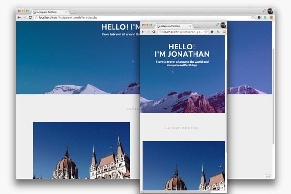
That small amount of code has made a substantial difference. We need to make it even better though, so back in the Sass file add the following code:
.photo-box {
        margin: 0 0 $margin*3 0;

        .image-wrap {
            img {
                width: 100%;
            }

            .likes {
                position: absolute;
                bottom: 5px;
                left: 15px;
                padding: $padding/2;
                background: $black;
                background: rgba($black, 0.4);
                color: $white;
            }
        }
        .description {
            font-family: $sub-font;
            font-size: 12px;
            background: $white;
            color: $mediumgrey;
            letter-spacing: 1px;
            padding: $padding*1.5;
            height: 75px;
            overflow: hidden;
            white-space: nowrap;
            text-overflow: ellipsis;
        }
    }
This needs to go right after the h3 declaration inside .instagram-content. Let's quickly run through this bit by bit. We give our .photo-box some bottom margin so each one is spaced nicely. We don't need to worry about left and right spacing as that is handled by Bootstrap. We then make sure any images in our .image-wrap are 100% wide so they scale with the browser. The .likes element has to be positioned absolutely in the bottom left corner of the image box and it has white text on semi-transparent black background.
Lastly, the styles for .description. The final four properties allow the box to hide any overflowing text in a graceful way by providing an ellipsis at the end. The good thing about doing this in CSS is that when the boxes change size more or less content will be revealed, but the ellipsis will still do its job if needed. Browser support is also very complete.
Time again to save the file and refresh the browser:
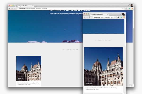
This is looking lovely now! I think the next step should be replacing our HTML with the actual Instagram feed images with the help of Instafeed.js.
Using Instafeed.js
The way this plugin works makes it straightforward for anyone to add an Instagram feed to their website. However, you will need a Client ID from Instagram to use it. You can get one by signing up for an Instagram account and heading over to the developer section to set up your Client ID.
Once you have that all set up we need to add the following code to the app.js file:
$(function() {

    //Set up instafeed
    var feed = new Instafeed({
        clientId: '97ae5f4c024c4a91804f959f43f2635f',
        target: 'instafeed',
        get: 'tagged',
        tagName: 'photographyportfolio',
        links: true,
        limit: 8,
        sortBy: 'most-recent',
        resolution: 'standard_resolution',
        template: '<div class="col-xs-12 col-sm-6 col-md-4 col-lg-3"><div class="photo-box"><div class="image-wrap"><a href="{{link}}"><img src="{{image}}"></a><div class="likes">{{likes}} Likes</div></div><div class="description">{{caption}}<div class="date">{{model.date}}</div></div></div></div>'
    });
    feed.run();

});
Let me run down what's going on here:
Firstly, some jQuery. Start off with a document ready function (abbreviated version) so nothing runs until we're ready.
Secondly, declare a feed variable and set its value to a new instance of Instafeed.
Next supply Instafeed with some options to control what it returns:
-
clientId- The Client ID you obtained from Instagram. -
target- The ID of the element on the page you wish to populate with images.
-
get- The mode Instafeed is running in. Using 'tagged' here so Instafeed knows we are searching by tagname.
-
tagName- The name of the tag to search by.
-
links- Whether to wrap the images in links back to Instagram
-
limit- Limit the amount of images returned. Useful for paging.
-
sortBy- How to sort the returned images. Set tomost-recentfor our project.
-
resolution- The size of the images returned.
-
template- The HTML to use when rendering the images on the page. We will use the markup we created earlier. Instafeed uses curly braces to denote where the various properties of the image will be inserted.
Lastly, run the feed!
If you save the file and refresh the browser you should see something similar to this:
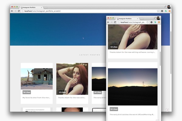
If you have any problems make sure your Client ID is correct and the code is all OK. If you use what is provided in the source files everything should be fine. You should see eight images returned from Instagram with the Likes and descriptions showing.
Tidying Up
We now need to tidy up our HTML as we still have the initial template we coded earlier. Switch back to index.html and find the following code...
<div class="col-xs-12 col-sm-6 col-md-4 col-lg-3">
    <div class="photo-box">
            <div class="image-wrap">
                <img src="images/test_img.jpg">
                <div class="likes">309 Likes</div>
            </div>
            <div class="description">
                Fantastic Architecture #architecture #testing
            <div class="date">September 16, 2014</div>
        </div>
    </div>
</div>
Either remove or comment this out. I've decided to comment it out so I can refer to it later if needed.
The Footer
Back in index.html add the following code inside the <footer> element.
<div class="container">
    <div class="row">
        <div class="col-xs-12">
            <h4>Get in touch</h4>
            <p class="about-text">I shoot, design and write. Don't hesitate and get in touch with me if you need some creative work done. I always work to achieve my best and fulfil client needs</p>
            <a class="contact-now-btn" href="#">Contact Now</a>
        </div>
    </div>
</div>
As you can see, we are using more Bootstrap classes here. This time it tells this element to span the full twelve columns at all times.
Footer Styles
Let's also add the styles for this section.
footer {
    background: $white;
    padding: $padding*3 0;
    text-align: center;

    @media screen and (min-width: $screen-lg) {
        padding: $padding*10 0;
    }

    h4 {
        font-size: 36px;
        text-align: center;
        font-weight: 700;
        text-transform: uppercase;
        letter-spacing: 2px;
    }

    .about-text {
        padding: 0 $padding*3;

        @media screen and (min-width: $screen-lg) {
            width: 650px;
            margin: 0 auto;
        }
    }

    .contact-now-btn {
        display: inline-block;
        width: 70%;
        padding: $padding*2 $padding*5;
        margin-top: $margin*2;
        color: $white;
        background: $grey;
        font-size: 13px;
        letter-spacing: 1px;
        text-decoration: none;
        text-transform: uppercase;

        @media screen and (min-width: $screen-md) {
            width: 60%;
        }

        @media screen and (min-width: $screen-lg) {
            width: 20%;
            margin-top: $margin*5;
        }

        &:hover {
            background: lighten($grey, 5%);
        }
    }
}
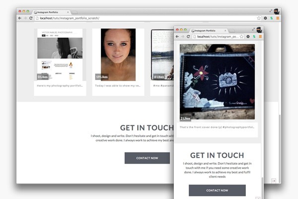
Another complicated looking block of code! Again, it isn't too scary. It's really just setting some colours, font-sizes and spacing. We're making use of a few media queries to pull elements into different positions for different screen sizes. Notably, the .contact-now-btn which needs two levels of media query to adjust its size, ending up at its smallest on large screens. If you save the files and refresh the browser you should see something like this...
Let's finish this off with the last part that I like to call the .footer-bottom.
Footer Bottom
<section class="footer-bottom">
2014 © Jonathan White. All rights reserved.
</section>
Add some text into that section in the HTML. Then open up the Sass file and add the following styles:
.footer-bottom {
    background: $white;
    padding: $padding $padding*6;
    border-top: 2px solid $lightgrey;
    letter-spacing: 2px;
    text-align: center;
    color: $mediumgrey;
    text-transform: uppercase;

    @media screen and (min-width: $screen-md) {
        padding: $padding*4 0;
    }
}
This can be placed underneath the footer styles. We're using letter-spacing to space the letters of the words out slightly. This section has quite a bit of spacing to the left and right that switches to top and bottom on larger screens. Save the file and refresh the browser.
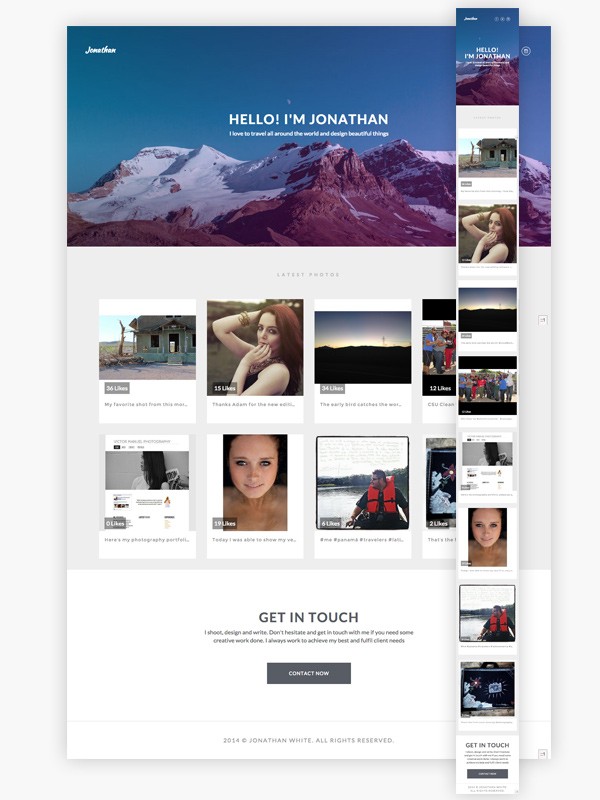
We've finished! The layout is looking awesome on mobile and desktop and we've managed to get photos directly from Instagram using Instafeed. Well done!
Conclusion
What I like about this layout is that you could adapt it to any kind of portfolio content. We could have been more adventurous with Bootstrap and Sass but often you just don't need to if the basics work flawlessly. What we have here is a brilliant foundation to expand and adapt.
I hope you followed the steps without any problems and have learnt something new along the way. Feel free to leave any thoughts, suggestions or improvements in the comments. For example, there's an odd issue with the way Safari renders the page if you scroll too fast - suggestions for why that happens are very welcome! Thanks for reading.


Comments