After months of speculation, hype and teasing, Google officially released Android 5.0 to the world on 12 November 2014. The SDK was made available on 3 November. We already knew a lot about the features, due to the L preview SDK that was released on 25 June 2014. What we didn't know was what the L would stand for.
Lollipop was the name given to the 5.0 update. Looking back, Lollipop was a clear favorite. But, if given enough time to speculate, the obvious once again holds the power to surprise.
Lollipop is a significant update for the Android platform. It's arguably the biggest release to date, and certainly the most ambitious.
1. Features
Now that the Android SDK is out, here's a roundup of some of the new features in Android 5.0.
Battery
Project Volta
In recent years, Google has focused with every Android release on a particular development aspect of the operating system and how it can be improved. For 5.0, it was improving battery life.
The JobScheduler API allows
you to run jobs asynchronously at a later time or under particular conditions.
JobInfo objects can be used to define the conditions a scheduled job will run
under.
Thanks to these additions, developers now have a lot more control over when and how battery-draining tasks are performed.
Developer Tools
There is a new ADB command dumpsys batterystats that can be used to generate statistical data about battery usage on a device. Take a look at the following command to see how this works.
adb shell dumpsys batterystats --charged <package-name>
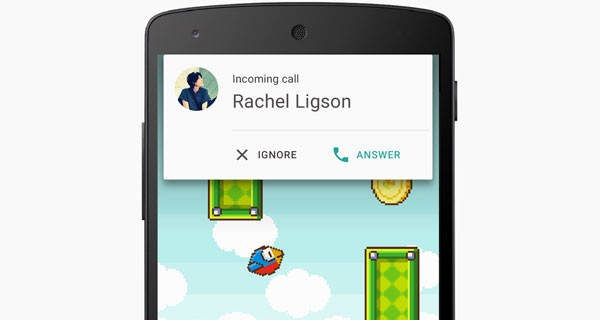
Notifications
In Lollipop, notifications can be displayed on the
lock screen. Developers can specify the amount of information displayed within
a notification via setVisibility, which accepts the following values:
-
VISIBILITY_PRIVATE: shows basic information, such as the notification's icon, but hides the notification's content -
VISIBILITY_PUBLIC: shows the notification's content -
VISIBILITY_SECRET: shows nothing, excluding even the notification's icon
Metadata can now be added to notifications to allow for categories and priority, and to collect additional contacts.
Key notifications, such as incoming calls, will appear in a heads-up notification window, which will float at the top of the current app until the user acknowledges or dismisses the notification.
Multitasking
The recents screen has been renamed to overview. With the new name come new APIs that improve multitasking options on Android. You can now have your activities treated as tasks and be shown in their own window in the overview screen.
For example, a web browser app could be set so that each tab has its own window. In the previous recents screen, a single browser app would have been displayed.
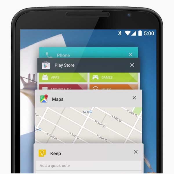
If you have a website, you can add <meta name="theme-color" content="#3F51B5"> to your header section to have overview display the given color as the header for your website.
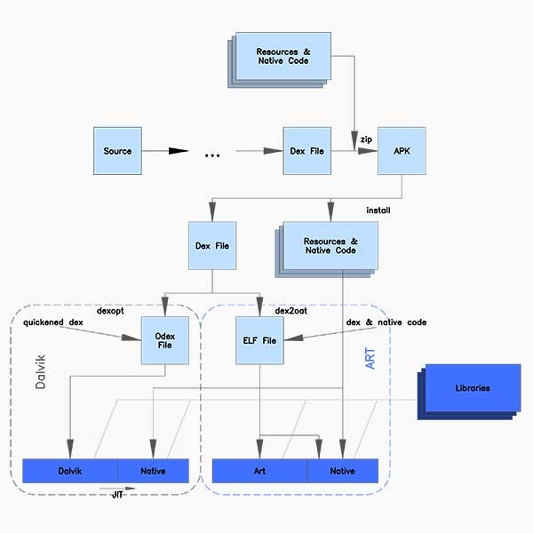
Runtime and ART
Previous versions of Android have all used Dalvik as the
process virtual machine. Applications are commonly written in Java, which is
then compiled to bytecode. This is then translated to Dalvik bytecode and
stored in .dex and .odex files, for Dalvik to then process.
This is a very a basic explanation of what the runtime is doing and hopefully conveys its importance. Applications run on the process virtual machine so its performance determines the overall performance of the app and is a bottleneck.
Dalvik uses JIT (Just In Time) compilation, meaning that it only runs the application at the moment it is needed.
ART, on the other hand, uses an AOT (Ahead Of Time) compilation to compile the bytecode. When an application is installed, it's compiled
by ART's dex2oat utility, which creates ELF executables instead of .odex files. From then on, the application is
executed from the already compiled ELF executable.
That's a lot of saved compiling at the expense of longer application install times and some extra disk space.
With the addition of improved garbage collection (GC), ART outperforms Dalvik in nearly every way, making for a sharper and more fluid Android experience.
Android TV
To help bring your app to large screen displays, Lollipop introduces the Leanback UI and the Android TV Input Framework (TIF). The Leanback library provides user interface widgets for TV apps. TIF is designed to allow TV apps to handle video streams from sources such as HDMI inputs, TV tuners, and IPTV receivers.
Graphics
Khronos OpenGL ES 3.1 has been added. Key features include:
- compute shaders
- separate shader objects
- shading language improvements
- extensions for advanced blend modes and debugging
- indirect draw commands
- multisample and stencil textures
Android 5.0 remains backwards compatible with OpenGL ES 2.0 and 3.0.
Android Extension Pack (AEP)
To supplement OpenGL ES 3.1, a set of OpenGL ES extensions have been added that allow for the following:
- guaranteed fragment shader support for shader storage buffers, images, and atomics (fragment shader support is optional in OpenGL ES 3.1)
- different blend modes for each color attachment in a frame buffer
- tessellation and geometry shaders
- ASTC (LDR) texture compression format
- per-sample interpolation and shading
Chrome View
Android Lollipop includes a new version of Chromium for Web View, based on the Chromium m37 release that adds support for WebAudio, WebRTC, and WebGL.
Native support for Web Components is also included in the update and will allow for the use of Polymer and its Material Design elements without requiring polyfills.
As of Android 5.0, Chromium is now updatable from the Play Store so new APIs and bug fixes will be available immediately and will no longer require an update of the Android operating system.
Media Browsing
The new android.media.browse API allows apps to browse the
media content library of other apps. The MediaBrowserService class is used to expose media in an
application, while the MediaBrowser class is used to interact with a media
browser service.
Media Playback Control
Two new classes have been introduced to make playback control simpler to manage across different UIs and services.
MediaSession replaces RemoteControlClient. It provides a set
of callback methods for use in transport controls and media buttons. MediaController can be used to create a custom media
controller app, which can then be used to send commands to a MediaSession.
New Sensors
Two new sensors have been introduced:
- Tilt Detector: improves activity recognition
- Heart Rate Sensor: capable of reporting the heart rate of the user touching the device
Of course, both of these sensors require supported hardware.
Managed Provisioning
Device administrators can use a managed provisioning service to add apps to a separate managed profile. If there's an existing personal account on a device that has been provisioned, the managed profile apps will appear alongside the existing applications.
Device Owner
A device owner is a specialised type of device administrator that can create and remove secondary users and configure global settings, essentially giving Android a traditional administrator and user account system.
Screen Pinning
Screen pinning is a new feature that is comparable to kiosk mode on iOS. Screen pinning includes the following features:
- The status bar is blank.
- Other apps cannot launch new activities.
- User notifications and status information are hidden.
- The current app can create new activities as long as no new tasks are created.
Screen pinning can be activated manually via Settings
> Security > Screen Pinning. It can also be activated programmatically. The startLockTask method can
be called from your app to activate screen pinning. If the app is not from a device owner, a confirmation prompt will be shown. The setLockTaskPackages method can be called by an owner app and will
avoid the confirmation prompt.
To deactivate
screen pinning, you need to call stopLockTask if it was initiated by a device
owner app. If it was activated by a non-device owner, the user can exit screen pinning mode by
holding both the back and recents buttons.
Screen Sharing
Screen capturing is now possible through the new
android.media.projection APIs. The create VirtualDisplay method allows the
calling app to capture the screen into a surface object, which can then be sent
across the network. The API can only capture non-secure content and does not include
audio.
Camera
RAW image capturing has finally arrived on Android, thanks
to the new android.hardware.camera2 API.
Bluetooth Low Energy
Android devices can now act as Bluetooth LE peripherals. Apps can make use of
this to make their presence known to nearby devices. With the new android.bluetooth.le APIs, you can enable your
apps to connect to nearby Bluetooth devices, broadcast advertisements, and scan
for responses. These new features also come with a new manifest
permission, BLUETOOTH_ADMIN.
These APIs will be extremely useful when working with wearable devices, health and fitness apps, and monitoring apps. All of these are predicted growth areas for Android in the near future.
NFC
NFC has been improved in the several ways:
- Android Beam is now an option in the share menu.
-
invokeBeamcan be used to initiate the sharing of data. You no longer have to physically bump devices. -
registerAidsForServiceandsetPreferredServicehave been added to aid the development of payment apps.
Multiple Network Connections
New APIs allow for apps to query networks for available features, such as whether the network is cellular, metered or Wi-Fi.
Printing Framework
Bitmap images can now be rendered from PDF document pages,
using the new PdfRendered class.
Input Method Editors (IME)
You can now cycle through different IMEs available to the
platform. This is accomplished by using the shouldOffetToNextInputMethod method.
2. Material Design
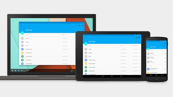
One of the biggest features of Android 5.0 is Material Design. Material Design is a set of guidelines relating to visual design, content motion, and user interaction. The guidelines are intended to go beyond Android and are designed for a wide array of devices and platforms.
Polymer is a notable example of the cross-platform nature of Material Design, with Google creating several Material Design web elements to aid in construction of websites/web apps with a Material Design theme. Despite its cross-platform nature, Material Design still remains a focal point of Android 5.0.
New Widgets
Lollipop introduced two new widgets:
-
CardView: This widget allows for information to be grouped together in a consistent manner. The card itself can have its depth altered to promote or highlight it as needed. -
RecyclerView: This is a more advanced version of theListViewwidget.
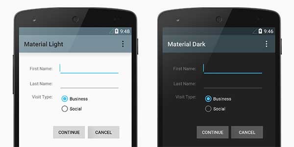
New Themes
There are two new themes that make use of Material Design principles, Dark Material and Light Material. Both apply new user interface system widgets. System widgets are easy to customize and you can set their color palette. Several animations and transitions are also defaults of these themes, such as the ripple effect.
Depth and Shadow
Depth can now be altered on Android views through the new Z property. Higher Z values cast larger shadows around the view, giving the appearance of increased elevation. This is a staple of the Material Design ethos where the goal is to create a textile appearance through the use of layers.
Animations
Another staple of Material Design is animation. Touch feedback animations and a host of activity transitions all aid in creating a tactile and immersive experience. The goal is not to have information pop out or disappear. Every view/object should appear as a layer on a surface.
Imagine a nice, clean, white desk. On this desk you have various papers, post-it notes and stationery. When you look down at the desk, it’s not a flat view. The desk contains several layers, and objects have different depths and cast shadows on the layer beneath.
If you need to see a page underneath another page, you must move the covering page out of the way. If you want to place your laptop on the desk, you need to slide the existing papers out of the way to make space. When you touch something on your desk, it moves, bends, vibrates, and shuffles.
3. Using Android 5.0
To get started with Android 5.0, download the SDK platform for v21 in your preferred IDE. This will most likely be done through the SDK manager in Eclipse or Android Studio.
In the ApplicationManifest.xml file and/or build.gradle file, set the targetSdkVersion to 21.
Important changes and considerations:
There's a saying in the superhero world, "With great power, comes great responsibility." There is a similar one in the development community, "With large updates, comes extensive testing."
Here's a quick checklist, if you already have an Android app:
- Does my app run issue-free on ART?
- If my app uses notifications, how will they be integrated into the lock screen?
- Can the user interface benefit from a refresh? Is Material Design a good fit and how much work will it involve?
- The
RemoteControlClientclass is now deprecated so should I move over to theMediaSessionAPI? -
WebViewnow blocks mixed content and third party cookies by default. Do I need to usesetMixedContentModeandsetAcceptThirdPartyCookies?
A complete list list can be found on the Android Developer website.
4. Backwards Compatibility
One of the biggest changes in Android 5.0 is the user interface with the introduction of Material Design. Making use of Material Design and putting best design practices to use, takes a lot of consideration and work on the part of the developer.
For existing apps, developers are faced with further challenges, such as how to leverage the new features of 5.0 whilst maintaining backwards compatibility, providing a consistent user experience across different API levels.
To show how to use Android 5.0 and Material Design in your project, I've created a simple app. It consists of a single activity that displays several widgets. I have then added the following to the res/ folder:
-
menu-v21/: This contains a copy of the menu_main.xml and will be used to display Material Design icons on Android 5.0 devices. -
values-v11/: This contains a styles.xml file that sets the base theme to holo.light for all devices running Android 3.0 or above. Appearance changes to the action bar have also been made in this file. -
values-v21/: This contains a styles.xml file that sets the base theme to material.light for devices running on Android 5.0 and above. It also defines the base colors.
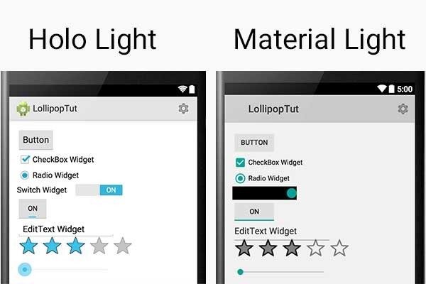
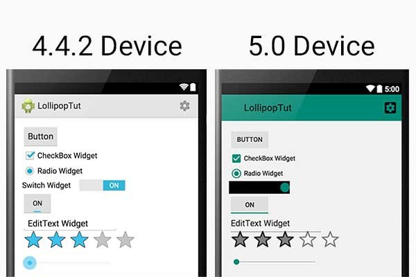
The below image shows the app running on a 4.4.2 device and a 5.0 device. The Material theme has been applied for 5.0+ devices. Other devices will receive the holo.light theme. It shows the default state of both themes and the user interface differences between them.
Color and Action Bar
With Material Design, defining your app's base colors to fit in with your brand has never been easier. For example, adding the below code to your theme will set the notification bar background, the action bar background, and user interface widgets.
<!-- Base application theme. -->
<style name="AppTheme" parent="android:Theme.Material.Light">
    <!-- Customize your theme here. -->
    <!-- Main theme colors -->
    <!--   your app branding color for the app bar -->
    <item name="android:colorPrimary">#0d7963</item>
    <!--   darker variant for the status bar and contextual app bars -->
    <item name="android:colorPrimaryDark">#ff0d5b47</item>
    <!--   theme UI controls like checkboxes and text fields -->
    <item name="android:colorAccent">#0d7963</item>
</style>
The results can be very striking and the app can become identifiable with just a glance. There's also a new set of Material Design icons, which are another quick and easy way to bring a modern user interface feel to any existing app.
Here's an example of the difference made by using Material Design icons and defining the main theme colors:
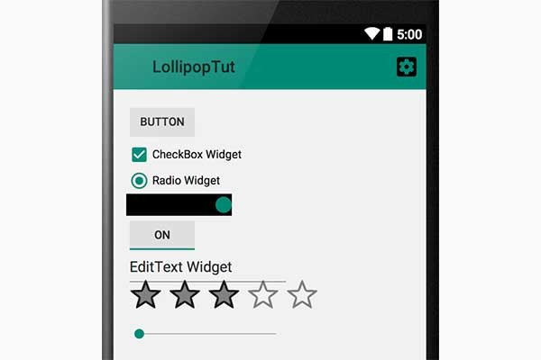
The use of the action bar and color is a dominating feature of Material Design and can effectively brand and distinguish your app. One way to provide a consistent user experience across different API levels is to replicate these features over to styles and themes intended for different API levels.
For example, if we compare the application running on a 4.4.2 device to a 5.0 device:
As you can see, they have a very distinctive look to them. To improve this, we can use the same Material Design icons on API levels lower than 5.0. We can also style the action bar so that it resembles the Material Design version.
For the icons, we can change the images in res/menu/menu-main.xml to Material Design icons. For the action bar, we can edit the res/values-v11/styles.xml file to look like the following:
<resources>
    <!-- Base application theme. -->
    <style name="AppTheme" parent="android:Theme.Holo.Light">
        <!-- Customize your theme here. -->
        <item name="android:actionBarStyle">@style/MyActionBar</item>
    </style>

    <style name="MyActionBar" parent="@android:style/Widget.Holo.Light.ActionBar">
        <item name="android:background">#0d7963</item>
    </style>
</resources>
Here's another look at the two compared, after the changes:

The version running on the 4.4.2 device becomes more recognizable as our application and our brand. Without any significant changes, the app already looks more consistent across the different APIs and has a more modern feel to it.
Using Non-Supported Features
Certain features are exclusive to Android Lollipop, most notably the activity transitions and the reveal animations. This does not necessarily mean that you have to forgo using them or create a separate app that makes use of them. You can check the system version at runtime and only perform certain API calls if the app is running on an appropriate version of Android.
An example to check if the system is 5.0+:
// Check if we're running on Android 5.0 or higher
if (Build.VERSION.SDK_INT >= Build.VERSION_CODES.LOLLIPOP) {
    // Call some material design APIs here
} else {
    // Implement this feature without material design
}
Keeping Previous Themes
Just because you can do something doesn't always mean that you should. There is absolutely nothing wrong with the Holo theme that Android has been using since Honeycomb. You can provide alternative layouts and themes and have them apply to different API levels. For example, you could have the Material Design theme apply to any devices with an API of 5.0 and above. The Holo theme will apply to any device with an API of 3.0 and above. Finally, the classic theme could be applied to all devices below 3.0.
To do this, you would use the following directories in your project:
- res/values/ (default location)
- res/values-v11/ (for 3.0 +)
- res/values-v21/ (for 5.0 +)
In each directory, you can place a styles.xml file that will define the desired theme.
Support Libraries
The V7 r21 support libraries support several widgets and features from Material Design.
Theme.AppCompat enables the use of the color palette by extending one of the AppCompat themes. For example, Theme.AppCompat.Light:
<style name="Theme.MyTheme" parent="Theme.AppCompat.Light">
    <item name="colorPrimary">@color/material_blue_500</item>
    <item name="colorPrimaryDark">@color/material_blue_700</item>
    <item name="colorAccent">@color/material_green_A200</item>
</style>
It also provides Material Design widgets for the following:
- EditText
- CheckBox
- Spinner
- RadioButton
- SwitchCompat
- CheckedTextView
The V7 support library also gives access to the new CardView and RecyclerView widgets.
If you stick with AppCompat in your layout designs, it's possible to create a single layout that will maintain the same visuals throughout multiple API levels.
To use the V7 support library, you need to add it your project. If you're using Android Studio and Gradle, it can be added to your dependencies section in the build.gradle file:
dependencies {
    compile 'com.android.support:appcompat-v7:21.0.+'
    compile 'com.android.support:cardview-v7:21.0.+'
    compile 'com.android.support:recyclerview-v7:21.0.+'
}
When including the v7 support library you must set your minSdkVersion to 7.
Conclusion
Android 5.0 is a major release. Updates such as ART and on-screen notifications will make an immediate impact. Other updates such as Material Design, Overview and, Job Scheduling will take time for developers to implement and adopt.
The users will also play a large role in shaping the near future of Android. Previous attempts at bringing Android to the TV space have not been well received. Smart TVs on the whole have yet to become a must-have device.
Having a unified and familiar user experience across multiple devices and screens is exciting and in my opinion necessary going forward. The success of this, though, will ultimately depend on adoption and user demand.
Google set the stage at this year's Google I/O and with Lollipop the actors are now assembled. Regardless of how long the play runs for and the plaudits it receives, no one can say that Google hasn't tried.

Comments