The new layout system introduced by Apple in WatchKit last November is a completely new concept for iOS and OS X developers. It isn't based on Auto Layout and it's much simpler.
In this tutorial, I'll show you the main features—and limitations—of this new layout system. We won't be writing any code, because the focus is on understanding the mechanism of the new layout system. In the end, you should be able to start building application interfaces using the WatchKit layout system.
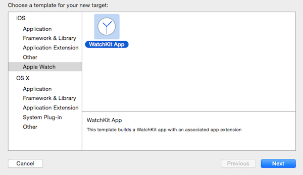
1. What's So Cool About WatchKit?
WatchKit doesn't use the same layout system as normal iOS applications. It is much smarter and easier. You must use storyboards to design your interfaces in this case.
You don't have access to the positions of your elements at runtime and you are required to design static interfaces that are included in your app bundle. You can even forget about x and y coordinates, bounds, and frames, because everything is laid out in the storyboard. Let's create an example app to help you better understand these new concepts.
2. Create Your First WatchKit App
Step 1: Create Project
Open Xcode 6.2+ and create a new project. Choose the Single View Application template to start with. Name it WatchKitLayoutDemo, click Next, and save it somewhere on your computer.
Step 2: Add WatchKit Target
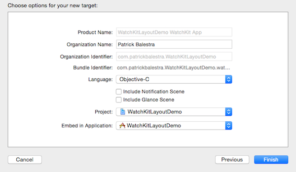
It's time to add the WatchKit target to the project. Go to menu File > New > Target... and select Apple Watch on the left. Choose WatchKit App and click Next.
In the following screen, you can configure your WatchKit target. Uncheck Include Notification Scene and Include Glance Scene, because I will only focus on a simple WatchKit app in this tutorial. Click Finish to add the WatchKit app to the project.
Step 3: Explore the WatchKit Targets
You may notice that Xcode added two targets to your project. To make it easier for us, Xcode has created a group for each target, containing the source files and assets for each target.
Expand these groups in the Project Navigator on the left. The blue group (see below) contains the source files and assets of the WatchKit extension, which will run on the iPhone. The Apple Watch doesn't run your application. The paired iPhone does the heavy lifting for the Apple Watch. The Apple Watch only renders the user interface and handles any user interaction. This concept is explained in more detail in this Tuts+ article.
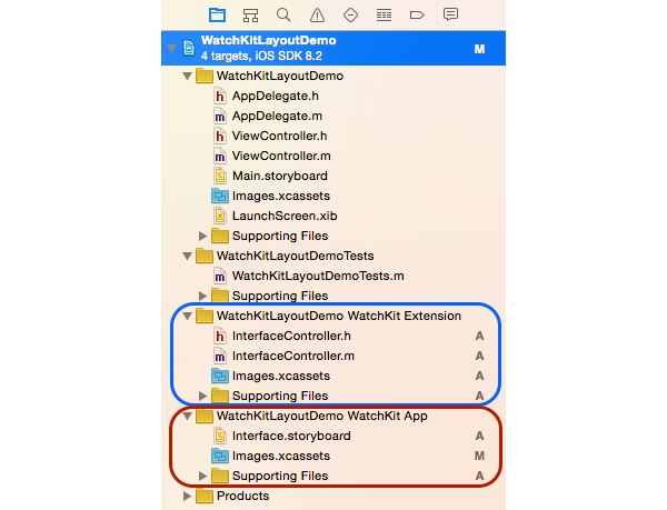
The red group contains the assets of the WatchKit application, such as the storyboard file that will be stored and used on the Apple Watch. This is done because the resources would be expensive to send every time the user opens an app and would drain the battery much faster.
This also means that the app's user interface is static and can't be changed at runtime. Adding or removing elements, for example, isn't possible. You can show and hide user interface elements though. If you, for example, set the hidden property of a group to YES at runtime—or true if you love Swift—, the group will be hidden and the other user interface elements will be automatically repositioned.
In this tutorial, I'll show you the powerful layout used by WatchKit. You won't need to write any code. Let's focus on the WatchKitLayoutDemo WatchKit App group, which contains the storyboard file.
3. Storyboard
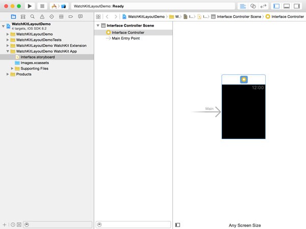
Select the Interface.storyboard file to open it. If you are coming from the iOS or OS X world, you should be familiar with storyboards. As I previously mentioned, storyboards are the only way to design WatchKit apps. Auto Layout is absent and manipulating frames is not possible using the WatchKit framework.
The UIKit's UIViewController class is absent in WatchKit. Instead, WatchKit declares the WKInterfaceController class. You can see that Xcode already added an interface controller for us.
The WatchKit framework defines a range of user interface elements that you can use to create your app's user interface. This is a complete list of the elements you can use:
- Group
- Table
- Image
- Separator
- Button
- Switch
- Slider
- Label
- Date
- Timer
- Map
- Menu
- Menu Item
Most of these don't need explaining, but there are quite a few new elements, such as group, separator, date, timer, and menu. One of the most important elements is the group.
If you ever used HTML and CSS to create a website, you may be familiar with the <div> tag. You can think of a group as a container for other interface elements. A group has many properties that you can customize directly in Interface Builder.
Step 1: Define the Layout of Your App
It's important to plan the layout in detail before starting development. This will save you hours and hours of headaches if, at some point, you realize that the really cool feature you wanted to build isn't possible or doesn't look good on a physical device. Make sure you have read the Apple Watch Human Interface Guidelines.
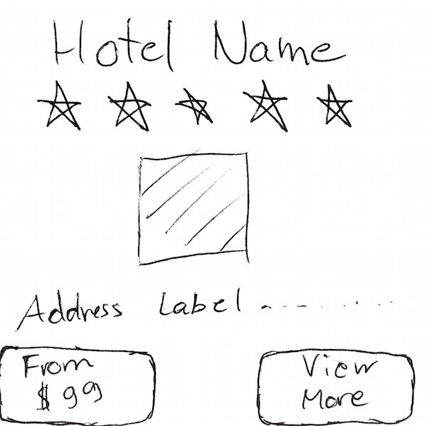
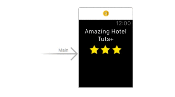
For this example, I'm going to teach how to create a layout for an hotel app in which you can find hotels near your current location. I design the screen that will show the details for a particular hotel. As I mentioned in the introduction, I won't write any code. Instead I will focus on understanding the mechanism of the new layout system.
Leaving out my drawing skills, this is what I have in mind for my layout. The hotel name will be at the top of the screen and below it will be some star icons showing the hotel's rating. I then want to add an image along with its address and two buttons.
Step 2: Adding a Group
Our interface controller is empty at the moment and there is no base group. To add new elements, drag and drop them from the Object Library on the right into the Interface Controller. The Scene Navigator on the left is useful to check if the elements are correctly positioned. The first thing to do is to add a group, which will allow us to scroll vertically if the content doesn't fit the screen. Drag a group from the Object Library and drop it into the Interface Controller as shown below.
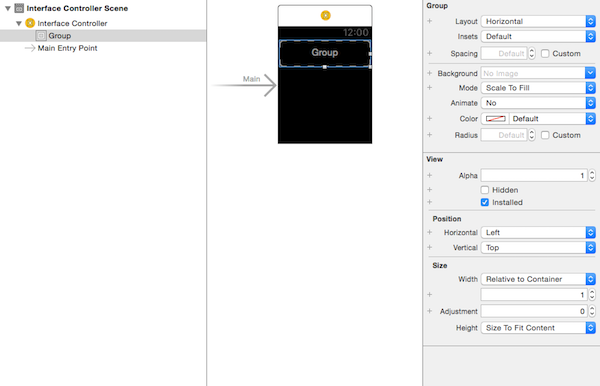
Now that you have a group in your interface controller, you can see its attributes in the Attributes Inspector on the right. Let's look at some of them in more detail.
- Layout: The layout determines if the group's elements are laid out horizontally or vertically. When you add an element, it'll be positioned next to or below the previous one.
- Insets: This attribute determines the top, bottom, left, and right inset for the group.
- Spacing: As its name implies, it determines the spacing between the elements within the group.
- Background: You can set an image as the background of the group and animate it by naming the images sequentially.
- Position: The position attribute determines the horizontal (left, center, right) and vertical (top, center, bottom) position of the group.
- Size: The size attribute determines the width and height of the element. There are three values, Size to Fit Content (automatically adjusted based on the content), Relative to Container (takes the container size and multiplies it by the value defined), Fixed (constant value).
Keep in mind that Apple Watch comes in two sizes. You should use the same layout in both cases, but you may run into some small differences. By clicking the plus icon on the left of an attribute, you can set an attribute that will only be applied when the app runs on the specified device.
Let's continue building our layout. Change the Group Layout to Vertical so that the content will scroll vertically when I add more elements. Set the Horizontal position to Center so that the content will be centered. Finally, set the Width attribute to Width Relative to Container with the multiplier set to 1. This will expand the group to fill the entire screen width.
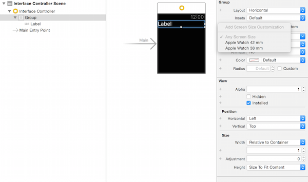
Step 3: Adding a Label
Now that we have set up the main properties for our container group, let's add a label to the group. From the Object Library, add a label to the group you added a moment ago. If you select the label, you'll see how its width doesn't take up all the available space. Let's fix that by changing its width attribute to Relative to Container. To center the label, change the Horizontal attribute to Center and set Text Alignment to Center.
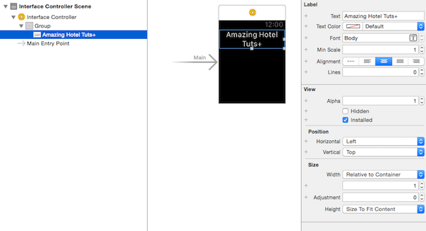
What happens if the hotel's name is too long? I want it to expand and grow vertically. To do that, change the Lines attribute of the label to 0. This means that the name of the hotel will span multiple lines if necessary. Change the label's text to see the result for yourself. The result should look like the below screenshot.
Step 4: Adding Stars
We also want to show the hotel's rating. The idea is to have a group just below the hotel's name with the number of stars of the hotel. Add another group to the group we already have. In other words, the new group is nested within the first group.
I want the five stars to be on the same line and centered. As I previously mentioned, I can't add or remove objects at runtime, but I can hide and show objects. I will add five images to the group. If the hotel has fewer stars, I will hide them at runtime.
Drag five images into the nested group and set the width of each star to Relative to Container. Change the multiplier from 1 to 0.2. The reason for choosing 0.2 as the multiplier is simple. If I want five images to fit in the available space on the same line, I want each image to be 20% of the group's width. Change the Horizontal position to Center so that they'll always be centered, no matter how many stars there are.
Next, let's assign a cool image to each image. You can find the images I use in the source files of this tutorial. Set the Image attribute to star.png and change the mode to Aspect Fit to ensure the aspect ratio is respected.
The result should look similar to the animated image below. You can even try to check the Hidden property of one of the images in the Attributes Inspector and see how the stars are always centered.
Step 5: Adding the Hotel Image
Start by downloading the example image of an hotel from freeimages. I want to add an image of the hotel to show the user what the hotel looks like. Add a new image from the Object Library as you just did earlier for the stars. Change the Image attribute to the image you downloaded and set the Mode to Aspect Fit.
Change the Horizontal position to Center and the Width to Relative to Container. Always make sure to add the image as a nested element of the main group by checking the layer hierarchy in the Scene Navigator on the left. Set Height be Size to Fit Content to automatically resize the image based on the image's dimensions.

Step 6: Adding the Address
Below the image, I'd like to add an address label. We could also add a map, but let's use a label for this example. Drag a label from the Object Library and position it below the hotel image. Set Lines to 0 and Width to Relative to Container. Change the text to be a random address of your choice.

As you may have noticed, the interface controller is now taller. It automatically resizes in the storyboard so you can see its content.
Step 7: Adding Buttons
The interface controller should have two buttons at the bottom. I want the buttons to be half the width of the screen and positioned side by side. Because our main group has a vertical layout, we need to add a nested group so the buttons are positioned horizontally instead of vertically.
Add a new group as shown below and add two buttons to it. Set their Width attribute to Relative to Container and set the multiplier to 0.5. Set the Vertical position of the two buttons to Center to center them vertically.
Set the text of the first button to "From $99" and the background color to a nice looking red. Set the text of the second button to "View More" and the background color to blue. The interface controller should now look like this:

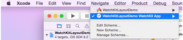
Make sure you have selected the correct scheme and press Command-R to run the WatchKit application.
When the iOS Simulator opens, there is one more thing you need to do. Select the iOS Simulator and choose Hardware > External Displays > Apple Watch 42 mm. The Apple Watch Simulator will appear next to your iPhone Simulator. You can now see your working layout in action. See the result in the video below.
Conclusion
In this tutorial, I showed you the main features and concepts to build complex layouts in WatchKit. We explored adding and positioning user interface elements, and a few best practices. You are now able to turn your Apple Watch app ideas into reality. I hope you enjoyed this tutorial.

Comments