One of the biggest challenges facing web developers today is properly handling images for responsive design. We face issues like sizing the image properly for the screen it's being viewed on, taking into account the user's download speeds, whether or not the device is retina (or in general a super high resolution screens), and more.
Thankfully, the <picture> element recently became an accepted spec that will be implemented by major browsers but there is still some work to do. Luckily, the way WordPress handles images makes things a lot easier.
How the Media Uploader Works
First, let's go through a quick crash course on using the Media Uploader. It's accessible in the WordPress admin from several areas, including posts, pages, custom post types that support it (generally speaking, the editor), and the Media menu.
The only differences between the Media menu and the rest is that an image will be directly associated with a post or page if it's uploaded from the editor.
Once an image gets uploaded, WordPress will by default create up to 4 sizes:
- thumbnail (150x150)
- medium (300 max x 300 max)
- large (640 max x 640 max)
- full (the original size of the image).
You can also add your own image sizes using the function add_image_size(). For example, if we wanted to add an image for a product that's 700px wide by 450px high, we would do:
add_image_size( 'product-img', 700, 450, false );
This is telling WordPress to create a new image with the name 'product-img' with our specified dimensions. The last argument is whether or not the image should be cropped.
When set to false, the image will be resized proportionally without cropping; when set to true, the image will be cropped either from the sides or the top/bottom. Be careful with this though, because the results will vary from image to image.
Inserting an Image
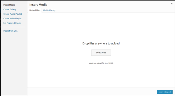
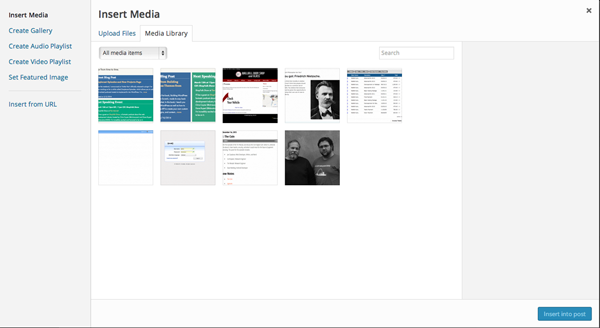
There are two ways to insert an image into a post or page: the first way is through the Media Uploader, as pictured here:
The second way is by using a featured image. You can enable featured images by adding this code to your theme's functions.php file, or somewhere near the beginning of your plugins:
if ( function_exists( 'add_theme_support' ) ) {
    add_theme_support( 'post-thumbnails' );
}
This will add a 'featured image' box to all posts, pages, and custom post types that support it. You can also send a second argument, which is an array of what should have a featured image.
For example, if you only want posts to support featured images:
if ( function_exists( 'add_theme_support' ) ) {
    add_theme_support( 'post-thumbnails', array('post' );
}
The last step is to place this code within the Loop of your template, wherever you want the image to show up:
if ( has_post_thumbnail() ) {
  the_post_thumbnail('large');
}
The argument accepted is the name of the image size you want to use. By default, it is post-thumbnail. Once you have that, you will add your featured image via this box:

Finally, if you upload a set of images to the same post or page, you can insert them as a gallery using the [gallery] shortcode, which you can read more about here.
Improvements in 3.9
With the WordPress 3.9 roll out, and with it, some really nice improvements to images and the gallery. Aside from improvements to the visual editor, like the ability to drag and drop images, add_image_size() is getting a new argument to specify whether to crop on the sides or top/bottom.
So what does all of this have to do with Responsive? Glad you asked!
Leveraging the Media Uploader
The basis of the <picture> element is that we as web developers supply multiple copies of an image to be displayed at particular breakpoints, i.e. image-small.jpg for smartphones and image-full.jpg for larger screens.
At the moment, this element is accepted but still a few months from being integrated into browsers. There is another option, however.
picturefill.js
There is a JavaScript file created by the Filament Group called picturefill.js, which emulates the same function as the <picture> element.
The syntax looks like this:
<span data-picture data-alt="A giant stone face at The Bayon temple in Angkor Thom, Cambodia">
    <span data-src="small.jpg"></span>
    <span data-src="medium.jpg"     data-media="(min-width: 400px)"></span>
    <span data-src="large.jpg"      data-media="(min-width: 800px)"></span>
    <span data-src="extralarge.jpg" data-media="(min-width: 1000px)"></span>

    <!-- Fallback content for non-JS browsers. Same img src as the initial, unqualified source element. -->
    <noscript>
        <img src="small.jpg" alt="A giant stone face at The Bayon temple in Angkor Thom, Cambodia">
    </noscript>
</span>
Notice there is a data-src entry for each image we want to use, as well as an associated minimum breakpoint to show that image. It's worth noting that there is no limit to the number of images/breakpoints you can have.
This is currently a largely accepted way to achieve the same affect as the <picture> element. I imagine that as it gets rolled out to browsers, the proper way to code responsive images will be: <picture> -> picturefill.js -> <noscript>.
This will allow us to use the latest and greatest HTML in modern browsers with the proper fallbacks in place (yay progressive enhancement!).
With picturefill.js and the multiple images that the Media Uploader creates, we can create an automated process for responsive images on our WordPress-powered sites.
Putting It All Together
Right now, there is no way that WordPress does this natively; I imagine that will change when the <picture> element gets rolled out (dibs on submitting it to Core :). That doesn't mean we can do a couple of things ourselves to automate the process. In this section, we are going to touch on some possibilities.
Note: You will notice I'm using the prefix jlc_ on my functions. I recommend you use you to prevent conflicts with other themes and plugins.
Replacing Featured Images
The first piece of this puzzle, and the most straight forward, is to replace the featured images with the picturefill.js markup.
This can be achieved with the filter post_thumbnail_html, which will swap out the default markup for ours. The first thing we need to do is enqueue picturefill.js (which can be done in functions.php or in your plugin):
function jlc_script() {
  wp_register_script( 'picturefill', get_stylesheet_directory_uri() . '/js/picturefill.js');
  wp_enqueue_script( 'picturefill' );
}
add_action( 'wp_enqueue_scripts', 'jlc_script' );
Be sure to modify the path here to make the location of your picturefill.js file. Once that is in place, it's time to add our replacement function:
function jlc_get_featured_image( $html, $aid = false ) {

    $sizes= array( ‘thumbnail’, ‘medium’, ‘large’, ‘full’ );
    $img= ‘<span data-picture data-alt=”’.get_the_title().’”>’;
    $ct = 0;
    $aid = ( ! $aid ) ? get_post_thumbnail_id() : $aid;

    foreach ( $sizes as $size ) {

        $url = wp_get_attachment_image_src( $aid, $size );
        $width = ( $ct < sizeof( $sizes ) - 1 ) ? ( $url[1] * 0.66 ) : ( $width / 0.66 ) + 25;
        $img .= ‘<span data-src=”’. $url[0] .’”’;
        $img .= ( $ct > 0)  ? ‘ data-media=”( min-width: ‘. $width .’px)”></span>’ :’></span>’;
        $ct++;
    }

    $url= wp_get_attachment_image_src( $aid, $sizes[1] );
    $img.=  ‘<noscript>
                <img src=”’.$url[0] .’” alt=”’.get_the_title().’”>
            </noscript>
    </span>’;

    return $img;

}
There are several tasks being performed here:
- We have an array of each image size we want to be included (by name). You can add or remove here as you wish
- We set up the
picturefill.jsmarkup - We loop through the array, getting the URL for each size and adding it as an entry to our picturefill.js element
- We include some math to figure out where the breakpoints should occur based on the image sizes
- For users without javascript, we fallback to the medium-sized image
The next step is to add our filter, which you can add right under the function:
add_filter( ‘post_thumbnail_html’, ‘jlc_get_featured_image’);
Now our function jlc_get_featured_image() will be used for the post_thumbnail output instead of the default markup.
I've wrapped all of this into a simple plugin called Responsive Featured Image. You can download it from Github.
Other Methods
As you can imagine, handling images is a pretty complicated matter when it comes to responsive design. The function about will only work with featured images, not all images in the post. While there are methods to do this, including this plugin, my testing has shown performance and scaling issues.
You can also use a shortcode, passing a URL or an image ID to generate the code, like so: [jlc_picturefill_image aid=x]. Unfortunately without extensive coding, this will disable the use of the Media Uploader to insert images into the post. With the drag and drop functionality in 3.9, it could cause even more conflict.
If you are interested in this method, in my book, Responsive Design with WordPress, I go much more in-depth on this and WordPress images in general.
Conclusion
In this article, we looked pretty extensively at how WordPress handles images, and explored a way to integrate picturefill.js in an easy-to-use and more importantly efficient manor.
It's important to know that this is a constantly evolving area of interest. As better methods begin to develop, I'm excited to see what the (hopefully near) future holds for both responsive images and WordPress.

Comments