Are you happy with with any of the CSS grid libraries available? No? I don't blame you. Enter Susy, a plugin for the Compass CSS framework that lets you create your own custom grid framework, minimizing overhead, while making it more understandable to use. Sounds good, right? Let's jump right in.
I'm not going to delve much into Compass or SCSS (the language you write the CSS in), but feel free to refer to our Maintainable CSS With Sass and Compass Premium course, if you want to learn about them.
Setting the Stage
You can create three different types of grids: static, fluid and magic.
Today's popular grid libraries seem to fall short in one way or another. Grids like 960 and Blueprint are both static grids with very specific pixel values. Viewing these grids on screens that are under 950 pixels wide results in horizontal scroll bars--the bane of the Web.
Fluid grids are tricky to get right, but a few do exist. Most fluid grids work with percentages instead of pixels, but they tend to have a maximum size and make it impossible to scale past a respectable maximum width. By itself, a fluid layout is almost as bad as a fixed layout, because while you get better coverage of desktop computers, mobile devices tend to suffer with a worse layout. In this particular situation, a static grid gives you a better experience. Yes, you do have to scroll horizontally on devices with a lower resolution, but percentage based systems usually end up with a column that is, for example, 10% of 480px. This causes a vertical split in your text.
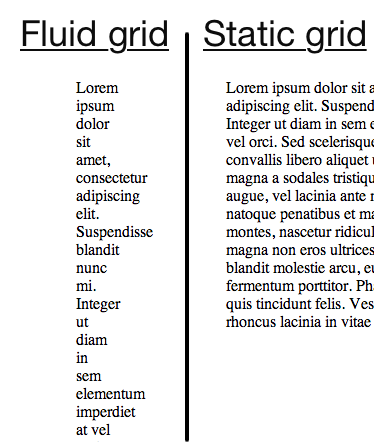
One solution to this problem is CSS media queries. Some of the more popular libraries, like the "1140 grid" and the "Bootstrap scaffolding grid", come with preset media queries. The 1140 grid has a fluid layout, but small screen sizes cause the columns to stack on top of each other.
Fluid grids are tricky to get right...
Bootstrap's scaffolding grid, on the other hand, incorporates multiple static layouts. As the screen size changes, Bootstrap changes the layout to the one best suited for the current screen size. Once you get to a mobile screen size, Bootstrap loads the same setup as the 1140 grid, a fluid layout with all the columns stacked on top of each other.
What's wrong with choosing one of these? Well, technically nothing, but they are not tailor-made for your specific app. This forces you to build your app into their grid and work around the framework's limitations. You can always modify their framework, but you might as well make your own and shave off the unneeded, overhead features.
Introducing Susy
As I mentioned before, Susy is a plugin for the Compass framework that brings a wide array of mix-ins for creating your own CSS grids. You simply specify the default number of columns and a few size options (column width, grid padding, etc), and Susy calculates the correct percentages for your elements. This gives you the power to change the number of columns and their sizes.
You can create three different types of grids: static, fluid and magic.
You already know what static and fluid grids are; let's take a look at what "magic" grids give you. Magic grids have an elastic outside and a fluid inside. In other words, the outside of the grid (max width) adjusts according to the browser's default font size (desktop browsers usually have a default of about 16px). The grid's inside resizes based on the browser's actual width. This combination gives your site a more consistent look across browsers while still supporting smaller screens.
Susy provides a mix-in called "at-breakpoint", which allows you to set custom CSS according to the size of the screen. This mix-in accomplishes this feat with CSS media queries. So for example, you can rearrange the columns to stack on top of each other like in the previously discussed frameworks, and you can even remove content that doesn't fit a mobile device.
Setting Up a Susy Project
I assume you already have Compass installed, but if not, you can refer to Jeffrey's video series. To install Susy, just open a Ruby command line and type the following:
sudo gem install susy
Next create a Compass project. Type the following:
compass create project_name -r susy -u susy
You should see an info page, detailing how to get started.
Inside the newly created directory, you should see two folders along with a config file. You will edit the files residing in the sass directory; Compass compiles these files to output the final CSS to the stylesheets folder.
To save time compiling the CSS files after each update, you can use Compass' watch command to make Compass automatically recompile your files every time you save an update. So, in the terminal window type the following command:
compass watch
Compass will now start monitoring and re-compiling the files in the sass folder. Keep in mind that you must keep the terminal window open in order to monitor the folder; if you use the terminal for file editing (i.e. vim), then you need to open another window.
Susy in Action
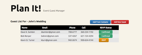
Now that you have everything setup, let's take a look at my quick demo. I am going to keep the HTML short because it's the CSS that we are really here for. The demo is an event guest manager that lists the invited guests and keeps track of who RSVP'd. It's a simple idea that showcases many of the concepts we discussed.
The Plan
HTML-wise, there will be a header area followed by a row with the name of the event, some controls, and finally the actual list of guests. You can take a look at the image below to better understand the layout.
Here is the entire HTML page for the demo:
<!DOCTYPE HTML>
<html>
	<head>
		<meta name="viewport" content="width=device-width, initial-scale=1" />
		<link href="stylesheets/screen.css" media="screen, projection" rel="stylesheet" type="text/css" />
	</head>
	<body>
		<div class="container">
			<h1 id="header">Plan It! <span class="tagline">Event Guest Manager</span></h1>
			<div id="controls">
				<h3 id="menutitle">Guest List For - John's Wedding</h3>
				<div id="buttons">
					<a id="phonebook" href="#">Add From Contacts</a>
					<a id="newguest" href="#">Add New Guest</a>
				</div>
			</div>
			<table cellspacing="0">
				<thead>
					<tr>
						<th>Name</th>
						<th class="email">Email</th>
						<th class="phone">Phone</th>
						<th class="cell">Cell</th>
						<th>RSVP Status</th>
					</tr>
				</thead>
				<tbody>
					<tr>
						<td>Dave K. Samten</th>
						<td class="email">[email protected]</td>
						<td class="phone">708-6777</td>
						<td class="cell">360-234-1192</td>
						<td class="buttoncell">
							<a class="unconfirm" href="#" alt="Confirmed">Confirmed</a>
						</td>
					</tr>
					<tr class="alt">
						<td>Bob Renper</th>
						<td class="email">[email protected]</td>
						<td class="phone">537-4267</td>
						<td class="cell">621-124-4294</td>
						<td class="buttoncell">
							<a class="unconfirm" href="#" alt="Confirmed">Confirmed</a>
						</td>
					</tr>
					<tr>
						<td>Kevin D. Turner</th>
						<td class="email">[email protected]</td>
						<td class="phone">942-2674</td>
						<td class="cell">930-654-4144</td>
						<td class="buttoncell">
							<a class="confirm" href="#" alt="RSVP">RSVP</a>
						</td>
					</tr>
				</tbody>
			</table>
		</div>
	</body>
</html>
Susy uses min-width for the media queries by default; so, you start by defining the CSS for the smallest layout and then gradually expand the layout with the increasing screen size. The 'mobile' version separates the tagline and buttons onto their own lines, and we make everything fill the width of the page.
I use another Compass plugin, called Sassy Buttons, to generate the buttons' CSS. It isn't integral to this demo, but you can install it by typing the following in a terminal:
gem install sassy-buttons
Then add the following line to your config.rb file:
require 'sassy-buttons'
The SCSS
Let's define the layout. Open _base.scss in the sass folder. This file contains all the import statements and variables that we need later. Replace everything inside that file with the following:
@import "susy";

//if you want to use the buttons plugin
@import "sassy-buttons";

//this is the default number of columns
$total-columns: 5;

//width of each column
$column-width   : 4em;

//space between columns
$gutter-width   : 1em;

//space on the right and left of the grid
$grid-padding   : $gutter-width;

//alternative layout breakpoints
$tablet: 8;
$computer: 55em 12;
By itself, a fluid layout is almost as bad as a fixed layout...
The total-columns holds the default number of columns for the smallest display in your layout.
I went with three layouts total: mobile, tablet, and computer. Susy's breakpoints allow you to do things like setting the min and max sizes for the media queries, and you can even add special support for Internet Explorer. I'm going to keep this example simple and cover just two types.
The tablet breakpoint activates when the screen can fit eight columns. The computer breakpoint activates when the screen is at least 55em wide, and the 12 in $computer: 55em 12; tells Susy to switch to twelve columns.
Now save this file and open screen.scss. Erase everything in the file and import the base file. Let's also define the main container:
@import "base";

body{
	background:#F7F3E8;
	a{ text-decoration: none; }
	.container{
		@include container($total-columns, $tablet, $computer);
Notice you don't need the underscore or the file extension when importing the base file. Inside the container class, we use the first Susy mix-in that defines the different layouts for the grid. Then, it's just regular SCSS for the mobile layout:
		#header{
			font-weight: 700;
			font-size: 72px;
			span{
				font-weight: 300;
				font-size: 18px;
				display: block;
			}
		}
		#controls{
			#buttons{
				margin-bottom: 5px;
				#phonebook{ @include sassy-button("simple", 6px, 14px, #337EC4); }
				#newguest{
					margin-top: 5px;
					@include sassy-button("simple", 6px, 14px, #D93131);
				}
			}
		}
		table{
			width:100%;
			thead{
				color: #FEFEFE;
				background: #000;
				th{
					text-align: left;
					font-weight:500;
					padding:10px;
				}
			}
			tbody{
				border: 3px solid #000;
				tr{ background: #E5E5E5; }
				tr.alt{ background: #EEEEEE; }
				.buttoncell{
					.confirm{ @include sassy-button("simple", 6px, 14px, #F39B06); }
					.unconfirm{ @include sassy-button("flat", 6px, 14px, #3BA06F); }
				}
			}
			.email{ display: none; }
			.phone{ display: none; }
		}
	}
}
As you can see in the last two lines, I hide the email and phone columns in the table so that the page fits normally on a mobile device. As a best practice, give the user a different way to view the full information (i.e. modal, other page), but I leave that out for the sake of this example's simplicity.
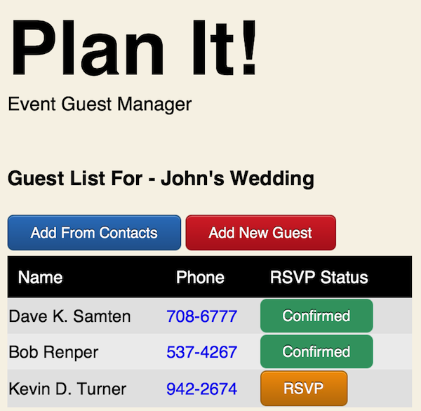
We now have the basic CSS completed for the mobile website, and we can start modifying the layout with breakpoints. Here is a quick screenshot I took on my iPhone of the mobile version:
Adding Breakpoints
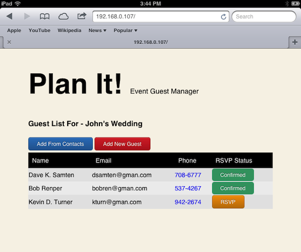
The first breakpoint we need to implement is the tablet version; remember, we must start with the smallest layout first. The tablet size is large enough to put the tagline on it's own line, and we can also display the email column. Unfortunately, it still isn't big enough to put the event name and buttons on the same line. Here is the SCSS for this breakpoint:
@include at-breakpoint($tablet){
	body .container{
		#header span{ display: inline; }
		table .email{ display: table-cell; }
	}
}
No 'magic' commands here, just standard SCSS inside a Susy mix-in. Here is a screenshot from an iPad of the tablet layout:
Finally, let's implement the desktop version. We definitely have more than enough room for all the columns; therefore, we indent the table on both sides so that it doesn't have too much blank space. We also move the buttons onto the same line as the event's name, aligning it to the right side, in order to center the table (visually, at least). Here is that code:
@include at-breakpoint($computer){
	body .container{
		#controls{
			#menutitle{
				@include span-columns(5);
				margin-top:5px;
			}
			#buttons{
				text-align: right;
				@include span-columns(5 omega);
			}
		}
		table{
			@include prefix(1);
			@include suffix(1);
			.cell{ display: table-cell; }
		}
	}
}
This is the first time we use the span-columns mix-in. Susy takes whatever value you pass to calculate the width percentage of the container. The omega keyword tells Susy that this is the final column in the row. This makes Compass float the column to the right and removes the right margin.
The
prefixandsuffixmix-ins push the container x amount of columns in from the left and right respectively.
You can now save this file and let compass compile it into CSS. If you added the sassy-buttons plugin after launching the compass watch command, you have to stop the watch command ( shortcut: CTLR-C ) and restart it in order to compile the SCSS.
Closing Thoughts
This is a very brief introduction into Susy. For a more complete list of features, you can visit Susy's documentation.
I hope you enjoyed this article, and thank you for reading. Like always, feel free to leave any comments or questions in the comments section. You can also contact me on Twitter - @GabrielManricks and I will try to get back to you as soon as possible.

Comments