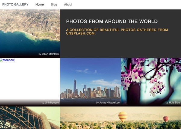
What Is Pure.css?
While Bootstrap's taken over a huge swath of the web, it can put a bit of a performance burden on sites that might not be necessary for your next project. Pure.css is Yahoo's responsive framework; it offers a minimalist, well-documented and flexible alternative.
In this tutorial, I'm going to introduce you to Pure, "a set of small, responsive CSS modules that you can use in every web project." We'll review the feature set and advantages of using Pure and then walk through some basic example usage.
If you have any requests for future tutorials or questions and comments on today's, please post them below. You can also reach me on Twitter @reifman directly.
Selecting a Platform
Pure offers all the common features you need in a standard web design framework. So, whether you're building a theme for WordPress or a custom website of your own, it could be a good option.
For project managers, it's usually critical that client projects be built with standard tools that can be easily understood and maintained, and most importantly, that it's easy to recruit talent that comes in with experience in your platform. Bootstrap is perfect for this. Pure seems simple enough to me that it can also be a good starting point.
The Pure Feature Summary
Here's a summary of Pure's benefits and features. It provides:
- a customizable, responsive grid
- built-in vertical and horizontal menus, including dropdown menus
- buttons that work with the
<a>and<button>elements - flexible form alignments
- common table styles
- a clean, minimalist look that can be easily extended
However, most impressively, Pure.css is super small, just 4.5KB minified + gzipped. Here's how much space the different components of Pure take up in your production environment:

Pure is also well tested and works in IE 8+, Firefox, Chrome, Safari, iOS 6-8, and Android 4.x.
And, you can still use it with elements of Bootstrap, adding them in where you need. I'll show an example of this below.
Pure is built on Normalize.css, which standardizes the framework's performance across browsers. Normalize provides a default CSS reset that:
- preserves useful defaults
- normalizes styles for a wide range of elements
- corrects bugs and common browser inconsistencies
- improves usability with subtle improvements
- explains what code does using detailed comments
Getting Started With Pure
Pure's website is built with its framework, so its minimalist, well-developed code leads to a simple to navigate, easy to use guide. Here's an example of Pure's lefthand menu in action:
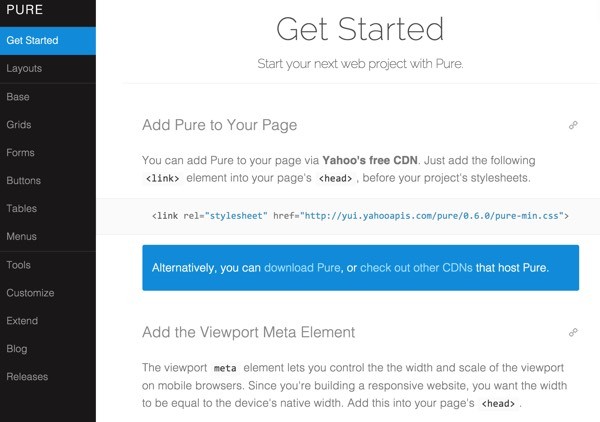
You can add Pure to your page via Yahoo's free CDN. Just add the following <link> element into your page's <head>, before your project's stylesheets:
<link rel="stylesheet" href="http://yui.yahooapis.com/pure/0.6.0/pure-min.css">
To initialize the responsive width of your website, set a meta tag for the viewport to your device width:
<meta name="viewport" content="width=device-width, initial-scale=1">
Layouts
On its Layouts page, Pure offers a sampling of downloads for different example pages for common application needs:
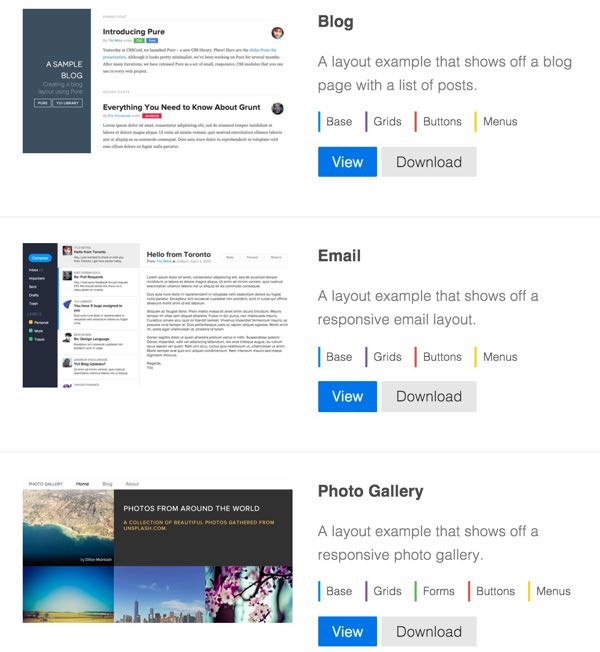
You can browse and download any of them that you want to experiment with or add to your application. These include:
- Blog
- Photo gallery
- Landing page
- Pricing gallery
- Responsive Side Menu
- Responsive Horizontal-to-Vertical Menu
- Responsive Horizontal-to-Scrollable Menu
The Pure Base
The Base page provides a brief background on the foundation underneath the Pure framework, primarily Normalize.css:
Normalize.css is a small CSS file that provides better cross-browser consistency in the default styling of HTML elements. It’s a modern, HTML5-ready, alternative to the traditional CSS reset.
You can also load Normalize separately using Yahoo's CDN for independent usage:
<link rel="stylesheet" href="http://yui.yahooapis.com/pure/0.6.0/base-min.css">
And there are other small foundation features such as classes to tell Pure to load images responsively by viewport:
<img class="pure-img" src="...">
But now, let's take a look at some of the example layouts Pure provides.
Grids
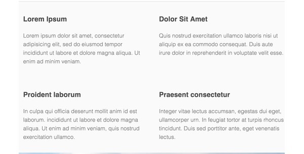
Grids are a key aspect of website layouts which Pure makes fairly simple. Here's a quick example of a four-column Pure grid on a desktop display:
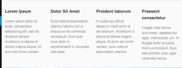
And here's how it reduces on a tablet-size viewport in half:
And finally, a single column on a smartphone:
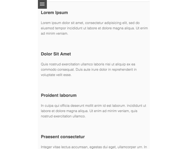
Pure Grids consist of two types of classes: grids and units. Child elements of grid divs must be unit divs. Your content goes inside the unit divs. Unit classes are named to represent their widths. For example, pure-u-1-4 has a width of 25%.
Here's the code for the responsive fourth's above:
<div class="grids-example">
    <div class="pure-g">
    <div class="pure-u-1 pure-u-md-1-2 pure-u-lg-1-4">
        <div class="l-box">
            <h3>Lorem Ipsum</h3>
            <p>
                Lorem ipsum dolor sit amet, consectetur adipisicing elit, sed do eiusmod tempor incididunt ut labore et dolore magna aliqua. Ut enim ad minim veniam.
            </p>
        </div>
    </div>

    <div class="pure-u-1 pure-u-md-1-2 pure-u-lg-1-4">
        <div class="l-box">
            <h3>Dolor Sit Amet</h3>
            <p>
                Quis nostrud exercitation ullamco laboris nisi ut aliquip ex ea commodo consequat. Duis aute irure dolor in reprehenderit in voluptate velit esse.
            </p>
        </div>
    </div>

    <div class="pure-u-1 pure-u-md-1-2 pure-u-lg-1-4">
        <div class="l-box">
            <h3>Proident laborum</h3>
            <p>
                In culpa qui officia deserunt mollit anim id est laborum. incididunt ut labore et dolore magna aliqua. Ut enim ad minim veniam, quis nostrud exercitation ullamco.
            </p>
        </div>
    </div>

    <div class="pure-u-1 pure-u-md-1-2 pure-u-lg-1-4">
        <div class="l-box">
            <h3>Praesent consectetur</h3>
            <p>
               Integer vitae lectus accumsan, egestas dui eget, ullamcorper urn. In feugiat tortor at turpis rhoncus tincidunt. Duis sed porttitor ante, eget venenatis lectus.
            </p>
        </div>
    </div>
As you can see above, <div class="pure-g"> represents the outer grid class. Then, <div class="pure-u-1 pure-u-md-1-2 pure-u-lg-1-4"> instructs the browser to show a single column for minimum viewports, half columns for medium, and quarter columns for large width.
You can learn more about Pure Grids here.
Forms
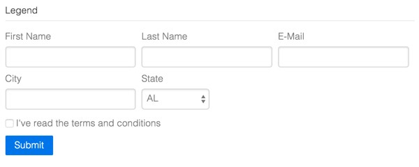
Pure has support for aligning input fields within forms and for styling specialized fields, such as:
- Inline forms
- Stacked forms
- Two-column forms
- Multi-column forms (shown above)
- Grouped inputs
- Required inputs
- Disabled inputs
- Read only inputs
- Rounded inputs
- Checkboxes and Radios
You can see all of this described here. Let's explore a two-column form, which Pure refers to as an Aligned Form:
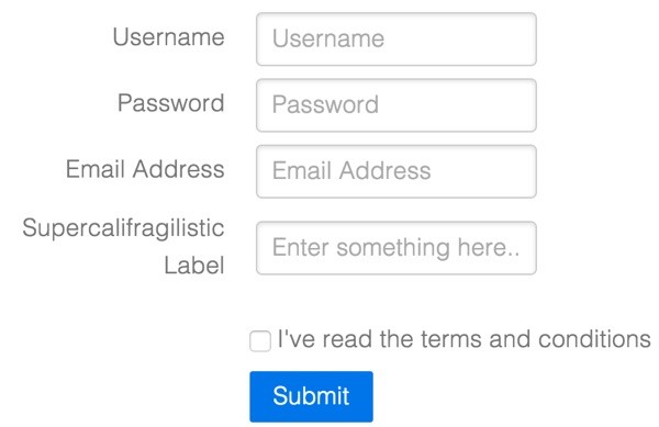
By using the pure-form-aligned class with pure-control-group(s), Pure ensures that each set of fields is properly positioned as shown above.
form class="pure-form pure-form-aligned">
    <fieldset>
        <div class="pure-control-group">
            <label for="name">Username</label>
            <input id="name" type="text" placeholder="Username">
        </div>

        <div class="pure-control-group">
            <label for="password">Password</label>
            <input id="password" type="password" placeholder="Password">
        </div>

        <div class="pure-control-group">
            <label for="email">Email Address</label>
            <input id="email" type="email" placeholder="Email Address">
        </div>

        <div class="pure-control-group">
            <label for="foo">Supercalifragilistic Label</label>
            <input id="foo" type="text" placeholder="Enter something here...">
        </div>

        <div class="pure-controls">
            <label for="cb" class="pure-checkbox">
                <input id="cb" type="checkbox"> I've read the terms and conditions
            </label>

            <button type="submit" class="pure-button pure-button-primary">Submit</button>
        </div>
    </fieldset>
</form>
It's a pretty simple way to build a highly usable, well laid out form.
Tables
Pure makes building and formatting tables quite easy as well. Here's an example of a horizontally striped table:
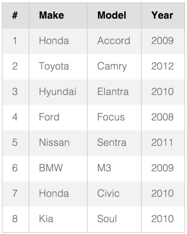
You can see the table above coded by simply adding pure-table-odd class rows alternately through your code to change the striping:
<table class="pure-table">
    <thead>
        <tr>
            <th>#</th>
            <th>Make</th>
            <th>Model</th>
            <th>Year</th>
        </tr>
    </thead>

    <tbody>
        <tr class="pure-table-odd">
            <td>1</td>
            <td>Honda</td>
            <td>Accord</td>
            <td>2009</td>
        </tr>

        <tr>
            <td>2</td>
            <td>Toyota</td>
            <td>Camry</td>
            <td>2012</td>
        </tr>

        <tr class="pure-table-odd">
            <td>3</td>
            <td>Hyundai</td>
            <td>Elantra</td>
            <td>2010</td>
        </tr>

        <tr>
            <td>4</td>
            <td>Ford</td>
            <td>Focus</td>
            <td>2008</td>
        </tr>

        <tr class="pure-table-odd">
            <td>5</td>
            <td>Nissan</td>
            <td>Sentra</td>
            <td>2011</td>
        </tr>

        <tr>
            <td>6</td>
            <td>BMW</td>
            <td>M3</td>
            <td>2009</td>
        </tr>

        <tr class="pure-table-odd">
            <td>7</td>
            <td>Honda</td>
            <td>Civic</td>
            <td>2010</td>
        </tr>

        <tr>
            <td>8</td>
            <td>Kia</td>
            <td>Soul</td>
            <td>2010</td>
        </tr>
    </tbody>
</table>
There are a number of other Table examples shown here.
Menus
Menus in Pure are also easily facilitated, including:
- Vertical Menu
- Horizontal Menu
- Selected and Disabled Items
- Dropdowns
- Vertical Menu with Submenus
- Scrollable Horizontal Menu
- Scrollable Vertical Menu
- Responsive Vertical Menu
- Responsive Horizontal-Scrollable Menu
- Responsive Horizontal-to-Vertical Menu
See all the menus illustrated here. Here's how you'd code a Dropdown menu:
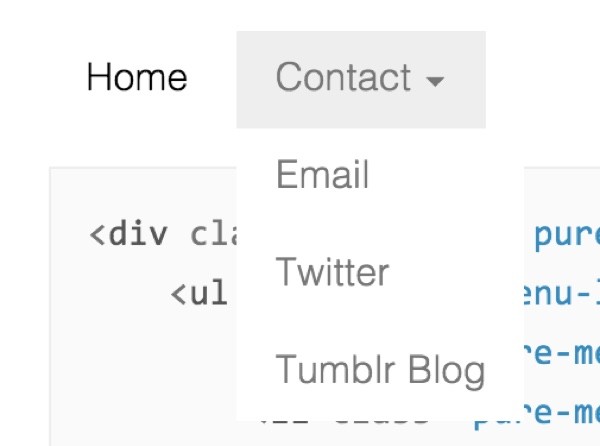
Basically, it's just a pure-menu-horizontal's pure-menu-list and pure-menu-item pure-menu-has-children pure-menu-allow-hover and then a list of child menu items:
<div class="pure-menu pure-menu-horizontal">
    <ul class="pure-menu-list">
        <li class="pure-menu-item pure-menu-selected"><a href="#" class="pure-menu-link">Home</a></li>
        <li class="pure-menu-item pure-menu-has-children pure-menu-allow-hover">
            <a href="#" id="menuLink1" class="pure-menu-link">Contact</a>
            <ul class="pure-menu-children">
                <li class="pure-menu-item"><a href="#" class="pure-menu-link">Email</a></li>
                <li class="pure-menu-item"><a href="#" class="pure-menu-link">Twitter</a></li>
                <li class="pure-menu-item"><a href="#" class="pure-menu-link">Tumblr Blog</a></li>
            </ul>
        </li>
    </ul>
</div>
Pure provides sample JavaScript for implementing additional accessibility features within your menus.
Going Further
Pure's website provides some excellent guides for building on the framework:
- Using Tools with Pure such as Bower and Grunt
- Customizing Pure and using slices of the codebase on their own
- Extending Pure features and classes
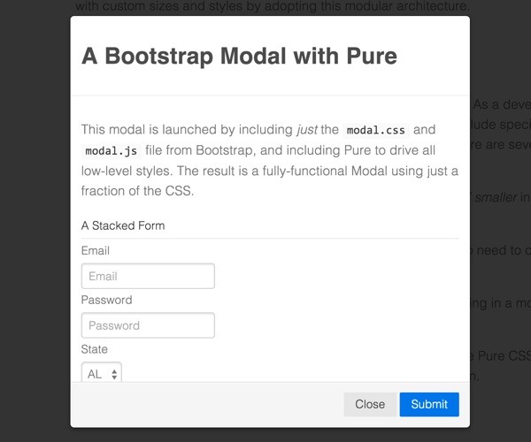
And you can explore combining pieces of Pure with Bootstrap and JavaScript. If you'd like to begin with Pure's small footprint and minimalist style, you can still leverage various Bootstrap features, only loading what you need.
Here's an example of a Bootstrap modal dialog on top of Pure, which you can see on Pure's extension page:
In Closing
Bootstrap's becoming the IBM of web frameworks. It's responsive, it's a standard, and you can't get fired for choosing it (on a recent contract, we actually had to fire a theme developer for not properly implementing Bootstrap). But, if you want something smaller, faster and simpler, then check out Pure.css.
If you give it a try, please let me know about your experience in the comments below. You can also reach me on Twitter @reifman directly. And, you can also browse my Envato Tuts+ instructor page to read my other tutorials.


Comments