Ok so a couple of weeks ago now, on its very own two-year anniversary, Mark Otto and the rest of the guys responsible for the develop and maintenance of Bootstrap announced the official release of the framework's third version, and it came on steroids. Let's see what we're getting.
What's New?
First off, the most important changes you're going to find in the new Bootstrap release is the support for responsive websites, as a matter of fact the responsive module has been removed. Now, from its core, Bootstrap is responsive, more than that, this new version comes with the approach of "Mobile First", meaning that almost everything has been redesigned to start from a lower screen size and scale up (more on that in a bit).
Nearly everything has been redesigned and rebuilt to start from your handheld devices and scale up.
In the look and feel you'll see a lot of changes too, prominently the fact that the whole style has gone flat, and there's an optional theme for a 2.0-er look. Additionally, the icons have gone from images to a font, which is really handy to use when needing different sizes and colors.
Grid System
Let's start talking about the Grid System, oh the Grid, as a matter of fact, there are four Grid Systems in this new version of Bootstrap, each works exactly the same, being differentiated by the screen size width at which they operate.
Enabling the Grid
In order for the Grid System to work properly and also to ensure proper rendering and touch zooming, add the viewport meta tag to your document:
<meta name="viewport" content="width=device-width, initial-scale=1.0">
Different Width Grids
There are four Grid Systems in this new version of the framework, with the width of the viewport being the parameter that differentiates them. The widths that set the frontiers between one and another are as follows:
- Extra small devices ~ Phones (< 768px)
- Small devices ~ Tablets (>= 768px)
- Medium devices ~ Desktops (>= 992px)
- Large devices ~ Desktops (>= 1200px)
And each of the different supported viewports have a particular class to address it, as follows:
- col-xs- ~ Extra small devices
- col-sm- ~ Small devices
- col-md- ~ Medium devices
- col-lg- ~ Large devices
To make use of the Grid System you'd need a container element, with a class "container", and inside a second container with a class "row". Notice how in both cases the "fluid" suffix has disappeared, this in contrast with Bootstrap 2. And inside the second container you'd place your columns.
<div class="container">
    <div class="row">
        <div class="col-xs-6">col-xs-6</div>
        <div class="col-xs-6">col-xs-6</div>
    </div>
</div>
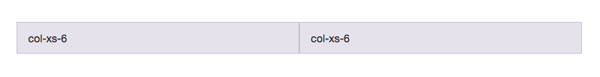
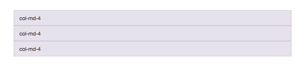
As I mentioned earlier, this new version of Bootstrap comes with a Mobile First approach, what this means is that the columns with a class suffixed with an "xs" are always going to be floated horizontally, no matter the viewport size. If you were to say, use columns prefixed by an "md" and the viewport happened to be less than 992px wide (even 991px), those columns will stack one below the other with a 100% width, as in the next example.
<div class="container">
<div class="row">
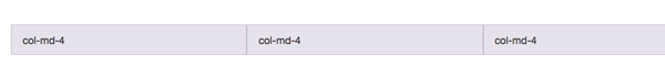
<div class="col-md-4">col-md-4</div>
<div class="col-md-4">col-md-4</div>
<div class="col-md-4">col-md-4</div>
</div>
</div>
When this page is viewed at a viewport of 992px or more, it will look like this:
If you would happen to see that document in a viewport of 991px or less, it would look as follows:
You can also combine classes to address your elements at a given viewport size. For instance, if in the following example you'd need the first two columns floated side by side in small devices (sm) and stacked on phones, you could add the col-sm-6 in addition to the col-md-4 class.
<div class="container">
<div class="row">
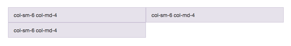
<div class="col-sm-6 col-md-4">col-sm-6 col-md-4</div>
<div class="col-sm-6 col-md-4">col-sm-6 col-md-4</div>
<div class="col-sm-6 col-md-4">col-sm-6 col-md-4</div>
</div>
</div>
In this case, opening the page in a viewport larger than 991px you'd see three equal columns, one next to the other, just like in the last example. However, if you'd see it in a viewport with a width between 768px and 991px, you'd get the following result:
As in the example above, you can combine and nest columns in a lot of different combinations to create very complex layouts. There's a lot more to the Grid System in Bootstrap, but going into detail about every aspect of it would take a while to cover, so for a deeper look into it I'd strongly suggest that you go ahead and take a look at the documentation.
Bootstrap CSS
Most of the classes for the Base CSS part of Bootstrap have remained the same, however there are some changes that we must keep in mind when using this new version.
The code as a whole, has being re-written and variable names have changed. If you look at the .less files, you'll find that all the variables in the framework have switched from camelCase to use hyphens for word separation, and also every variable name has been standardized in a "element-state-pseudo state" approach. What this means is that element-specific styles like:
<ul class="unstyled">...</ul>
Now are prefixed with the element that they are applied to, so in this new version of Bootstrap the previous list would become.
<ul class="list-unstyled">...</ul>
The same applies for lists with an "inline" style applied to them. Some other changes in the variables names reflecting in the classes that we've known from the earlier days are those related with size, for instance with buttons, in version 2.* you'd have:
<button class="btn btn-mini"></button>
<button class="btn btn-small"></button>
<button class="btn btn-large"></button>
This size suffixes have changed to match the overall naming convention and this is the same as for the Grid System, so the previous buttons declaration for version three becomes:
<button class="btn btn-xs"></button>
<button class="btn btn-sm"></button>
<button class="btn btn-lg"></button>
The same applies for input sizes and visibility declarations as well.
Responsive Tables
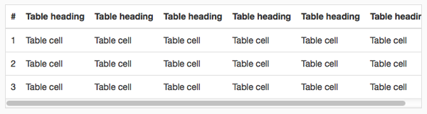
The overall syntax and layout for the tables remain the same in this version of the framework, but, loyal to the whole "Mobile First" paradigm, now we have responsive tables in this iteration of Bootstrap. To take advantage of it, simply wrap the whole table in a container with a class of "responsive-table", what this will do is make the tables scroll horizontally in small devices (< 768px).
<div class="table-responsive">
    <table class="table">...</div>
</div>
And the resulting table:
Forms
In the CSS department, it's in the Forms where you'd see the major differences. For starters, every input in a form in Bootstrap three is now displayed as a "block" element with a 100% width. The "size" attributes you can modify with a class in form controls relate to the padding and font-size of the element and not the width, to control that you'd need to put it in a container of the desired width.
The markup for the forms has also changed, in it's most basic form, in version 2.* a form would look something like this.
<form>
    <fieldset>
        <legend>...</legend>
        <label for="input">...</label>
        <input type="text" name="input" placeholder="..." >
    </fieldset>
</form>
The markup for the same form in the new version adds an extra element, and a class to the input itself, and goes as follows.
<form role="form">
    <fieldset>
        <legend>...</legend>
        <div class="form-group">
            <label for="input">...</label>
            <input type="text" name="input" class="form-control" placeholder="..." >
        </div>
    </fieldset>
</form>
Bootstrap has been created with Accessibility in mind, that's the reason for the "role" attribute addition, note also that the label/input combo is wrapped inside a wrapper with a class of "form-group", and like everything else, this has to do with the responsive nature of the framework.
The search form is gone in this version, and since all inputs and textareas are 100% width by default, special consideration has to be taken with inline forms, however the markup for these is almost identical to that of the previous form.
<form class="form-inline" role="form">
    <div class="form-group">
        <label class="sr-only" for="email">Email address</label>
        <input type="email" class="form-control" placeholder="Enter email">
    </div>
    <div class="form-group">
        <label class="sr-only" for="pass">Password</label>
        <input type="password" class="form-control" placeholder="Password">
    </div>
    <div class="checkbox">
        <label>
            <input type="checkbox"> Remember me
        </label>
    </div>
    <button type="submit" class="btn btn-default">Sign in</button>
</form>
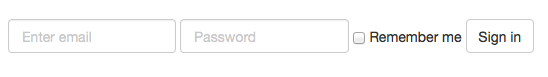
Note the addition of the class "form-inline" to the form element, and that of "sr-only" to the label, this last class has to do with the Accessibility part of the framework. The use of a label is optional with inline forms, however it's highly encouraged and doesn't hurt anyone. And by the way, the "sr-only" stands for Screen Reader only. So screen readers will find the label and "say it" to the user.
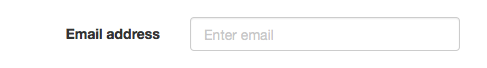
Lastly, to create a horizontal form you simply set the width of the label by setting it's "col-md-" or "_sm" or whatever and the corresponding "control-label" class, just as with version two., and then wrap the input in a container with its own column width specified.
<form class="form-horizontal">
    <div class="form-group">
        <label class="col-md-2 control-label" for="email">Email address</label>
        <div class="col-md-3">
            <input type="email" class="form-control" placeholder="Enter email">
        </div>
    </div>
</form>
And the resulting form.
There are some other changes that have been made in regard to forms, like the removal of "input-prepend" and "input-append" classes, in favor of "input-group" and "input-group-addon". However, there's a lot more to cover yet, so for details on that, please refer to the documentation.
Glyphicons
Another area where you're going to find major changes is in the framework's icons. The icon library includes 40 new glyphs, and not only that, they switched from using images to fonts, so now instead of adding the two "glyphicons-*" images to your "img" folder, you'll have to add the four "glyphicons" fonts to your "fonts" directory, and yes, four of them. This has to do with the browser's compatibility.
For performance reasons, every icon requires a base class and a icon specific class. So now, to add a user icon you'd use:
<span class="glyphicon glyphicon-user"></span>
The switch from images to fonts, gives control to icon coloring and sizing, and also allows you to replace the default icons with some custom ones you may like. If you happen to wonder where you might find such font icons, Fontello is a great resource.
JavaScript Components
Although redesigned and recreated, the JavaScript Components in Bootstrap 3.0 keep the same names and usage. With a couple of slightly and not that gentle differences.
Modals
Perhaps one of the most used plugins in Bootstrap is Modals. You'll find it is quite similar, with the differences being that the containers "modal-header", "modal-body" and "modal-footer" are not wrapped inside a "modal-content" inside a "modal-dialog" container. So what used to be:
<div class="modal hide fade">
    <div class="modal-header"></div>
    <div class="modal-content"></div>
    <div class="modal-footer"></div>
</div>
Changes to:
<div class="modal fade">
    <div class="modal-content">
        <div class="modal-dialog">
            <div class="modal-header"></div>
            <div class="modal-content"></div>
            <div class="modal-footer"></div>
        </div>
    </div>
</div>
Yes, it's a little more markup, but it improves the responsiveness of the component and also allows it to scroll the whole viewport instead of having a "max-height" parameter.
To trigger them via JavaScript, you'd use the same method as before.
$( '#my-modal' ).modal('show');
The rest of the plugins remain mostly the same. On a special note, the accordion is gone in favor of collapsible panels, they work pretty much the same and have a very similar syntax. With some classes changing a bit, they still require the transitions plugin and don't require any extra containers.
Also, the Typeahead plugin has disappeared from Bootstrap in favor of Twitter's Typeahead plugin.
Events
JavaScript events are now namespaced, but what does mean to you? Well, in Bootstrap two, to listen for the moment when some alert in your site was "close", you'd add:
$( '#my-alert' ).bind( 'close', function() {});
Now in this third version, the event name has changed, it is namespaced to the framework, so the previous snippet would be:
$( '#my-alert' ).bind( 'close.bs.alert', function() {});
Go ahead and take a look at the rest of the JavaScript Components Bootstrap has to offer (which, are still dependent on jQuery).
New components
There are a couple new components in the CSS part of the framework, list groups and panels.
List Groups
List groups, from the official documentation.
... are a flexible and powerful component for displaying not only simple lists of elements, but complex ones with custom content.
To create a list group simply create an unordered list with a "list-group" class, and add the "list-group-item" to every list item.
<ul class="list-group">
    <li class="list-group-item">Lorem ipsum...</li>
    <li class="list-group-item">Dolor sit...</li>
</ul>
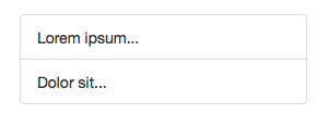
You can add the "active" class to any item in the list to highlight it, also if you happen to place a badge inside it, it will be centered vertically and align it to the right, inside the item. Go ahead and try it.
Panels
Panels are a way to box in some content in your site or application, highlight it and give it a sense of unity. The panel markup is fairly simple, and its contents can be combined with different elements to achieve a unique look and feel.
Panels can have headers and footers and get a special meaning with the well known "sucess", "error", "warning", etc. classes. For instance.
<div class="panel panel-success">
    <div class="panel-heading">Panel Heading</div>
    <div class="panel-body"><p>Some content here</p></div>
    <ul class="list-group">
        <li class="list-group-item">Lorem ipsum...</li>
        <li class="list-group-item">Dolor sit...</li>
    </ul>
</div>
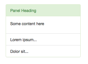
As you can see, panels work well with list groups, and also with non-bordered tables.
Customizer
Also new in this version is the Customizer in which, not only the look has changed, is far better organized and gives you control on things like the viewport width at which a certain Grid System takes control.
As always, you can set all your fonts styles and colors. It's a huge topic on its own so I'd encourage you to go on your own and mess with it.
Browser Support
Long has been the suffering brought to all of us by Internet Explorer, it's version six was a total nightmare and its predecessors still have a lot of catching up to do. In version 2.* Bootstrap's team still supported the version seven of Microsoft's browser. In this new iteration of the framework, support for IE seven is gone, as well as for Mozilla Firefox 3.6 and below.
Specifically, Bootstrap supports the latest version of all the major browsers (Safari, Opera, Chrome, Firefox and IE), in both Windows and Mac when there are both.
For IE, it supports version eight and forward, and although there are some properties that the browser doesn't render, such as "border-radius", the framework is fully functional only with some minor look and feel differences. Also IE eight requires respond.js for media query support.
To get a detailed list of workarounds and gotchas for the different browsers (cough Internet Explorer cough) look at the official docs.
Conclusion
Since its beginning, Bootstrap has been a great tool for rapid prototyping and creation of great sites and web applications and this third version is no different. If you need just one reason to use it, I would definitely go for the Grid System, with the growth of mobile browsing and the always increasing viewport sizes out there, responsiveness is a must now, more than ever. And in this latest version, that's the area where Bootstrap shines the most.
If you need help getting started, try one of the easy-to-use Bootstrap templates available on Envato Market.

Comments