There are probably hundreds of iPhone applications related to photography and film now, yet only a small selection of them have really made it. In this article, we'll be looking at five different iPhone camera applications (including the official iOS 'Camera' app) and examining the pros and cons of their design.
The following applications have all done reasonably well; if not extraordinarily well. This is because of two simple factors: a good final product (the photos or videos look good), and a visually appealing and easy to use user interface. Let's get started, shall we?
Camera
Overview
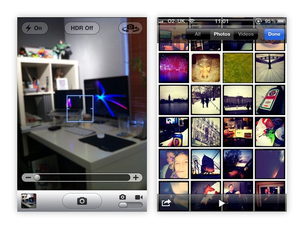
The 'Camera' app is the standard application that comes preinstalled on the iPhone for taking photographs and recording footage.
UI Design
As this is the standard application for photographs, it was designed by Apple. As you might expect, this means we are provided with a basic but sleek interface. As the design is based purely on the elements from Apple's iPhone UIKit, it is incredibly easy to use, especially as there are only a few functions.
The second screen is the page you will be shown when clicking on your latest photo thumbnail; which is exactly the same as the official "Photos" app (also installed by default on the iPhone). This tiled wall design is simple to use, with additional buttons to allow you to select multiple photos, view them by 'All', 'Photos' or 'Videos', and start a slideshow.
- Photo/Video Switch - A great looking switch with simple icons that allow the user to easily understand how it works.
- Shutter Button - Being larger than any other button in the interface makes it clear that this is the shutter button. The dark icon really emphasizes what this button does.
- Zoom Slider - This element is clear and to the point. The '-' and '+' sign at either side clearly explain what the slider does.
- Image Thumbnail - This miniature image thumbnail displays your latest photo and, when tapped, takes you directly to your captured images.
- Setting Buttons - These buttons are clear and out of the way. The use of icons and simple typography make them easy to understand.
The official Camera app interface is simple and incredibly user-friendly. As an Apple designed application, we should expect nothing less!
Camera+
Overview
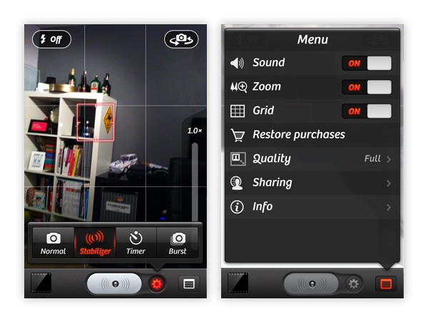
The Camera+ app offers everything the default 'Camera' app offers -and more (hence the '+' in the application's name). The application allows you to turn on a stabilizer (only takes the photo when the iPhone is held still) and also sports timers and bursts. Further, it gives you the option to turn specific features on or off and allows you to edit your photos (brightness, contrast, color overlays, etc) quickly.
UI Design
In terms of design, the application uses an approach similar to the default 'Camera' application, but with a darker theme. Similar buttons are placed around the same location.
- Settings Button - The small settings button next to the shutter button allows the user to quickly and easily turn on some of the commonly used settings. A lovely red glow appears when a setting in the menu is active/turned on.
- Settings Menu Button - As this application doesn't support video recording, the switch we looked at in the default photo app isn't displayed. Instead, it has been replaced with a button that takes you to the main settings menu.
- Shutter Button - The shutter button in this app is a little different from the original camera app. You'll notice there is what looks like a little LED light. This flashes when the stabilizer mode is active. A great little design feature!
- Settings Menu Icons - These icons really help to improve the menu, giving the user a graphic reference to each menu item.
- On/Off Switches - The on/off switches take on a similar appearance to the switches you'll find in the iPhone's default UIKit (in the Settings menu for example), but are edited in minor ways to fit in well with the design. A great idea as the user will already be familiar with using this type of interface.
Not only is this a great little application for giving you a few extra settings when snapping away with your iPhone, it is also well designed, taking on many modern effects to create an easy to understand application.
Overview
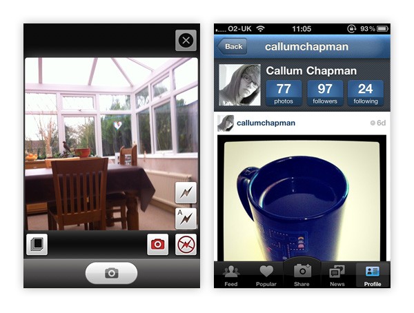
Instagram is a nifty little iPhone application that allows you to take photographs and then apply effects to them from a small list of pre-existing filters. It's a very simple application. While it doesn't have a ton of features, one really sticks out: it will upload your photo and automatically tweet or post to several sites online.
UI Design
The design of it is again based on the default Apple Camera app, making users who have never used the application before relatively comfortable with it immediately.
- Setting Buttons - The setting buttons in the capture screen make use of the extra space created by the way all the photos Instagram produces are squared. This allows the bottom bar to be dedicated to the shutter button.
- Focusing - Focusing in the app isn't as obvious compared to other camera apps, but it works in the exact same way. Tapping the screen to focus will bring up a small box allowing the user to focus on different areas.
- Texture - In all screens but the capture screen, texture is used in the title bars and several buttons. This gives the design more depth and generally makes it nicer to look at. It's also a great fit for the app as the effects that can be applied to photos are often meant to look vintage and retro.
- Five Tabs - Most UI designs tend to have four tabs in the tab bar, but in this case we have five. The center tab "Share" is the main focal points of all the tabs as it is the one that allows you to take a new photo. The round extension on the top of this icon looks and works great.
Overall, the Instagram design looks great. It combines modern, sleek styles with noise and texture to create a unique look. It's also easy to use.
Hipstamatic
Overview
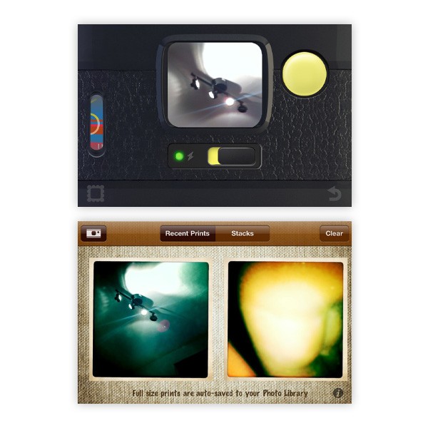
Hipstamatic is a great photography application that allows you to simulate the effects of old lenses, films, and flashes. The application comes with several pre-installed kits, but more can be purchased if these aren't enough for you!
UI Design
The design of this application is just brilliant. You can see the front and back of the camera itself, which is actually where you can change the lens and flashes. You can also open the back of the camera to change the film type.
When not using the camera interface, your recent photos (or "prints") can be viewed on a lovely textured interface. The camera store is also well designed!
- Texture - This user interface design makes superb use of texture, from the leather of the camera grip to the fabric textures used in the recent photos screen.
- Different Structure - Considering the application uses a different wireframe compared with the "norm", the application is relatively easy to come to grips with.
- Icons - Icons are used throughout the application as a main way of getting around the app's different menus and screens. When using the app for the first time, this can be more of a guessing game, but once you're use to what each icon does, it's super simple to use and looks awesome!
- LED Lights - Little lights are used throughout the application to tell you when things are on and/or ready to be viewed; a lovely little feature.
All in all this application is superb, and well deserves to be one of the top selling iPhone apps of all time. It produces fantastic results, and in general it is a joy to use thanks to its gorgeous interface.
8mm

Overview
8mm is a little different from the other applications in this showcase as it doesn't actually take still photographs. Instead, it only does video footage. The idea of the application is to produce a vintage effect as if the film was recorded onto a reel using an 8mm camera.
UI Design
Being an app that films vintage-style footage, the interface is also rather vintage looking. What you see here is what you get: everything that looks like it does something most probably does, including the wheel on the right hand side.
- Screen - The screen itself deserves a mention. Whilst in live view and recording your footage, the effect that will be applied to your film is actually what you see whilst recording, unlike most other photo and video applications where the effects/filters are applied after the initial shot.
- Texture - The textures used in the camera's main interface (capture screen) adds real depth to the app, making it look like a real 8mm camera.
- Metal Effects - Some really good techniques have been used to produce both shiny and brushed metal effects in the design, making it look much more lifelike and usable.
- Repeated Pattern - A really lovely repeated damask pattern has been used in the background of the "My Reels" page. Other than this, things are kept super simple here, but the pattern brings it all to life! If you want to use patterns like this in your work, be sure to check out the Decorative Patterns category on our very own GraphicRiver.
In conclusion, just like the Hipstamatic application, 8mm is an absolute joy to use. Its vintage design is fun to use, and, more importantly, the outcome of the recorded footage is excellent!
Conclusion
Based on what we've just seen, it's clear that an application does a million times better if it is well designed. A good looking application suggests it has been well researched, and if a lot of time and money was spent on the design, the chances are the same has been done with development.
They say you shouldn't judge a book by its cover...but can you judge an application by its user interface? What do you think?
Post your answers and thoughts in the comments section below!

Comments