In this tutorial I will show you how to use JavaScript and the canvas as a means to display numerical information in the form of pie charts and doughnut charts.
There are easier ways to create charts than coding one from scratch, for example this complete charting library from CodeCanyon.
But if you want to know what goes on behind the scenes in a library like this, read on.
What Is a Pie Chart?
A chart is a statistical tool used to graphically represent numerical data. A pie chart displays that numerical data as a circle divided into slices. The size of each slice is proportional to the numeric value that it stands for.
What Is a Doughnut Chart?
To put it simply, a doughnut chart is a variation on the pie chart. The difference is that the slices are cut towards the center of the pie such that only the rim is visible. In this way, the chart looks like a doughnut and therefore the name.
Start Drawing With the Canvas
Before drawing the pie chart, we will take a look at drawing its parts. We will see how we can use the canvas component and JavaScript to draw:
- a line
- an arc (a part of a circle)
- a color-filled shape
To start drawing using the HTML5 canvas, we'll need to create a few things:
- One folder to hold the project files; let's call this folder
piechart-tutorial. - One HTML file
index.htmlinside thepiechart-tutorialfolder. This file will contain the HTML code. - One JS file
script.jsinside thepiechart-tutorialfolder. This file will contain our JavaScript code.
We'll keep things very simple and add the following code inside index.html:
<html>
<body>
    <canvas id="myCanvas"></canvas>
	<script type="text/javascript" src="script.js"></script>
</body>
</html>
We have the <canvas> element with the ID myCanvas so that we can reference it in our JS code. We then load the JS code via the <script> tag.
Inside script.js, the JS code will first get a reference to the canvas and then set its width and height. To draw on the canvas, we only need a reference to its 2D context which contains all the drawing methods.
var myCanvas = document.getElementById("myCanvas");
myCanvas.width = 300;
myCanvas.height = 300;

var ctx = myCanvas.getContext("2d");
Now that we have canvas set up and also a reference to the drawing canvas, let's define a few JavaScript functions that we will be able to reuse when drawing the pie chart. We will add the functions in our script.js file.
function drawLine(ctx, startX, startY, endX, endY){
    ctx.beginPath();
	ctx.moveTo(startX,startY);
	ctx.lineTo(endX,endY);
	ctx.stroke();
}
The drawLine function takes five parameters:
-
ctx: reference to the drawing context -
startX: the X coordinate of the line starting point -
startY: the Y coordinate of the line starting point
-
endX: the X coordinate of the line end point
-
endY: the Y coordinate of the line end point
We start drawing the line by calling beginPath(). This informs the drawing context that we are starting to draw something new on the canvas. We use moveTo() to set the starting point, call lineTo() to indicate the end point, and then do the actual drawing by calling stroke().
Let's now see how we can draw a part of a circle, also called an arc.
function drawArc(ctx, centerX, centerY, radius, startAngle, endAngle){
    ctx.beginPath();
	ctx.arc(centerX, centerY, radius, startAngle, endAngle);
	ctx.stroke();
}
The drawArc function takes six parameters:
-
ctx: reference to the drawing context -
centerX: the X coordinate of the circle center -
centerY: the Y coordinate of the circle center -
radius: the X coordinate of the line end point -
startAngle: the start angle in radians where the portion of the circle starts -
endAngle: the end angle in radians where the portion of the circle ends
We've seen how to draw a line and how to draw an arc, so now let's see how to draw a colored shape. Since our goal is to draw a pie chart that is made up of slices, let's create a function that draws a pie slice.
function drawPieSlice(ctx,centerX, centerY, radius, startAngle, endAngle, color ){
    ctx.fillStyle = color;
	ctx.beginPath();
	ctx.moveTo(centerX,centerY);
	ctx.arc(centerX, centerY, radius, startAngle, endAngle);
	ctx.closePath();
	ctx.fill();
}
The drawPieSlice function takes seven parameters:
-
ctx: reference to the drawing context -
centerX: the X coordinate of the circle center -
centerY: the Y coordinate of the circle center -
radius: the X coordinate of the line end point -
startAngle: the start angle in radians where the portion of the circle starts -
endAngle: the end angle in radians where the portion of the circle ends -
color: the color used to fill the slice
Here is an example for calling three functions:
drawLine(_ctx,100,100,200,200);
drawArc(_ctx, 150,150,150, 0, Math.PI/3);
drawPieSlice(_ctx, 150,150,150, Math.PI/2, Math.PI/2 + Math.PI/4, '#ff0000');
It will produce this result:

Now we have all the tools necessary to draw a pie chart, so let's see how we use them together.
Drawing the Pie Chart
Conceptually, any chart has two main parts:
- The data model contains the numerical data to be represented. This is structured in a format specific to the type of chart.
- The graphical representation is how the numerical data in the data model gets represented by visual elements according to some rules in the form of math formulas.
The Pie Chart Data Model
The most common way to structure the data model for pie charts is a series of categories and corresponding values, where each of the categories and values are associated to a slice of the pie.
As an example, the data model of a pie chart displaying the number of vinyls I have grouped by genre would look something like:
- Classical music: 10
- Alternative rock: 14
- Pop: 2
- Jazz: 12
We can add a JS object to the script.js file to store the data model like this:
var myVinyls = {
    "Classical music": 10,
	"Alternative rock": 14,
	"Pop": 2,
	"Jazz": 12
};
The Pie Chart Graphical Representation
The pie chart uses a circle to display the information in the data model by dividing it into slices. Each slice corresponds to a category from the data model, and the size of the slice is proportional to the category value.
My small collection of 38 vinyls has four categories. Each category will get a slice of the pie chart proportional to the number of vinyls in that category.
But how do we measure the size of a slice? That's easy—we do that by the angle at the tip of the slice. All we have to know is that the full circle corresponds to an angle of 360 degrees or 2 * PI. So half a circle would be 180 deg or PI, a quarter 90 deg or PI/2, and so on.
For determining the angle for each category slice, we use the formula:
slice angle = 2 * PI * category value / total value
According to this formula, the ten classical music vinyls will get a slice angle of approx. 0.526 * PI or 94 deg.
Let's get to drawing. For this we will use a JavaScript class which we will name Piechart. The constructor will receive one options argument, an object containing the following:
- canvas: reference to the canvas where we want to draw the pie chart
- data: reference to an object holding the data model
- colors: an array holding the colors we want to use for each slice
The Piechart class also contains one method draw() which does the actual drawing of the chart.
var Piechart = function(options){
    this.options = options;
	this.canvas = options.canvas;
	this.ctx = this.canvas.getContext("2d");
	this.colors = options.colors;

	this.draw = function(){
		var total_value = 0;
		var color_index = 0;
		for (var categ in this.options.data){
			var val = this.options.data[categ];
			total_value += val;
		}

		var start_angle = 0;
		for (categ in this.options.data){
			val = this.options.data[categ];
			var slice_angle = 2 * Math.PI * val / total_value;

			drawPieSlice(
				this.ctx,
				this.canvas.width/2,
				this.canvas.height/2,
				Math.min(this.canvas.width/2,this.canvas.height/2),
				start_angle,
				start_angle+slice_angle,
				this.colors[color_index%this.colors.length]
			);

			start_angle += slice_angle;
			color_index++;
		}

	}
}
The class starts by storing the options passed as parameters. It stores the canvas reference and creates a drawing context also stored as a class member. Then it stores the colors array passed as options.
The next part is the most consistent, the draw() function. This will draw the data from the data model. First it calculates the sum of all values in the data model. Then, for each category in the data model we apply the formula mentioned above for calculating the pie slice angle. Finally we use the drawPieSlice() function using the center of the canvas as the center of the slice. As a radius we use the minimum value between half of the canvas width and half of the canvas height since we don't want our pie to go out of the canvas.
We also offset the start and end angle of the slices each time we draw a category, otherwise the slices would overlap.
To use the class, we have to create an instance and then call the draw() method on the created object.
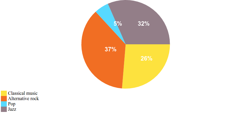
var myPiechart = new Piechart(
    {
		canvas:myCanvas,
		data:myVinyls,
		colors:["#fde23e","#f16e23", "#57d9ff","#937e88"]
	}
);
myPiechart.draw();
And the result looks like this

Drawing the Doughnut Chart
We've seen how to draw the pie chart. We also know that a doughnut chart differs only by having a hole in the middle of the chart. How do we draw the hole? We can draw a white circle over the pie chart.
Let's modify the code of the Piechart class to do that.
var Piechart = function(options){
    this.options = options;
	this.canvas = options.canvas;
	this.ctx = this.canvas.getContext("2d");
	this.colors = options.colors;

	this.draw = function(){
		var total_value = 0;
		var color_index = 0;
		for (var categ in this.options.data){
			var val = this.options.data[categ];
			total_value += val;
		}

		var start_angle = 0;
		for (categ in this.options.data){
			val = this.options.data[categ];
			var slice_angle = 2 * Math.PI * val / total_value;

			drawPieSlice(
				this.ctx,
				this.canvas.width/2,
				this.canvas.height/2,
				Math.min(this.canvas.width/2,this.canvas.height/2),
				start_angle,
				start_angle+slice_angle,
				this.colors[color_index%this.colors.length]
			);

			start_angle += slice_angle;
			color_index++;
		}

        //drawing a white circle over the chart
        //to create the doughnut chart
		if (this.options.doughnutHoleSize){
			drawPieSlice(
				this.ctx,
				this.canvas.width/2,
				this.canvas.height/2,
				this.options.doughnutHoleSize * Math.min(this.canvas.width/2,this.canvas.height/2),
				0,
				2 * Math.PI,
				"#ff0000"
			);
		}

	}
}
The added code looks in the options parameter for a member variable doughnutHoleSize. If this doesn't exist in the options then the code will draw the pie chart as before, but if it does exist then a white circle is drawn with the same center as the pie chart.
The radius of the circle is determined by multiplying the pie chart radius and the value of doughnutHoleSize. This should be a number between 0 and 1, where 0 will result in a pie chart and any values higher than 0 would result in a doughnut with the hole larger and larger, 1 making the chart invisible.
To draw a doughnut chart with a hole half the size of the chart, we would need to use a doughnutHoleSize of 0.5 and make the following calls:
var myDougnutChart = new Piechart(
    {
		canvas:myCanvas,
		data:myVinyls,
		colors:["#fde23e","#f16e23", "#57d9ff","#937e88"],
		doughnutHoleSize:0.5
	}
);
myDougnutChart.draw();
And here is the result:

Adding Labels and a Chart Legend
Our pie chart and doughnut chart look pretty good, but we can make them even better by adding two things:
- value labels: showing the percentage corresponding to each slice
- a chart legend: showing the categories and their corresponding colors in the chart
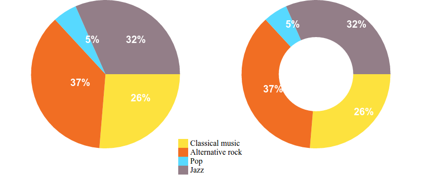
Usually, values associated with the slices are represented as percentage values calculated as 100 * value associated to a slice / total value, with the whole circle representing 100%.
For example, in the case of our sample data, vinyls with classical music would represent approximately 26%. It would be nice to be able to write that value right on the corresponding slice. To do that, we will use the fillText(text,x,y) function of the drawing context. This function takes three parameters: the text and the x and y coordinates.
How do we calculate the x and y coordinates at which to place the text? We have to make use of some geometry knowledge and something called polar coordinates. Basically, polar coordinates use a radius and an angle to define the position of a point. The two formulas we will use are:
x = R * cos(angle)
y = R * sin(angle)
We will apply these two formulas to place the text halfway along the pie chart radius and halfway around the angle for each pie slice. To do this, we need to modify our Piechart class and add the following code right after the if (this.options.doughnutHoleSize){...} block:
        ...
        start_angle = 0;
		for (categ in this.options.data){
			val = this.options.data[categ];
			slice_angle = 2 * Math.PI * val / total_value;
			var pieRadius = Math.min(this.canvas.width/2,this.canvas.height/2);
			var labelX = this.canvas.width/2 + (pieRadius / 2) * Math.cos(start_angle + slice_angle/2);
			var labelY = this.canvas.height/2 + (pieRadius / 2) * Math.sin(start_angle + slice_angle/2);

			if (this.options.doughnutHoleSize){
				var offset = (pieRadius * this.options.doughnutHoleSize ) / 2;
				labelX = this.canvas.width/2 + (offset + pieRadius / 2) * Math.cos(start_angle + slice_angle/2);
				labelY = this.canvas.height/2 + (offset + pieRadius / 2) * Math.sin(start_angle + slice_angle/2);
			}

			var labelText = Math.round(100 * val / total_value);
			this.ctx.fillStyle = "white";
			this.ctx.font = "bold 20px Arial";
			this.ctx.fillText(labelText+"%", labelX,labelY);
			start_angle += slice_angle;
		}
        ...
The code goes over each slice, calculates the percentage, calculates the position, and uses the fillText() method to draw it on the chart. We have used the fillStyle property to set the text color to white and the font property to set the size, style and font family of the label. It's also important to note that if the chart is a doughnut chart and the doughnutHoleSize is set, then the label will be pushed towards the edge of the chart to make it centered on the doughnut slice.
And here's how the resulting charts look with the value labels:
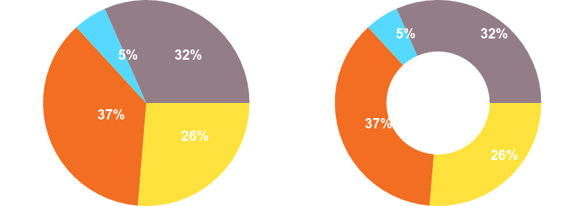
To complete our chart, the last thing we will add is the chart legend. Our chart legend will display the categories of our data model and the color used for the corresponding slice. First we have to make some modifications to our index.html file by adding a <div> tag that will store our legend element.
<html>
<body>
    <canvas id="myCanvas"></canvas>
	<div id="myLegend"></div>
	<script type="text/javascript" src="script.js"></script>
</body>
</html>
Then in script.js we add the code that creates the content of the legend element. We add this code at the end of the draw() function of the Piechart class:
...
if (this.options.legend){
color_index = 0;
var legendHTML = "";
for (categ in this.options.data){
legendHTML += "<div><span style='display:inline-block;width:20px;background-color:"+this.colors[color_index++]+";'> </span> "+categ+"</div>";
}
this.options.legend.innerHTML = legendHTML;
}
...
The code looks for a legend element passed via the options parameter. If one is supplied, this element is filled in with the HTML code containing a colored box and the name of the data model category.
We also need to make a change to the way we call the drawing of our pie chart like this:
var myLegend = document.getElementById("myLegend");

var myDougnutChart = new Piechart(
    {
		canvas:myCanvas,
		data:myVinyls,
		colors:["#fde23e","#f16e23", "#57d9ff","#937e88"],
		legend:myLegend
	}
);
myDougnutChart.draw();
And here is the resulting chart and chart legend:
Congratulations
We have seen that drawing charts using the HTML5 canvas is actually not that hard. It only requires a bit of math and a bit of JavaScript knowledge. You now have everything you need for drawing your own pie charts and doughnut charts.
If you want a quick and easy solution for creating not only pie charts and doughnut charts but loads of other types of charts, you can download the Infographic Charts and Graphics HTML Tags Library or its WordPress plugin counterpart Charts and Graphs WordPress Visual Designer.

Comments