Today, I'd like to show you a neat trick. We'll create a document icon with pure CSS3. Even better, this effect will only require a single HTML element.
The Game Plan
- Create a square box
- Round the edges
- Use pseudo elements to create a curled corner
- Create the illusion of text with a striped gradient
Let's get started!
Step 1: Create a Box
We'll begin by adding our single HTML element: an anchor tag. This makes sense, as most icons also serve to be links.
<a class="docIcon" href="#">Document Icon</a>
Let's set the somewhat arbitrary dimensions for our icon. We'll do 40x56px - simply for this demo. In a real world application, you'll likely want to reduce this! Also, keep in mind that we need to add display: block, since all anchor tags are inline, by default.
.docIcon
{
    background:#eee;
    background: linear-gradient(top, #ddd 0, #eee 15%, #fff 40%, #fff 70%, #eee 100%);
    border:1px solid #ccc;
    display:block;
    width:40px;
    height:56px;
    position:relative;
    margin:42px auto;
}
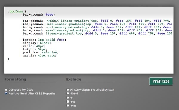
Note that, above, we're setting a positioning context in order to work with pseudo elements shortly. You'll find that I've only used the official CSS3 syntax for the gradient. You'll likely want to use the various browser prefixes as well. To speed things up, you can use Prefixr.com, or its API in your favorite code editor. Simply copy the code snippet above, paste it into Prefixr's textarea, and click enter. It'll then spit out all of the various prefixized properties, like so:
.docIcon {
	background: #eee;

	background: -webkit-linear-gradient(top, #ddd 0, #eee 15%, #fff 40%, #fff 70%, #eee 100%);
	background: -moz-linear-gradient(top, #ddd 0, #eee 15%, #fff 40%, #fff 70%, #eee 100%);
	background: -o-linear-gradient(top, #ddd 0, #eee 15%, #fff 40%, #fff 70%, #eee 100%);
	background: -ms-linear-gradient(top, #ddd 0, #eee 15%, #fff 40%, #fff 70%, #eee 100%);
	background: linear-gradient(top, #ddd 0, #eee 15%, #fff 40%, #fff 70%, #eee 100%);

	border: 1px solid #ccc;
	display: block;
	width: 40px;
	height: 56px;
	position: relative;
	margin: 42px auto;
}
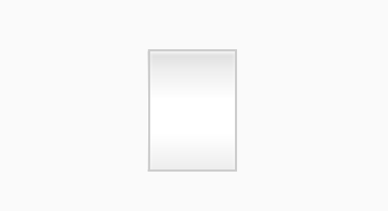
Next, let's add some shine using CSS box shadows. I've also used the text-indent property to hide the text.
.docIcon
{
   ...
    -webkit-box-shadow:inset rgba(255,255,255,0.8) 0 1px 1px;
    -moz-box-shadow:inset rgba(255,255,255,0.8) 0 1px 1px;
    box-shadow:inset rgba(255,255,255,0.8) 0 1px 1px;

    text-indent:-9999em;
}
So Far, We Have:
Step 2: Rounded Corners
Next, we need to create a rounded corner effect. Add the following:
.docIcon
{
    ...
    -webkit-border-radius:3px 15px 3px 3px;
    -moz-border-radius:3px 15px 3px 3px;
    border-radius:3px 15px 3px 3px;
}
By passing four values, we can specify the top, right, bottom, and left radii, accordingly. This is similar to the way you would apply margins or padding.
Which Gives Us...
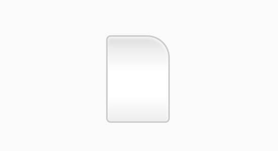
Step 3: One Curled Corner
To create the illusion of a curled corner, we'll use generated content, or pseudo elements.
First, add content :before our icon. In this case, we don't require any specific text. Instead, we need to create a 15px box, and apply a background gradient.
.docIcon:before {
	content: "";
	display: block;
	position: absolute;
	top: 0;
	right: 0;
	width: 15px;
	height: 15px;
	background: #ccc;

	background: -webkit-linear-gradient(45deg, #fff 0, #eee 50%, #ccc 100%);
	background: -moz-linear-gradient(45deg, #fff 0, #eee 50%, #ccc 100%);
	background: -o-linear-gradient(45deg, #fff 0, #eee 50%, #ccc 100%);
	background: -ms-linear-gradient(45deg, #fff 0, #eee 50%, #ccc 100%);
	background: linear-gradient(45deg, #fff 0, #eee 50%, #ccc 100%);

	-webkit-box-shadow: rgba(0,0,0,0.05) -1px 1px 1px, inset white 0 0 1px;
	-moz-box-shadow: rgba(0,0,0,0.05) -1px 1px 1px, inset white 0 0 1px;
	box-shadow: rgba(0,0,0,0.05) -1px 1px 1px, inset white 0 0 1px;

	border-bottom: 1px solid #ccc;
	border-left: 1px solid #ccc;
}
In order for our generated content to also receive the top-right rounded edge, we must, again, apply the same radii to align it.
...
-webkit-border-radius:3px 15px 3px 3px;
-moz-border-radius:3px 15px 3px 3px;
border-radius:3px 15px 3px 3px;
Tada!
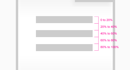
Step 4: Adding Lines
Next, we're going to use the :after psuedo element to add some dashed lines to represent zoomed out text. Apply a width of 60%, and a margin-left and margin-right of 20% (which equals 100%). Next, we specify a height and position it at 0 0.
.docIcon:after
{
    content:"";
    display:block;
    position:absolute;
    left:0;
    top:0;
    width:60%;
    margin:22px 20% 0;
    height:15px;
}
Creating a set of lines is a bit tricky. If we're clever, though, we can use CSS gradients to achieve this effect. First, divide the total height by five, and set each block with a solid fill. Refer to the image below for a clearer exemplification of this thinking. Nifty, ay? It's a nice technique to have in your toolbelt.
Multiple Lines (Stripes) with CSS3 Gradienst
.docIcon:after
{
    ...
    background:#ccc;
    background: -webkit-linear-gradient(top, #ccc 0, #ccc 20%, #fff 20%, #fff 40%, #ccc 40%, #ccc 60%, #fff 60%, #fff 80%, #ccc 80%, #ccc 100%);
    background: -moz-linear-gradient(top, #ccc 0, #ccc 20%, #fff 20%, #fff 40%, #ccc 40%, #ccc 60%, #fff 60%, #fff 80%, #ccc 80%, #ccc 100%);
    background: -o-linear-gradient(top, #ccc 0, #ccc 20%, #fff 20%, #fff 40%, #ccc 40%, #ccc 60%, #fff 60%, #fff 80%, #ccc 80%, #ccc 100%);
    background: -ms-linear-gradient(top, #ccc 0, #ccc 20%, #fff 20%, #fff 40%, #ccc 40%, #ccc 60%, #fff 60%, #fff 80%, #ccc 80%, #ccc 100%);
    background:linear-gradient(top, #ccc 0, #ccc 20%, #fff 20%, #fff 40%, #ccc 40%, #ccc 60%, #fff 60%, #fff 80%, #ccc 80%, #ccc 100%);
}
We're Finished!
Did you enjoy the post? Have other similar tricks? If so, link to them in the comments below.

Comments