
In this tutorial, we're going to take a look at how to serve HTML5 forms to modern browsers, while compensating for older browsers by using a mix of Webforms2, Modernizr, jQuery UI and assorted jQuery Plugins.
Introduction
HTML5 powered forms provide a great deal of semantic markup, and remove the need for a lot of JavaScript.
One of the first efforts toward HTML5 was WHATWG's Web Forms 2.0, originally called XForms Basic. The spec introduced new form controls and validation, among other things. Later, it got incorporated into HTML5, and was subsequently stripped of the repetition model, resulting in what we know today as HTML5 Forms.
The ever-present issue, backward compatibility, still remains a headache though, unfortunately. Developers have to deal with the dreaded Internet Explorer, which, as you might have guessed, doesn't provide much support for the latest advancement in forms - even in the latest available beta of IE9. Older versions of IE? Fagetaboutit.
Nonetheless, we want to use these new features, and use them, we will! Today, we're going to look at some of these new elements. We'll check whether the browser support these features, and if not, provide fallbacks using CSS and JavaScript.
Tool: Modernizer
We'll be providing fallbacks only to browsers that don't support HTML5 forms, or certain parts of them. But instead of relying on browser sniffing, the proper technique is to use feature detection. We'll use the popular Modernizr library.
Modernizr is a small JavaScript library that tests the current browser against a plethora of HTML5 and CSS3 features.
If you want to learn more about Modernizr, you might check out "A Video Crash-Course in Modernizr" premium tutorial available on the Tuts+ Marketplace.
Tool: Webforms2
Webforms2 is a JavaScript library by Weston Ruter, which provides a cross-browser implementation of the "previous" version of HTML5 forms, the "WHATWG Web Forms 2.0" specification.
We'll be using it for validation and extending functionality for current elements.
<script type="text/javascript" src="webforms2/webforms2-p.js"></script>
Widget: Slider
The spec describes the range input as an imprecise control for setting the element's value to a string representing a number.
<input type="range" name="slider">
Here's a preview of how it looks in Opera 10.63:
To provide fallback for other browsers, we'll use jQuery UI's slider widget.
First, we create our initializing function, which creates the slider from the input range element.
var initSlider = function() {
	$('input[type=range]').each(function() {
		var $input = $(this);
		var $slider = $('<div id="' + $input.attr('id') + '" class="' + $input.attr('class') + '"></div>');
		var step = $input.attr('step');

		$input.after($slider).hide();

		$slider.slider({
			min: $input.attr('min'),
			max: $input.attr('max'),
			step: $input.attr('step'),
			change: function(e, ui) {
				$(this).val(ui.value);
			}
		});
	});
};
We create a new <div> element for each of our range inputs, and call the slider on that node. This is because jQuery UI's slider will not work by calling it directly on the input element.
Note that we're getting attributes from the input, such as
min, maxandstep,, and are then using them as parameters for the slider. This helps our fallback slider mimic the real HTML5 slider in functionality.
Next, we'll use Modernizr to determine if the current browser supports this input type. Modernizr adds classes to the document element (html), allowing you to target specific browser functionality in your stylesheet. It also creates a self-titled global JavaScript object which contains properties for each feature: if a browser supports it, the property will evaluate to true and if not, it will be false.
With that knowledge, to detect support for input types, we'll use Modernizr.inputtypes[type].
if( !Modernizr.inputtypes.range ){
	$(document).ready( initSlider );
};
If there's no support for the range input, we attach the initSlider function to jQuery's document.ready, to initialize our function after the page has loaded.
This is how the slider should look in a browser without native support for the range input.
Widget: Numeric Spinner
To quote Mark Pilgrim:
Asking for a number is trickier than asking for an email address or web address.
That's why we're provided with a separate form control which specifically deals with numbers: the numeric spinner, also called the numeric stepper.
<input type="number" value="2">
At the time of this writing, it is supported by Opera and Webkit-based browsers; here's a snapshot from Opera 10.6.
Because jQuery doesn't provide a numeric spinner, we'll instead use a jQuery plugin by Brant Burnett, built as a jQuery UI widget.
We implement the same technique as before; build out the function to create the spinner, test with Modernizr, and attach the function to $(document).ready.
var initSpinner = function() {
	$('input[type=number]').each(function() {
		var $input = $(this);
		$input.spinner({
			min: $input.attr('min'),
			max: $input.attr('max'),
			step: $input.attr('step')
		});
	});
};

if(!Modernizr.inputtypes.number){
	$(document).ready(initSpinner);
};
Because number inputs also support min, max and step, we get the attributes from the field, and use them as parameters for initializing the numeric spinner plugin.
And our fallback widget looks like so:
Widget: Date Picker
There are no less than six input types to serve as date pickers.
- date
- month
- week
- time
- datetime and
- and datetime-local
At the time of this writing, the only browser that properly supports them is Opera, versions 9+.
<input type="date">
<input type="month">
<input type="week">
<input type="time">
<input type="datetime">
<input type="datetime-local">
For now, we'll only provide fallback for the date input, using the jQuery UI Datepicker. Feel free to use any other plugin to completely mimic the functionality of the HTML5 date picker input in your implementation.
var initDatepicker = function() {
	$('input[type=date]').each(function() {
		var $input = $(this);
		$input.datepicker({
			minDate: $input.attr('min'),
			maxDate: $input.attr('max'),
			dateFormat: 'yy-mm-dd'
		});
	});
};

if(!Modernizr.inputtypes.date){
	$(document).ready(initDatepicker);
};

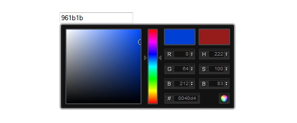
Widget: Color Picker
Right now, no browser provides support for the color input. So, until they catch up, they'll all need to use our fallback technique.
<input type="color">
We'll use Stefan Petre's ColorPicker jQuery plugin, since jQuery UI does not provide one with the base pack yet.
var initColorpicker = function() {
	$('input[type=color]').each(function() {
		var $input = $(this);
		$input.ColorPicker({
			onSubmit: function(hsb, hex, rgb, el) {
				$(el).val(hex);
				$(el).ColorPickerHide();
			}
		});
	});
};

if(!Modernizr.inputtypes.color){
	$(document).ready(initColorpicker);
};
And our result:
Input Type: Search
The new search input type is implicitly used for semantics, but could provide a lot of interesting functionalities in the future.
<input type="search">
Currently, only Webkit-based browsers offer support for this feature. The spec also supports a results attribute to display a number of searched terms in a dropdown.
It should look like this on Safari on OS X:
The rest of the browsers display this as a standard text field, so you may confidently use it with the standard markup.
Input Type : URL and Email
These two input types, url and email, are used for validation purposes. They can be particularly useful in mobile browsers, where the on-screen keyboard layout can be changed to suit the focused field. This is already implemented in Safari on iOS(iPhone, iPad, iPod), and some versions of Android.
<input type="email">
<input type="url">
These input types can be implemented by Webforms2 in other browsers.
You can freely use these types in your new projects, as they fallback to simple textboxes. On your phone, you'll find that the keyboard changes accordingly, if you supply these types to your inputs.
Attribute: Required Fields
The new spec introduces the very handy required attribute. Instead of using fancy JavaScript to take care of our required fields, now we can easily use this attribute.
<input type="email" required>
For browsers that don't support this attribute, we can again use Webforms2. So, since we've included it from the start, there's nothing to worry about.
Note: Be sure to assign a name attribute to your form elements, or the required attribute will not take effect.
Attribute: Pattern
The pattern attribute is used for field validation and accepts values only if they match a specific format, defined with regular expressions. If the entered value does not match the pattern, the form won't submit.
For example, to validate a phone number, we'd have to use the following pattern, or regular expression:
<input type="text" name="Tel" pattern="^0[1-689][0-9]{8}$">
The pattern attribute can be implemented in browsers that don't support it, by using Webforms2.
Attribute: Autofocus
The autofocus attribute does just what it says: automatically focuses one of our controls. It is currently supported in Webkit-based browsers(Safari, Chrome, etc.) and Opera. Remember: only one form control can receive this attribute.
<input type="email" autofocus>
Webforms2 takes care of the implementation in unsupported browsers.
Attribute: Placeholder
The placeholder attribute is something we've been doing with JavaScript for years. It adds a piece of information about the field, like a short description, that disappears when the field is focused.
<input name="name" placeholder="First Name">
This attribute is supported by the latest Beta Firefox and Webkit browsers.
To mimic the behavior in older browsers, we'll use the Placehold jQuery plugin, by Viget's Design Lab.
var initPlaceholder = function() {
	$('input[placeholder]').placehold();
};

if(!Modernizr.input.placeholder){
	$(document).ready(initPlaceholder);
};
Attribute: Min, Max and Step
The min, max and step input attributes specify constraints for certain form controls, such as the date picker, number, and range. You can surely guess the purpose of min and max from their names. The step attribute specifies the multiple range for each click, or "step." For isntance, if the step value is 2, the accepted values could be 0, 2, 4, and so on.
<input type="range" name="slider" min="0" max="20" step="5" value="0">
These attributes are only supported by Opera and Webkit browsers right now, and are implemented, as fallback for other browsers, by Webforms2.
Conclusion
We've learned today that creating forms and providing fallback for most of the new additions is a fairly easy task. If people are still trying to scare you from using HTML5 today, pay no attention to them; start using the awesome tools you have at your disposal right now!
Be sure to also check out Zoltan "Du Lac" Hawryluk's great html5Widgets, which provide similar solutions, with native JavaScript widgets.
Further Reading
- 28 HTML5 Features, Tips, and Techniques you Must Know
- HTML5 and CSS3: The Techniques you'll Soon be Using /a>
- The Forms section of Mark Pilgrim's Dive Into HTML5
- Forms in HTML5 on Mozilla's Developer Center
- The W3C HTML5 Forms Specification Working Draft
- Comparison of layout engines (HTML5) on Wikipedia

Comments