In last two tutorials of this series, we have discussed how filters and blend modes can completely change the appearance of images. In this tutorial, I will cover the basics of editing images by using both these properties together.
The Basics
Any non-primitive image editing usually requires more than just a single element. This can be accomplished with pseudo elements. Unfortunately, there is one more complication. The img element comes under replaced elements. As a result, :before and :after won't work with image tags. To resolve this issue, we will need a wrapper around our image, and the figure tag seems the best candidate in this case. Therefore, our markup should look like this:
<figure>
  <img src="image-url">
</figure>
All the editing effects that we will create will have some common core CSS.
figure {
  position: relative;
}

figure:before,
figure:after {
  content: '';
  height: 100%;
  width: 100%;
  top: 0;
  left: 0;
  position: absolute;
}

img {
  width: 100%;
  height: 100%;
  margin: 0;
  padding: 0;
}
I have used the :before and :after pseudo elements so that I can apply various blend modes. Notice that I have set the width and height to 100% to cover the figure properly, and I've used absolute positioning for perfect alignment.
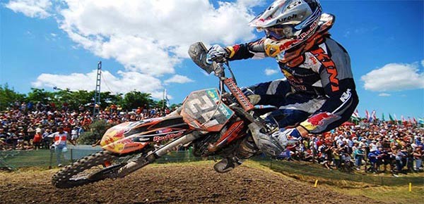
In most of the cases, we will be applying the filters on images and using blend modes and other effects on the pseudo elements. The image below is the original image that we will be editing.
High-Contrast Grayscale Images
To create a high-contrast image, you can just set the contrast to a higher value, but increasing the brightness makes the effect more dramatic. If you were to just use filters, then that's all you could do. However, with blend modes you can also add an inset box-shadow with overlay blending to the image for better results. Here is the CSS for this effect:
img {
  filter: contrast(1.8) brightness(1.5) grayscale(1);
}

figure:before {
  z-index: 3;
  mix-blend-mode: overlay;
  box-shadow: 0 0 200px black inset;
}
Adding a z-index keeps our pseudo elements above the image. I have used the overlay blend mode to keep the image slightly dark after application of the box-shadow.
Try hovering over the image below to see the difference between filters and a combo of filters and blend modes.
For practice, you may try out different values for the box-shadow property in the CodePen demo.
Giving Images an Older Look
Color in most old photos generally fades away, and they have a reddish-brown outer lining. To recreate the same effect, we will have to use more elements and filters. Here is our CSS:
img {
  filter: saturate(0.6);
}

figure {
  filter: contrast(1.1) saturate(1.9) sepia(0.7) grayscale(0.3);
}

figure:before {
  z-index: 2;
  mix-blend-mode: multiply;
  box-shadow: 0 0 250px brown inset;
  background: rgba(125, 100, 0, 0.3);
}

figure:after {
  z-index: 3;
  mix-blend-mode: hard-light;
  box-shadow: 0 0 150px pink inset;
  background: rgba(198, 155, 0, 0.3);
}
This time, I have applied filters on both the image as well as the figure. Basically, we want the image to be less colorful. This is achieved by using the saturate filter with a value lower than 1. The figure filters are applied after all the blending. If you don't apply these filters, the final result will have much more prominent shades of brown, which is undesirable.
You should note that I have also applied a semi-transparent reddish background on both the pseudo elements. This gives the images their reddish-brown look. The box-shadow is used to keep the outline comparatively more brown.
You should experiment with various properties in the demo to see if you can get better results.
Adding a Specific Hue
This time we will try to give our image a blue hue. Compared to warm colors, adding a shade of cool colors like blue makes images easy on our eyes.
This is the CSS that we need to apply:
img {
  filter: brightness(1.1) contrast(1.3);
}

figure:before {
  z-index: 2;
  mix-blend-mode: multiply;
  box-shadow: 0 0 100px rgba(100, 150, 200, 1) inset, 0 0 300px rgba(100, 150, 200, 1) inset;
}

figure:after {
  z-index: 3;
  mix-blend-mode: difference;
  background: rgba(0, 0, 255, 0.3);
}
I begin by increasing the brightness and contrast of our image. This will make sure that our image does not lose less prominent colors and become too dull during the editing.
You generally have to use multiple box-shadows with lighter colors for noticeable changes. That's why I add two bluish box-shadows to our image. Just using a box-shadow restricts the blue shade to the boundary of our image. To spread the blue color all over our image, I use it as background on the :after pseudo element. Here is the final result of all these filters:
Try adding a green or red hue to the image in the demo.
Yellowish Haze
Have you ever witnessed a slightly cloudy evening with sand particles suspended in the atmosphere because of the wind? In those weather conditions, everything has a yellowish hue, and objects seem to be a little dull. To recreate the same effect, we need the following CSS:
img {
  filter: saturate(0.2);
}

figure {
  filter: contrast(1.8) brightness(1.1) saturate(1.5);
}

figure:before {
  z-index: 2;
  mix-blend-mode: multiply;
  box-shadow: 0 0 100px rgba(0,0,0,0.5) inset;
  background: rgba(125, 100, 0, 0.3);
}

figure:after {
  z-index: 3;
  mix-blend-mode: hard-light;
  box-shadow: 0 0 500px rgba(0,0,0,0.6) inset;
  background: rgba(198, 155, 0, 0.3);
}
The first thing that I do is reduce the image saturation. Both the :before and :after pseudo elements have translucent yellowish backgrounds to add the desired hue. Using the hard-light blend mode on :after makes the haze more prominent.
The box-shadow on pseudo elements increases the focus on the biker. Finally, applying high contrast, brightness and saturation filters to our figure element reinforces the haze.
In the demo, you may try out different values for various properties to see how they affect the final result.
Final Thoughts
It's not that hard to edit images in CSS. If you keep the points I discussed in this tutorial in mind, you will be able to create some amazing filters of your own.
For practice, you can experiment with the demos in this tutorial or try to recreate popular Instagram filters. You can also check out the variety of animations and effects available in the Envato Marketplace in case you need some ready-to-use filters.

Comments