Now that we have been introduced Photoshop and a couple of the most essential tools, let’s put the first four tutorials in this series to good use and make a nice background for a mobile application. Designing app backgrounds differs from designing desktop backgrounds in at least one fundamental way: you have to strip out all unnecessary clutter and only provide the user with what is absolutely necessary. Read on to learn more!
I am starting with just one image that we will turn into a visually appealing background to be used as a mobile application home page / landing screen. The homepage is probably the single most important page on a site. More often than not, it is the first page your user will see, and if it isn’t appealing or easy to use, the user will go find something that is.
We are going to be utilizing all of the tools I covered in the previous three tutorials, so if you haven’t checked those out yet, I urge you to read them first now.
Here is the file that I am starting with:

- Open Photoshop and create a new document (File > New or Ctrl+N)
- In the ‘Name’ Field, name you document. In this case, I named mine ‘MobileBackground.’
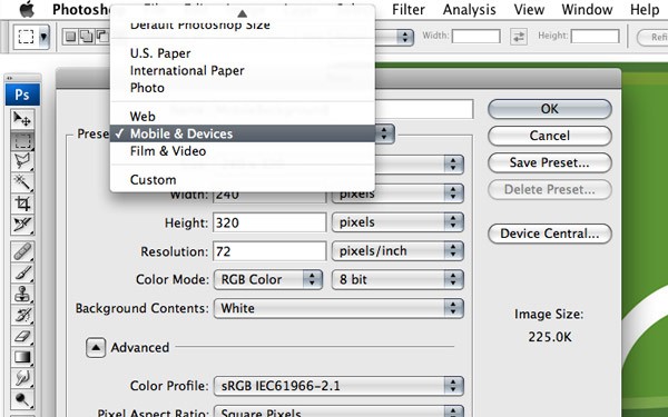
- Click the drop down box next to Preset to expand the options.
- For ease of use we are going to choose ‘Mobile & Devices’ from the Preset drop down.
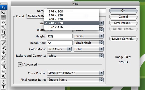
- From the Size drop down choose 240x320.
- Verify that the resolution is set to 72 and click OK.
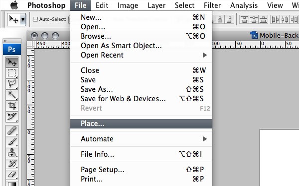
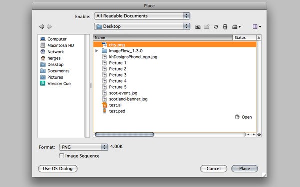
- Choose File > Place
- Choose the location of the image and click Place.
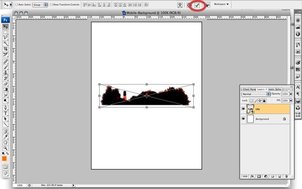
- Click the little check mark in the Option Bar.
- Double click the title in the new layer and to edit the name. Name it "City" or something else descriptive.
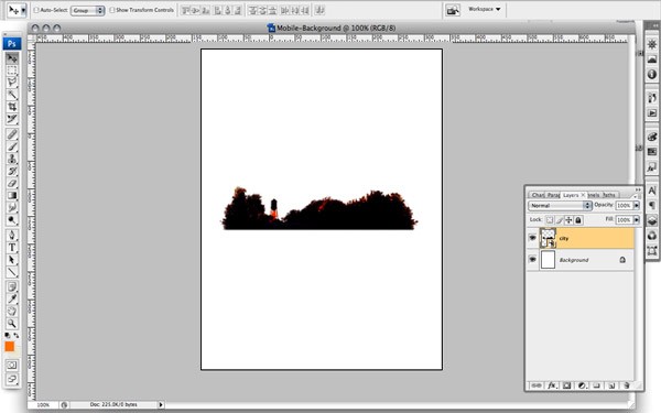
- Select the background layer from the layer palette.
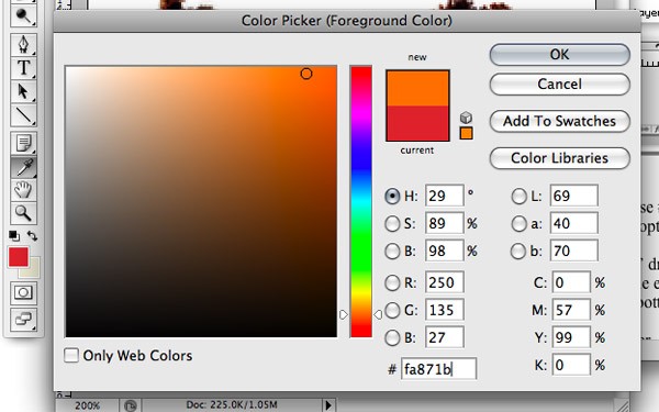
- Double click the foreground color
 and choose a light orange. I am going to use #fa871b.
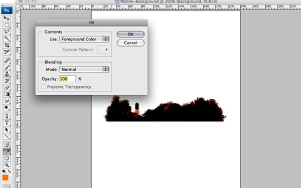
 - With the foreground color chosen, push SHIFT+F5 to bring up the fill color option box.
- With the fill color option box open and foreground color selected in the ‘Use’ drop down box, click OK.
- Click the eye next to the background layer in the layer palette.

- Create a new layer for our gradient by clicking the New Layer button at the bottom of the layer palette.
- Name the layer accordingly.

- Double click the foreground color to open the palette.
- The orange color that we used for the background color should still be in the palette, but if it isn’t, the color palette "automagically" changes to a color picker when open.
- With the color picker, click the background color of the hidden layer.
- Now, since we want a little lighter shade of orange, drag the color picker to the left a little bit to add more white. The color I ended up with is #f5a23a.

- Select the gradient tool (G) from the tool bar.
- From the Option Bar, set the Gradient option to 'Foreground to Transparent.'

- Click at the bottom of the city graphic and drag up.
- Let’s repeat steps 16 through 23, except use an even lighter color for the gradient. I used #f2cc38.
- Click the eye icon next to the background layer to make it visible.
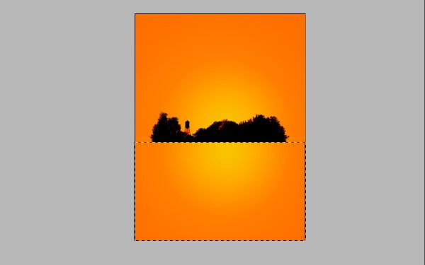
- With the rectangle marquee tool, select the area just below the city graphic as seen below.
- With the first gradient layer selected, press DELETE.
- Select the second gradient layer and press DELETE again.
- Double click the foreground color and, with the color picker, click the background layer to select #f5a23a (the color we had earlier). With the background color selected, add a little more red to make the text darker than the background. I used #da5a00.

- Select the text tool (T) from the toolbar.
- Click right below the city graphic and type your text. I used Scotland South Dakota since that is where the graphic is from.

- Select the text layer from the layer palette.
- Drag the layer to the Create New Layer button at the bottom of the layer palette.

- With the new layer selected, click the Blending Style Button at the bottom of the layer palette. You can also just double click the layer in the layer palette.

- In the Layer Style window, check and highlight Color Overlay from the options on the left.
- Leave Blend Mode set to Normal and double click the Color swatch.
- Choose a color that you want to use as a highlight. I used #ffa800.

- Click OK to choose the color.
- Click OK to close the Layer Style window.

- Click and drag the top text layer directly below the next text layer.

- Select the layer of text with the darker colored font (It should be the text layer on top).
- Select the Move tool (V) from the toolbar.
- Use your keyboard and press the arrow right key once.
- Use your keyboard and press the arrow down key once.

Here we are going to choose a Photoshop preset for the document size. Photoshop has the most common file sizes built in, so we don’t have to mess with customizations. Based on the device you are developing for, this is where you determine how large your canvas is.
Again, this is going to vary depending on what device you are developing for, but for this instance I am going to use a preset.
With the new document open, we are going to bring in the city graphic. If I haven't already driven this point home enough, allow me to do so yet again now: there are a thousand ways to do this (and most other tasks) in Photoshop. Personally, I like to either drag-and-drop the image or, an easier way, place it into the file directly.
When you place the image you have the option to scale the image if you want. I won’t this time, so:
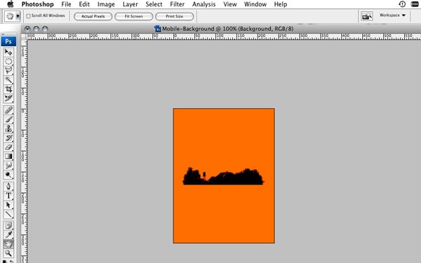
Fine and dandy, but so far nothing special, right? Let’s add some color.
We are going to fill the background with a solid orange color.
NOTE: You can also use the fill tool (G) from the toolbar.
Now we're starting to get somewhere. Lets add a gradient to give it some depth. The effect I am going for is a sunset, so we are going to use a yellow and an orange.
To make things easier to see, lets turn off the visibility of the background layer.
NOTE: The further you drag up, the larger your gradient will be.
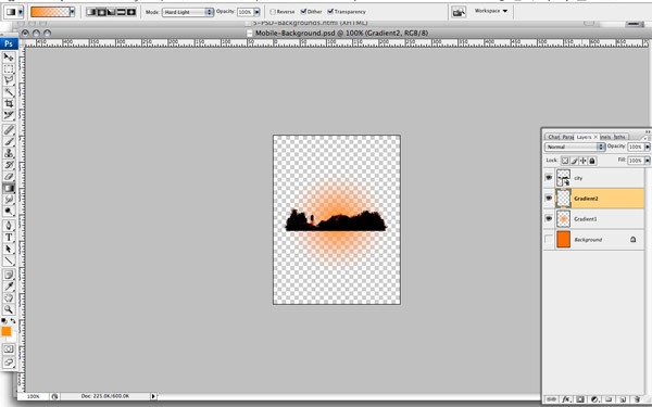
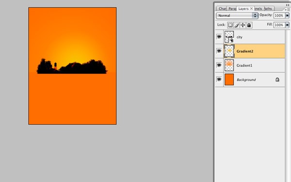
You should have something that looks like this:
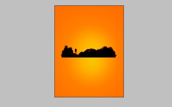
It's starting to look pretty good.
Now we got rid of both gradients below the city graphic and we created a nice little horizon line. Let’s add some text.
Doesn’t look too shabby, but could be better. It’s the detail that makes a good background great.
This will duplicate the layer and place it directly on top of the first text layer.
NOTE: Double click the layer, not the title of the layer. If you double click the title of the layer, all you are going to do is edit the layer title.
We are going to use a lighter color than our initial font.
The overlay is now complete but we want the highlight to appear behind the darker, red text.
Ugh, now our highlighted layer of text isn’t visible! Let's offset the highlight by just a couple pixels.
This should have created a nice little subtle highlight on the text, a little depth, and some nice detail.
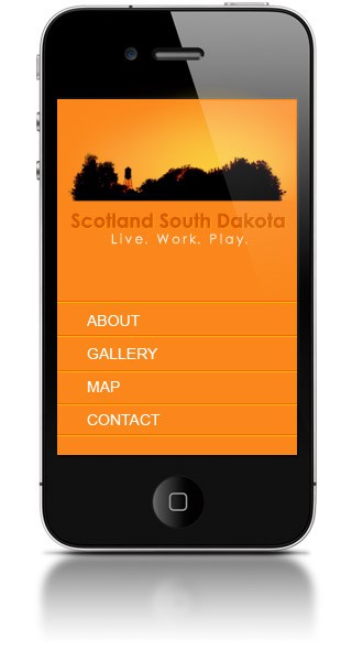
And there you have it. Now we have a nice visual background for our homepage that will keep the users coming back and staying longer. With a little HTML and CSS, you can add some navigation and styling.
What’s that? You want to get the full effect of how it’s going to look on your iPhone or iPad? There are lots of good, free resources out there that offer Photoshop templates just for this purpose. Fortunately, I’ll share my little secret with you.
Next week we'll dabble in a little color theory so you won’t be "that guy" who puts red font on a blue background.

Comments